background-image: -moz-linear-gradient(top, rgba(0,0,0,0), rgba(0,0,0,0.5) 75%);
    background-image: -webkit-linear-gradient(top, rgba(0,0,0,0), rgba(0,0,0,0.5) 75%);
    background-image: -o-linear-gradient(top, rgba(0,0,0,0), rgba(0,0,0,0.5) 75%);
    background-image: -ms-linear-gradient(top, rgba(0,0,0,0), rgba(0,0,0,0.5) 75%);
    background-image: linear-gradient(to bottom, rgba(0,0,0,0), rgba(0,0,0,0.5) 75%);
linear-gradient:to 方位词
-前缀-linear-gradient:方位词


最近在做的项目中用到的实例(2016-12-13 13:53:11)
background: -webkit-linear-gradient(bottom, #fba555, #ffed6c 75%);
background: -moz-linear-gradient(bottom, #fba555, #ffed6c 75%);
background: -ms-linear-gradient(bottom, #fba555, #ffed6c 75%);
background: -o-linear-gradient(bottom, #fba555, #ffed6c 75%);
background: linear-gradient(to top, #fba555, #ffed6c 75%);
20180307 补充代码:
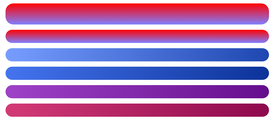
qq浏览器效果如下:
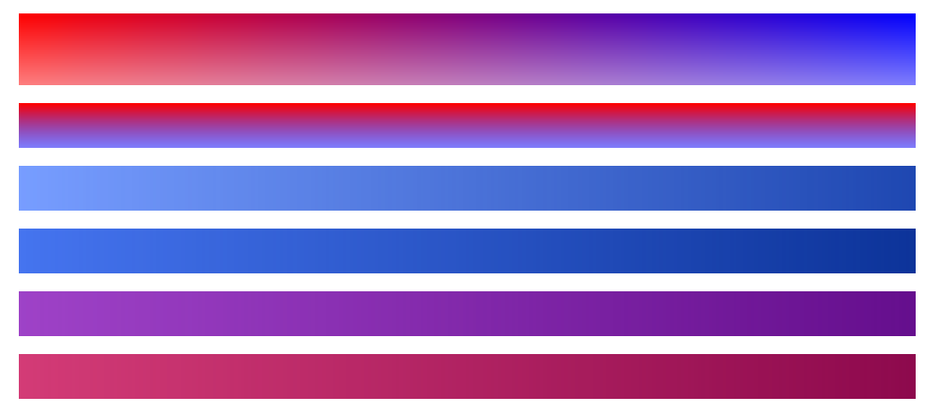
ie8浏览器效果如下:
html
<div class="zhang1"></div>
<div class="zhang2"></div>
<div class="myself1"></div>
<div class="myself2"></div>
<div class="myself3"></div>
<div class="myself4"></div>
css
div{
            height: 50px;
            width: 1000px;
            margin: 20px auto;
            border-radius: 30px;
        }
        .zhang1{
            height: 80px;
        background:red; /* 一些不支持背景渐变的浏览器 */
            filter:alpha(opacity=100 finishopacity=50 style=1 startx=0,starty=0,finishx=0,finishy=150) progid:DXImageTransform.Microsoft.gradient(startcolorstr=red,endcolorstr=blue,gradientType=1);
        -ms-filter:alpha(opacity=100 finishopacity=50 style=1 startx=0,starty=0,finishx=0,finishy=150) progid:DXImageTransform.Microsoft.gradient(startcolorstr=red,endcolorstr=blue,gradientType=1);/*IE8 gradientType=1代表横向渐变,gradientType=0代表纵向淅变。*/
        background:-moz-linear-gradient(top, red, rgba(0, 0, 255, 0.5));
        background:-webkit-gradient(linear, 0 0, 0 bottom, from(#ff0000), to(rgba(0, 0, 255, 0.5)));
        background:-o-linear-gradient(top, red, rgba(0, 0, 255, 0.5));
        }
        .zhang2{
            filter:alpha(opacity=100 finishopacity=50 style=1 startx=0,starty=0,finishx=0,finishy=150) progid:DXImageTransform.Microsoft.gradient(startcolorstr=red,endcolorstr=blue,gradientType=0);
        -ms-filter:alpha(opacity=100 finishopacity=50 style=1 startx=0,starty=0,finishx=0,finishy=150) progid:DXImageTransform.Microsoft.gradient(startcolorstr=red,endcolorstr=blue,gradientType=0);/*IE8*/
        background:red; /* 一些不支持背景渐变的浏览器 */
        background:-moz-linear-gradient(top, red, rgba(0, 0, 255, 0.5));
        background:-webkit-gradient(linear, 0 0, 0 bottom, from(#ff0000), to(rgba(0, 0, 255, 0.5)));
        background:-o-linear-gradient(top, red, rgba(0, 0, 255, 0.5));
        }
        .myself1{
            background: #779DFF;
            filter:alpha(opacity=100) progid:DXImageTransform.Microsoft.gradient(startcolorstr=#779DFF,endcolorstr=#1E47B1,gradientType=1);/*IE8*/
        -ms-filter:alpha(opacity=100) progid:DXImageTransform.Microsoft.gradient(startcolorstr=#779DFF,endcolorstr=#1E47B1,gradientType=1);/*IE8*/
            background: -webkit-linear-gradient(left, #779DFF, #1E47B1 100%);
            background: -moz-linear-gradient(left, #779DFF, #1E47B1 100%);
            background: -ms-linear-gradient(left, #779DFF, #1E47B1 100%);
            background: -o-linear-gradient(left, #779DFF, #1E47B1 100%);
            background: linear-gradient(to right, #779DFF, #1E47B1 100%);
        }
        .myself2{
            background: #4574EF;
            filter:alpha(opacity=100) progid:DXImageTransform.Microsoft.gradient(startcolorstr=#4574EF,endcolorstr=#0C3399,gradientType=1);/*IE8*/
        -ms-filter:alpha(opacity=100) progid:DXImageTransform.Microsoft.gradient(startcolorstr=#4574EF,endcolorstr=#0C3399,gradientType=1);/*IE8*/
            background: -webkit-linear-gradient(left, #4574EF, #0C3399 100%);
            background: -moz-linear-gradient(left, #4574EF, #0C3399 100%);
            background: -ms-linear-gradient(left, #4574EF, #0C3399 100%);
            background: -o-linear-gradient(left, #4574EF, #0C3399 100%);
            background: linear-gradient(to right, #4574EF, #0C3399 100%);
        }
        .myself3{
            background: #9E42C7;
            filter:alpha(opacity=100) progid:DXImageTransform.Microsoft.gradient(startcolorstr=#9E42C7,endcolorstr=#650E8D,gradientType=1);
        -ms-filter:alpha(opacity=100) progid:DXImageTransform.Microsoft.gradient(startcolorstr=#9E42C7,endcolorstr=#650E8D,gradientType=1);IE8
            background: -webkit-linear-gradient(left, #9E42C7, #650E8D 100%);
            background: -moz-linear-gradient(left, #9E42C7, #650E8D 100%);
            background: -ms-linear-gradient(left, #9E42C7, #650E8D 100%);
            background: -o-linear-gradient(left, #9E42C7, #650E8D 100%);
            background: linear-gradient(to right, #9E42C7, #650E8D 100%);
        }
        .myself4{
            background: #D33B76;
            filter:alpha(opacity=100) progid:DXImageTransform.Microsoft.gradient(startcolorstr=#D33B76,endcolorstr=#8D094D,gradientType=1);
        -ms-filter:alpha(opacity=100) progid:DXImageTransform.Microsoft.gradient(startcolorstr=#D33B76,endcolorstr=#8D094D,gradientType=1);/*IE8 */
            background: -webkit-linear-gradient(left, #D33B76, #8D094D 100%);
          background: -moz-linear-gradient(left, #D33B76, #8D094D 100%);
            background: -ms-linear-gradient(left, #D33B76, #8D094D 100%);
            background: -o-linear-gradient(left, #D33B76, #8D094D 100%);
            background: linear-gradient(to right, #D33B76, #8D094D 100%);
        }
张鑫旭教程