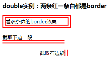
border特性:
-
能形成BFC但是不能清除浮动。但是bfc也是把子元素的margin包裹进来,但是拿自己的margin穿透没办法的。
-
边框宽度不支持百分比
-
透明border可以突破可视区域的限制
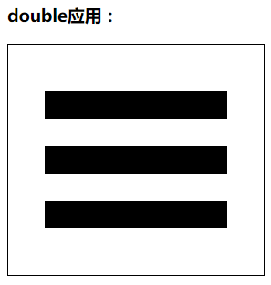
border-style:double巧用
double可以利用来配合border-style:solid制作三条杠小icon
具体代码见下边
border-style:dotted来做圆
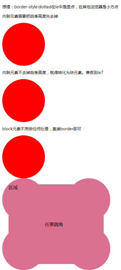
  <h3>原理:border-style:dotted在ie中是圆点,在其他浏览器是小方点</h3>
  <h3>内联元素需要把自身高度先去掉</h3>
  <div class="box2">
    <span class="dot2">圆</span>
  </div>
  <h3>内联元素不去掉自身高度,就得转化为块元素。兼容到ie7</h3>
  <div class="box1">
    <span class="dot1">圆</span>
  </div>
  <h3>block元素不用做任何处理,直接border即可</h3>
  <div class="box3">
    <div class="dot3">圆</div>
  </div>
  <span class="dot"></span>

  <div class="ever">
    <div class="dots">任意圆角</div>
    <div class="area">区域</div>
  </div>
   .dot {
      background: green;
      padding: 20px;
      /* 这样,元素宽40,高61。即使是一个空文本。 */
    }

    .box1 {
       150px;
      height: 150px;
      overflow: hidden;
    }

    .dot1 {
      display: block;
       100%;
      height: 100%;
      /* 解决内联元素不可见内容的高度 */
      border: 150px dotted red;
    }

    .box2 {
      margin: 10px 0;
       150px;
      height: 150px;
      overflow: hidden;
      font-size: 0;
      /* 解决内联元素不可见内容的高度 */
    }

    .dot2 {
      border: red 150px dotted;
    }

    .box3 {
       150px;
      height: 150px;
      overflow: hidden;
    }

    .dot3 {
      border: 150px dotted red;
    }
   .ever {
       380px;
      /* overflow: hidden; */
    }

    .dots {
      border: 150px dotted palevioletred;
    }

    .area {
       335px;
      background: palevioletred;
      margin-top: -300px;
      margin-left: 22px;
      height: 279px;
    }
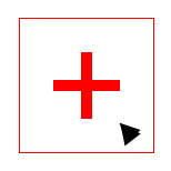
border-color : 默认颜色就是color
利用这个原理,用border做的icon,可以在hover时只改变color颜色值即可。
示例:
<div class="add"></div>
  <style>
    .add{
      position: relative;
       120px;
      height: 120px;
      margin: 200px;
      color: #ccc;//border的颜色来自于此
      border: 1px solid;
      transition: color .5s;
    }
    .add::before,.add::after{
      content: "";
       60px;
      height: 60px;
      position: absolute;
      left: 50%;
      top: 50%;
    }
    .add::before{
      margin-top: -5px;
      margin-left: -30px;
      border-top: 10px solid;
    }
    .add::after{
      margin-top: -30px;
      margin-left: -5px;
      border-left: 10px solid;
    }
    .add:hover{
      color: red;//hover的时候只需要修改color即可
      cursor: pointer;
    }
  </style>
border应用
1. 三条杠
横向效果:
<div></div>
div {
     200px;
    position: relative;
    border: 1px solid;
    padding: 51px 40px;
}
div::after {
    content: "";
    display: block;
    height: 30px;
    border-top: 90px double;
    border-bottom: 30px solid;
}
竖排效果:
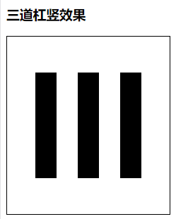
<div class="shu"></div>
div.shu {
    height: 150px;
     150px;
    position: relative;
    border: 1px solid;
    padding: 51px 40px;
}
div.shu::after {
    content: "";
    display: block;
    border: 0;
     30px;
    border-right: 90px double;
    border-left: 30px solid;
    height: 150px;
}
2. 加号icon (可以用伪元素的宽高实现)
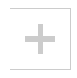
代码:
<div class="add">
  </div>
  <style>
    .add{
      position: relative;
       120px;
      height: 120px;
      margin: 200px;
      color: #ccc;
      border: 1px solid;
      transition: color .5s;
    }
    .add::before,.add::after{
      content: "";
       60px;
      height: 60px;
      position: absolute;
      left: 50%;
      top: 50%;
    }
    .add::before{
      margin-top: -5px;
      margin-left: -30px;
      border-top: 10px solid;
    }
    .add::after{
      margin-top: -30px;
      margin-left: -5px;
      border-left: 10px solid;
    }
    .add:hover{
      color: red;
      cursor: pointer;
    }
  </style>
3. 小三角效果、梯形效果
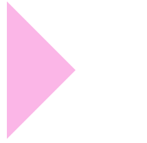
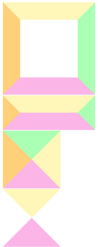
  <div class="trans"></div>
  <div class="trans2"></div>
  <div class="trans3"></div>
  <div class="trans4"></div>
  <div class="trans5"></div>
div{
      margin: 2px;
    }
    .trans{
       200px;
      height: 200px;
      border: 60px solid;
      border-top-color: #fff6b9;
      border-right-color: #aaffb4;
      border-bottom-color: #fbb6e7;
      border-left-color: #ffd07a;
    }
    .trans2{
       200px;
      border: 60px solid;
      border-top-color: #fff6b9;
      border-right-color: #aaffb4;
      border-bottom-color: #fbb6e7;
      border-left-color: #ffd07a;
    }
    .trans3{
       0px;
      height: 0px;
      border: 100px solid;
      border-top-color: #aaffb4;
      border-right-color: #fff6b9;
      border-bottom-color: #fbb6e7;
      border-left-color: #ffd07a;
    }
    .trans4{
       0px;
      height: 0px;
      border: 100px solid;
      border-top-color: #fff6b9;
      border-right-color: transparent;
      border-bottom-color: #fbb6e7;
      border-left-color: transparent;
    }
    .trans5{
       0px;
      height: 0px;
      border: 100px solid;
      border-top-color: transparent;
      border-right-color: transparent;
      border-bottom-color: transparent;
      border-left-color: #fbb6e7;
    }
4. 模拟圆角效果
- 利用border-top和border-bottom的两端斜边效果
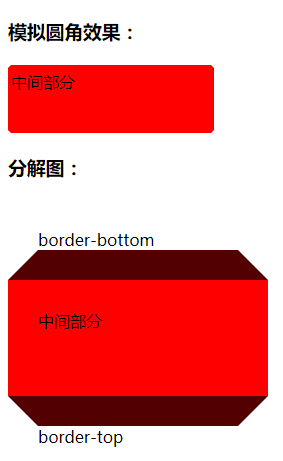
<h3>模拟圆角效果:</h3>
  <div class="top"></div>
  <div class="cont">中间部分</div>
  <div class="bottom"></div>
  <h3>分解图:</h3>
  <div class="top top1">border-bottom</div>
  <div class="cont cont1">中间部分</div>
  <div class="bottom bottom1">border-top</div>
div{
       200px;
      border: 3px solid transparent;
    }
    .top{
      border-bottom-color: red;
    }
    .cont{
      height: 56px;
      background: red;
      border-color: red;
    }
    .bottom{
      border-top-color: red;
    }
    .cont1{
      border- 30px;
    }
    .top1{
      border- 30px;
      border-bottom-color: rgb(83, 0, 0);
    }
    .bottom1{
      border- 30px;
      border-top-color: rgb(83, 0, 0);
    }
5. 使用透明边框增加可点击区域的大小,兼容到ie7+;
- 利用原理:透明border可以突破可视区域的限制,原边框用盒阴影制作
6. 增加图标的可渲染区域:
png图标是可以设置颜色的;
icon{filter:drop-shadow(20px 0 #000);}
布局应用:
border等高布局 (不支持百分比结构)
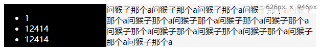
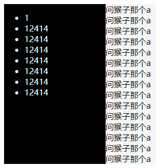
<div class="box">
    <div class="left">
      <ul>
        <li>1</li>
        <li>12414</li>
        <li>12414</li>
        <li>12414</li>
        <li>12414</li>
        <li>12414</li>
        <li>12414</li>
        <li>12414</li>
      </ul>
    </div>
    <div class="right">
      <article>问猴子那个a问猴子那个a问猴子那个a问猴子那个a问猴子那个a问猴子那个a问猴子那个a问猴子那个a问猴子那个a问猴子那个a问猴子那个a问猴子那个a问猴子那个a问猴子那个a问猴子那个a</article>
    </div>
  </div>
   .box{
      border-left: 200px solid black;
      background: #f5f5f5;
      color: #fff;
      clear:both;
    }
    .right{
      color: #000;
    }
    .left{
      float: left;
       200px;
      margin-left: -200px;
    }
2018-08-29 14:57