@theboysmithy did a great piece on coming up with an alternate view for a timeline for an FT piece.
Here’s an excerpt (read the whole piece, though, it’s worth it):
Here is an example from a story recently featured in the FT: emerging- market populations are expected to age more rapidly than those in developed countries. The figures alone are compelling: France is expected to take 157 years (from 1865 to 2022) to triple the proportion of its population aged over 65, from 7 per cent to 21 per cent; for China, the equivalent period is likely to be just 34 years (from 2001 to 2035).
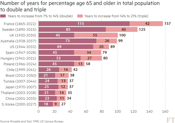
You may think that visualising this story is as simple as creating a bar chart of the durations ordered by length. In fact, we came across just such a chart from a research agency.
But, to me, this approach generates “the feeling” — and further scrutiny reveals specific problems. A reader must work hard to memorise the date information next to the country labels to work out if there is a relationship between the start date and the length of time taken for the population to age. The chart is clearly not ideal, but how do we improve it?
Alan went on to talk about the process of improving the vis, eventually turning to Joseph Priestly for inspiration. Here’s their makeover:
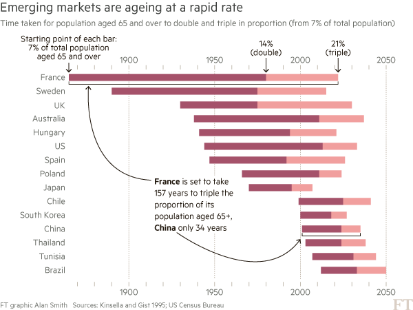
Alan used D3 to make this, which had me head scratching for a bit. Bostock is genius & I :heart: D3 immensely, but I never really thought of it as a “canvas” for doing general data visualization creation for something like a print publication (it’s geared towards making incredibly data-rich interactive visualizations). It’s 100% cool to do so, though. It has fine-grained control over every aspect of a visualization and you can easily turn SVGs into PDFs or use them in programs like Illustrator to make the final enhancements. However, D3 is not the only tool that can make a chart like this.
I made the following in R (of course):
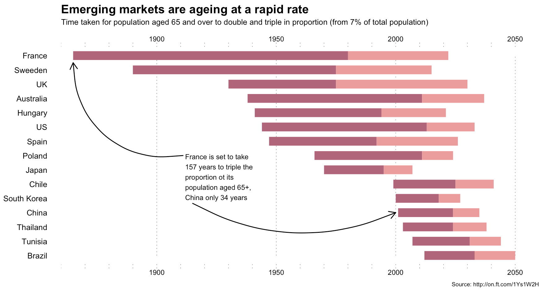
The annotations in Alan’s image were (99% most likely) made with something like Illustrator. I stopped short of fully reproducing the image (life is super-crazy, still), but could have done so (the entire image is one ggplot2 object).
This isn’t an “R > D3” post, though, since I use both. It’s about (a) reinforcing Alan’s posits that we should absolutely take inspiration from historical vis pioneers (so read more!) + need a diverse visualization “utility belt” (ref: Batman) to ensure you have the necessary tools to make a given visualization; (b) trusting your “Spidey-sense” when it comes to evaluating your creations/decisions; and, (c) showing that R is a great alternative to D3 for something like this :-)
Spider-man (you expected headier references from a dude with a shield avatar?) has this ability to sense danger right before it happens and if you’re making an effort to develop and share great visualizations, you definitely have this same sense in your DNA (though I would not recommend tossing pie charts at super-villains to stop them). When you’ve made something and it just doesn’t “feel right”, look to other sources of inspiration or reach out to your colleagues or the community for ideas or guidance. You can and do make awesome things, and you do have a “Spidey-sense”. You just need to listen to it more, add depth and breadth to your “utility belt” and keep improving with each creation you release into the wild.
R code for the ggplot vis reproduction is below, and it + the CSV file referenced are in this gist.
library(ggplot2)
library(dplyr)

ft <- read.csv("ftpop.csv", stringsAsFactors=FALSE)

arrange(ft, start_year) %>%
  mutate(country=factor(country, levels=c(" ", rev(country), "  "))) -> ft

ft_labs <- data_frame(
  x=c(1900, 1950, 2000, 2050, 1900, 1950, 2000, 2050),
  y=c(rep(" ", 4), rep("  ", 4)),
  hj=c(0.5, 0.5, 0.5, 0.5, 0.5, 0.5, 0.5, 0.5),
  vj=c(1, 1, 1, 1, 0, 0, 0, 0)
)

ft_lines <- data_frame(x=c(1900, 1950, 2000, 2050))

ft_ticks <- data_frame(x=seq(1860, 2050, 10))

gg <- ggplot()

# tick marks & gridlines
gg <- gg + geom_segment(data=ft_lines, aes(x=x, xend=x, y=2, yend=16),
                        linetype="dotted", size=0.15)
gg <- gg + geom_segment(data=ft_ticks, aes(x=x, xend=x, y=16.9, yend=16.6),
                        linetype="dotted", size=0.15)
gg <- gg + geom_segment(data=ft_ticks, aes(x=x, xend=x, y=1.1, yend=1.4),
                        linetype="dotted", size=0.15)

# double & triple bars
gg <- gg + geom_segment(data=ft, size=5, color="#b0657b",
                        aes(x=start_year, xend=start_year+double, y=country, yend=country))
gg <- gg + geom_segment(data=ft, size=5, color="#eb9c9d",
                        aes(x=start_year+double, xend=start_year+double+triple, y=country