引言
上一篇文章中,我们主要讲解了如何在保证GridView控件的用户体验基础上,扩展GridView生成GridViewEx控件,增加动态添加新分组功能等,本文在上文的基础上,介绍如何在Windows10中使用GridViewEx,开发UWP应用。
Demo 下载:
开发UWP应用程序
开发UWP应用程序最好是从创建empty项目开始,重用已开发的一些模块,这样可以提高开发效率。
本文为了创建UWP 应用程序,首先创建一些通用类如下,详细代码见附件:
- Common/VisibilityConverter.cs
- Common/LayoutAwarePage.cs
- Common/SuspensionManager.cs
DataModel 和Sample 文件夹下的所有文件都可以重用。
修改布局和导航
VisibilityConverter 和 SuspensionsManager暂时不需要修改,可直接在UWP中使用。主要修改布局和导航逻辑文件。
由于微软支持的设备种类越来越多,导致ApplicationViewState不再适用。UWP平台提供了其他的解决方法如AdaptiveTriggers,内置了自适应布局。因此创建UWP应用程序,首先需要删除所有ApplicationViewStates的代码。可能会导致使用报错。因此我们需要做一些兼容性的改变。LayoutAwarePage的部分会
无论是WinRT还是UWP应用,都会使用返回键导航。桌面WinRTx应用会在Xaml文件添加返回按钮。但是在UWP应用中,非常灵活,桌面应用可以在标题栏中添加返回按钮,在移动设备中不仅能使用标题栏中的返回键,也可以使用物理返回键实现导航功能。UWP的方法比较通用,且不需要编写自定义的Xaml文件。因此只需要开发一个基类,应用到不同的Xaml 页面中就可以实现轻松实现导航功能,不需要重复编写代码。修改后的LayoutAwarePage 类:
1: protected override void OnNavigatedTo(NavigationEventArgs e)
2: {
3: // subscribe on Back button event
4: if (IsWindowsPhoneDevice())
5: {
6: // use hardware button
7: Windows.Phone.UI.Input.HardwareButtons.BackPressed += HardwareButtons_BackPressed;
8: }
9: else
10: {
11: // enable/disable window back button depending on navigation state
12: var currentView = SystemNavigationManager.GetForCurrentView();
13: currentView.AppViewBackButtonVisibility = this.Frame != null && this.Frame.CanGoBack ?
14: AppViewBackButtonVisibility.Visible : AppViewBackButtonVisibility.Collapsed;
15: currentView.BackRequested += backButton_Tapped;
16: }
17: ...
18: protected override void OnNavigatedFrom(NavigationEventArgs e)
19: {
20: // unsubscribe from Back button event
21: if (IsWindowsPhoneDevice())
22: {
23: Windows.Phone.UI.Input.HardwareButtons.BackPressed -= HardwareButtons_BackPressed;
24: }
25: else
26: {
27: // unsubscribe from window back button
28: var currentView = SystemNavigationManager.GetForCurrentView();
29: currentView.BackRequested -= backButton_Tapped;
30: }
31: ...
32: // handle Back button events
33: private void HardwareButtons_BackPressed(object sender, BackPressedEventArgs e)
34: {
35: if (this.Frame != null && this.Frame.CanGoBack)
36: {
37: e.Handled = true;
38: this.Frame.GoBack();
39: }
40: }
41: private void backButton_Tapped(object sender, BackRequestedEventArgs e)
42: {
43: this.GoBack(this, new RoutedEventArgs());
44: }
因为需要使用物理返回键,我们需要在程序中添加引用文件“Windows Mobile Extensions for the UWP”。
现在由LayoutAwarePage派生而来的所有页面都可直接使用,无需在多个文件中添加引用。
LayoutAwarePage 类最后添加设备查询的静态方法,来检测运行时设备。
1: public static bool IsWindowsPhoneDevice()
2: {
3: if (Windows.Foundation.Metadata.ApiInformation.IsTypePresent("Windows.Phone.UI.Input.HardwareButtons"))
4: {
5: return true;
6: }
7: return false;
8: }
其他平台
1. 如果想保证应用程序在Windows10中具有与系统一致的界面风格和用户体验,可使用Windows 10 ThemeResources (主题资源)。
2. 微软也在Windows10 发布中升级了GridView控件,相对于Windows 8 版本来说,最重要的改变是添加了用户重定向检测。
3. VariableSizedWrapGrid 面板也添加了重定向检测功能。并且去掉了行和列自动展开的功能。下面是Windows8 版本的Xaml文件,在Windows10 中已经无法使用。
1: <GridView Grid.Row="1" Grid.Column="1" Margin="10" AllowDrop="True" CanReorderItems="True" CanDragItems="True" IsSwipeEnabled="True">
2: <GridView.ItemsPanel>
3: <ItemsPanelTemplate>
4: <VariableSizedWrapGrid/>
5: </ItemsPanelTemplate>
6: </GridView.ItemsPanel>
7: <Rectangle Height="100" Width="200" Fill="Blue" />
8: <Rectangle Height="100" Width="100" Fill="Red" />
9: <Rectangle Height="100" Width="100" Fill="Yellow" />
10: <Rectangle Height="100" Width="100" Fill="Green" />
最好的解决方法就是将VariableSizedWrapGrid 与item的属性绑定,并将值传给自定义的GridView控件的ListViewItemPresenter 元素:
1: /// <summary>
2: /// This class sets VariableSizedWrapGrid.ColumnSpanProperty for GridViewItem controls,
3: /// so that every item can have different size in the VariableSizedWrapGrid.
4: /// Also it sets VerticalContentAlignment and HorizontalContentAlignment to Stretch.
5: /// </summary>
6: public class GridViewTiled : GridView
7: {
8: // set ColumnSpan according to the business logic (maybe some GridViewSamples.Samples.Item or group properties)
9: protected override void PrepareContainerForItemOverride(Windows.UI.Xaml.DependencyObject element, object item)
10: {
11: element.SetValue(ContentControl.HorizontalContentAlignmentProperty, HorizontalAlignment.Stretch);
12: element.SetValue(ContentControl.VerticalContentAlignmentProperty, VerticalAlignment.Stretch);
13: UIElement el = item as UIElement;
14: if (el != null)
15: {
16: int colSpan = Windows.UI.Xaml.Controls.VariableSizedWrapGrid.GetColumnSpan(el);
17: int rowSpan = Windows.UI.Xaml.Controls.VariableSizedWrapGrid.GetRowSpan(el);
18: if (rowSpan > 1)
19: {
20: // only set it if it has non-defaul value
21: element.SetValue(Windows.UI.Xaml.Controls.VariableSizedWrapGrid.RowSpanProperty, rowSpan);
22: }
23: if (colSpan > 1)
24: {
25: // only set it if it has non-defaul value
26: element.SetValue(Windows.UI.Xaml.Controls.VariableSizedWrapGrid.ColumnSpanProperty, colSpan);
27: }
28: }
29: base.PrepareContainerForItemOverride(element, item);
30: }
31: }
UWP中的XAML文件:
<controls:GridViewTiled Grid.Row="1" Grid.Column="1" Margin="10" AllowDrop="True" CanReorderItems="True" CanDragItems="True" >
    <controls:GridViewTiled.ItemsPanel>
        <ItemsPanelTemplate>
            <VariableSizedWrapGrid ItemHeight="100" ItemWidth="100" Orientation="Horizontal"/>
        </ItemsPanelTemplate>
    </controls:GridViewTiled.ItemsPanel>
    <Rectangle VariableSizedWrapGrid.ColumnSpan="2" VariableSizedWrapGrid.RowSpan="2" Fill="Blue" />
    <Rectangle Fill="Red" />
    <Rectangle Fill="Yellow" />
    <Rectangle Fill="Green" />
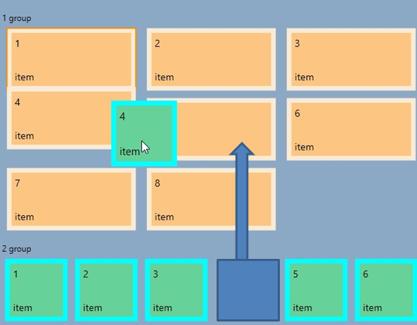
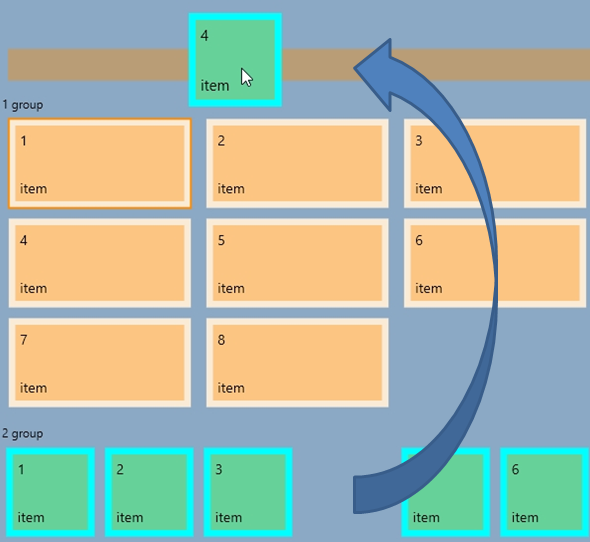
新占位符(NewGroupPlaceholder)控件
WinRT版的GridViewEx控件使用了简单border作为新分组的占位符,在拖拽项过程中外观是静态的,无法改变。为了使界面对用户更加友好,并且将拖放的位置高亮, 因此我们新建了新的“NewGroupPlaceholder”控件,在拖拽过程中有简单的状态切换逻辑。
代码很简单,见附件,系统提供的控件模板代码如下:
1: <Style TargetType="local:NewGroupPlaceholder">
2: <Setter Property="Background" Value="Transparent" />
3: <Setter Property="Margin" Value="8" />
4: <Setter Property="Height" Value="32" />
5: <Setter Property="Template">
6: <Setter.Value>
7: <ControlTemplate TargetType="local:NewGroupPlaceholder">
8: <Border x:Name="root" Background="{TemplateBinding Background}">
9: <VisualStateManager.VisualStateGroups>
10: <VisualStateGroup x:Name="DragStates">
11: <VisualState x:Name="Normal"/>
12: <VisualState x:Name="DragOver">
13: <Storyboard>
14: <DoubleAnimation Duration="0" To="1" Storyboard.TargetProperty="Opacity" Storyboard.TargetName="dragOverElement"/>
15: </Storyboard>
16: </VisualState>
17: </VisualStateGroup>
18: </VisualStateManager.VisualStateGroups>
19: <Border x:Name="dragOverElement" Background="{ThemeResource SystemControlHighlightListAccentLowBrush}" Opacity="0"/>
20: </Border>
21: </ControlTemplate>
22: </Setter.Value>
23: </Setter>
24: </Style>
修改GridViewEx 控件
接下来,我们将介绍如何修改GridViewEx控件,使得其可以适应UWP。
UWP平台下运行GridViewEx大部分的功能与WinRT保持一致。只有OnDragOver中的DragEventArgs.AcceptedOperation 属性需要重写。显然UWP 中的GridView 将所有非空项的该属性都设置为None。因此,如果不重写OnDragOver 方法,Drop 事件就不会被触发。
代码如下:
1: protected override void OnDragOver(DragEventArgs e)
2: {
3: int newIndex = GetDragOverIndex(e);
4: if (newIndex >= 0)
5: {
6: e.AcceptedOperation = Windows.ApplicationModel.DataTransfer.DataPackageOperation.Move;
运行代码时编译器会发出很多关于ItemContainerGenerator 方法的警告,调用ItemsControl 响应方法就可以处理Warning
VariableSizedWrapGrid存在很多限制,为了解决这些限制,在上述代码中添加 PrepareContainerForItemOverride 方法。最后需要升级GridViewEx 控件自带的样式,使其支持设备重定向。
更加适应手持设备
在GridViewEx控件中添加新的PreparingContainerForItem 事件,该事件的参数即包含数据对象,也包含UI 容器,因此可根据需求设置UI属性,代码如下:
1: /// <summary>
2: /// Set column spans depending on group id.
3: /// </summary>
4: /// <param name="sender"></param>
5: /// <param name="e"></param>
6: private void gve_PreparingContainerForItem(object sender, GridViewEx.PreparingContainerForItemEventArgs e)
7: {
8: try
9: {
10: Item it = e.Item as Item;
11: if (it != null)
12: {
13: e.Element.SetValue(Windows.UI.Xaml.Controls.VariableSizedWrapGrid.ColumnSpanProperty, it.GroupId % 2 + 1);
14: }
15: }
16: catch
17: {
18: e.Element.SetValue(Windows.UI.Xaml.Controls.VariableSizedWrapGrid.ColumnSpanProperty, 1);
19: }
20: }
在多设备中具有良好用户体验
为了适应多种设备,需要生成自适应布局。本文中主要通过修改内容项的尺寸来实现该功能。创建了Bound ,Unbound以及Grouped 示例文件,Grouped 显示单个GridView控件,因此在移动端能够修改Tile的尺寸及边框。
Bound 和Unbound 示例是由2个GridView控件组成,小屏幕中显的内容较多,无法显示更多的细节性的内容,因此使用Pivot控件保证同一时间只显示一个GridView控件,并支持GridView之间切换。
代码如下:
1: public double TileSize
2: {
3: get { return (double)GetValue(TileSizeProperty); }
4: set { SetValue(TileSizeProperty, value); }
5: }
6: public static readonly DependencyProperty TileSizeProperty =
7: DependencyProperty.Register(nameof(TileSize), typeof(double), typeof(Customized), new PropertyMetadata(100));
8: public Customized()
9: {
10: if (IsWindowsPhoneDevice())
11: {
12: TileSize = 72;
13: }
14: this.InitializeComponent();
15: }
GridViewEx 和GridView 中绑定代码如下:
1: <GroupStyle.Panel>
2: <ItemsPanelTemplate>
3: <VariableSizedWrapGrid ItemHeight="{Binding TileSize, ElementName=pageRoot}"
4: ItemWidth="{Binding TileSize, ElementName=pageRoot}"
5: Orientation="Horizontal" MaximumRowsOrColumns="10"/>
6: </ItemsPanelTemplate>
7: </GroupStyle.Panel>
总结
自定义GridViewEx控件扩展了GridView控件,丰富了功能,并新增适应UWP平台App的开发。
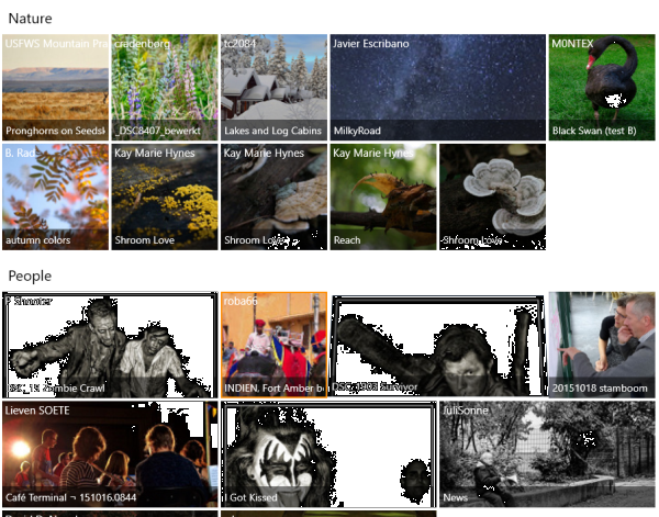
示例图片:
UWP平台开发工具
ComponentOne Studio for UWP,是一套可以编写所有 UWP 平台应用的控件集,包括表格、报表、图表、仪表盘、组织图、地图、PDF、Excel、Word、日程安排、输入、导航等多个控件,有效帮助开发过程。
原文链接:http://www.codeproject.com/Articles/1037059/How-to-Upgrade-Extended-GridView-from-WinRT-to-Uni