Matplotlib 能够创建多数类型的图表,如条形图,散点图,条形图,饼图,堆叠图,3D 图和地图图表。首先,为了实际使用 Matplotlib,我们需要安装它。如果你安装了更高版本的 Python,你应该能够打开 cmd.exe 或终端,然后执行:pip install matplotlib。或者在安装Anaconda的情况下可以在环境中查找matplotlib并Apply。
为了能够在程序中使用matplotlib,我们需要在程序的开头将其引入:import matplotlib,通常我们使用较多的是pyplot这个模块,因此import matplotlib.pyplot as plt,接下来就可以在程序中使用他们了。
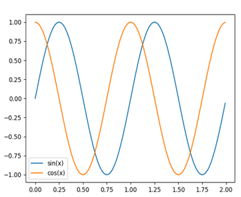
练习1:绘制三角函数图像,并为图像增加图例,添加图表标题,x轴、y轴标题。
代码:
x1=np.arange(0,2,0.01)
y1=np.sin(2*np.pi*x1)
x2 = np.arange(0,2,0.01)
y2 =np.cos(2*np.pi*x2)
#在同一副图里画出两个函数的图像
plt.plot(x1,y1,label="sin(x)")
plt.plot(x2,y2,label="cos(x)")
plt.legend()
plt.show()
程序运行结果:
练习2:绘制条形图
代码:
x1=[1,3,5,7,9]
y1=[1,2,5,4,8]
x2=[2,4,6,8,10]
y2=[3,2,4,7,1]
plt.bar(x1,y1,label="ex.1")
plt.bar(x2,y2,label="ex.2")
plt.legend()
plt.xlabel("bar number")
plt.ylabel("bar height")
plt.title("Hoho")
plt.show()
结果:
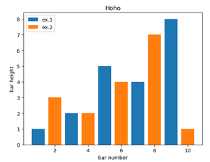
Pyplot.bar()函数可以绘制条形图,并指定条形图的图例,颜色等参数。同样地,可以给图标的坐标轴设置标题以及为图标设置标题。
练习3:绘制直方图
代码:
population_ages =[22,55,62,45,21,22,34,42,42,4,99,102,110,120,
1,21,122,130,111,115,112,80,75,65,54,44,43,42,48]
bins = [0,10,20,30,40,50,60,70,80,90,100,110,120,130]
plt.hist(population_ages, bins, histtype='bar', rwidth=0.8,label="ex.01")
plt.xlabel("x")
plt.ylabel("y")
plt.legend()
plt.title("Interesting Graph")
plt.show()
程序结果:
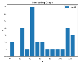
Pyplot.hist()函数可以绘制直方图,用以描述频数的分布状况。在这个函数中,可以指定要画的数据所存储的变量,直方图类型(histtype),宽度,图例等参数。
练习4:绘制散点图
代码:
x = [1,2,3,4,5,6,7,8]
y = [5,2,4,2,1,4,5,2]
plt.scatter(x,y)
plt.show()
程序结果:
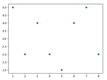
在这段代码中,我们只需要指定每个点的X值和Y值,然后使用pyplot.scatter()函数即可绘制,非常简单。
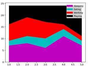
练习5:绘制堆叠图
堆叠图用于显示『部分对整体』随时间的关系。 堆叠图基本上类似于饼图,只是随时间而变化。
代码:
days = [1,2,3,4,5]
sleeping = [7,8,6,11,7]
eating = [2,3,4,3,2]
working = [7,8,7,2,2]
playing = [8,5,7,8,13]
plt.plot([],[],color='m', label='Sleeping', linewidth=8)
plt.plot([],[],color='c', label='Eating', linewidth=8)
plt.plot([],[],color='r', label='Working', linewidth=8)
plt.plot([],[],color='k', label='Playing', linewidth=8)
plt.legend()
plt.stackplot(days,sleeping,eating,working,playing,colors=["r","g","b","m"])
plt.show()
程序结果:
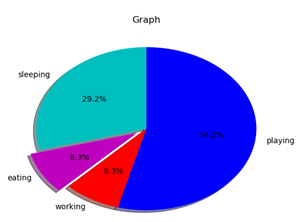
练习6:绘制饼图
饼图很像堆叠图,只是它们位于某个时间点。 通常,饼图用于显示部分对于整体的情况,通常以%为单位。 幸运的是,Matplotlib 会处理切片大小以及一切事情,我们只需要提供数值。
代码:
slices = [7,2,2,13]
activities = ['sleeping','eating','working','playing']
cols = ['c','m','r','b']#指定每一部分绘制时的颜色
plt.pie(slices,
labels=activities,
colors=cols,
startangle=90,#开始绘制的角度,设置为90°是为了便于观看
shadow= True,
explode=(0,0.1,0,0),#设置eating部分突出,对应于第二个下标
autopct='%1.1f%%')#将百分比放置在图表上
plt.title('Graph t')
plt.show()
程序结果: