CSS(Cascading Style Sheet 层叠样式表 级联样式表)
一、简述
(1)优先级:行内样式>内部样式>外部样式>导入样式
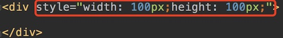
(1)行内样式
<div style="css样式"></div>
(2)内部样式(只适用当前页面)
<head>
<style>
css样式;
</style>
</head>
(3)外部样式(实现了内容与表现分离,可以同时被多个HTML引入,从而提高了代码的可重用性和可维护性)
<head>
<link rel="stylesheet" href=".css"/>
</head>
(4)导入式
<head>
<style>
@import "";
</style>
</head>@import和link的区别:
1)@import先加载HTML文件,再加载css文件,link是一边加载HTML文件,一边加载css样式
2)@import有兼容性(IE5以上兼容),link没有兼容性(IE新旧都兼容)
3)@import只能引入css文件,link可以引入其他内容
4)引入javaScript只能用link
(2)特点:
a、css是以属性/值对形式出现;
b、属性和属性值之间用冒号(:)连接;
c、多对属性之间用分号(;)隔开;
d、具有继承性,优先级,层叠性。
(3)优点
a、外部css文件可被多个HTML文件调用,提高代码复用性;
b、实现内容与表现分离。
二、选择器:
1、基本选择器
(1)全局选择器(通用选择器):对页面内所有元素操作
语法:*{ }
(2)元素选择器:(div,p,img,a,input,ul,ol,li,span,I,u…..)
语法:元素{ }
(3)类选择器
语法:.className{ }
(4)ID选择器
语法:#idName{ }
注意:class和ID选择器的区别在于,ID选择器是唯一的,class选择器可以设置多个
(5)合并选择器
语法:选择器1,选择器2,....{ }
注意(范围越小,优先级越高):
选择器优先级:行内样式style>ID选择器>类选择器>元素选择器>全局选择器
对应的权重: 1000 100 10 1 0
2、关系选择器
(1)子代选择器:选中直接子代
父选择器>子选择器{ }
(2)后代选择器:选中所有后代
父选择器 后代选择器{ }
(3)相邻兄弟选择器 :选中紧接相邻的后一个选择器,选择器之间是平级
选择器1+选择器2{ }
(4)通用兄弟选择器:选中后面的所有选择器,选择器之间平级
选择器1~{ }
3、伪类选择器
:link{ } 点击之前(只适用于a)
:visited{ } 点击之后(只适用于a)
:hover{ } 鼠标悬浮时
:active{ } 鼠标点击时
CSS3新增伪类
:first-child{ } 第一个子元素
:last-child{ } 最后一个子元素
:nth-child(num/2n倍数/odd奇数/even偶数){ } 第几个子元素(内容:num)
:only-child{ } 唯一一个子元素
:empty{ } 空的子元素
:checked{ } 被选中 (一般配合单选按钮盒多选按钮)
:focus{ } 获取焦点 (一般配合input用,在input框内鼠标闪烁时触发)
个人比较喜欢 :nth-child(参数),它的自定义方式最高,比如:nth-child(n-1)表示倒数第二个
4、属性选择器
元素[属性=”属性值”]{ }
元素[属性^=”开头字母”]{ }以什么开头
元素[属性$=”结尾的字母”]{ }以什么结尾
元素[属性*=”包含的内容”]{ }包含
如:input[type=”text”]{ }
5、伪对象选择器
(1):after/:: after{
content:" ";
}
(2): before/:: before{
content:" ";
}
如:
插入文字:.box:before{
content:”之前”
}
插入图片:.box:before{
content:url(“images/qw.jpg”)
}
插入样式:.box:before{
content:””
200px;
height:700px;
border-color:red;
}
三、盒模型
1、标准盒模型(W3C模型,默认)
组成部分:content+padding+border+margin
实际宽度:width+padding+border+margin
(1)border 边框
border-style:; 边框样式(solid实心线、dotted点线、double双线)
border-color:;
border-;
border-top:;
border-bottom:;
border-left:;
border-right:;
简写:border:1px solid red;(border包含了上下左右)
(2)margin 外边距
盒子距盒子之间的距离 透明的 可以取负值和auto
margin:value; 四周
margin:value value; 上下 左右
margin:value value value; 上 左右 下
margin:value value value value; 上 右 下 左
margin-left:;
margin-right:;
margin-top:;
margin-bottom:;
注意:
1)垂直方向上外边距合并 取较大值,浮动元素垂直方向上不合并
2)margin-top问题(第一个块级子元素设置margin-top)
1.父元素加overflow:hidden;
2.子元素或者父元素float
3.父元素加border:1px solid transparent;
4.父元素加padding-top:1px;
(3)padding 内边距
内容距边框的距离 不可以取负值和auto,内边距撑大容器
padding:value; 四周
padding:value value; 上下 左右
padding:value value value; 上 左右 下
padding:value value value value; 上 右 下 左
padding-left:;
padding-right:;
padding-top:;
padding-bottom:;
2、IE盒模型(怪异盒模型)
组成部分:content+padding+border+margin
实际宽度:width+margin(width包含了padding和border)
转换方式:
box-sizing:content-box; 默认值 标准盒模型
box-sizing:border-box; IE盒模型
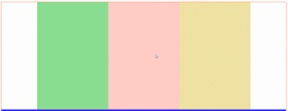
3、弹性盒(常用于移动端布局,如三栏布局)
注意:在设置弹性盒模型后,float,Clear和vertical-align在flex中不起作用。
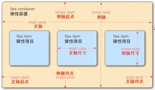
1.添加在父元素上的属性
(1)display: flex; 定义一个flex容器,子元素默认水平排列
(2)flex-direction: column; 设置子元素垂直排列(即此时主轴为Y轴,默认主轴为X轴)
主轴为X轴时
水平(主轴对齐方式):
(3)justify-content:flex-start; 默认值居左
(4)justify-content:flex-end; 居右
(5)justify-content:center; 居中
(6)justify-content:space-around; 四周(两边的距离是中间的一半)
(7)justify-content:space-between; 之间
垂直(侧轴对齐方式):
(1)align-items: flex-start; 默认值 居上
(2)align-items:flex-end; 居下
(3)align-items:center; 居中
2.添加在子元素上的属性
(1)flex-grow : number ; (number表示比例,取值如1、2、3…..,在三栏布局中,中间最大部分取1,其他2部分不用取值)
(2)min-width : 50px ;(可以搭配50%;可以随着浏览器缩小而缩小,当width缩小到50px时,则不再缩小)
四、定位
3种定位方式:
1、普通流定位(即块级元素垂直排列,行内元素同一行显示)
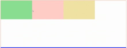
2、浮动定位
float:left/right/none; (浮动没有上下)
特点:(1)浮动碰到父元素的边框或者浮动元素的边框就停止,浮动不会重叠;
(2)浮动之后所有元素转换为块元素
(3)加float的元素不占据其他元素的位置,但是占据其他元素的内容位置。(即浮动后排除到文档流以外)
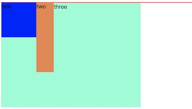
如:金色的盒子加了float之后,使下一个文本盒子上去,但是文本盒子里的内容文字仍排在金色盒子的周围,一般这个效果在报纸中常见
其中:
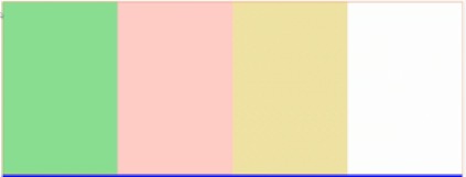
<!DOCTYPE html>
<html lang="en">
<head>
    ...
    <style>
        .box{
            border: 1px solid red;
        }

        .one{
            width: 100px;
            height: 100px;
            background-color: blue;
            float: left;
        }

        .two{
            width: 50px;
            height: 200px;
            background-color: #ed854b;
            float: left;
        }

        .three{
            width: 400px;
            height:300px;
            background-color: aquamarine;
        }
    </style>
</head>
<body>
  <div class="box">
      <div class="one">one</div>
      <div class="two">two</div>
  </div>
      <div class="three">three</div>
</body>
</html>
box是浮动元素one和two的父元素,浮动元素对three元素造成了影响:
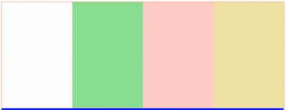
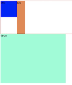
清除浮动影响方法(以下列出5种):
(1)给浮动元素的父元素加 overflow : hidden ;或者加 overflow : auto ;(使父元素的高度为其最大子元素的高度,即自动找高)
(2)对受影响的元素加 clear : both ;
(3)在浮动元素的后面加空div,div加 clear : both ;
(4)伪对象法(类似在浮动元素后面加空div)
浮动元素的父元素:after{
content:"";
display:block;
clear:both;
}(5)父元素加高(前提是父元素的高已知)
最后,清除浮动之后的效果:
3、position定位 元素定位
(1)默认值 static 静态定位
(2)相对定位 relative
相对自己原位置定位,定位后原位置保留
配合top,bottom,left,right使用
(3)绝对定位 absolute
相对于已经定位的父元素进行定位(一般在父元素加relative,相对定位),如果父元素没有定位,逐级往上找,最后相对于body定位,定位后原位置不保留。
配合top,bottom,left,right使用
(4)固定定位 fixed
相对于浏览器窗口定位,定位后原位置不保留
配合top,bottom,left,right使用
注意:
z-index : number;
堆叠顺序
默认为1,取值越大,层级越往上,可以取负值(不推荐用负值)
必须配合position使用(relative,absolute,fixed)
display属性值:
| block | 块级元素 |
| inline | 行内元素 |
| inline-block | 行内块(在同一行显示,同时可以设置宽高) |
| none |
隐藏,隐藏后不占位置 (opacity:0; 隐藏,隐藏后占位置 visibility:hidden; 隐藏,隐藏后占位置) |
| flex | 弹性盒 |
| table-cell | 单元格(将元素转化为表格中的单元格td , 变成单元格之后可以使用vertical-align:middle;垂直居中) |
居中方式:
1、内容水平居中(前提:子内容非块级元素)
text-align:center;
2、一行文字垂直居中
行高等于高,即 line-height:当前元素height;
3、块级元素水平居中
div{
1000px;(width必须要设)
margin:0 auto;
}
4、多行垂直居中
padding:10px 0;
5、子元素在父元素中水平垂直居中
<div class="parent">
<div class="child"></div>
</div>
(1)绝对定位法
<style>
.parent{
100px;
height: 100px;
background-color: red;
position: relative;
}
.
child{
20px;
height: 20px;
background-color: blue;
position: absolute;
top: 50%;
left: 50%;
margin-left: -10px;
margin-top: -10px;
}
</style>
(2)表格法
<style>
.parent{
500px;
height: 500px;
background-color: plum;
display: table-cell;
vertical-align: middle;
}
.child{
200px;
height: 200px;
background-color: palegreen;
margin: 0 auto;
}
</style>
(3)弹性盒法
<style>
.parent{
500px;
height: 500px;
background-color: plum;
display: flex;
justify-content: center;
align-items: center;
}
.child{
200px;
height: 200px;
background-color: palegreen;
}
</style>
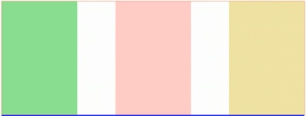
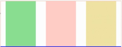
三栏布局
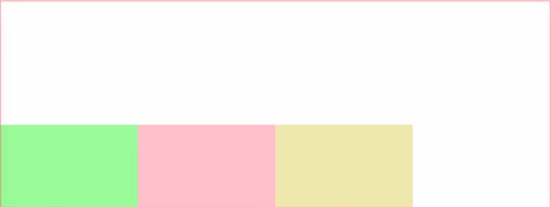
<div class="box">
<div class="left"></div>
<div class="center"></div>
<div class="right"></div>
</div>
(1)弹性盒法
<style>
.box{
display: flex;
}
.left{
200px;
height: 400px;
background-color: plum;
}
.right{
200px;
height: 400px;
background-color: palevioletred;
}
.center{
height:400px; (不加高也行,如果不加高度,它的高度会自动匹配父元素内的最大高度)
background-color: pink;
flex-grow: 1;
}
</style>
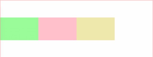
(2)绝对定位法
<style>
.box{
position: relative;
}
.left{
200px;
height: 400px;
background-color: plum;
position: absolute;
left: 0;
top: 0;
}
.right{
200px;
height: 400px;
background-color: palevioletred;
position: absolute;
top: 0;
right: 0;
}
.center{
height: 400px;
background-color: pink;
margin-left: 200px;
margin-right: 200px;
}
</style>
五、雪碧图
原理:先将雪碧图通过背景图方式输入元素,然后通过背景定位获取所需要的图
(用到background:url(" ") no-repeat;
background-position: ;)
优点:1、减少http请求
2 、提高页面加载速度
3、减少图片命名困扰
缺点:1、切图麻烦
(用PS进行切图,常用PS切图快捷键window版
ctrl+r: 标尺 (Mac下 command+r)
ctrl+d: 取消选区
alt+左右键: 拖动选取
最后存储为web所有格式,选png格式,切片选择“所有用户切片”
)
六、其他
(1)背景图片:
background-image:url(“路径”)(默认平铺)
background-repeat:reapt-x;(水平方向平铺)
background-repeat:no-repeat;(不平铺)
background-size:100px;(调整背景图片大小,cover覆盖盒子图片不一定显示完整,contain尽量自适应到最大)
backround-position:30xp(垂直向右移动30像素) 40px(垂直向右移动40像素)
backround-position:right bottom;
backgroung-attachment:fixed;(背景图片固定)
简写: 简写属性一般放在单个属性之前,以防覆盖
background:rgba(255,255,255,.5) url(“图片路径”);
(2)字体属性
color : red ;
font-size : 20px ;
font-family :黑体 ;(可以支持中文填写,主要看系统支持哪些字体)
font-style : italic ; (倾斜)
font-weight :bold ;(或lighter细)
text-align:center;(内容水平对齐方式)
text-decoration:underline;(加下划线)
text-decoration:none;(去下划线)
text-decoration:line-through;(删除线)
text-indent:40px;首行缩进(配合font-size=20px,刚好缩进2个字节);
(3)列表ul
list-style-type:none ; 去掉无序列表前面标记;
list-style-images:url(“ ”) ; 列表标记换成要加载的图标的路径;
list-style-position:inside ; 表示把列表前面的点放到列表里面的区域;
可以简写:
list-style:none inside …;
(4)行高、字间距、透明度
line-height:200px ; 行高等于外边盒子的高度,则一行文字垂直居中;
letter-spacing:2px; 字符之间距离;
opacity:0.5; 用于内部全部透明度(取值0-1),单个设置透明度,用rgba方式
(8) 内容溢出容器处理
overflow:hidden; 溢出部分隐藏(一般写在容器中超出容器部分则隐藏);
overflow:auto; 溢出部分可点击出现的滚动条下滑;
overflow:scroll; 不论是否溢出都存在滚动条;
(9) 文本溢出部分省略
第一步:white-space:nowrap; 文本在同一行显示)
第二步:overflow:hidden; 显示不下则隐藏)
第三步:text-overflow:ellipsis; 显示不下的部分变省略号(属性值clip,表示剪裁)
(10) 长单词碰到边框是否换行
word-wrap : break-word ; 自动换行(对中文无效)
(11)悬浮图标显示
cursor : pointer; 把鼠标箭头图标显示转换成小手图标显示
cursor : wait; 把鼠标箭头图标显示转换成等待的圆圈图标显示