实现一个普通边框
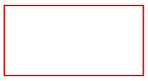
    <style>
        .border {
             100px;
            height: 50px;
            border: 1px solid red;
        }
    </style>
    <div class="border"></div>
实现由四个三角形组成的正方形
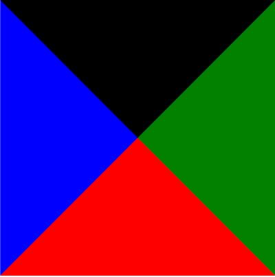
    <style>
        .triangle {
             0;
            height: 0;
            border: 100px solid red;
            border-right-color: green;
            border-left-color: blue;
            border-top-color: black;
        }
    </style>
    <div class="triangle"></div>
三角形
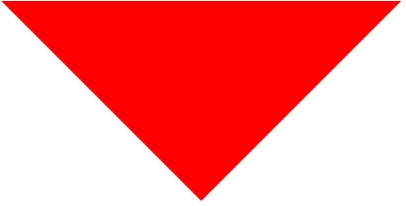
    <style>
        .triangle-bottom {
             0;
            height: 0;
            border: 100px solid transparent;
            border-top-color: red;
        }
    </style>
    <div class="triangle-bottom"></div>
将左右下边颜色设置为透明 transparent,得到向下的箭头
将三角形放入边框中
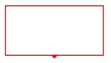
    <style>
        .border-triangle {
             100px;
            height: 50px;
            border: 1px solid red;
            position: relative;
        }

        .border-triangle:before {
            content: "";
            position: absolute;
             0;
            height: 0;
            border: 4px solid transparent;
            border-top-color: red;
            left: 50%;
            margin-left: -4px;
            bottom: -8px;
        }
    </style>
    <div class="border-triangle"></div>
将三角形设置为绝对定位,利用margin-left和left 定位到元素中间,bottom设置-8px,靠近边框底部
电脑刺绣绣花厂 http://www.szhdn.com 广州品牌设计公司https://www.houdianzi.com
遮住多余三角形
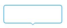
    <style>
        .border-triangle-bottom {
             100px;
            height: 30px;
            border: 1px solid #1d9cd6;
            position: relative;
            border-radius: 4px;
        }

        .border-triangle-bottom:after,
        .border-triangle-bottom:before {
            content: "";
            position: absolute;
             0;
            height: 0;
            border: 4px solid transparent;
            border-top-color: #1d9cd6;
            left: 50%;
            margin-left: -4px;
            bottom: -8px;
        }

        .border-triangle-bottom:after {
            border-top-color: #fff;
            bottom: -7px;
        }
    </style>
    <div class="border-triangle-bottom"></div>
将边框颜色换成好看的蓝色,将before和after伪元素都设置为绝对定位,定位到边框底部剧中,将after伪元素设置成白色,底部偏移量大于before 1px,遮住三角形底部的颜色。这样一个好看的箭头边框就实现了