一、组件简介
组件系统是Vue.js其中一个重要的概念,它提供了一种抽象,让我们可以使用独立可复用的小组件来构建大型应用,任意类型的应用界面都可以抽象为一个组件树: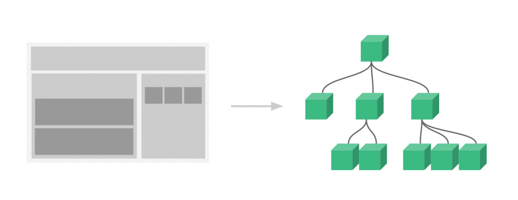
那么什么是组件呢?
组件可以扩展HTML元素,封装可重用的HTML代码,我们可以将组件看作自定义的HTML元素。
本文的Demo和源代码已放到GitHub,如果您觉得本篇内容不错,请点个赞,或在GitHub上加个星星!
(所有示例都放在GitHub Pages上了,请访问https://github.com/keepfool/vue-tutorials查看示例汇总)
由于组件的篇幅较大,我将会把组件的入门知识分为两篇来讲解,这样也便于各位看官们快速消化。
二、组件的创建和注册
2.1 基本步骤
Vue.js的组件的使用有3个步骤:创建组件构造器、注册组件和使用组件。
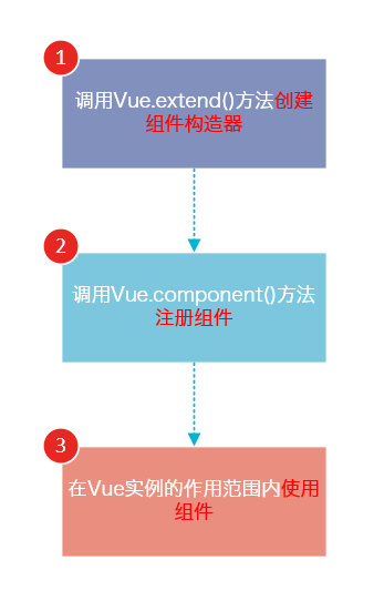
下面的代码演示了这3个步骤:
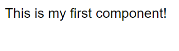
<!DOCTYPE html>
<html>
    <body>
        <div id="app">
            <!-- 3. #app是Vue实例挂载的元素,应该在挂载元素范围内使用组件-->
            <my-component></my-component>
        </div>
    </body>
    <script src="js/vue.js"></script>
    <script>

        // 1.创建一个组件构造器
        var myComponent = Vue.extend({
            template: '<div>This is my first component!</div>'
        })

        // 2.注册组件,并指定组件的标签,组件的HTML标签为<my-component>
        Vue.component('my-component', myComponent)

        new Vue({
            el: '#app'
        });

    </script>
</html>
运行结果如下:
可以看到,使用组件和使用普通的HTML元素没什么区别。
2.2 理解组件的创建和注册
我们用以下几个步骤来理解组件的创建和注册:
Vue.extend()是Vue构造器的扩展,调用Vue.extend()创建的是一个组件构造器。2.
Vue.extend()构造器有一个选项对象,选项对象的template属性用于定义组件要渲染的HTML。3. 使用
Vue.component()注册组件时,需要提供2个参数,第1个参数时组件的标签,第2个参数是组件构造器。4. 组件应该挂载到某个Vue实例下,否则它不会生效。
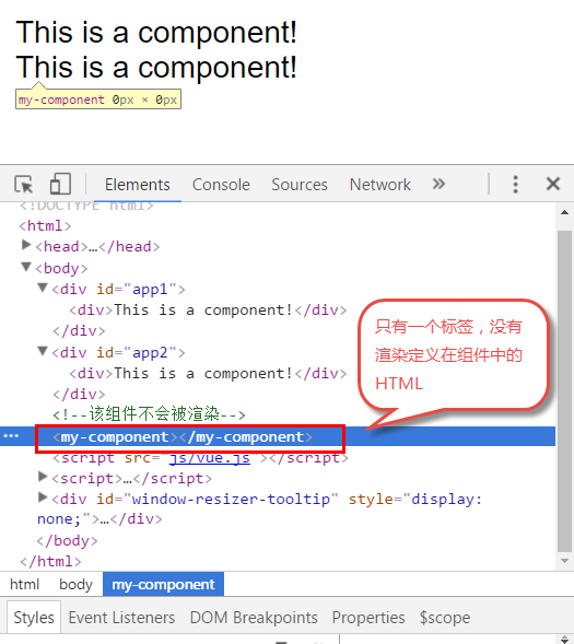
请注意第4点,以下代码在3个地方使用了<my-component>标签,但只有#app1和#app2下的<my-component>标签才起到作用。
<!DOCTYPE html>
<html>
    <body>
        <div id="app1">
            <my-component></my-component>
        </div>

        <div id="app2">
            <my-component></my-component>
        </div>

        <!--该组件不会被渲染-->
        <my-component></my-component>
    </body>
    <script src="js/vue.js"></script>
    <script>
        var myComponent = Vue.extend({
            template: '<div>This is a component!</div>'
        })

        Vue.component('my-component', myComponent)

        var app1 = new Vue({
            el: '#app1'
        });

        var app2 = new Vue({
            el: '#app2'
        })
    </script>
</html>
2.3 全局注册和局部注册
调用Vue.component()注册组件时,组件的注册是全局的,这意味着该组件可以在任意Vue示例下使用。
如果不需要全局注册,或者是让组件使用在其它组件内,可以用选项对象的components属性实现局部注册。
上面的示例可以改为局部注册的方式:
<!DOCTYPE html>
<html>
    <body>
        <div id="app">
            <!-- 3. my-component只能在#app下使用-->
            <my-component></my-component>
        </div>
    </body>
    <script src="js/vue.js"></script>
    <script>
        // 1.创建一个组件构造器
        var myComponent = Vue.extend({
            template: '<div>This is my first component!</div>'
        })

        new Vue({
            el: '#app',
            components: {
                // 2. 将myComponent组件注册到Vue实例下
                'my-component' : myComponent
            }
        });
    </script>
</html>
由于my-component组件是注册在#app元素对应的Vue实例下的,所以它不能在其它Vue实例下使用。
<div id="app2">
    <!-- 不能使用my-component组件,因为my-component是一个局部组件,它属于#app-->
    <my-component></my-component>
</div>

<script>
    new Vue({
        el: '#app2'
    });
</script>
如果你这样做了,浏览器会提示一个错误:

2.4 父组件和子组件
我们可以在组件中定义并使用其他组件,这就构成了父子组件的关系。
<!DOCTYPE html>
<html>
    <body>
        <div id="app">
            <parent-component>
            </parent-component>
        </div>
    </body>
    <script src="js/vue.js"></script>
    <script>

        var Child = Vue.extend({
            template: '<p>This is a child component!</p>'
        })

        var Parent = Vue.extend({
            // 在Parent组件内使用<child-component>标签
            template :'<p>This is a Parent component</p><child-component></child-component>',
            components: {
                // 局部注册Child组件,该组件只能在Parent组件内使用
                'child-component': Child
            }
        })

        // 全局注册Parent组件
        Vue.component('parent-component', Parent)

        new Vue({
            el: '#app'
        })

    </script>
</html>
我们分几个步骤来理解这段代码:
var Child = Vue.extend(...)定义一了个Child组件构造器var Parent = Vue.extend(...)定义一个Parent组件构造器components: { 'child-component': Child },将Child组件注册到Parent组件,并将Child组件的标签设置为child-component。template :'<p>This is a Parent component</p><child-component></child-component>',在Parent组件内以标签的形式使用Child组件。Vue.component('parent-component', Parent)全局注册Parent组件- 在页面中使用<parent-component>标签渲染Parent组件的内容,同时Child组件的内容也被渲染出来
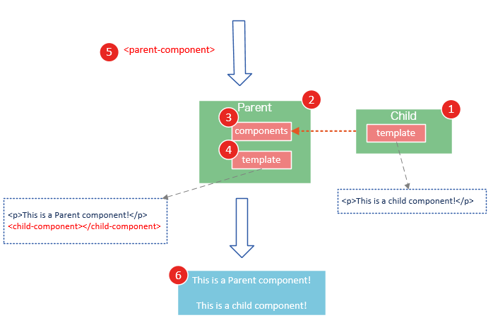
Child组件是在Parent组件中注册的,它只能在Parent组件中使用,确切地说:子组件只能在父组件的template中使用。
请注意下面两种子组件的使用方式是错误的:
1. 以子标签的形式在父组件中使用
<div id="app">
    <parent-component>
        <child-component></child-component>
    </parent-component>
</div>
2. 在父组件标签外使用子组件
<div id="app">
    <parent-component>
    </parent-component>
    <child-component>
    </child-component>
</div>
运行这段代码,浏览器会提示以下错误

2.5 组件注册语法糖
以上组件注册的方式有些繁琐,Vue.js为了简化这个过程,提供了注册语法糖。
使用Vue.component()直接创建和注册组件:
// 全局注册,my-component1是标签名称
Vue.component('my-component1',{
    template: '<div>This is the first component!</div>'
})

var vm1 = new Vue({
    el: '#app1'
})
Vue.component()的第1个参数是标签名称,第2个参数是一个选项对象,使用选项对象的template属性定义组件模板。
使用这种方式,Vue在背后会自动地调用Vue.extend()。
在选项对象的components属性中实现局部注册:
var vm2 = new Vue({
    el: '#app2',
    components: {
        // 局部注册,my-component2是标签名称
        'my-component2': {
            template: '<div>This is the second component!</div>'
        },
        // 局部注册,my-component3是标签名称
        'my-component3': {
            template: '<div>This is the third component!</div>'
        }
    }
})
2.6 使用script或template标签
尽管语法糖简化了组件注册,但在template选项中拼接HTML元素比较麻烦,这也导致了HTML和JavaScript的高耦合性。
庆幸的是,Vue.js提供了两种方式将定义在JavaScript中的HTML模板分离出来。
使用<script>标签
<!DOCTYPE html>
<html>
    <body>
        <div id="app">
            <my-component></my-component>
        </div>

        <script type="text/x-template" id="myComponent">
            <div>This is a component!</div>
        </script>
    </body>
    <script src="js/vue.js"></script>
    <script>

        Vue.component('my-component',{
            template: '#myComponent'
        })

        new Vue({
            el: '#app'
        })

    </script>
</html>
template选项现在不再是HTML元素,而是一个id,Vue.js根据这个id查找对应的元素,然后将这个元素内的HTML作为模板进行编译。
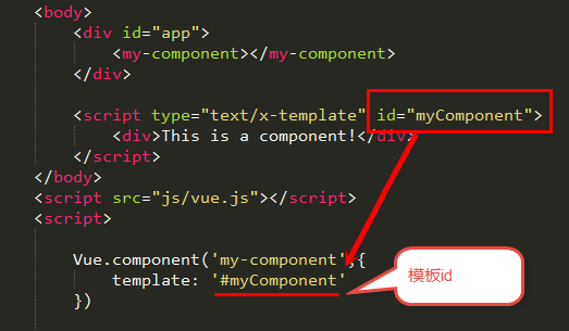
注意:使用<script>标签时,type指定为text/x-template,意在告诉浏览器这不是一段js脚本,浏览器在解析HTML文档时会忽略<script>标签内定义的内容。
使用<template>标签
如果使用<template>标签,则不需要指定type属性。
<!DOCTYPE html>
<html>
    <head>
        <meta charset="UTF-8">
        <title></title>
    </head>
    <body>
        <div id="app">
            <my-component></my-component>
        </div>

        <template id="myComponent">
            <div>This is a component!</div>
        </template>
    </body>
    <script src="js/vue.js"></script>
    <script>

        Vue.component('my-component',{
            template: '#myComponent'
        })

        new Vue({
            el: '#app'
        })

    </script>
</html>
在理解了组件的创建和注册过程后,我建议使用<script>或<template>标签来定义组件的HTML模板。
这使得HTML代码和JavaScript代码是分离的,便于阅读和维护。
另外,在Vue.js中,可创建.vue后缀的文件,在.vue文件中定义组件,这个内容我会在后面的文章介绍。
2.7 组件的el和data选项
传入Vue构造器的多数选项也可以用在 Vue.extend() 或Vue.component()中,不过有两个特例: data和el。
Vue.js规定:在定义组件的选项时,data和el选项必须使用函数。
下面的代码在执行时,浏览器会提出一个错误
Vue.component('my-component', {
    data: {
        a: 1
    }
})
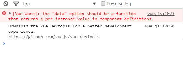
另外,如果data选项指向某个对象,这意味着所有的组件实例共用一个data。
我们应当使用一个函数作为 data 选项,让这个函数返回一个新对象:
Vue.component('my-component', {
    data: function(){
        return {a : 1}
    }
})
三、使用props
组件实例的作用域是孤立的。这意味着不能并且不应该在子组件的模板内直接引用父组件的数据。可以使用 props 把数据传给子组件。
3.1 props基础示例
下面的代码定义了一个子组件my-component,在Vue实例中定义了data选项。
var vm = new Vue({
    el: '#app',
    data: {
        name: 'keepfool',
        age: 28
    },
    components: {
        'my-component': {
            template: '#myComponent',
            props: ['myName', 'myAge']
        }
    }
})
为了便于理解,你可以将这个Vue实例看作my-component的父组件。
如果我们想使父组件的数据,则必须先在子组件中定义props属性,也就是props: ['myName', 'myAge']这行代码。
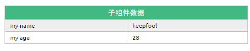
定义子组件的HTML模板:
<template id="myComponent">
    <table>
        <tr>
            <th colspan="2">
                子组件数据
            </th>
        </tr>
        <tr>
            <td>my name</td>
            <td>{{ myName }}</td>
        </tr>
        <tr>
            <td>my age</td>
            <td>{{ myAge }}</td>
        </tr>
    </table>
</template>
将父组件数据通过已定义好的props属性传递给子组件:
<div id="app">
    <my-component v-bind:my-name="name" v-bind:my-age="age"></my-component>
</div>
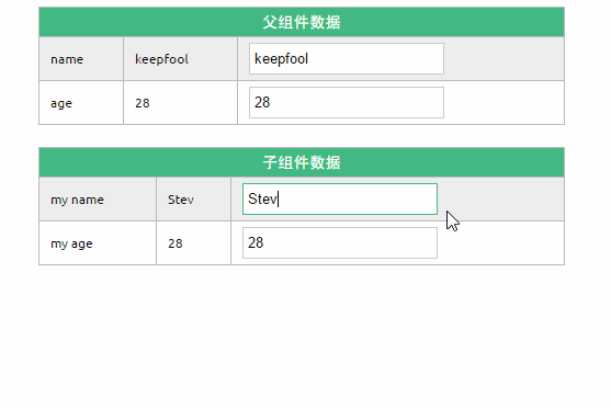
注意:在子组件中定义prop时,使用了camelCase命名法。由于HTML特性不区分大小写,camelCase的prop用于特性时,需要转为 kebab-case(短横线隔开)。例如,在prop中定义的myName,在用作特性时需要转换为my-name。
这段程序的运行结果如下:
父组件是如何将数据传给子组件的呢?相信看了下面这图,也许你就能很好地理解了。
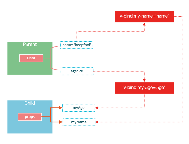
在父组件中使用子组件时,通过以下语法将数据传递给子组件:
<child-component v-bind:子组件prop="父组件数据属性"></child-component>
3.2 prop的绑定类型
单向绑定
既然父组件将数据传递给了子组件,那么如果子组件修改了数据,对父组件是否会有所影响呢?
我们将子组件模板和页面HTML稍作更改:
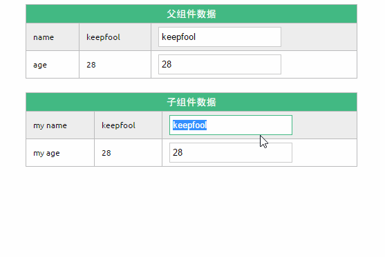
<div id="app">

    <table>
        <tr>
            <th colspan="3">父组件数据</td>
        </tr>
        <tr>
            <td>name</td>
            <td>{{ name }}</td>
            <td><input type="text" v-model="name" /></td>
        </tr>
        <tr>
            <td>age</td>
            <td>{{ age }}</td>
            <td><input type="text" v-model="age" /></td>
        </tr>
    </table>

    <my-component v-bind:my-name="name" v-bind:my-age="age"></my-component>
</div>

<template id="myComponent">
    <table>
        <tr>
            <th colspan="3">子组件数据</td>
        </tr>
        <tr>
            <td>my name</td>
            <td>{{ myName }}</td>
            <td><input type="text" v-model="myName" /></td>
        </tr>
        <tr>
            <td>my age</td>
            <td>{{ myAge }}</td>
            <td><input type="text" v-model="myAge" /></td>
        </tr>
    </table>
</template>
运行这个页面,我们做两个小试验:
1. 在页面上修改子组件的数据
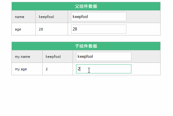
修改了子组件的数据,没有影响父组件的数据。
2. 在页面上修改父组件的数据

修改了父组件的数据,同时影响了子组件。
双向绑定
可以使用.sync显式地指定双向绑定,这使得子组件的数据修改会回传给父组件。
<my-component v-bind:my-name.sync="name" v-bind:my-age.sync="age"></my-component>
单次绑定
可以使用.once显式地指定单次绑定,单次绑定在建立之后不会同步之后的变化,这意味着即使父组件修改了数据,也不会传导给子组件。
<my-component v-bind:my-name.once="name" v-bind:my-age.once="age"></my-component>
示例
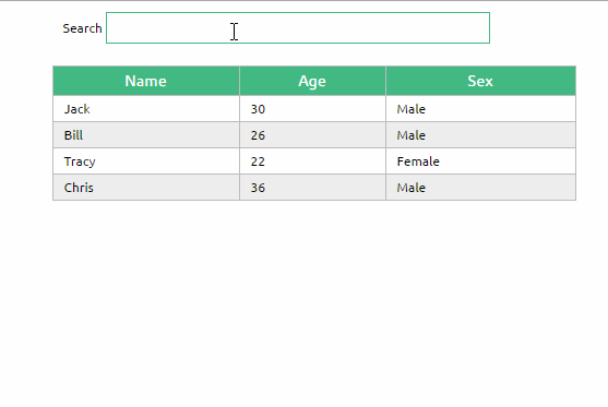
为了尽快消化这些知识,我们来做一个小示例吧。
<!DOCTYPE html>
<html>

    <head>
        <meta charset="UTF-8">
        <title></title>
        <link rel="stylesheet" href="styles/demo.css" />
    </head>

    <body>
        <div id="app">
            <div id="searchBar">
                Search <input type="text" v-model="searchQuery" />
            </div>
            <simple-grid :data="gridData" :columns="gridColumns" :filter-key="searchQuery">
            </simple-grid>
        </div>

        <template id="grid-template">
            <table>
                <thead>
                    <tr>
                        <th v-for="col in columns">
                            {{ col | capitalize}}
                        </th>
                    </tr>
                </thead>
                <tbody>
                    <tr v-for="entry in data | filterBy filterKey">
                        <td v-for="col in columns">
                            {{entry[col]}}
                        </td>
                    </tr>
                </tbody>
            </table>
        </template>

    </body>
    <script src="js/vue.js"></script>
    <script>
        Vue.component('simple-grid', {
            template: '#grid-template',
            props: {
                data: Array,
                columns: Array,
                filterKey: String
            }
        })

        var demo = new Vue({
            el: '#app',
            data: {
                searchQuery: '',
                gridColumns: ['name', 'age', 'sex'],
                gridData: [{
                    name: 'Jack',
                    age: 30,
                    sex: 'Male'
                }, {
                    name: 'Bill',
                    age: 26,
                    sex: 'Male'
                }, {
                    name: 'Tracy',
                    age: 22,
                    sex: 'Female'
                }, {
                    name: 'Chris',
                    age: 36,
                    sex: 'Male'
                }]
            }
        })
    </script>

</html>
除了以上介绍的知识点,这个示例还用到了两个知识点:
1. prop验证
props: {
    data: Array,
    columns: Array,
    filterKey: String
}
这段代码表示:父组件传递过来的data和columns必须是Array类型,filterKey必须是字符串类型。
更多prop验证的介绍,请参考:官方文档prop验证
2. filterBy过滤器
可以根据指定的字符串过滤数据。
使用组件的前提是创建并注册组件,本篇文章详细介绍了组件从创建到使用的步骤,并介绍了几种不同的方式去创建和注册组件;然后介绍了组件的props选项,它用于将父组件的数据传递给子组件,最后我们用一个小的示例演示了这些知识点。我们重点介绍了组件的创建、注册和使用,熟练这几个步骤将有助于深入组件的开发。另外,在子组件中定义props,可以让父组件的数据传递下来,这就好比子组件告诉父组件:“嘿,老哥,我开通了一个驿站,你把东西放到驿站我就可以拿到了。”
今天我们将着重介绍slot和父子组件之间的访问和通信,slot是一个非常有用的东西,它相当于一个内容插槽,它是我们重用组件的基础。Vue的事件系统独立于原生的DOM事件,它用于组件之间的通信。
本文的主要内容如下:
- 组件的编译作用域
- 在组件template中使用<slot>标签作为内容插槽
- 使用$children, $refs, $parent 实现父子组件之间的实例访问
- 在子组件中,使用$dispatch向父组件派发事件;在父组件中,使用$broadcast向子组件传播事件
- 结合这些基础知识,我们一步一步实现一个CURD的示例
注意:以下示例的组件模板都定义在<template>标签中,然而IE不支持<template>标签,这使得在IE中<template>标签中的内容会显示出来。解决办法——隐藏<template>标签
template{
    display: none;
}
个浏览器对<template>标签的支持情况,请参见:http://caniuse.com/#feat=template
四、编译作用域
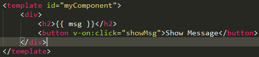
尽管使用组件就像使用一般的HTML元素一样,但它毕竟不是标准的HTML元素,为了让浏览器能够识别它,组件会被解析为标准的HTML片段,然后将组件的标签替换为该HTML片段。
<div id="app">
    <my-component>
    </my-component>
</div>

<template id="myComponent">
    <div>
        <h2>{{ msg }}</h2>
        <button v-on:click="showMsg">Show Message</button>
    </div>
</template>
<script src="js/vue.js"></script>
<script>
    new Vue({
        el: '#app',
        components: {
            'my-component': {
                template: '#myComponent',
                data: function() {
                    return {
                        msg: 'This is a component!'
                    }
                },
                methods: {
                    showMsg: function() {
                        alert(this.msg)
                    }
                }
            }
        }
    })
这段代码定义了一个my-component组件,<my-component><my-component>不是标准的HTML元素,浏览器是不理解这个元素的。
那么Vue是如何让浏览器理解<my-component><my-component>标签的呢?(下图是我个人的理解)
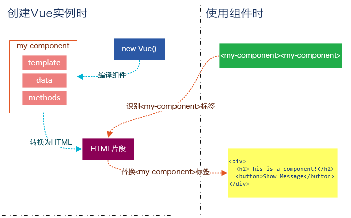
在创建一个Vue实例时,除了将它挂载到某个HTML元素下,还要编译组件,将组件转换为HTML片段。
除此之外,Vue实例还会识别其所挂载的元素下的<my-component>标签,然后将<my-component>标签替换为HTML片段。
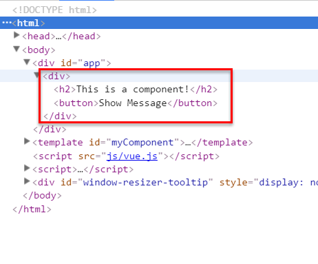
实际上浏览器仍然是不理解<my-component>标签的,我们可以通过查看源码了解到这一点。
组件在使用前,经过编译已经被转换为HTML片段了,组件是有一个作用域的,那么组件的作用域是什么呢?
你可以将它理解为组件模板包含的HTML片段,组件模板内容之外就不是组件的作用域了。
例如,my-component组件的作用域只是下面这个小片段。
组件的模板是在其作用域内编译的,那么组件选项对象中的数据也应该是在组件模板中使用的。
考虑下面的代码,在Vue实例和组件的data选项中分别追加一个display属性:
new Vue({
    el: '#app',
    data: {
        display: true
    },
    components: {
        'my-component': {
            template: '#myComponent',
            data: function() {
                return {
                    msg: 'This is a component!',
                    display: false
                }
            },
            methods: {
                showMsg: function() {
                    alert(this.msg)
                }
            }
        }
    }
})
然后在my-component标签上使用指令v-show="display",这个display数据是来源于Vue实例,还是my-component组件呢?
<div id="app">
    <my-component v-show="display">
    </my-component>
</div>
答案是Vue实例。
至此,我们应该认识到组件的作用域是独立的:
通俗地讲,在子组件中定义的数据,只能用在子组件的模板。在父组件中定义的数据,只能用在父组件的模板。如果父组件的数据要在子组件中使用,则需要子组件定义props。
五、使用Slot
为了让组件可以组合,我们需要一种方式来混合父组件的内容与子组件自己的模板。这个处理称为内容分发,Vue.js 实现了一个内容分发 API,使用特殊的 <slot> 元素作为原始内容的插槽。
如果不理解这段话,可以先跳过,你只要知道<slot>元素是一个内容插槽。
单个Slot
下面的代码在定义my-component组件的模板时,指定了一个<slot></slot>元素。
<div id="app">
    <my-component>
        <h1>Hello Vue.js!</h1>
    </my-component>

    <my-component>
    </my-component>
</div>
<template id="myComponent">
    <div class="content">
        <h2>This is a component!</h2>
        <slot>如果没有分发内容,则显示slot中的内容</slot>
        <p>Say something...</p>
    </div>
</template>
<script src="js/vue.js"></script>
<script>
    Vue.component('my-component', {
        template: '#myComponent'
    })

    new Vue({
        el: '#app'
    })
</script>
这段代码运行结果如下:
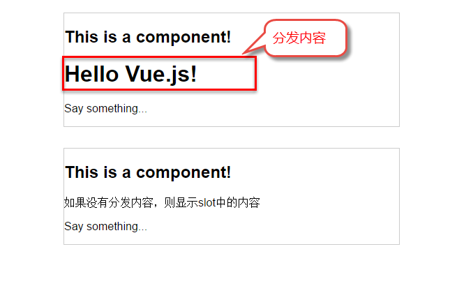
第一个<my-component>标签有一段分发内容<h1>Hello Vue.js!</h1>,渲染组件时显示了这段内容。

第二个<my-component>标签则没有,渲染组件时则显示了slot标签中的内容。
指定名称的slot
上面这个示例是一个匿名slot,它只能表示一个插槽。如果需要多个内容插槽,则可以为slot元素指定name属性。
多个slot一起使用时,会非常有用。例如,对话框是HTML常用的一种交互方式。
在不同的运用场景下,对话框的头部、主体内容、底部可能是不一样的。

这时,使用不同名称的slot就能轻易解决这个问题了。
<template id="dialog-template">
    <div class="dialogs">
        <div class="dialog" v-bind:class="{ 'dialog-active': show }">
            <div class="dialog-content">
                <div class="close rotate">
                    <span class="iconfont icon-close" @click="close"></span>
                </div>
                <slot name="header"></slot>
                <slot name="body"></slot>
                <slot name="footer"></slot>
            </div>
        </div>
        <div class="dialog-overlay"></div>
    </div>
</template>

<script src="js/vue.js"></script>
<script>
    Vue.component('modal-dialog', {
        template: '#dialog-template',
        props: ['show'],
        methods: {
            close: function() {
                this.show = false
            }
        }
    })

    new Vue({
        el: '#app',
        data: {
            show: false
        },
        methods: {
            openDialog: function() {
                this.show = true
            },
            closeDialog: function() {
                this.show = false
            }
        }
    })
</script>
在定义modal-dialog组件的template时,我们使用了3个slot,它们的name特性分别是header、body和footer。
在<modal-dialog>标签下,分别为三个元素指定slot特性:
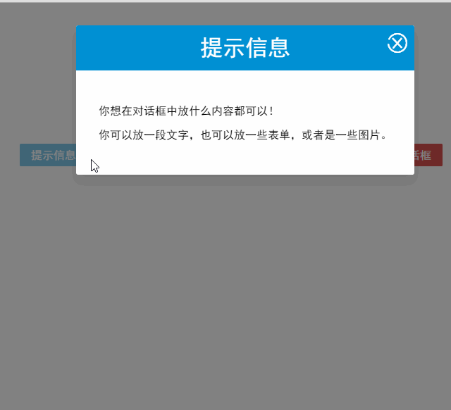
<div id="app">
    <modal-dialog v-bind:show.sync="show">

        <header class="dialog-header" slot="header">
            <h1 class="dialog-title">提示信息</h1>
        </header>

        <div class="dialog-body" slot="body">
            <p>你想在对话框中放什么内容都可以!</p>
            <p>你可以放一段文字,也可以放一些表单,或者是一些图片。</p>
        </div>

        <footer class="dialog-footer" slot="footer">
            <button class="btn" @click="closeDialog">关闭</button>
        </footer>
    </modal-dialog>

    <button class="btn btn-open" @click="openDialog">打开对话框</button>
</div>
对话框的标题内容、主体内容、底部内容,完全由我们自定义,而且这些内容就是一些简单的HTML元素!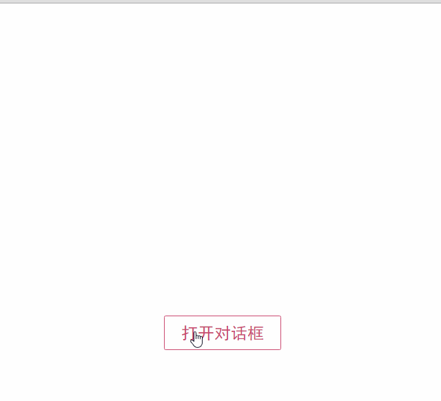
如果需要定制对话框的样式,我们只需要在<modal-dialog>上追加一个v-bind指令,让它绑定一个class。
<modal-dialog v-bind:show.sync="show" v-bind:class="dialogClass">
然后修改一下Vue实例,在data选项中追加一个dialogClass属性,然后修改openDialog()方法:
new Vue({
    el: '#app',
    data: {
        show: false,
        dialogClass: 'dialog-info'
    },
    methods: {
        openDialog: function(dialogClass) {
            this.show = true
            this.dialogClass = dialogClass
        },
        closeDialog: function() {
            this.show = false
        }
    }
})
虽然我们在modal-dialog组件中定义了3个slot,但是在页面中使用它时,并不用每次都指定这3个slot。
比如,有时候我们可能只需要header和body:
<modal-dialog v-bind:show.sync="show" v-bind:class="dialogClass">
    <header class="dialog-header" slot="header">
        <h1 class="dialog-title">提示信息</h1>
    </header>

    <div class="dialog-body" slot="body">
        <p>你想在对话框中放什么内容都可以!</p>
        <p>你可以放一段文字,也可以放一些表单,或者是一些图片。</p>
    </div>
</modal-dialog>
现在看到的对话框是没有底部的,只有标题和主体内容。
多个slot同时使用的场景还有很多,例如:用户的注册、登录、找回密码等这些表单集合,也可以用一个组件来完成。
父子组件之间的访问
有时候我们需要父组件访问子组件,子组件访问父组件,或者是子组件访问根组件。
针对这几种情况,Vue.js都提供了相应的API:
- 父组件访问子组件:使用
$children或$refs - 子组件访问父组件:使用
$parent - 子组件访问根组件:使用
$root
$children示例
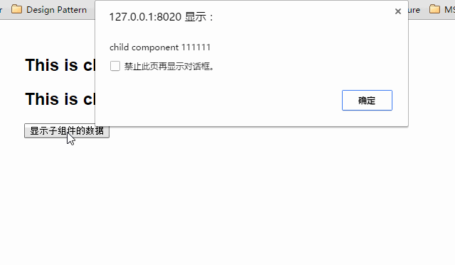
下面这段代码定义了3个组件:父组件parent-component,两个子组件child-component1和child-component2。
在父组件中,通过this.$children可以访问子组件。this.$children是一个数组,它包含所有子组件的实例。
<div id="app">
    <parent-component></parent-component>
</div>

<template id="parent-component">
    <child-component1></child-component1>
    <child-component2></child-component2>
    <button v-on:click="showChildComponentData">显示子组件的数据</button>
</template>

<template id="child-component1">
    <h2>This is child component 1</h2>
</template>

<template id="child-component2">
    <h2>This is child component 2</h2>
</template>

<script src="js/vue.js"></script>
<script>
    Vue.component('parent-component', {
        template: '#parent-component',
        components: {
            'child-component1': {
                template: '#child-component1',
                data: function() {
                    return {
                        msg: 'child component 111111'
                    }
                }
            },
            'child-component2': {
                template: '#child-component2',
                data: function() {
                    return {
                        msg: 'child component 222222'
                    }
                }
            }
        },
        methods: {
            showChildComponentData: function() {
                for (var i = 0; i < this.$children.length; i++) {
                    alert(this.$children[i].msg)
                }
            }
        }
    })

    new Vue({
        el: '#app'
    })
</script>
$refs示例
组件个数较多时,我们难以记住各个组件的顺序和位置,通过序号访问子组件不是很方便。
在子组件上使用v-ref指令,可以给子组件指定一个索引ID:
<template id="parent-component">
    <child-component1 v-ref:cc1></child-component1>
    <child-component2 v-ref:cc2></child-component2>
    <button v-on:click="showChildComponentData">显示子组件的数据</button>
</template>
在父组件中,则通过$refs.索引ID访问子组件的实例:
showChildComponentData: function() {
    alert(this.$refs.cc1.msg);
    alert(this.$refs.cc2.msg);
}
$parent示例
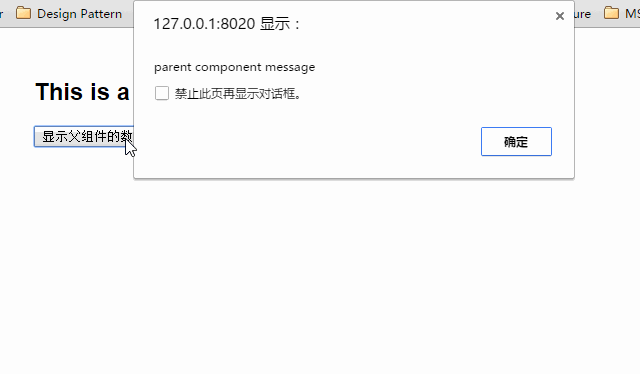
下面这段代码定义了两个组件:child-component和它的父组件parent-component。
在子组件中,通过this.$parent可以访问到父组件的实例。
<div id="app">
    <parent-component></parent-component>
</div>

<template id="parent-component">
    <child-component></child-component>
</template>

<template id="child-component">
    <h2>This is a child component</h2>
    <button v-on:click="showParentComponentData">显示父组件的数据</button>
</template>

<script src="js/vue.js"></script>
<script>
    Vue.component('parent-component', {
        template: '#parent-component',
        components: {
            'child-component': {
                template: '#child-component',
                methods: {
                    showParentComponentData: function() {
                        alert(this.$parent.msg)
                    }
                }
            }
        },
        data: function() {
            return {
                msg: 'parent component message'
            }
        }
    })
    new Vue({
        el: '#app'
    })
</script>
注意:尽管可以访问父链上任意的实例,不过子组件应当避免直接依赖父组件的数据,尽量显式地使用 props 传递数据。另外,在子组件中修改父组件的状态是非常糟糕的做法,因为:
1.这让父组件与子组件紧密地耦合;
2. 只看父组件,很难理解父组件的状态。因为它可能被任意子组件修改!理想情况下,只有组件自己能修改它的状态。
自定义事件
有时候我们希望触发父组件的某个事件时,可以通知到子组件;触发子组件的某个事件时,可以通知到父组件。
Vue 实例实现了一个自定义事件接口,用于在组件树中通信。这个事件系统独立于原生 DOM 事件,用法也不同。
每个 Vue 实例都是一个事件触发器:
- 使用
$on()监听事件; - 使用
$emit()在它上面触发事件; - 使用
$dispatch()派发事件,事件沿着父链冒泡; - 使用
$broadcast()广播事件,事件向下传导给所有的后代。
派发事件
下面这段代码是一个简单的事件派发处理
<div id="app">
    <p>Messages: {{ messages | json }}</p>
    <child-component></child-component>
</div>

<template id="child-component">
    <input v-model="msg" />
    <button v-on:click="notify">Dispatch Event</button>
</template>

<script src="js/vue.js"></script>
<script>
    // 注册子组件
    Vue.component('child-component', {
        template: '#child-component',
        data: function() {
            return {
                msg: ''
            }
        },
        methods: {
            notify: function() {
                if (this.msg.trim()) {
                    this.$dispatch('child-msg', this.msg)
                    this.msg = ''
                }
            }
        }
    })

    // 初始化父组件
    new Vue({
        el: '#app',
        data: {
            messages: []
        },
        events: {
            'child-msg': function(msg) {
                this.messages.push(msg)
            }
        }
    })
</script>
我们将这个示例分为几个步骤解读:
- 子组件的button元素绑定了click事件,该事件指向
notify方法 - 子组件的
notify方法在处理时,调用了$dispatch,将事件派发到父组件的child-msg事件,并给该该事件提供了一个msg参数 - 父组件的events选项中定义了
child-msg事件,父组件接收到子组件的派发后,调用child-msg事件。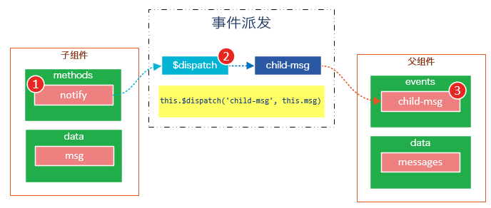
- 运行结果如下:

广播事件
下面这段代码是一个简单的事件广播处理
<div id="app">
    <input v-model="msg" />
    <button v-on:click="notify">Broadcast Event</button>
    <child-component></child-component>
</div>

<template id="child-component">
    <ul>
        <li v-for="item in messages">
            父组件录入了信息:{{ item }}
        </li>
    </ul>
</template>

<script src="js/vue.js"></script>
<script>
    // 注册子组件
    Vue.component('child-component', {
        template: '#child-component',
        data: function() {
            return {
                messages: []
            }
        },
        events: {
            'parent-msg': function(msg) {
                this.messages.push(msg)
            }
        }
    })
    // 初始化父组件
    new Vue({
        el: '#app',
        data: {
            msg: ''
        },
        methods: {
            notify: function() {
                if (this.msg.trim()) {
                    this.$broadcast('parent-msg', this.msg)
                }
            }
        }
    })
</script>
我们将这个示例分为几个步骤解读:
- 父组件的button元素绑定了click事件,该事件指向
notify方法 - 父组件的
notify方法在处理时,调用了$broadcast,将事件派发到子组件的parent-msg事件,并给该该事件提供了一个msg参数 - 子组件的events选项中定义了
parent-msg事件,子组件接收到父组件的广播后,调用parent-msg事件。
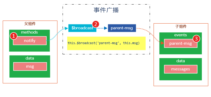
运行结果如下:

CURD示例
Vue.js组件的API来源于三部分——prop,slot和事件。
- prop 允许外部环境传递数据给组件;
- 事件 允许组件触发外部环境的 action;
- slot 允许外部环境插入内容到组件的视图结构内。
至此,这三部分我都已经介绍完了,接下来我就用这些知识来教大家一步一步完成一个CURD示例。
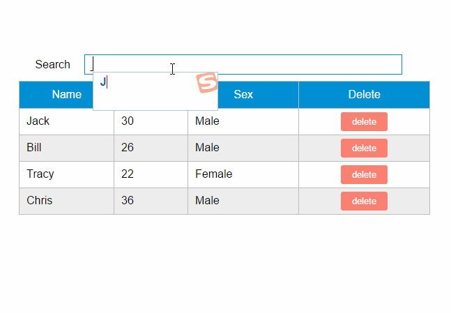
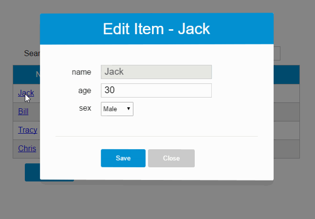
第1步——创建表格组件,添加查询和删除功能
创建表格组件,添加过滤,数据删除功能
<div id="app">
    <div class="container">
        <div class="form-group">
            <label>Search</label>
            <input type="text" class="search-input" v-model="searchQuery" />
        </div>

    </div>
    <div class="container">
        <simple-grid :data-list="people" :columns="columns" :search-key="searchQuery">
        </simple-grid>
    </div>
</div>

<template id="grid-template">
    <table>
        <thead>
            <tr>
                <th v-for="col in columns">
                    {{ col.name | capitalize}}
                </th>
                <th>
                    Delete
                </th>
            </tr>
        </thead>
        <tbody>
            <tr v-for="(index,entry) in dataList | filterBy searchKey">
                <td v-for="col in columns">
                    {{entry[col.name]}}
                </td>
                <td class="text-center">
                    <button @click="deleteItem(index)">delete</button>
                </td>
            </tr>
        </tbody>
    </table>
</template>

<script src="../js/vue.js"></script>
<script>
    Vue.component('simple-grid', {
        template: '#grid-template',
        props: ['dataList', 'columns', 'searchKey'],
        methods: {
            deleteItem: function(index) {
                this.dataList.splice(index, 1);
            },
        }
    })

    var demo = new Vue({
        el: '#app',
        data: {
            searchQuery: '',
            columns: [{
                name: 'name'
            }, {
                name: 'age'
            }, {
                name: 'sex'
            }],
            people: [{
                name: 'Jack',
                age: 30,
                sex: 'Male'
            }, {
                name: 'Bill',
                age: 26,
                sex: 'Male'
            }, {
                name: 'Tracy',
                age: 22,
                sex: 'Female'
            }, {
                name: 'Chris',
                age: 36,
                sex: 'Male'
            }]
        }
    })
</script>
使用知识点
1. 使用Vue.component语法糖
Vue.component是创建并注册组件的语法糖,使用Vue.component注册的组件是全局的。
2. 使用prop将父组件数据传递给子组件
#app元素是父组件,simple-grid是子组件。
在simple-grid组件中定义选项props: ['dataList', 'columns', 'searchKey']
在#app下使用<simple-grid :data-list="people" :columns="columns" :search-key="searchQuery"> 将数据传递给simple-grid组件
3. 使用过滤器
{{ col.name | capitalize}}使用了capitalize过滤器,将字符串的首字母转换为大写后输出。filterBy filterKey使用了filterBy过滤器,根据指定条件过滤数组元素,filterBy返回过滤后的数组。
4. 使用数组索引别名
数组默认的索引名称为$index,v-for="(index,entry) in dataList使用了数组索引别名。
括号中的第一个参数index是$index的别名,第二个参数是遍历的数组元素。
5. 使用了v-bind和v-on指令的缩写
<simple-grid :data-list="people" :columns="columns" :search-key="searchQuery"> 使用了v-bind指令的缩写。:data-list是v-bind:data-list的缩写,:columns是v-bind:columns的缩写,:search-key是v-bind:search-key的缩写。
<button @click="deleteItem(index)">delete</button> 使用了v-on指令的缩写,@click是v-on:click的缩写。
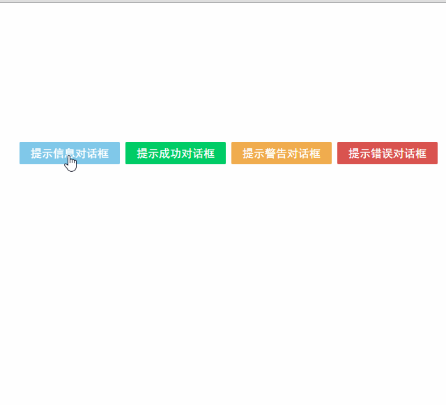
第2步——创建对话框组件
表格数据的添加和修改,我们使用模态对话框来实现。
模态对话框有两种模式,新建模式和修改模式,分别用于新建一条数据和修改指定的数据。
由于对话框的内容来源于具体的数据,所以我们可以考虑将对话框作为simple-grid组件的一个子组件。
modal-dialog组件的模板内容:
<template id="dialog-template">
    <div class="dialogs">
        <div class="dialog" v-bind:class="{ 'dialog-active': show }">
            <div class="dialog-content">
                <header class="dialog-header">
                    <h1 class="dialog-title">{{ title }}</h1>
                </header>
                <footer class="dialog-footer">
                    <div class="form-group">
                        <label></label>
                        <button v-on:click="save">Save</button>
                        <button v-on:click="close">Close</button>
                    </div>
                </footer>
            </div>
        </div>
        <div class="dialog-overlay"></div>
    </div>
</template>
modal-dialog组件在simple-grid组件中注册:
Vue.component('simple-grid', {
    // ...已省略
    data: function() {
        return {
            mode: 0,
            item: {}
            titie: ''
        }
    },
    components: {
        'modal-dialog': {
            template: '#dialog-template',
            data: function() {
                return {
                    // 对话框默认是不显示的
                    show: false
                }
            },
            /*
             * mode = 1是新增数据模式,mode = 2是修改数据模式
             * title表示对话框的标题内容
             * fields表示对话框要显示的数据字段数组
             * item是由simple-dialog传下来,用于绑定表单字段的
             */
            props: ['mode', 'title', 'fields', 'item'],
            methods: {
                close: function() {
                    this.show = false
                },
                save: function() {

                }
            }
        }
    }
    // ...已省略
})
由于modal-dialog组件是simple-grid的子组件,所以它应该在simple-grid的template中使用:

<template id="grid-template">
    <!--...前面的内容已省略    -->
    <modal-dialog :mode="mode" :title="title" :fields="columns" :item="item">
    </modal-dialog>
    <!--...后面的内容已省略    -->
</template>
modal-dialog组件的props选项,追加了3个元素:
- title表示对话框的标题内容
- fields表示对话框要显示的数据字段数组
- item用于绑定表单字段,它是一个对象
注意:由于modal-dialog是一个子组件,它仅用于simple-grid组件的新增或修改模式,所以modal-dialog的template没有使用
使用知识点
1. 使用组件的局部注册
modal-dialog组件没有使用Vue.component进行全局注册,使用simple-grid组件components选项实现了局部注册。
2. 使用组件的data选项
组件的data选项必须以函数的方式返回。
第3步——实现数据新建功能
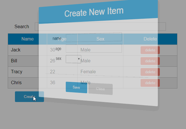
1. 修改Vue实例的data选项的columns:
var demo = new Vue({
    // ...已省略
    columns: [{
            name: 'name',
            isKey: true
        }, {
            name: 'age'
        }, {
            name: 'sex',
            dataSource: ['Male', 'Female']
        }]
    // ...已省略
})
为’name’列追加一个isKey属性,并设置为true,表示该列为主键列。
为’sex’列追加一个dataSoruce属性,并设置为[‘Male’, ‘Female’],表示新增或修改数据时选择性别的下拉框数据源。
2. 修改modal-dialog的template:
<template id="dialog-template">
    <div class="dialogs">
        <div class="dialog" v-bind:class="{ 'dialog-active': show }">
            <div class="dialog-content">
                <header class="dialog-header">
                        <h1 class="dialog-title">{{ title }}</h1>
                </header>

                <div v-for="field in fields" class="form-group" >
                        <label>{{ field.name }}</label>
                        <select v-if="field.dataSource" v-model="item[field.name]">
                            <option v-for="opt in field.dataSource" :value="opt">{{ opt }}</option>
                        </select>
                        <input v-else type="text" v-model="item[field.name]">
                </div>

                <footer class="form-group">
                    <label></label>
                    <button v-on:click="save">Save</button>
                    <button v-on:click="close">Close</button>
                </footer>
            </div>
        </div>
        <div class="dialog-overlay"></div>
    </div>
</template>
在modal-dialog组件的模板中遍历fields,然后显示field的名称。
在渲染表单时,根据是否有dataSource判定表单是下拉框还是文本框。
(由于示例较为简陋,所以只提供了input和select两种表单类型)
注意modal-dialog组件的fields是由Vue实例传递给simple-grid,然后再由simple-grid传递过来的。
3. 修改simple-grid的template
<template id="grid-template">
    <!--...已省略    -->
    <div class="container">
        <button class="btn" @click="openNewItemDialog('Create new item')">Create</button>
    </div>

    <modal-dialog :mode="mode" :title="title" :fields="columns" :item="item" v-on:create-item="createItem">
    </modal-dialog>
</template>
添加一个Create按钮,绑定click事件到openNewItemDiaolog()方法,该方法用于打开modal-dialog组件,并将模式设置为新建模式。
在<modal-dialog>标签上给sample-grid绑定一个自定义事件create-item,后面在$dispatch派发事件时会用到。

4. 修改simple-grid的methods选项
Vue.component('simple-grid', {
    // ...已省略
    methods: {

        openNewItemDialog: function(title) {
            // 对话框的标题
            this.title = title
            // mode = 1表示新建模式
            this.mode = 1
            // 初始化this.item
            this.item = {}
            // 广播事件,showDialog是modal-dialog组件的一个方法,传入参数true表示显示对话框
            this.$broadcast('showDialog', true)
        },
        createItem: function() {
            // 将item追加到dataList
            this.dataList.push(this.item)
            // 广播事件,传入参数false表示隐藏对话框
            this.$broadcast('showDialog', false)
            // 新建完数据后,重置item对象
            this.item = {}
        },
        deleteItem: function(index) {
            this.dataList.splice(index, 1);
        },
    },
    // ...已省略
})
追加了两个方法:opeNewItemDialog和createItem方法。
opeNewItemDialog方法用于打开对话框,this.$broadcast('showDialog', true) 调用子组件modal-dialog的showDialog事件,传入参数true表示显示对话框。
createItem方法用于保存新建的数据,this.$broadcast('showDialog', false) 调用子组件modal-dialog的showDialog事件,传入参数false表示隐藏对话框。
5. 修改modal-grid的methods和events选项
Vue.component('simple-grid', {
    // ...已省略
    components: {
        'modal-dialog': {
            // ...已省略
            methods: {
                close: function() {
                    this.show = false
                },
                save: function() {
                    //新建模式
                    if (this.mode === 1){
                        // 使用$dispatch调用simple-grid的create-item方法
                        this.$dispatch('create-item')
                    }
                }
            },
            events: {
                // 显示或隐藏对话框
                'showDialog': function(show) {
                    this.show = show
                }
            }
        }
    }
    // ...已省略
})
修改methods选项的save方法,由于保存按钮是在子组件modal-dialog中的,而createItem方法是在父组件simple-grid中的,所以这里使用this.$dispatch('create-item') 派发到父组件的自定义事件create-item。
追加events选项,添加showDialog事件,用于显示或隐藏对话框。
请将4和5结合起来看,我们既用到了$broadcast广播事件,又用到了$dispatch派发事件。
下面这幅图有助于理解simple-grid和modal-dialog组件之间的通信: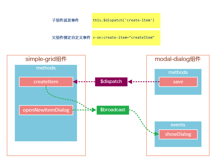
create-item是一个自定义事件,由子组件modal-dialog调用this.$dispatch('create-item') 派发到自定义事件create-item,自定义事件create-item是绑定在父组件simple-grid上的,该事件会执行createItem方法。
第4步——实现数据修改功能
1. 修改sample-grid的template
<template id="grid-template">
    <!--...已省略-->
    <tbody>
        <tr v-for="(index,entry) in dataList | filterBy searchKey">
            <td v-for="col in columns">
                <span v-if="col.isKey"><a href="javascript:void(0)" @click="openEditItemDialog(index, 'Edit item ' + entry[col.name])">{{entry[col.name]}}</a></span>
                <span v-else>{{entry[col.name]}}</span>
            </td>
        </tr>
    </tbody>
    <!--...已省略-->
    <modal-dialog
        :mode="mode"
        :title="title"
        :item="item"
        :fields="columns"
        v-on:create-item="createItem"
        v-on:update-item="updateItem">
    </modal-dialog>
</template>
遍历列表数据时,使用v-if指令判断当前列是否为主键列,如果是主键列,则给主键列添加链接,然后给链接绑定click事件,click事件用于打开修改数据的对话框。
在<modal-dialog>标签上,给sample-grid绑定自定义事件update-item,update-item事件指向sample-grid的方法updateItem。
2. 修改modal-dialog的template
<div v-for="field in fields" class="form-group">
    <label>{{ field.name }}</label>
    <select v-if="field.dataSource" v-model="item[field.name]" :disabled="mode === 2 && field.isKey">
            <option v-for="opt in field.dataSource" :value="opt">{{ opt }}</option>
    </select>
    <input v-else type="text" v-model="item[field.name]" :disabled="mode === 2 && field.isKey">
</div>
在修改模式下(mode = 2),如果当前字段是主键字段,则禁止修改。
3. 修改sample-grid的methods选项
// 弹出修改数据的对话框时,使用对象的深拷贝
initItemForUpdate: function(p) {
    var c = c || {};
    for (var i in p) {
        // 属性i是否为p对象的自有属性
        if (p.hasOwnProperty(i)) {
            if (typeof p[i] === 'object') {
                c[i] = Array.isArray(p[i]) ? [] : {}
                deepCopy(p[i], c[i])
            } else {
                // 属性是基础类型时,直接拷贝
                c[i] = p[i]
            }
        }
    }
    return c;
},
findItemByKey: function(key){
    var keyColumn = this.keyColumn
    for(var i = 0; i < this.dataList.length; i++){
        if(this.dataList[i][keyColumn] === key){
            return this.dataList[i]
        }
    }
},
createItem: function() {
    // 将item追加到dataList
    this.dataList.push(this.item)
    // 广播事件,传入参数false表示隐藏对话框
    this.$broadcast('showDialog', false)
    // 新建完数据后,重置item对象
    this.item = {}
},
updateItem: function() {
    // 获取主键列
    var keyColumn = this.keyColumn

    for (var i = 0; i < this.dataList.length; i++) {
        // 根据主键查找要修改的数据,然后将this.item数据更新到this.dataList[i]
        if (this.dataList[i][keyColumn] === this.item[keyColumn]) {
            for (var j in this.item) {
                this.dataList[i][j] = this.item[j]
            }
            break;
        }
    }
    // 广播事件,传入参数false表示隐藏对话框
    this.$broadcast('showDialog', false)
    // 修改完数据后,重置item对象
    this.item = {}
}
追加的内容:调用内置的ready()函数,openEditDialog、updateItem、findItemByKey和initItemForUpdate方法。
ready()函数会在编译结束和 $el 第一次插入文档之后调用,你可以将其理解为jQuery中的document.ready()。
在ready()函数中,初始化keyColumn,keyColumn表示主键列,调用updateItem方法时,会根据主键数据找到dataList中匹配的元素。
opeEditItemDialog方法用于打开对话框,this.$broadcast('showDialog', true) 调用子组件modal-dialog的showDialog事件,传入参数true表示显示对话框。
ready()函数没有特别的业务逻辑,主要是获取主键列,调用updateItem方法时,会根据主键数据找到dataList中匹配的元素。
updateItem方法用于保存修改的数据,this.$broadcast('showDialog', false) 调用子组件modal-dialog的showDialog事件,传入参数false表示隐藏对话框。
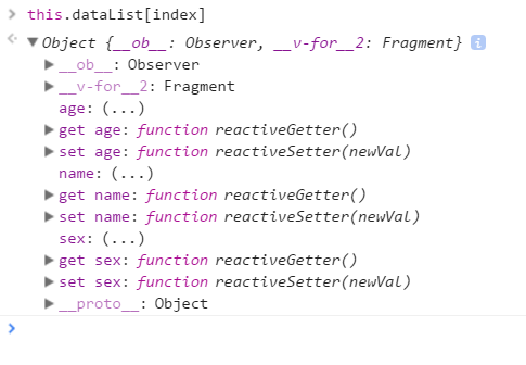
initItemForUpdate方法用于将选中的数据this.dataList[index]深拷贝到this.item。为什么要使用深拷贝呢?因为this.dataList[index]是一个引用对象,它有一些属性也是引用类型的,如果使用浅拷贝可能得到一些超出预期的效果。
4.修改modal-dialog的methods选项
save: function() {
    //新建模式
    if (this.mode === 1) {
        // 使用$dispatch调用simple-grid的create-item事件
        this.$dispatch('create-item')
    }else if(this.mode === 2){
        // 使用$dispatch调用simple-grid的update-item事件
        this.$dispatch('update-item')
    }
}
修改methods选项中的save方法,this.mode === 2时,将事件派发到父组件的update-item事件。
第5步——修改数据新建功能

修改sample-grid的methods选项,追加itemExists方法,然后修改createItem方法。
itemExists: function(keyColumn) {
    for (var i = 0; i < this.dataList.length; i++) {
        if (this.item[keyColumn] === this.dataList[i][keyColumn])
            return true;
    }
    return false;
},
createItem: function() {
    var keyColumn = this.getKeyColumn()
    if (!this.itemExists(keyColumn)) {
        // 将item追加到dataList
        this.dataList.push(this.item)
        // 广播事件,传入参数false表示隐藏对话框
        this.$broadcast('showDialog', false)
        // 新建完数据后,重置item对象
        this.item = {}
    } else {
        alert(keyColumn + ' "' + this.item[keyColumn] + '" is already exists')
    }

}
由于主键列数据是不能重复的,所以在新增数据时需要判断主键列数据是否已经存在。
总结
说到底,组件的API主要来源于以下三部分:
- prop 允许外部环境传递数据给组件;
- 事件 允许组件触发外部环境的 action;
- slot 允许外部环境插入内容到组件的视图结构内。
这三大知识点在上下两篇文章中都体现出来了,限于篇幅和个人知识的匮乏,我并不能将组件的所有特性都描述出来,这还需要靠各位花一些时间去多多了解官网的API,并付诸实践。
如果要构建一些大型的应用,基于组件的开发模式是一个不错的选择,我们将整个系统拆分成一个一个小组件,就像乐高一样,然后将这些组件拼接起来。
原文出处:Web前端开发 » http://www.ujiuyeweb.com/archives/419