矩阵图
https://datawhalechina.github.io/pms50/#/chapter9/chapter9
导入所需要的库
import numpy as np              # 导入numpy库
import pandas as pd             # 导入pandas库
import matplotlib as mpl        # 导入matplotlib库
import matplotlib.pyplot as plt
import seaborn as sns           # 导入seaborn库
%matplotlib inline              # 在jupyter notebook显示图像
设定图像各种属性
large = 22; med = 16; small = 12

params = {'axes.titlesize': large,    # 设置子图上的标题字体
            'legend.fontsize': med,     # 设置图例的字体
            'figure.figsize': (16, 10), # 设置图像的画布
           'axes.labelsize': med,      # 设置标签的字体
            'xtick.labelsize': med,     # 设置x轴上的标尺的字体
            'ytick.labelsize': med,     # 设置整个画布的标题字体
          'figure.titlesize': large}
#plt.rcParams.update(params)           # 更新默认属性
plt.style.use('seaborn-whitegrid')    # 设定整体风格
sns.set_style("white")                # 设定整体背景风格
程序代码
# step1:导入数据
df = sns.load_dataset('iris')
# step2: 绘制矩阵图
    # 画布
plt.figure(figsize = (12, 10),    # 画布尺寸_(12, 10)
           dpi = 80)             # 分辨率_80
    # 矩阵图
sns.pairplot(df,                                     # 使用的数据
            kind = 'scatter',                        # 绘制图像的类型_scatter
            hue = 'species',                         # 类别的列,让不同类别具有不谈的颜色
            plot_kws = dict(s = 50,                  # 点的尺寸
                           edgecolor = 'white',      # 边缘颜色
                           linewidth = 2.5))         # 线宽

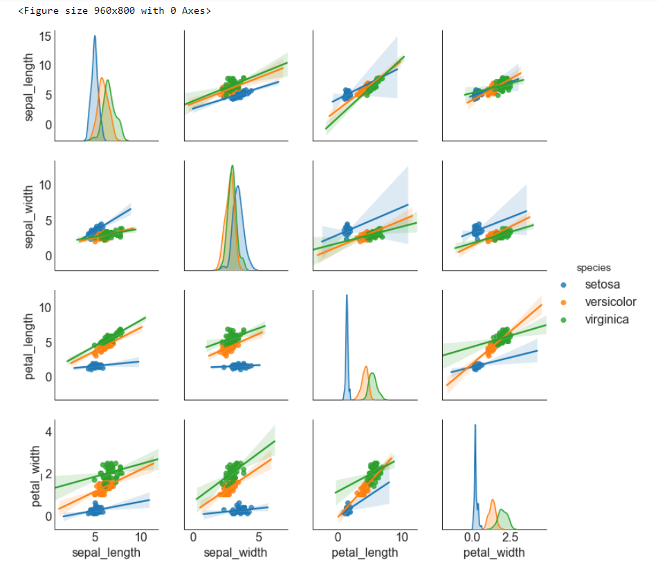
# step1:导入数据
df = sns.load_dataset('iris')
# step2: 绘制矩阵图
    # 画布
plt.figure(figsize = (12, 10),    # 画布尺寸_(12, 10)
           dpi = 80)             # 分辨率_80
    # 矩阵图(带有拟合线的散点图)
sns.pairplot(df,                                     # 使用的数据
            kind = 'reg',                            # 绘制图像的类型_reg
            hue = 'species')                         # 类别的列,让不同类别具有不谈的颜色
博文总结
seaborn.pairplot
seaborn.pairplot(data, hue=None, hue_order=None,
 palette=None, vars=None, x_vars=None, y_vars=None, kind='scatter',
diag_kind='auto', markers=None, height=2.5, aspect=1,
dropna=True, plot_kws=None, diag_kws=None, grid_kws=None, size=None)
Plot pairwise relationships in a dataset.
By default, this function will create a grid of Axes such that each variable in data will by shared in the y-axis across a single row and in the x-axis across a single column.
The diagonal Axes are treated differently, drawing a plot to show the univariate distribution of the data for the variable in that column.
It is also possible to show a subset of variables or plot different variables on the rows and columns.
This is a high-level interface for PairGrid that is intended to make it easy to draw a few common styles. You should use PairGriddirectly if you need more flexibility.
参数:data:DataFrame
Tidy (long-form) dataframe where each column is a variable and each row is an observation.
hue:string (variable name), optional
Variable in
datato map plot aspects to different colors.
hue_order:list of strings
Order for the levels of the hue variable in the palette
palette:dict or seaborn color palette
Set of colors for mapping the
huevariable. If a dict, keys should be values in thehuevariable.
vars:list of variable names, optional
Variables within
datato use, otherwise use every column with a numeric datatype.
{x, y}_vars:lists of variable names, optional
Variables within
datato use separately for the rows and columns of the figure; i.e. to make a non-square plot.
kind:{‘scatter’, ‘reg’}, optional
Kind of plot for the non-identity relationships.
diag_kind:{‘auto’, ‘hist’, ‘kde’}, optional
Kind of plot for the diagonal subplots. The default depends on whether
"hue"is used or not.
markers:single matplotlib marker code or list, optional
Either the marker to use for all datapoints or a list of markers with a length the same as the number of levels in the hue variable so that differently colored points will also have different scatterplot markers.
height:scalar, optional
Height (in inches) of each facet.
aspect:scalar, optional
Aspect * height gives the width (in inches) of each facet.
dropna:boolean, optional
Drop missing values from the data before plotting.
{plot, diag, grid}_kws:dicts, optional
Dictionaries of keyword arguments.
返回值:grid:PairGrid
Returns the underlying
PairGridinstance for further tweaking.
seaborn.load_dataset
seaborn.load_dataset(name, cache=True, data_home=None, **kws)
从在线库中获取数据集(需要联网)。
参数:name:字符串
数据集的名字 (<cite>name</cite>.csv on https://github.com/mwaskom/seaborn-data)。 您可以通过
get_dataset_names()获取可用的数据集。
cache:boolean, 可选
如果为True,则在本地缓存数据并在后续调用中使用缓存。
data_home:string, 可选
用于存储缓存数据的目录。 默认情况下使用 ~/seaborn-data/
kws:dict, 可选
传递给 pandas.read_csv