CSS3中包含几个新的背景属性,提供更大背景元素控制。
在本章您将了解以下背景属性:
- background-image
- background-size
- background-origin
- background-clip
CSS3中可以通过background-image属性添加背景图片。
不同的背景图像和图像用逗号隔开,所有的图片中显示在最顶端的为第一张。
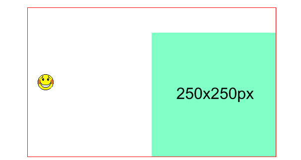
<!DOCTYPE html>
<html>
<head>
<meta charset="utf-8">
<title>css3背景</title>
<style type="text/css">
  * {
      margin: 0;
      padding: 0;
  }

  .rcorners {
    width: 500px;
    height: 300px;
    margin: 20px auto;
    border:1px solid red;
    background-image: url(250x250px.gif), url(smiley.gif);
    background-position: right bottom, 20px center;
    background-repeat: no-repeat, no-repeat;
  }

</style>
</head>
<body>
  <div class="rcorners"></div>
</body>
</html>
效果如下:
可以给不同的图片设置多个不同的属性
<!DOCTYPE html>
<html>
<head>
<meta charset="utf-8">
<title>css3背景</title>
<style type="text/css">
  * {
      margin: 0;
      padding: 0;
  }

  .rcorners {
    width: 500px;
    height: 300px;
    margin: 20px auto;
    border:1px solid red;
    background: url(250x250px.gif) right bottom,url(smiley.gif) 20px center;
    background-repeat: no-repeat, no-repeat;
  }

</style>
</head>
<body>
  <div class="rcorners"></div>
</body>
</html>
效果如下:
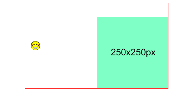
效果是跟上面一样的只是换了个写法写成了简写的方式
background-size指定背景图像的大小。CSS3以前,背景图像大小由图像的实际大小决定。
CSS3中可以指定背景图片,让我们重新在不同的环境中指定背景图片的大小。您可以指定像素或百分比大小。
你指定的大小是相对于父元素的宽度和高度的百分比的大小。
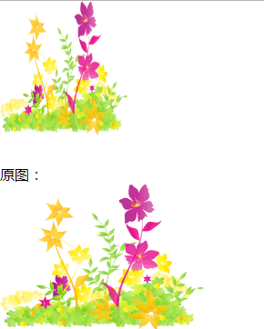
<!DOCTYPE html>
<html>
<head>
<meta charset="utf-8">
<title>css3背景</title>
<style type="text/css">
  * {
      margin: 0;
      padding: 0;
  }

  body {
      background: url(img_flwr.gif) no-repeat;
      background-size: 140px 148px;
      padding-top: 180px;
  }
</style>
</head>
<body>
    <p>原图:</p>
    <img src="img_flwr.gif" alt="原图" width="224" height="162">
</body>
</html>
效果如下:
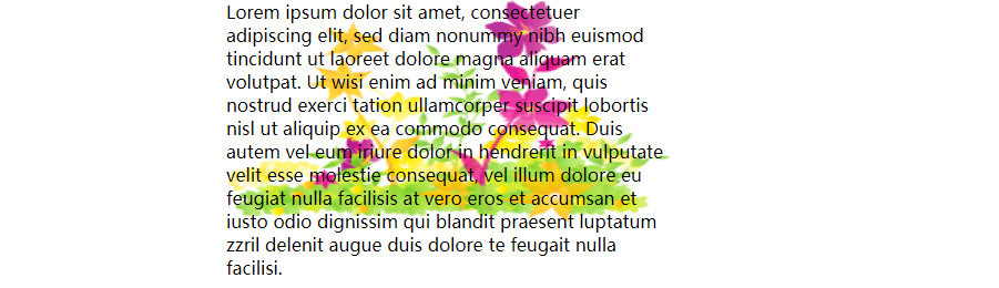
使用百分比伸展背景图像完全填充内容区域:
<!DOCTYPE html>
<html>
<head>
<meta charset="utf-8">
<title>css3背景</title>
<style type="text/css">
  * {
      margin: 0;
      padding: 0;
  }

  div {
      width: 400px;
      height: 200px;
      margin: 0 auto;
      background: url(img_flwr.gif) no-repeat;
      background-size: 100% 100%;
  }

</style>
</head>
<body>
  <div>
    Lorem ipsum dolor sit amet, consectetuer adipiscing elit, sed diam nonummy nibh euismod tincidunt ut laoreet dolore magna aliquam erat volutpat. Ut wisi enim ad minim veniam, quis nostrud exerci tation ullamcorper suscipit lobortis nisl ut aliquip ex ea commodo consequat. Duis autem vel eum iriure dolor in hendrerit in vulputate velit esse molestie consequat, vel illum dolore eu feugiat nulla facilisis at vero eros et accumsan et iusto odio dignissim qui blandit praesent luptatum zzril delenit augue duis dolore te feugait nulla facilisi.
  </div>
</body>
</html>
效果如下:
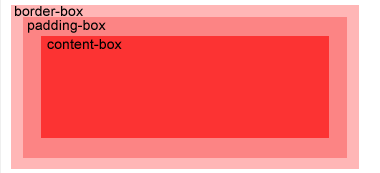
background-Origin属性指定了背景图像的位置区域。
content-box, padding-box,和 border-box区域内可以放置背景图像。
我们看看下面的例子
<!DOCTYPE html>
<html lang="en">
<head>
    <meta charset="UTF-8">
    <title>css background-origin</title>
    <style type="text/css">
     * {
       margin: 0;
       padding: 0;
     }

     div {
      width: 450px;
      height: 100px;
      margin: 6px auto;
      padding: 25px;
      overflow: hidden;
      border: 10px solid red;
      background: url(smiley.gif) no-repeat;
     }
     .padding-box {
       background-origin: padding-box;
     }

     .content-box {
       background-origin: content-box;
     }

     .border-box {
       background-origin: border-box;
     }
    </style>
</head>
<body>
  <div class="padding-box">
    那是我日夜思念深深爱着的人啊
到底我该如何表达
她会接受我吗
也许永远都不会跟她说出那句话
注定我要浪迹天涯
怎么能有牵挂
梦想总是遥不可及
是不是应该放弃
花开花落又是一季
春天啊你在哪里
青春如同奔流的江河
一去不回来不及道别
只剩下麻木的我
没有了当年的热血
看那满天飘零的花朵
在最美丽的时刻凋谢
有谁会记得这世界它来过
转眼过去多年时间
多少离合悲欢
曾经志在四方少年
羡慕南飞的雁
各自奔前程的身影
匆匆渐行渐远
未来在哪里平凡
啊谁给我答案
那时陪伴我的人啊
你们如今在何方
我曾经爱过的人啊
现在是什么模样
  </div>
  <div class="content-box">
    那是我日夜思念深深爱着的人啊
到底我该如何表达
她会接受我吗
也许永远都不会跟她说出那句话
注定我要浪迹天涯
怎么能有牵挂
梦想总是遥不可及
是不是应该放弃
花开花落又是一季
春天啊你在哪里
青春如同奔流的江河
一去不回来不及道别
只剩下麻木的我
没有了当年的热血
看那满天飘零的花朵
在最美丽的时刻凋谢
有谁会记得这世界它来过
转眼过去多年时间
多少离合悲欢
曾经志在四方少年
羡慕南飞的雁
各自奔前程的身影
匆匆渐行渐远
未来在哪里平凡
啊谁给我答案
那时陪伴我的人啊
你们如今在何方
我曾经爱过的人啊
现在是什么模样
  </div>
  <div class="border-box">
    那是我日夜思念深深爱着的人啊
到底我该如何表达
她会接受我吗
也许永远都不会跟她说出那句话
注定我要浪迹天涯
怎么能有牵挂
梦想总是遥不可及
是不是应该放弃
花开花落又是一季
春天啊你在哪里
青春如同奔流的江河
一去不回来不及道别
只剩下麻木的我
没有了当年的热血
看那满天飘零的花朵
在最美丽的时刻凋谢
有谁会记得这世界它来过
转眼过去多年时间
多少离合悲欢
曾经志在四方少年
羡慕南飞的雁
各自奔前程的身影
匆匆渐行渐远
未来在哪里平凡
啊谁给我答案
那时陪伴我的人啊
你们如今在何方
我曾经爱过的人啊
现在是什么模样
  </div>
</body>
</html>
效果如下:
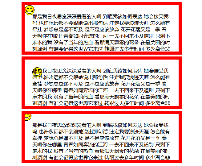
我们可以看出第一个应用了padding-box出现在了左上角的位置这是相对于内边距来的,第二个是根据相对位置来的,第三个是相对于边框的,紧挨着最外层的边框线
CSS3中background-clip背景剪裁属性是从指定位置开始绘制。下面看例子:
<!DOCTYPE html>
<html lang="en">
<head>
    <meta charset="UTF-8">
    <title>css background-clip</title>
    <style type="text/css">
     * {
       margin: 0;
       padding: 0;
     }

     div {
       width: 500px;
       height: 80px;
       margin: 20px auto;
       padding: 25px;
       border: 10px dotted red;
       background: orange;
     }

     .padding-box {
       background-clip: padding-box
     }

     .border-box {
       background-clip: border-box
     }

     .content-box {
       background-clip: content-box;
     }


    </style>
</head>
<body>
  <div class="padding-box"></div>
  <div class="border-box"></div>
  <div class="content-box"></div>
</body>
</html>
效果如下;
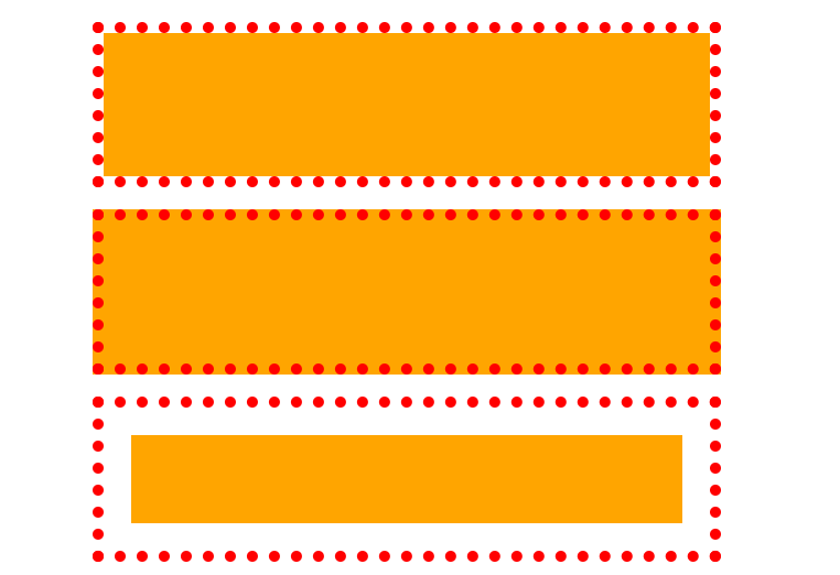
padding-box是从内边距开始绘制背景
border-box 是从边框开始绘制背景
content-box 是从内容开始绘制背景