对于表单,input[type="radio"] 的样式总是不那么友好,在不同的浏览器中表现不一。
对单选按钮自定义样式,我们以前一直用的脚本来实现,不过现在可以使用新的伪类 :checkbox 来实现。
如果直接对单选按钮设置样式,那么这个伪类并不实用,因为没有多少样式能够对单选按钮起作用。不过,倒是可以基于单选按钮的勾选状态借助组合选择符来给其他元素设置样式。
很多时候,无论是为了表单元素统一,还是为了用户体验良好,我们都会选择 label 元素和 input[type="radio"] 一起使用。当<label>元素与单选按钮关联之后,也可以起到触发开关的作用。
思路:
1. 可以为<label>元素添加生成性内容(伪元素),并基于单选按钮的状态来为其设置样式;
2. 然后把真正的单选按钮隐藏起来;
3. 最后把生成内容美化一下。
解决方法:
1. 一段简单的结构代码:

<div class="female">
    <input type="radio" id="female" name="sex" />
    <label for="female">女</label>
</div>
<div class="male">
    <input type="radio" id="male" name="sex" />
    <label for="male">男</label>
</div>
2. 生成一个伪元素,作为美化版的单选按钮,先给伪元素添加一些样式:
input[type="radio"] + label::before {
    content: "a0"; /*不换行空格*/
    display: inline-block;
    vertical-align: middle;
    font-size: 18px;
     1em;
    height: 1em;
    margin-right: .4em;
    border-radius: 50%;
    border: 1px solid #01cd78;
    text-indent: .15em;
    line-height: 1;
}
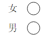
现在的样子:

原来的单选按钮仍然可见,但是我们先给单选按钮的勾选状态添加样式:
3. 给单选按钮的勾选状态添加不同的样式:
input[type="radio"]:checked + label::before {
    background-color: #01cd78;
    background-clip: content-box;
    padding: .2em;
}
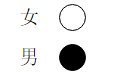
现在的样子:

4. 现在把原来的单选按钮隐藏:
input[type="radio"] {
    position: absolute;
    clip: rect(0, 0, 0, 0);
}
现在的样子:


隐藏原来的单选按钮时,如果使用 display: none; 的话,那样会把它从键盘 tab 键切换焦点的队列中完全删除。
于是可采用剪切的方式,让剪切后的尺寸为零,这样就隐藏了原来的单选按钮。
下面为旧内容:
为了最大程度的显示出它们的差别,并且为了好看,首先定义了一些样式:
<form action="">
    <div class="sex">
        <div class="female">
            <label for="female">女</label>
            <input type="radio" name="sex" id="female">
        </div>
        <div class="male">
            <label for="male">男</label>
            <input type="radio" name="sex" id="male">
        </div>
    </div>
</form>
body { margin: 0; }
input { padding: 0; margin: 0; border: 0; }
.female, .male {
    position: relative;
    height: 40px;
    line-height: 40px;
    margin-left: 40px;
}
.sex label {
    display: block;
    height: 40px;
     40px;
    line-height: 40px;
    font-size: 20px;
    cursor: pointer;
}
.sex input {
    z-index: 3;
    position: absolute;
    top: 0;
    bottom: 0;
    left: 40px;
    margin: auto;
    display: block;
     30px;
    height: 30px;
    cursor: pointer;
}
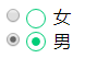
然后在各个浏览器中观察,会发现有很大的差别:
ie:
edge:

opera:

chrome:

firefox:

对于 firefox 浏览器,即便是设置了宽和高,依然是没有效果,input[type="radio"] 的那个圆圈还是初始状态那么大。其它浏览器的表现也不一致,为了达到一致的效果,我们需要做兼容处理。
思路:
1. 将 input[type="radio"] 隐藏, opacity: 0; 置于上层,当我们点击它时,就能正确的响应原本的事件。
2. 自定义一个圆圈,置于下层,模拟原本相似的样式;
3. 用 js 实现选中 input[type="radio"] 时,在其下层的自定义的元素改变原来的背景颜色。
代码:
<form action="">
    <div class="sex">
        <div class="female">
            <label for="female">女</label>
            <input type="radio" name="sex" id="female">
            <span class="female-custom"></span> <!-- 同下面的 span 一样作为自定义的元素 -->
        </div>
        <div class="male">
            <label for="male">男</label>
            <input type="radio" name="sex" id="male">
            <span class="male-custom"></span>
        </div>
    </div>
</form>
body { margin: 0; }
input { padding: 0; margin: 0; border: 0; }
.female, .male {
    position: relative; /* 设置为相对定位,以便让子元素能绝对定位 */
    height: 40px;
    line-height: 40px;
    margin-left: 40px;
}
.sex label {
    display: block;
    height: 40px;
     40px;
    line-height: 40px;
    font-size: 20px;
    cursor: pointer;
}
.sex input {
    z-index: 3;
    position: absolute;
    top: 0;
    bottom: 0;
    left: 40px;
    margin: auto; /* 这里及以上的定位,可以让该元素竖直居中。(top: 0; bottom: 0;) */
    opacity: 0;
    display: block;
     30px;
    height: 30px;
    cursor: pointer;
}
.sex span {
    position: absolute;
    top: 0;
    bottom: 0;
    left: 40px;
    margin: auto;
    display: block;
     25px;
    height: 25px;
    border: 1px solid #000;
    border-radius: 50%;
    cursor: pointer;
}
.sex span.active {
    background-color: #000;
}
$("#male").click( function () {
    $(this).siblings("span").addClass("active");
    $(this).parents("div").siblings("div").children("span").removeClass("active");
});
$("#female").click( function () {
    $(this).siblings("span").addClass("active");
    $(this).parents("div").siblings("div").children("span").removeClass("active");
});
这样处理后,在浏览器中展示效果全部一样了:

扩展:
1. 对于代码中出现的定位,对父元素使用 position: relative; 给子元素使用 position: absolute; top: 0; right: 0; bottom: 0; left: 0; margin: auto; 能实现让子元素相对于父元素居中(满足水平居中和竖直居中)显示。如果只是需要竖直居中,则不需要添加 right: 0; 和 left: 0; 的样式。
2. 有时当我们不容易确定子元素的高度时,可以这样设置:对父元素 position: relative; 对子元素 position: absolute; top: 10px; bottom: 10px; margin: auto; 这样一来,子元素的高度就是父元素的高度减去20px后的值了,同样,top 和 bottom 支持百分数,可扩展性更强。
优化更新:
需求:
1. 有时候我们需要内联的单选样式;
2. 选中的按钮内的小圆圈不需要占满整个外圈的大小。
思路:
1. 让每一个包裹选择的 div 左浮动;
2. 给父元素添加圆形的外边框,子元素设置一个稍小于父元素大小的背景。
代码:
<form action="">
    <div class="fruit">
        <div class="apple">
            <label for="apple">苹果</label>
            <input type="radio" name="fruit" id="apple">
            <div class="user-defined">
                <span class="circle"></span>
            </div>
        </div>
        <div class="banana">
            <label for="banana">香蕉</label>
            <input type="radio" name="fruit" id="banana">
            <div class="user-defined">
                <span class="circle"></span>
            </div>
        </div>
        <div class="orange">
            <label for="orange">橘子</label>
            <input type="radio" name="fruit" id="orange">
            <div class="user-defined">
                <span class="circle"></span>
            </div>
        </div>
    </div>
</form>
* { box-sizing: border-box; }

body { padding: 50px; }

input { padding: 0; margin: 0; border: 0; }

.fruit:before { content: ""; display: table; }

.fruit:after { content: ""; display: table; clear: both; }

.fruit > div { position: relative; float: left; margin-right: 50px;  80px; height: 40px; line-height: 40px; }

.fruit > div:last-child { margin-right: 0; }

.fruit label { display: block;  50px; height: 40px; line-height: 40px; cursor: pointer; }

.fruit input { z-index: 3; display: block; opacity: 0; position: absolute; top: 0; bottom: 0; left: 50px; margin: auto;  30px; height: 30px; cursor: pointer; }

.fruit .user-defined { z-index: 2; position: absolute; top: 0; bottom: 0; left: 50px; margin: auto;  30px; height: 30px; border: 1px solid #000; border-radius: 50%; cursor: pointer; }

.fruit .user-defined span.circle  { display: block;  24px; height: 24px; margin-top: 2px; margin-left: 2px; background-color: transparent; border-radius: 50%; }

.fruit .user-defined span.active  { background-color: #000; }
$("input").click(function() {
    $(this).siblings("div").children("span").addClass("active");
    $(this).parents("div").siblings("div").find("span").removeClass("active");
});
效果显示如下:

优化更新: (2016年11月07日)
需求:
1. 有时候我们的选择只有两种,比如性别;
2. 这种选择希望能像手机系统设置里的切换一样。
思路:
1. 让每一个包裹选择的 div 左浮动;
2. 让当前子元素添加区别的背景。
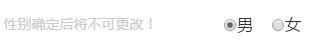
预期结果:

代码:
<div class="sex">
    <span class="warning fl">性别确定后将不可更改!</span>
    <div class="select fr">
        <div class="male fl">
            <label for="male">
                <input type="radio" name="sex" id="male" checked>男
            </label>
            <span class="btn active">男</span>
        </div>
        <div class="female fl">
            <label for="female">
                <input type="radio" name="sex" id="female">女
            </label>
            <span class="btn">女</span>
        </div>
    </div>
</div>
/*性别*/
.sex span.warning {
    font-size: 1.4rem;
    color: #ccc;
}
.sex .male,
.sex .female {
    position: relative;
     4rem;
    height: 3.9rem;
    z-index: 1;
    line-height: 3.9rem;
    text-align: center;
}
.sex .male label,
.sex .female label {
    position: absolute;
    top: 0;
    bottom: 0;
    left: 0;
     4rem;
    height: 3.9rem;
    z-index: 3;
    opacity: 0;
    margin: auto;
    display: inline-block;
    line-height: 3.9rem;
    cursor: pointer;
}
.sex input {
    display: inline-block;
    vertical-align: middle;/*让默认的单选样式的圆圈和“男”“女”的文本没有高差,看起来在同一水平线*/
    height: 2.8rem;
    line-height: 2.8rem;
    margin: 0; /*清除浏览器默认的外边距*/
}
.sex .male span.btn,
.sex .female span.btn {
    position: absolute;
    top: 0;
    bottom: 0;
    left: 0;
     4rem;
    height: 2.8rem;
    z-index: 2;
    margin: auto;
    display: inline-block;
    line-height: 2.6rem;
    text-align: center;
    border: .1rem solid #fe5454;
    color: #fe5454;
}
.sex .male span {
    border-top-left-radius: .2rem;
    border-bottom-left-radius: .2rem;
}
.sex .female span {
    border-top-right-radius: .2rem;
    border-bottom-right-radius: .2rem;
}
.sex .male span.active,
.sex .female span.active {
    background-color: #fe5454;
    color: #fff;
}
如果用 jQuery 来写切换的功能的话,很简单的几行代码:
$(".select label").click(function() {
    $(this).siblings("span").addClass("active");
    $(this).parent().siblings("div").find("span").removeClass("active");
});
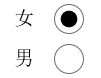
最后,做出来的效果单选原样式没有 opacity: 0; 隐藏时:
单选原样式 opacity: 0; 隐藏时:

