架构
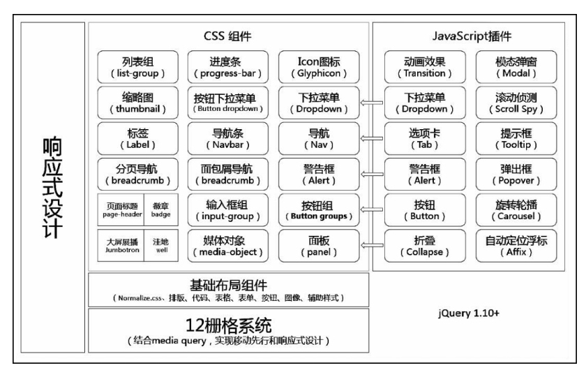
- 设计理念:响应式布局
- 架构基础:jQuery
- 核心功能:12栅格系统(或者称为网格系统)
- 基础布局组件:任意页面元素可以使用
- CSS组件:20种常见组件
- JavaScript插件:12种插件。依赖于jQuery实现
栅格系统的使用
实验效果:
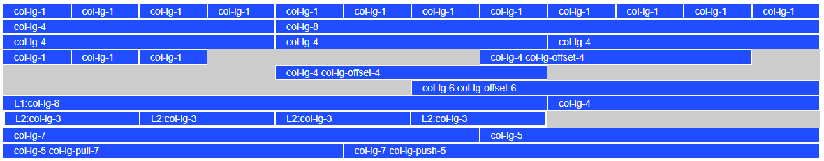
代码:
<!DOCTYPE html>
<html lang="zh-CN">
<head>
    <meta charset="utf-8">
    <!--IE浏览器设置:以当前IE浏览器所支持的最高版本模式来渲染页面-->
    <meta http-equiv="X-UA-Compatible" content="IE=edge">
    <meta name="viewport" content="width=device-width, initial-scale=1">
    <!-- 上述3个meta标签*必须*放在最前面,任何其他内容都*必须*跟随其后! -->
    <title>12栅格系统</title>

    <!-- Bootstrap -->
    <link href="bootstrap/css/bootstrap.css" rel="stylesheet">
    <style type="text/css">
        body {
            padding-top: 20px;
        }

        .container {
            background-color: #ccc;
        }

        .row div {
            border: 1px white solid;
            background-color: #1f4dff;
            color: white;
        }
    </style>
</head>
<body>

<div class="container">
    <!--列组合-->
    <div class="row">
        <div class="col-lg-1">col-lg-1</div>
        <div class="col-lg-1">col-lg-1</div>
        <div class="col-lg-1">col-lg-1</div>
        <div class="col-lg-1">col-lg-1</div>
        <div class="col-lg-1">col-lg-1</div>
        <div class="col-lg-1">col-lg-1</div>
        <div class="col-lg-1">col-lg-1</div>
        <div class="col-lg-1">col-lg-1</div>
        <div class="col-lg-1">col-lg-1</div>
        <div class="col-lg-1">col-lg-1</div>
        <div class="col-lg-1">col-lg-1</div>
        <div class="col-lg-1">col-lg-1</div>
    </div>
    <div class="row">
        <div class="col-lg-4">col-lg-4</div>
        <div class="col-lg-8">col-lg-8</div>
    </div>
    <div class="row">
        <div class="col-lg-4">col-lg-4</div>
        <div class="col-lg-4">col-lg-4</div>
        <div class="col-lg-4">col-lg-4</div>
    </div>
    <!--列偏移-->
    <div class="row">
        <div class="col-lg-1">col-lg-1</div>
        <div class="col-lg-1">col-lg-1</div>
        <div class="col-lg-1">col-lg-1</div>
        <div class="col-lg-4 col-lg-offset-4">col-lg-4 col-lg-offset-4</div>
    </div>
    <div class="row">
        <div class="col-lg-4 col-lg-offset-4">col-lg-4 col-lg-offset-4</div>
    </div>
    <div class="row">
        <div class="col-lg-6 col-lg-offset-6">col-lg-6 col-lg-offset-6</div>
    </div>
    <!--列嵌套-->
    <div class="row">
        <div class="col-lg-8">
            L1:col-lg-8
            <div class="row">
                <div class="col-lg-3">L2:col-lg-3</div>
                <div class="col-lg-3">L2:col-lg-3</div>
                <div class="col-lg-3">L2:col-lg-3</div>
                <div class="col-lg-3">L2:col-lg-3</div>
            </div>
        </div>
        <div class="col-lg-4">col-lg-4</div>
    </div>
    <!--列排序-->
    <div class="row">
        <div class="col-lg-7">col-lg-7</div>
        <div class="col-lg-5">col-lg-5</div>
    </div>
    <div class="row">
        <div class="col-lg-7 col-lg-push-5">col-lg-7 col-lg-push-5</div>
        <div class="col-lg-5 col-lg-pull-7">col-lg-5 col-lg-pull-7</div>
    </div>

</div>

<!-- jQuery (Bootstrap 的所有 JavaScript 插件都依赖 jQuery,所以必须放在前边) -->
<script src="script/jquery-1.12.4.js"></script>
<!-- 加载 Bootstrap 的所有 JavaScript 插件。你也可以根据需要只加载单个插件。 -->
<script src="bootstrap/js/bootstrap.js"></script>
</body>
</html>
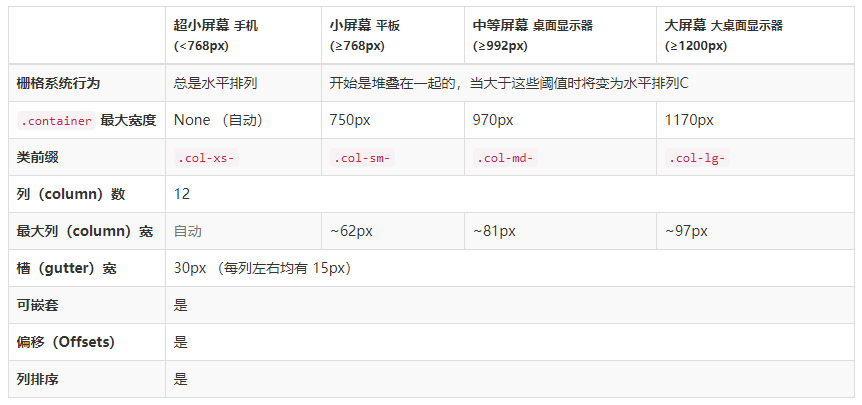
响应式栅格系统
栅格参数表(官网):
样式源码:
//小于768px默认为移动设备
@media (min- 768px) {
  .container {
     750px;
  }
}
@media (min- 992px) {
  .container {
     970px;
  }
}
@media (min- 1200px) {
  .container {
     1170px;
  }
}
响应式栅格系统的应用案例
<!DOCTYPE html>
<html lang="zh-CN">
<head>
    <meta charset="utf-8">
    <!--IE浏览器设置:以当前IE浏览器所支持的最高版本模式来渲染页面-->
    <meta http-equiv="X-UA-Compatible" content="IE=edge">
    <meta name="viewport" content="width=device-width, initial-scale=1">
    <!-- 上述3个meta标签*必须*放在最前面,任何其他内容都*必须*跟随其后! -->
    <title>网页支持多种屏幕显示</title>

    <!-- Bootstrap -->
    <link href="bootstrap/css/bootstrap.css" rel="stylesheet">
    <style type="text/css">
        .mydispace{
            margin-top: 20px;
        }
    </style>
</head>
<body>

<div class="container">
    <div class="row">
        <div class="col-lg-3 col-md-6 col-xs-12 mydispace"><img src="images/1.png"></div>
        <div class="col-lg-3 col-md-6 col-xs-12 mydispace"><img src="images/1.png"></div>
        <div class="col-lg-3 col-md-6 col-xs-12 mydispace"><img src="images/1.png"></div>
        <div class="col-lg-3 col-md-6 col-xs-12 mydispace"><img src="images/1.png"></div>
    </div>
</div>

<!-- jQuery (Bootstrap 的所有 JavaScript 插件都依赖 jQuery,所以必须放在前边) -->
<script src="script/jquery-1.12.4.js"></script>
<!-- 加载 Bootstrap 的所有 JavaScript 插件。你也可以根据需要只加载单个插件。 -->
<script src="bootstrap/js/bootstrap.js"></script>
</body>
</html>