一、特殊选择器
1、* 用于匹配任何的标记
2、> 用于指定父子节点关系
3、E + F 毗邻元素选择器,匹配所有紧随E元素之后的同级元素F
4、E ~ F 匹配所有E元素之后的同级元素F
5、名称[表达式]
5.1 E[att] 匹配所有具有att属性的E元素([att]获取所有的定义了att的标签;E[att=val] 匹配所有att属性等于“val”的E元素;
5.2 [att=val] 获取所有定义了att属性并且属性值等于val的标签;
5.3 [att^=val]获取所有定义了att属性并且属性值以val开头的标签;
5.4 [att$=val]获取所有定义了att属性并且属性值以val结尾的标签;
5.5 [att*=val]获取所有定义了att属性并且属性值包含val字符的标签;
5.6 [att~=val]获取所有定义了att属性并且属性值包含val单词的标签;
5.7 [att|=val]获取所有定义了att属性并且属性值等于val或者以val-开头的标签。)
6、伪类/伪元素
6.1 css 伪类用于向某些选择器添加特殊的效果。css 伪元素用于将特殊的效果添加到某些选择器。
可以明确两点,第一两者都与选择器相关,第二就是添加一些“特殊”的效果。这里特殊指的是两者描述了其他 css 无法描述的东西。
伪类种类伪元素种类区别
这里用伪类 :first-child 和伪元素 :first-letter 来进行比较。
p>i:first-child {color: red}

<p><i>first</i><i>second</i></p> //伪类 :first-child 添加样式到第一个子元素
如果我们不使用伪类,而希望达到上述效果,可以这样做:
.first-child {color: red}<p><i class="first-child">first</i><i>second</i></p>
即我们给第一个子元素添加一个类,然后定义这个类的样式。那么我们接着看看为元素:
:p:first-letter {color: red}<p>i am stephen lee.</p> //伪元素 :first-letter 添加样式到第一个字母
那么如果我们不使用伪元素,要达到上述效果,应该怎么做呢?
.first-letter {color: red}
<p><span class='first-letter'>i</span> am stephen lee.</p>
即我们给第一个字母添加一个 span,然后给 span 增加样式。
两者的区别已经出来了。那就是:
伪类的效果可以通过添加一个实际的类来达到,而伪元素的效果则需要通过添加一个实际的元素才能达到,这也是为什么他们一个称为伪类,一个称为伪元素的原因。
总结:
伪元素和伪类之所以这么容易混淆,是因为他们的效果类似而且写法相仿,但实际上 css3 为了区分两者,已经明确规定了伪类用一个冒号来表示,而伪元素则用两个冒号来表示。
:pseudo-classes::pseudo-elements但因为兼容性的问题,所以现在大部分还是统一的单冒号,但是抛开兼容性的问题,我们在书写时应该尽可能养成好习惯,区分两者。
简单的说呢:伪元素的权重比伪类高,比如一个容器的为元素和伪类都定义了同一属性,但值不一样,那么将采用伪元素的。 从规范的角度伪元素一个页面只使用一次,而伪类可以多次使用。伪元素产生新对象,在dom中看不到,但是可以操作;伪类是dom中一个元素的不同状态;
6.1 常用的伪类
6.1.1 a:hover,a:link,a:active,a:visited,:focus /*动态伪类*/
6.1.2 :disabled,:enabled,:checked,:read-only,:read-write /*UI状态伪类*/
6.1.2.1 :read-only 只读状态
6.1.2.2 :read-write 非只读状态
6.1.3 css3伪类
6.1.3.1 :nth-child(n)其父元素的第n个元素(如:p:nth-child(2){color:red;} p元素是其父元素的第2个元素的话字体颜色就是红色)
6.1.3.2 nth-last-child(n) 其父元素的倒数第n个元素
6.1.3.3 :nth-of-type(n) (如:p:nth-of-type(2){color:red;} p元素是其父元素的第2个p元素的话字体颜色就是红色)
6.1.3.4 :first-child 其父元素的第一个元素
6.1.3.5 :last-child 其父元素的最后一个元素
6.1.3.6 nth-last-of-type(n) (如:p:nth-last-of-type(2){color:red;} p元素是其父元素的倒数2个p元素的话字体颜色就是红色)
6.1.3.7 :first-of-type 其父元素的第一个p元素
6.1.3.8 :last-of-type 其父元素的最后一个p元素
6.1.4 :not() /*否定伪类选择器*/ (如:p:not(.a){color:red;})
6.2 常用的伪元素
6.2.1 :before,::after
<style type="text/css">
p::before
{
content:"台词:";
}
</style>
</head>
<body>
<p>我是唐老鸭。</p>
<p>我住在 Duckburg。</p>
<p><b>注释:</b>对于在 IE8 中工作的 :before,必须声明 DOCTYPE。</p>
</body>
6.2.2 ::first-letter
<style type="text/css">
p::first-letter
{
color:red;
}
</style>
</head>
<body>
<p>我是唐老鸭。</p>
<p>我住在 Duckburg。</p>
<p><b>注释:</b>对于在 IE8 中工作的 :before,必须声明 DOCTYPE。</p>
</body>
6.2.3 ::first-line
<style type="text/css">
p::first-line
{
color:red;
}
</style>
</head>
<body>
<p>我是唐老鸭。</p>
<p>我住在 Duckburg。</p>
<p><b>注释:</b>对于在 IE8 中工作的 :before,必须声明 DOCTYPE。注释:</b>对于在 IE8 中工作的 :before,必须声明 DOCTYPE。注释:</b>对于在 IE8 中工作的 :before,必须声明 DOCTYPE。注释:</b>对于在 IE8 中工作的 :before,必须声明 DOCTYPE。</p>
</body>
6.2.4 ::selection
<style type="text/css">
::selection
{
color:red;
background-color:#00F;
}
</style>
</head>
<body>
<p>我是唐老鸭。</p>
<p>我住在 Duckburg。</p>
<p><b>注释:</b>对于在 IE8 中工作的 :before,必须声明 DOCTYPE。注释:</b>对于在 IE8 中工作的 :before,必须声明 DOCTYPE。注释:</b>对于在 IE8 中工作的 :before,必须声明 DOCTYPE。注释:</b>对于在 IE8 中工作的 :before,必须声明 DOCTYPE。</p>
</body>
二、CSS权重
1、权重列表
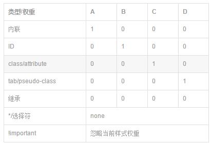
<style>
/*A>B>C>D>0*/
.main-content{color:#666;}/*0*/
h3{color:#f00;}/*D*/
.h3{color:#0f0;}/*C*/
.main-content h3{color:#00f;}/*CD*/
.main-content .h3{color:#0ff;}/*CC*/
#h3{color:#ff0;}/*B*/
</style>
</head>
<body>
<div class="main-content">
   <h3 class="h3" id="h3">你好</h3>
</div>
</body>
三、CSS3新增属性
1、定义文本样式
1.1 文字阴影text-shadow
<style>
p
{
    font-size:60px;
    font-weight:900;
    color:#999;
    text-shadow:5px 5px 5px #333,/*水平位移、垂直位移、模糊半径、颜色*/
    -15px 15px 5px #333,
    -15px -15px 5px #333;
}
</style>
</head>
<body>
<p>HTML5+CSS3</p>
</body>
1.2 文字缩进text-indent
1.3 文本换行
<style>
p
{
    width:100px;
    border:solid 1px red;
    word-wrap:break-word;/*断单词*/
    word-break:break-all;/*断字符*/
    white-space:nowrap;/*强制在一行内显示所有文本*/
}
</style>
</head>
<body>
 <p>中英混对萨排的时候English English English English English</p>
</body>
1.4 文本溢出
<style type="text/css">
div
{
    width:200px;
    white-space:nowrap;
    border:solid 1px red;
    text-overflow:clip;/*不显示省略标记,而是简单的裁切掉*/
    text-overflow:ellipsis;/*当对象内文本溢出时显示省略标记*/
    overflow:hidden;
}
</style>
</head>

<body>
<div>的撒打算打算打算大神大神大神大神大神</div>
</body>
1.5 圆角 border-radius
1.6 阴影 box-shadow
1.7 背景图片铺满 background-size:cover
1.8 transform
<style type="text/css">
#d1
{
    width:100px;
    height:100px;
    background-color:#00F;
}
#d1:hover
{
    transform:rotate(40deg) scale(1.2);/*顺时针旋转40度,放大1.2倍*/
    transform:translate(40px,40px);/*水平偏移40px,垂直偏移40px*/
    transform:skew(30deg,-10deg);/*水平倾斜30度,垂直倾斜10度*/
}
</style>
</head>

<body>
<div id="d1"></div>
</body>
1.9 平滑过渡 transition
<style type="text/css">
#d1
{
    width:100px;
    height:100px;
    background-color:#00F;
}
#d1:hover
{
    background-color:#F00;
    transition:background-color 1s ease-in;/*过渡的属性,如果是所有的则是all,经历的时间,过渡效果*/
}
</style>
</head>
<body>
<div id="d1"></div>
</body>
2.0 更复杂的动画 animation
<style type="text/css">
#d1
{
    magin:0px auto;
    width:959px;
    height:613px;
    background-image:url("11.jpg");
    animation:x-spin 20s infinite linear;/*动画名称,经历时间,播放次数(为infinite则一直播放),播放方式*/
}
@-webkit-keyframes x-spin
{
    0%{
        transform:rotateX(0deg);/*沿x轴开始旋转*/
    }
    50%{
        transform:rotateX(180deg);/*沿x轴旋转180*/
    }
    10%{
        transform:rotateX(360deg);/*沿x轴旋转360*/
    }
}
</style>
</head>
<body>
<div id="d1"></div>
</body>
<style type="text/css">
#d1
{
width:100px;
height:100px;
background:red;
position:relative;
animation:mymove 5s infinite;
}

@keyframes mymove
{
from {left:0px;}
to {left:200px;}
}
</style>
</head>
<body>
<div id="d1"></div>
</body>
2.1 渐变
<style type="text/css">
#d1
{
    height:200px;
    width:400px;
    border:solid 1px red;
    /*线性渐变,开始位置,结束位置,开始的颜色,结束的颜色,色标(色标位置,色标颜色,可以有多个色标,色标即是颜色过渡点)*/
    //background:-webkit-gradient(linear,left top,left bottom,from(blue),to(red),color-stop(0.4,#fff),color-stop(0.6,#fff));
    /*径向渐变,内圆圆心位置,内圆半径,外圆圆心半径,外圆半径,开始颜色,结束颜色,色标*/
    background:-webkit-gradient(radial, center center, 0, center center, 460, from(blue), to(red),color-stop(0.6,#fff));
}

</style>
</head>
<body>
<div id="d1"></div>
</body>
2.2 响应式布局
<style type="text/css">
/*屏幕宽度大于900的时候*/
*
{
    padding:0px;
    margin:0px;
    font-family:"微软雅黑";
}
#header
{
    height:100px;
    border:solid 1px red;
    margin:0px auto;
}
#main
{
    margin:10px auto;
    height:400px;
}
#footer
{
    margin:0px auto;
    height:100px;
    border:solid 1px red;
}
@media screen and (min-900px)
{
    #header,#footer
    {
        width:800px;
    }
    #main
    {
        width:800px;
        height:400px;;
    }
    #main-left
    {
        width:200px;
        height:400px;
        border:solid 1px red;
        float:left;
    }
    #main-center
    {
        width:394px;
        height:400px;
        border:solid 1px red;
        float:left;
    }
    #main-right
    {
        width:200px;
        height:400px;
        border:solid 1px red;
        float:left;
    }
}
@media screen and (min-600px) and (max-900px)
{
    #header,#footer
    {
        width:600px;
    }
    #main
    {
        width:600px;
        height:400px;;
    }
    #main-left
    {
        width:200px;
        height:400px;
        border:solid 1px red;
        float:left;
    }
    #main-center
    {
        width:396px;
        height:400px;
        border:solid 1px red;
        float:left;
    }
    #main-right
    {
        display:none;
    }
}
@media screen and (max-600px)
{
    #header,#footer
    {
        width:300px;
    }
    #main
    {
        width:300px;
        height:400px;;
    }
    #main-left
    {
        display:none;
    }
    #main-center
    {
        width:300px;
        height:400px;
        border:solid 1px red;
    }
    #main-right
    {
        display:none;
    }
}
</style>
</head>
<body>
<div id="header">头部</div>
<div id="main">
  <div id="main-left">主题-左边</div>
  <div id="main-center">主题-中间</div>
  <div id="main-right">主题-右边</div>
</div>
<div id="footer"></div>
</body>