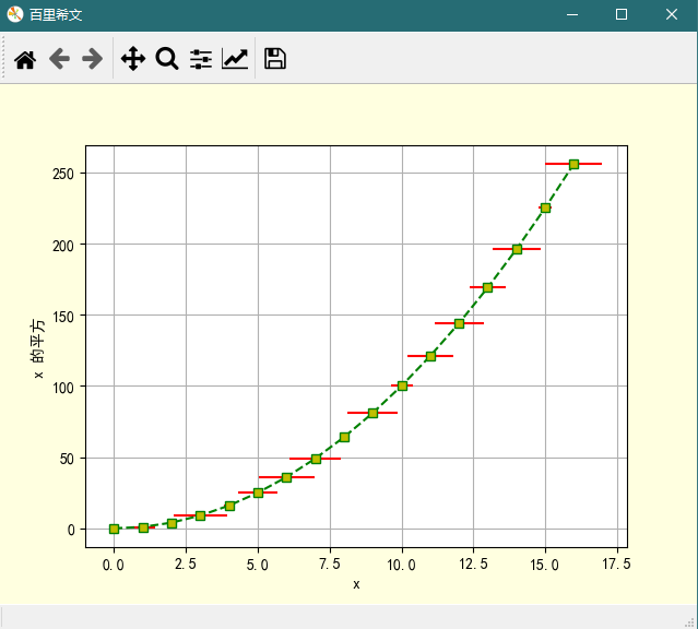
1、自变量的误差条
import numpy as np
import matplotlib.pyplot as plt

plt.rcParams['font.sans-serif'] = 'SimHei'   # 使图形中的中文正常编码显示
plt.rcParams['axes.unicode_minus'] = False   # 使坐标轴刻度表签正常显示正负号

# 定义数据
x = np.arange(17)
error = np.random.rand(17)
y = np.power(x, 2)

# 创建画布
plt.figure(num='百里希文'
           facecolor='lightyellow',
          )

# 绘制图形
plt.plot(x, y,
        'gs--',    # fmt, color marker linestyle
         mfc='y'   # marker facecolor
        )

plt.errorbar(x, y,
             xerr=error,
             ecolor='r'
            )

# 增加图形元素
plt.xlabel(xlabel='x')
plt.ylabel(ylabel='x 的平方')
plt.grid(axis='both')

plt.show()
图形
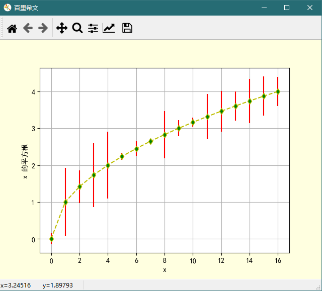
2、因变量的误差条
import numpy as np
import matplotlib.pyplot as plt

# 使图形中的中文正常编码显示
plt.rcParams['font.sans-serif'] = 'SimHei'
# 使坐标轴刻度表签正常显示正负号
plt.rcParams['axes.unicode_minus'] = False


# 定义数据
x = np.arange(17)
error = np.random.rand(17)
y = np.sqrt(x)

# 创建画布
plt.figure(num='百里希文',
           facecolor='lightyellow')

# 绘制图形
plt.plot(x, y,
         'yd--',
         mfc='g'
        )
plt.errorbar(x, y,
             yerr=error,
             ecolor='r'
            )

# 增加图形元素
plt.xlabel(xlabel='x')
plt.ylabel(ylabel='x 的平方根')
plt.grid(axis='both')

# 显示图形
plt.show()
图形
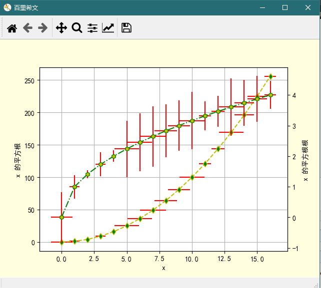
3 、x 和 y 各自的误差条
import numpy as np
import pandas as pd
import matplotlib.pyplot as plt

# 使图形中的中文正常编码显示
plt.rcParams['font.sans-serif'] = 'SimHei'
 # 使坐标轴刻度表签正常显示正负号
plt.rcParams['axes.unicode_minus'] = False


# 定义数据
x = np.arange(17)
error = np.random.rand(17)
y1 =np.power(x, 2)
y2 = np.sqrt(x)

# 创建画布
plt.figure(num='百里希文',
           facecolor='lightyellow'
          )


# 在第一个坐标系绘制图形
ax = plt.gca()
ax.plot(x, y1,
        'yd--',   # fmt
        mfc='g'   # marker facecolor, green
       )

ax.errorbar(x, y1,
            yerr=error,
            xerr=error,
            ecolor='r',
            marker='d'   # diamond 菱形
           )

ax.grid(axis='both',
        ls=':',   # linestyle 虚线
        c='gray',    # color
        alpha=0.7
       )

ax.set(xlabel='x',
       ylabel='x 的平方根',
      )

# 添加第二个 y 轴, 在第二坐标系绘图
ax2 = ax.twinx()
ax2.plot(x, y2,
         'gh-.',   # fmt
         mfc='y'   # marker facecolor, yellow
        )

ax2.errorbar(x, y2,
             yerr=error,
             xerr=error,
             ecolor='r'
            )
ax2.set_ylabel(ylabel='x 的平方根根')

# 显示图形
plt.show()
图形
。。。。