1、加载库
import numpy as np
import matplotlib as mpl
import matplotlib.pyplot as plt
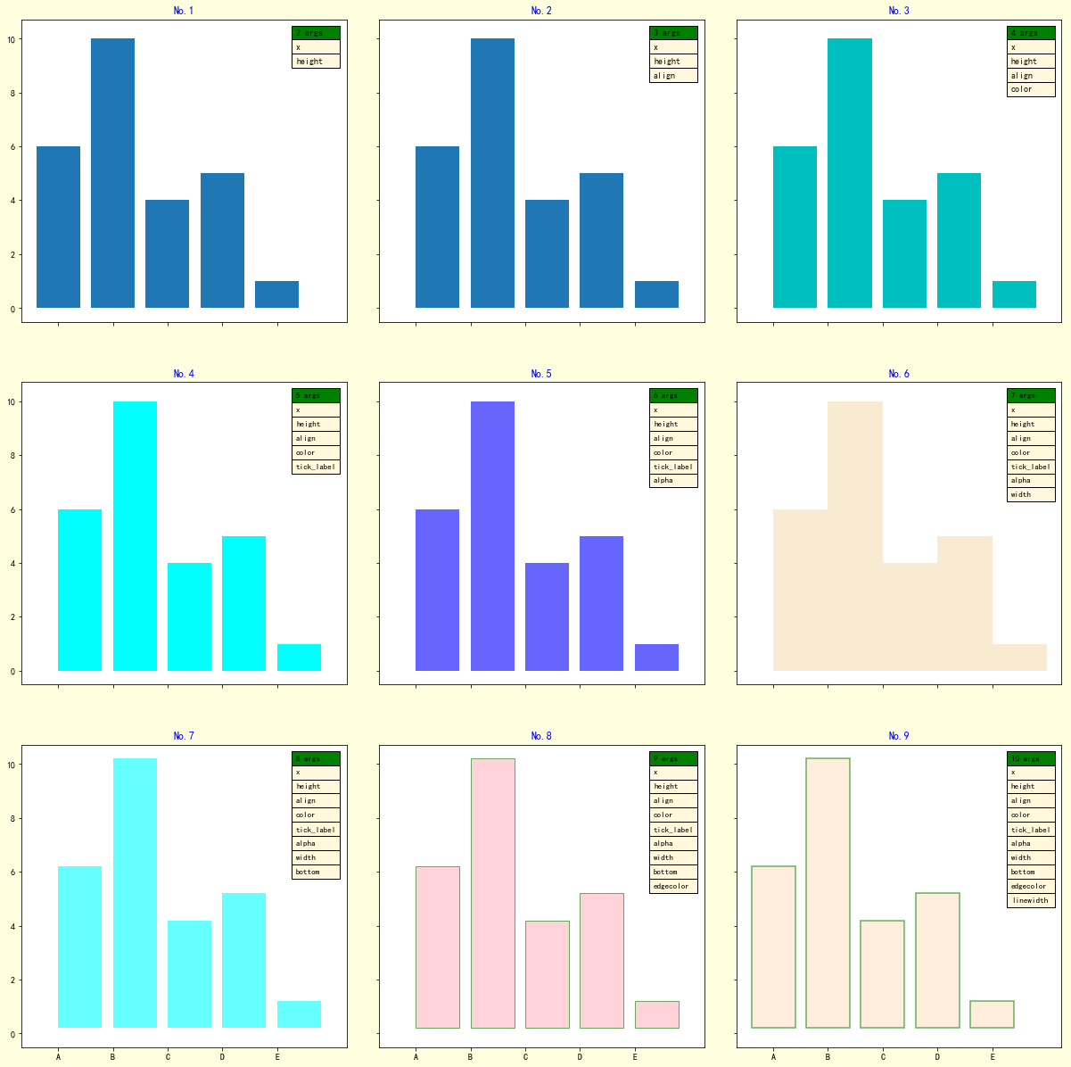
2 绘图,逐步设置 bar() 参数
def title_table(ax):
    '''为图表添加标题和表格'''
    ax.set_title(label=f'No.{i+1}',
                loc='center',
                pad=None,
                fontdict={'color': 'b'}
                 )
    ax.table(loc='upper right',    # 表格在图表区的位置

          colLabels=[f'{i+2} args'],    # 表格每列的列名称
          colColours=['g'],    # 表格每列列名称所在单元格的填充颜色
          colLoc='left',    # 表格中每列列名称的对齐位置
          colWidths=[0.15],    # 表格每列的宽度
          cellText=args,    # 表格中的数值, 每行数据的列表的列表
          cellColours=[['cornsilk']]*len(args),    # 表格中数据所在单元格的填充颜色
          cellLoc='left',    # 表格中数据的对齐位置
          fontsize=8)

# 配置字体,显示中文
mpl.rcParams['font.sans-serif'] = ['SimHei']
# 配置坐标轴刻度值模式,显示负号
mpl.rcParams['axes.unicode_minus'] = True

# 定义数据
x = [1, 2, 3, 4, 5]
y = [6, 10, 4, 5, 1]
labels = list('ABCDE')

fig, axes = plt.subplots(nrows=3,
                         ncols=3,
                         sharex=True,
                         sharey=True,
                         figsize=(18, 20),
                         facecolor='cornsilk')

axes = axes.ravel()

i = 0
ax = axes[i]

# 绘制柱状图
ax.bar(x=x,    # 柱体在 x 轴上的坐标位置
        height=y,    # 柱体的高度
       )
args = [[e] for e in ['x', 'height']]

# 向图表子区添加标题和数据表
title_table(ax)


i = 1
ax = axes[i]

# 绘制柱状图
ax.bar(x=x,    # 柱体在 x 轴上的坐标位置
        height=y,    # 柱体的高度
        align='edge',    #  x 轴上的坐标与柱体对其的位置
       )

args = [[e] for e in ['x', 'height', 'align']]
# 向图表子区添加标题和数据表
title_table(ax)

i = 2
ax = axes[i]

# 绘制柱状图
ax.bar(x=x,    # 柱体在 x 轴上的坐标位置
        height=y,    # 柱体的高度
        align='edge',    #  x 轴上的坐标与柱体对其的位置
        color='c',    # 柱体的填充颜色
        )

args = [[e] for e in ['x', 'height', 'align', 'color']]
# 向图表子区添加标题和数据表
title_table(ax)

i = 3
ax = axes[i]

# 绘制柱状图
ax.bar(x=x,    # 柱体在 x 轴上的坐标位置
        height=y,    # 柱体的高度
        align='edge',    #  x 轴上的坐标与柱体对齐的位置
        color='cyan',    # 柱体的填充颜色
        tick_label=labels,    # 每个柱体的标签名称
        )

args = [[e] for e in ['x', 'height', 'align', 'color', 'tick_label']]
# 向图表子区添加标题和数据表
title_table(ax)


i = 4
ax = axes[i]

# 绘制柱状图
ax.bar(x=x,    # 柱体在 x 轴上的坐标位置
        height=y,    # 柱体的高度
        align='edge',    #  x 轴上的坐标与柱体对其的位置
        color='blue',    # 柱体的填充颜色
        tick_label=labels,    # 每个柱体的标签名称
        alpha=0.6    # 柱体填充颜色的透明度
        )

args = [[e] for e in ['x', 'height', 'align', 'color', 'tick_label', 'alpha']]
# 向图表子区添加标题和数据表
title_table(ax)

i = 5
ax = axes[i]

# 绘制柱状图
ax.bar(x=x,    # 柱体在 x 轴上的坐标位置
        height=y,    # 柱体的高度
        align='edge',    #  x 轴上的坐标与柱体对其的位置
        color='wheat',    # 柱体的填充颜色
        tick_label=labels,    # 每个柱体的标签名称
        alpha=0.6,    # 柱体填充颜色的透明度
        width=1,  # 柱体的宽度
        )

args = [[e] for e in ['x', 'height', 'align', 'color', 'tick_label', 'alpha', 'width']]
# 向图表子区添加标题和数据表
title_table(ax)


i = 6
ax = axes[i]

# 绘制柱状图
ax.bar(x=x,    # 柱体在 x 轴上的坐标位置
        height=y,    # 柱体的高度
        align='edge',    #  x 轴上的坐标与柱体对其的位置
        color='aqua',    # 柱体的填充颜色
        tick_label=labels,    # 每个柱体的标签名称
        alpha=0.6,    # 柱体填充颜色的透明度
        width=0.8,    # 柱体的宽度
        bottom=0.2,     # 柱体基线的 y 轴坐标
        )

args = [[e] for e in ['x', 'height', 'align', 'color', 'tick_label', 'alpha', 'width',
                      'bottom']]
# 向图表子区添加标题和数据表
title_table(ax)
i = 7
ax = axes[i]

# 绘制柱状图
ax.bar(x=x,    # 柱体在 x 轴上的坐标位置
        height=y,    # 柱体的高度
        align='edge',    #  x 轴上的坐标与柱体对其的位置
        color='lightpink',    # 柱体的填充颜色
        tick_label=labels,    # 每个柱体的标签名称
        alpha=0.6,    # 柱体填充颜色的透明度
        width=0.8,    # 柱体的宽度
        bottom=0.2,    # 柱体基线的 y 轴坐标
        edgecolor='g'   # 柱体的边框颜色
        )

args = [[e] for e in ['x', 'height', 'align', 'color', 'tick_label', 'alpha', 'width',
                      'bottom', 'edgecolor']]
# 向图表子区添加标题和数据表
title_table(ax)

i = 8
ax = axes[i]

# 绘制柱状图
ax.bar(x=x,    # 柱体在 x 轴上的坐标位置
        height=y,    # 柱体的高度
        align='center',    #  x 轴上的坐标与柱体对其的位置
        color='bisque',    # 柱体的填充颜色
        tick_label=labels,    # 每个柱体的标签名称
        alpha=0.6,    # 柱体填充颜色的透明度
        width=0.8,    # 柱体的宽度
        bottom=0.2,    # 柱体基线的 y 轴坐标
        edgecolor='g',   # 柱体的边框颜色
        linewidth=1.5,   # 柱体边框线的宽度
        )

args = [[e] for e in ['x', 'height', 'align', 'color', 'tick_label', 'alpha', 'width',
                      'bottom', 'edgecolor', 'linewidth']]
# 向图表子区添加标题和数据表
title_table(ax)

# 设置整个子区的布局
fig.subplots_adjust(left=0,
                    bottom=0,
                    right=0.9,
                    top=1,
                    wspace=0.1,    # 子区间空白区域的宽度的归一化值
                    hspace=0.2);    # 子区间空白区域的高度的归一化值
图表