搜索用户留存曲线,偶然在知乎上发现了比较好看的图,原地址
图1:留存并不好
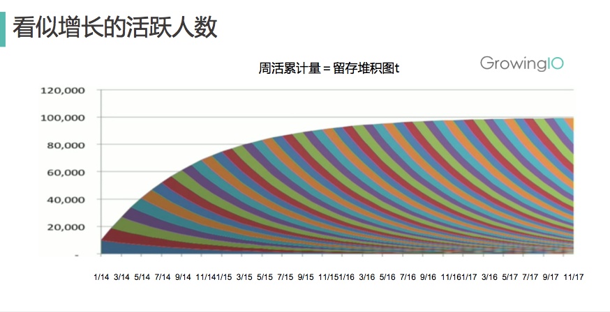
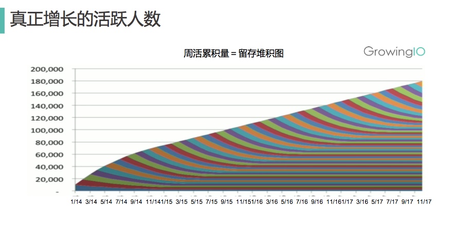
图2:正常的留存图
我利用公司数据自己做出来的图,当然还可以在其基础上进行优化:
其中 newData2为:
start_time month count
1 O_2017_06 1 612
2 O_2017_06 2 167
3 N_2017_07 2 1473
4 O_2017_06 3 115
5 N_2017_07 3 592
6 M_2017_08 3 3027
7 O_2017_06 4 80
8 N_2017_07 4 218
9 M_2017_08 4 542
10 L_2017_09 4 1083
newData3为:
newData3 <- newData2 %>% group_by(month) %>% summarise(sum = sum(count))
A tibble: 10 x 2
month sum
1 1 612
2 2 1640
3 3 3734
4 4 1923
5 5 3051
6 6 4676
7 7 5447
8 8 3256
9 9 2959
10 10 7882
library(ggplot2)

datex <- c("2017-06", "2017-07", "2017-08", "2017-09", "2017-10", "2017-11", "2017-12", "2018-01", "2018-02", "2018-03", "2018-04", "2018-05", "2018-06", "2018-07", "2018-08")

ggplot(newData2, aes(x=month, y=count)) +
  geom_area(aes(fill=start_time)) +
  geom_point(colour="grey80", position="stack") +
  geom_line(aes(group=start_time), colour="white", position="stack") +
  geom_line(aes(x=month, y=sum), newData3, size=1.5, colour="red") +
  geom_text(aes(x=month, y=sum, label=sum), newData3, nudge_y=400) +
  scale_x_continuous(breaks=1:15, labels=datex) +
  scale_y_continuous(breaks=seq(0, 10000, 1000), labels=seq(0, 10000, 1000))
  # scale_colour_brewer(palette="Set3")
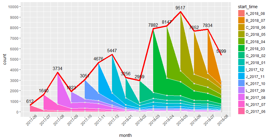
红色的粗线是指每个月有订单的总用户数变化曲线,每种颜色的面积代表着对应用户的留存数量趋势。x轴必须为连续型变量。