I always thought it was odd that WPF has both TextBlock and Label. They both are responsible for displaying a small amount of text. Every piece of documentation about Label I have read justifies its existence by mentioning that it allows for access keys. Access keys allow you to hit Alt + SomeKey to quickly interact with a control in the UI, such as hitting Alt + O to click an “OK” button. My thought has been, “Why not just add support for access keys to TextBlock and get rid of Label?”
Recently I discovered some reasons why it makes sense for Label to exist.

The “Username:” text is a TextBlock and the “Password:” text is a Label.
TextBlock is not a control
Even though TextBlock lives in the System.Windows.Controls namespace, it is not a control. It derives directly from FrameworkElement. Label is control, on the other hand, derives from ContentControl. This means that Label can:
- Be given a custom control template (via the Template property).
- Display data other than just a string (via the Content property).
- Apply a DataTemplate to its content (via the ContentTemplate property).
- Do whatever else a ContentControl can do that a FrameworkElement cannot.
Below is a fragment of the class inheritance hierarchy containing Label and TextBlock:

Label text is grayed out when disabled
When a Label’s IsEnabled property returns false its text is “grayed out.” TextBlock does not have this behavior by default. Here is what the demo app looks like when the input area is disabled. Keep in mind that the “Username:” text is a TextBlock and the “Password:” text is a Label:

The reason Label text turns gray when it is disabled is due to the fact that Label’s default control template has a Trigger which explicitly sets the Foreground property when IsEnabled is false. Here is that Trigger from Label’s default control template:

If we really wanted TextBlocks to appear grayed out when disabled, we could repurpose that XAML seen above into a Style which is applied to TextBlocks (as seen in the demo project available at the end of this post).
Label supports access keys
This is the standard explanation of why Label exists. You can associate a Label with another control, such as a PasswordBox, and allow the user to type an access key defined by the Label to set focus to the other control. The access key is represented in the UI by drawing a line under the appropriate character. If the user presses the Alt key and then the designated “access character” the target control will be given focus.
Here is what the demo application looks like after the user presses the Alt key:

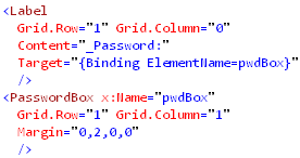
Notice how every piece of text in the UI has an access key indicator, except for the “Username” TextBlock. The “Password” Label and its target (a PasswordBox) were declared like this:
Label is much heavier than TextBlock
So far we have examined why Label can be considered better than TextBlock, but now its time to discuss the benefits of using a TextBlock instead. Label has a higher runtime overhead than TextBlock. Not only does Label inherit from two classes further down the inheritance hierarchy than TextBlock, but its visual tree is much more involved.
I snooped the visual tree of the demo app to see what was really going on when you create a Label with an access key defined. Below is a screenshot of Snoop displaying the visual trees of both the “Username” TextBlock and the “Password” Label (with an access key defined):

The “Username” TextBlock’s visual tree contains no child elements. The Label, however, is much more involved. It has a Border, which contains a ContentPresenter, which hosts an AccessText element, which finally uses a TextBlock to display the text. So it turns out that using a Label is really just an elaborate and customizable way of using a TextBlock.
Links
ContentPresenter.RecognizesAccessKey Property
How to: Create a Control That Has an Access Key and Text Wrapping
Download the demo
Download the demo project here: Label vs TextBlock (demo project) Be sure to change the file extension from .DOC to .ZIP and then decompress it.