绘图表达进阶操作
① 轴线设置
② 浮动设置
③ 多图表设置
1. 轴线标签设置
设置字符串
import numpy as np
import pandas as pd
import matplotlib.pyplot as plt
% matplotlib inline

import warnings
warnings.filterwarnings('ignore')
# 不发出警告

from bokeh.io import output_notebook
output_notebook()
# 导入notebook绘图模块

from bokeh.plotting import figure,show
from bokeh.models import ColumnDataSource
# 导入图表绘制、图标展示模块
# 导入ColumnDataSource模块

figure(x_range=name, y_range=(60,100), plot_height=350, title="考试成绩",tools="")
p.circle(x = 'name', y = 'score', source = source,
         size = 20, line_color = 'black', line_dash = [6,4],
         fill_color = 'red',fill_alpha = 0.8)
# 1、轴线标签设置
# 设置字符串

df = pd.DataFrame({'score':[98,86,74,67,87]},index = ['小明','小王','小张','小红','小红帽'])
df.index.name = 'name'
print(df)
# 创建数据

source = ColumnDataSource(df)
# 讲数据转化为ColumnDataSource对象

name = df.index.tolist()   # 提取name
print(name)
p = figure(x_range=name, y_range=(60,100), plot_height=350, title="考试成绩",tools="")
# 通过x_range设置横轴标签,这里提取成list

p.circle(x = 'name', y = 'score', source = source,
         size = 20, line_color = 'black', line_dash = [6,4],
         fill_color = 'red',fill_alpha = 0.8)

show(p)
--->>>
      score
name
小明       98
小王       86
小张       74
小红       67
小红帽      87
['小明', '小王', '小张', '小红', '小红帽']

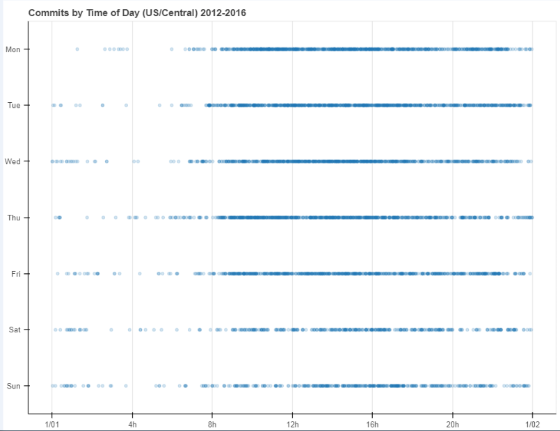
设置时间序列
# 1、轴线标签设置  时间序列设置
# Dataframe DatetimeIndex + x_axis_type

from bokeh.sampledata.commits import data
print(data.head())
print(type(data.index))#datetime是个时间序列
# 导入数据,查看数据
# 这里index为时间序列

DAYS = ['Sun', 'Sat', 'Fri', 'Thu', 'Wed', 'Tue', 'Mon']
source = ColumnDataSource(data)
# 转化为ColumnDataSource对象

p = figure(plot_width=800, plot_height=600,
           y_range=DAYS,                     # 设置图表的y轴刻度分类
           x_axis_type='datetime',           # 设置x轴类型 → 时间序列
           title="Commits by Time of Day (US/Central) 2012-2016")

p.circle(x='time', y='day',  source=source, alpha=0.2) #如果把x='datetime',放大会显示时间每个年月时刻/
# 生成散点图

p.ygrid.grid_line_color = None
# 设置其他参数

show(p)

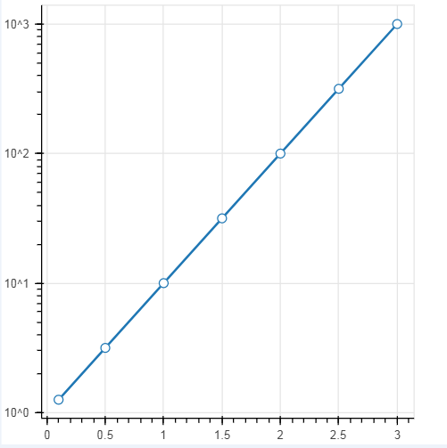
设置对数坐标轴
# 1、轴线标签设置
# 设置对数坐标轴

x = [0.1, 0.5, 1.0, 1.5, 2.0, 2.5, 3.0]
y = [10**xx for xx in x]
# 创建数据

p = figure(plot_width=400, plot_height=400,
           y_axis_type="log")    #如果不设置y_axis_type = "log"就是一个对数的展示;
# y_axis_type="log" → 对数坐标轴

p.line(x, y, line_width=2)
p.circle(x, y, fill_color="white", size=8)

show(p)
2. 浮动设置
# 2、浮动设置(多了个在上下空间的浮动)
# Jitter
# 参考文档:https://bokeh.pydata.org/en/latest/docs/reference/transform.html

from bokeh.transform import jitter

DAYS = ['Sun', 'Sat', 'Fri', 'Thu', 'Wed', 'Tue', 'Mon']
source = ColumnDataSource(data)
# 转化为ColumnDataSource对象

p = figure(plot_width=800, plot_height=600,
           y_range=DAYS,                     # 设置图表的y轴刻度分类
           x_axis_type='datetime',           # 设置x轴类型 → 时间序列
           title="Commits by Time of Day (US/Central) 2012-2016",
          tools = 'hover') #会对每个点进行识别

p.circle(x='time',
         y=jitter('day', width=0.6, range=p.y_range),
         source=source, alpha=0.3)
# jitter参数 → 'day':第一参数,这里指y的值,width:间隔宽度比例,range:分类范围对象,这里和y轴的分类一致

p.ygrid.grid_line_color = None
# 设置其他参数

show(p)

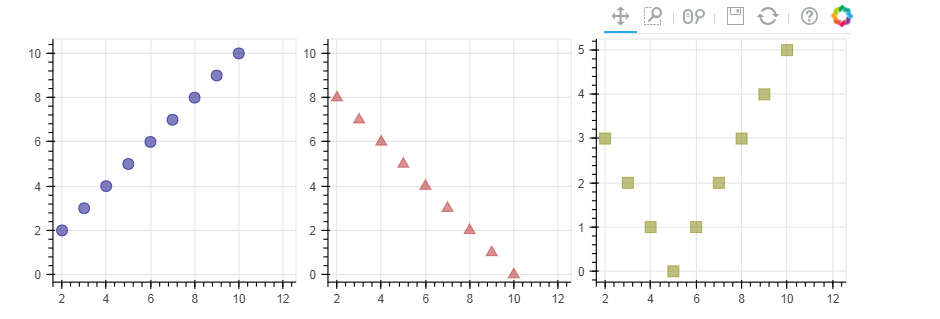
3. 多图表设置
# 3、多图表设置(通过范围做的一个共享数据)
# gridplot

from bokeh.layouts import gridplot
# 导入gridplot模块

x = list(range(11))
y0 = x
y1 = [10-xx for xx in x]
y2 = [abs(xx-5) for xx in x]
# 创建数据  #当这些数据用的是一组数据的时候就会形成联动,主要就是设置x_range=s1.x_range, y_range=s1.y_range,如果把s2 s3里里边去掉就不是用的一个数据了就不会产生联动

s1 = figure(plot_width=250, plot_height=250, title=None) #这个类似就是子图,在x_range和y_range上做一个共享
s1.circle(x, y0, size=10, color="navy", alpha=0.5)
# 散点图1

s2 = figure(plot_width=250, plot_height=250, x_range=s1.x_range, y_range=s1.y_range, title=None) #如果设置了tools='box_select'以放大筛选时不会有联动,但在移动时候会有联动
s2.triangle(x, y1, size=10, color="firebrick", alpha=0.5)
# 散点图2,设置和散点图1一样的x_range/y_range → 图表联动

s3 = figure(plot_width=250, plot_height=250, x_range=s1.x_range, title=None)
s3.square(x, y2, size=10, color="olive", alpha=0.5)
# 散点图3,设置和散点图1一样的x_range/y_range → 图表联动

p = gridplot([[s1, s2, s3]])  #把这3个图全部集合,做一个联动;
#p = gridplot([[s1, s2], [None, s3]])
# 组合图表

show(p) #show(s1)  show(s2)  show(s3) 这样就不会产生联动了,去掉p = gridplot那个
# 3、多图表设置(共享一个数据)
# gridplot

x = list(range(-20, 21))
y0 = [abs(xx) for xx in x]
y1 = [xx**2 for xx in x]
source = ColumnDataSource(data=dict(x=x, y0=y0, y1=y1)) #把数据转换成ColumnDataSource,共享数据,同一个数据源
# 创建数据

TOOLS = "box_select,lasso_select,help"

left = figure(tools=TOOLS, plot_width=300, plot_height=300, title=None)
left.circle('x', 'y0', source=source)    # 散点图1 left和right设置了同一个source

right = figure( plot_width=300, plot_height=300, title=None) #如果把tools=TOOLS去掉, 就是没有共享范围,在筛选放大时就不会有联动了;但由于用的是同一个数据,在移动时还说有联动
right.circle('x', 'y1', source=source)   # 散点图2
# 共用一个ColumnDataSource

p = gridplot([[left, right]])
# 组合图表

show(p)
