前言
相信在平时写CSS的时候大家都或多或少遇见过设置了height为百分比的时候发现不起作用。今天我们就来一探究竟
原因:父元素未设置具体高度,子元素设置height:100%是无效的。
现象以及方案
[1] 设置高度为100%时,无法实现全屏
<!DOCTYPE html>
<html lang="en">
<head>
    <meta charset="UTF-8">
    <style>
        .case-box{
            height: 100%;
            background:red;
        }
    </style>
</head>
<body>
<div class="case-box"></div>
</body>
</html>
这样写,你会发现一点效果都没有。
【解决方案】
增加如下代码:
html,body{
    height: 100%;
}
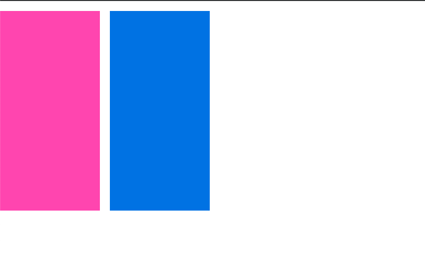
[2] 一个父元素中包含2个子元素,其中一个子元素非常高,撑开了父元素,另外1个子元素设置高度为100%失效。
<style>
    .case-box{
        overflow: hidden;
    }
    .height-max{
         200px;
        height:400px;
        background: #167be0;
        float:left;
    }
    .height-percent{
        margin-right:20px;
        background: hotpink;
         200px;
        height: 100%;
        padding:20px;
        float:left;
    }
</style>
<div class="case-box clearfix" data-case="f2">
    <div class="height-percent"></div>
    <div class="height-max"></div>
</div>

height-max 设置了高度是400px撑开了父级使得父级case-box高度也是400px,height-percent设置了高度为100%,本来我们期望会跟父级的高速一样都是400px,可是它还是没有高度(背景色是padding撑起来的)。
平时的布局经常可以碰到这样的情况,需要根据一个块的高度进行高度自适应布局,但是好像单纯的设置高度为100%是无法实现的。
【方案一】
父元素case-box设置一个定高(视乎这样压根就满足不了我们的需求)
【方案二】
使用position
<style>
    .case-box{
        overflow: hidden;
        position: relative;
    }
    .height-max{
         200px;
        height:400px;
        background: #167be0;
        float:left;
        margin-left: 220px;
    }
    .height-percent{
        margin-right:20px;
        background: hotpink;
         200px;
        height: 100%;
        padding:20px;
        float:left;
        position: absolute;
    }
</style>
[缺点]这样使用会破坏原本的布局顺序
【方案三】
使用flex
<style>
    .case-box{
        position: relative;
        display: flex;
    }
    .height-max{
         200px;
        height:400px;
        background: #167be0;
    }
    .height-percent{
        margin-right:20px;
        background: hotpink;
         200px;
        padding:20px;
    }
</style>

不可否认flex布局还是非常方便的
[缺点]兼容性稍差
【方案四】
display: table
<style>
    .case-box{
        position: relative;
        display: table;
    }
    .height-max{
         200px;
        height:400px;
        background: #167be0;
    }
    .height-percent{
        background: hotpink;
         200px;
        display: table-cell;
    }
</style>

[缺点]margin失效
【最佳方案】
padding-bottom:3000px;margin-bottom:-3000px;
<style>
    .case-box{
        overflow: hidden;
        zoom:1;
    }
    .height-max{
         200px;
        height:400px;
        background: #167be0;
        margin-left: 220px;
    }
    // 需要自使用的块设置好padding和margin
    .height-percent{
        background: hotpink;
         200px;
        float:left;
        padding-bottom: 3000px;
        margin-bottom: -3000px;
    }
</style>
3000像素是个可变值,如果您的分栏高度不可能高度超过2000像素,您就可以设为2000像素,如果会超过3000像素,那么您要修改值为4000像素或是更高。
父标签的overflow:hidden属性是必须的,否则会显示溢出的内容

小结
通过本文学习了
为什么height设置百分比无效(因为父元素没有设置固定高度的原因)
以及如何实现高度自适用的布局方法