前一阵遇到过一个需求,要求在App中点击某个按钮会弹出一个对话框(即模态框Modal)。第一件事自然是看看公司内部的组件库有没有已经实现的功能,结果这一看把我看得云里雾里的,这是神马?这又是神马?算了,还是自己写(抄)一个吧。
在网上翻找了许久,始终没有特别满意的实现,直到我找到了这篇:
https://blog.bitsrc.io/build-a-full-featured-modal-dialog-form-with-react-651dcef6c571
实现很简洁,却又非常好用。稍加改动,啊,真香~
这个模态框一共由3部分组成:

其中ModalContent负责实现模态框内部的内容,你现在框里显示信息也好,表单也好,加几个按钮,都在这里体现;
TriggerButton则负责在父页面上实现一个按钮,用来触发模态框的弹出,点了它就会弹出模态框;
ModalContainer就是个容器,负责将ModalContent和TriggerButton融合起来,以及模态框显示/隐藏的一些逻辑。
1、ModalContent
import React from 'react';
import ReactDOM from 'react-dom';
import FocusTrap from 'focus-trap-react';
import styled from 'styled-components';

export default function ModalContent(props) {
    const {
        modalRef,
        buttonRef,
        onKeyDown,
        closeModal,
        zindex
    } = props;

    return ReactDOM.createPortal(
        <FocusTrap>
            <aside
                tag="aside"
                role="dialog"
                tabIndex="-1"
                aria-modal="true"
                onKeyDown={onKeyDown}>
                <StyledOverlay zindex={zindex}/>
                <StyledWrapper zindex={zindex}>
                    <StyledModal ref={modalRef}>
                        <div>
                            { props.children }
                            <button
                                ref={buttonRef}
                                aria-label="Close Modal"
                                aria-labelledby="close-modal"
                                onClick={closeModal}>退下吧</button>
                        </div>
                    </StyledModal>
                </StyledWrapper>
            </aside>
        </FocusTrap>, document.body
    );
};

const StyledOverlay = styled.div`
    position: fixed;
    top: 0;
    left: 0;
    z-index: ${props => props.zindex + 1000};
     100vw;
    height: 100vh;
    background-color: #000;
    opacity: 0.5;
` //用于Modal弹出后遮蔽其他原内容

const StyledWrapper = styled.div`
    position: fixed;
    top: 0;
    left: 0;
    z-index: ${props => props.zindex + 1010};
     100%;
    height: 100%;
    overflow-x: hidden;
    overflow-y: auto;
    outline: 0;
`

const StyledModal = styled.div`
    z-index: 100;
    background: white;
    position: relative;
    top: 80px;
    margin: 1.75rem auto;
    border-radius: 3px;
    max- 1000px;
    padding: 2rem;
`
看上去还挺复杂的,其实真正模态框里的内容只有<div>和</div>之间的部分,其他的部分可以看做是框体和框外的实现。
其中createPortal负责创建模态框。FocusTrap负责把Tab限制在框内部的元素上,在FocusTrap存在的情况下,你随便怎么按Tab键,高亮都只会在模态框内部的元素间跳来跳去。如果没有FocusTrap的话,可能你按几下Tab,高亮就跳到模态框背后的内容上了。
此外,StyledOverlay负责一个遮罩效果,遮住模态框背后的内容,它的z-index一定要高于父页面;
StyledWrapper类似于一个模态框的外部容器,它的z-index一定要高于StyledOverlay;
StyledModal则是负责模态框的本体长什么样。
<div>和</div>之间的内容包含了两部分,一部分是{ props.children },这样一来我们可以接受任意子组件作为模态框中的内容,更加灵活。另一部分是个button,用来关闭模态框。
另外,这里用styled-components来替代了css,而且props中的属性可以传入其中,我们用这一方法来控制z-index,从而方便我们之后“框中框”中的使用。
2、TriggerButton
import React from 'react';

export default function TriggerButton(props) {
    const {
        triggerText,
        buttonRef,
        showModal
    } = props

    return (
        <button
            ref={buttonRef}
            onClick={showModal}>{ triggerText }</button>
    );
};
这里的内容很简单,主要就是点击时调用父组件的showModal函数从而打开模态框。
3、ModalContainer
这一部分是相对而言最复杂的(试图转成函数式组件,但貌似没法使用ref,放弃……):
import React, { Component } from 'react';
import ModalContent from "./ModalContent";
import TriggerButton from "./TriggerButton";

export default class ModalContainer extends Component {
    state = {isShown: false};

    showModal = () => {
        this.setState({isShown: true});
        this.toggleScrollLock();
    };

    closeModal = () => {
        this.setState({isShown: false});
        this.toggleScrollLock();
    };

    onKeyDown = (event) => {
        if (event.keyCode === 27) {
            this.closeModal();
        }; //按下ESC
    };

    toggleScrollLock = () => {
        document.querySelector("html").classList.toggle("scroll-lock");
    };

    render () {
        return (
            <React.Fragment>
                <TriggerButton
                    showModal={this.showModal}
                    buttonRef={(n) => {this.TriggerButton=n}}
                    triggerText={this.props.buttonText}/>
                {this.state.isShown ?
                <ModalContent
                    title={this.props.title}
                    modalRef={(n) => {this.modal=n}}
                    buttonRef={(n) => {this.closeButton=n}}
                    closeModal={this.closeModal}
                    onKeyDonw={this.onKeyDown}
                    zindex={this.props.zindex || 0}
                    children={this.props.children}/> :
                null}
            </React.Fragment>
        );
    }
};
isShown负责记录模态框处于显示还是隐藏的状态;
showModal和closeModal分别负责打开和关闭模态框;
onKeyDown负责在按下esc的时候关闭模态框;
toggleScrollLock用于锁定/解锁滚动(作用我没明白……试过去掉,好像没什么影响)。
最后的部分就是一个TriggerButton和一个条件渲染的ModalContent,isShown为true的情况下显示ModalContent,否则隐藏之,从而实现打开/关闭模态框的效果。
ModalContent的zindex在未指定的情况下为0,对应正常的模态框,如果我们传入一个值,还可以实现“框中框的效果”。
4、齐活了
现在我们来试试不同的模态框组合效果,把容器组件加入App中即可:
第1个框(张龙)没有任何子组件,因此只有一个关闭按钮:

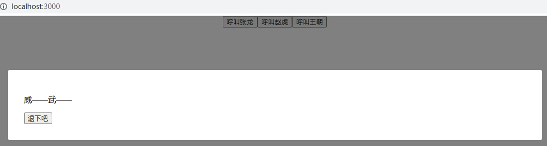
第2个框(赵虎)有一个子组件,因此框中会显示该子组件以及关闭按钮:
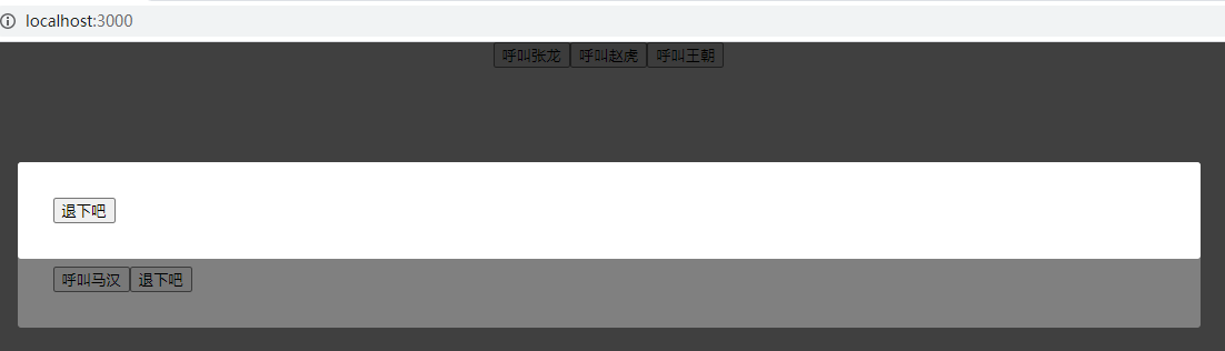
第3个框(王朝)包含了一个标题组件以及另一个模态框作为子组件,此处我们设置了zindex,以便后来的模态框覆盖先前的模态框:
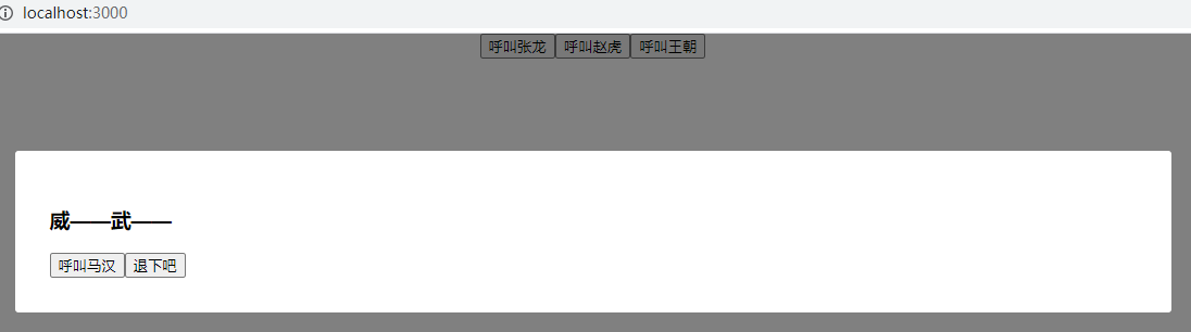
点击“呼叫马汉”,新的模态框会弹出:
此即最近对模态框的一些体会。
代码见: