折线图
下面是绘制折线图,设置图片的横轴纵轴标签,图片标题的API的用法。
import matplotlib.pyplot as pyplot


# init
pyplot.figure()

# arguments
x_label = 'X-label'
y_label = 'Y-label'
title = 'Demo-title'

# points data
x = [1, 2, 3, 4]
y = [45, 32, 46, 89]

# set arguments
pyplot.xlabel(x_label)
pyplot.ylabel(y_label)
pyplot.title(title)

# set data
pyplot.plot(x, y)

pyplot.show()
多个函数图像
import matplotlib.pyplot as pyplot
import numpy

# init
pyplot.figure()

# arguments
x_label = 'x'
y_label = 'sin(x)'
title = 'Figure-sin(x)'

# points data
# [0, 10] 区间内的 1000 个均匀分布的 x
x = numpy.linspace(0, 10, 1000)
sin_y = numpy.sin(x)
cos_y = numpy.cos(x)

# set arguments
pyplot.xlabel(x_label)
pyplot.ylabel(y_label)
pyplot.title(title)


# 设置 y 轴范围
pyplot.ylim(-1.5, 1.5)


# set data
# label, color, linewidth 是 图示 参数,用于区分多个曲线的情况
pyplot.plot(x, sin_y, label='$ sin(x) $', color='red', linewidth=1)
pyplot.plot(x, cos_y, label='$ cos(x) $', color='blue', linewidth=1)
pyplot.legend()

pyplot.show()
多个函数图像 2.0
在上述基础上进一步封装, 对 draw_arguments 进行实例化, 然后调用 draw_figure 即可.
import matplotlib.pyplot as pyplot
import numpy
import math


class draw_arguments:

    def __init__(self, func, func_name, x_domain: tuple, points_num=1000):
        super().__init__()
        self.draw_func = func
        self.func_name = func_name
        self.x_data = numpy.linspace(x_domain[0], x_domain[1], points_num)
        self.y_data = [func(x) for x in self.x_data]


def draw_figure(dargs, title='Figure', x_label='x', y_label='y'):
    # init
    pyplot.figure()

    # set arguments
    pyplot.xlabel(x_label)
    pyplot.ylabel(y_label)
    pyplot.title(title)

    # set data
    # label, color, linewidth 是 图示 参数,用于区分多个曲线的情况
    for draw in dargs:
        pyplot.plot(draw.x_data, draw.y_data, label='$' +
                    draw.func_name + '$', linewidth=1)
    pyplot.legend()

    pyplot.show()


d1 = draw_arguments(func=lambda x: 2**x,
                    func_name='2^x',
                    x_domain=(0, 5))

d2 = draw_arguments(func=lambda x: x*x,
                    func_name='x^2',
                    x_domain=(0, 5))

draw_figure([d1, d2])
绘制动画
心形曲线
提到心形曲线, 最著名的莫过于笛卡尔心形曲线, 其方程为(极坐标的形式):
[r = a(1 - sin{ heta})
]
但我不是很想用这个.
还有一个较为著名的方程形式的心形曲线:
[x^2+(y-x^frac{2}{3})^2 = 0
]
也不是很想用, 因为这都不是函数形式.
偶然发现了一个心形曲线为:
[f(x) = x^frac{2}{3} + sqrt{pi-x^2} sin(k pi x)
]
其中, (k ge 10) 时, 随着 (k) 的增大, 函数图像会越来趋近于一个心形.
当 (k=10) 时:
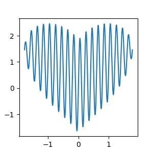
闲着没事, 用 python 做了一段动画:
import matplotlib.pyplot as pyplot
import numpy
import math

pyplot.rcParams['figure.figsize'] = (3, 3)      # 图像显示大小
pyplot.rcParams['lines.linewidth'] = 1.5        # 设置曲线线条宽度
pyplot.ion()
data = numpy.linspace(-math.sqrt(math.pi), math.sqrt(math.pi), 500)
x, y = [], []


def heart(x):
    return math.pow(x * x, 1 / 3) + math.sqrt(math.pi - x * x) * math.sin(10 * x * math.pi)


for k in data:
    x.append(k)
    y.append(heart(k))
    pyplot.clf()
    subplot = pyplot.subplot()
    pyplot.plot(x, y)
    pyplot.pause(0.0000001)


pyplot.ioff()
pyplot.show()