学习了一点2D转换,关于Transfrom-rotate的小用法
rotate()方法,在一个给定度数顺时针旋转的元素。负值是允许的,这样是元素逆时针旋转。
下面看实例
第一个例子是没有使用rotate,而是简单的就写一个容器,然后往容器中填写实物。

 1 <!DOCTYPE html>
 2 <html>
 3 <head>
 4  <meta charset="utf-8">
 5  <title>photoshow</title>
 6  <style type="text/css">
 7   body
 8   {
 9    margin:30px;
10    background-color: #E9E9E9;
11    text-align: center;
12   }
13
14   div.polaroid
15   {
16    width:230px;
17    padding:10px 10px 20px 10px;
18    border:1px solid #BFBFBF;
19    box-shadow: 2px 2px 3px #aaaaaa;
20   }
21
22  </style>
23 </head>
24 <body >
25  <div class="polaroid ">
26   <img id="first" src="Desktop11.jpg" alt="" width="220px" height="200px" >
27   <p >beautiful like summer flowers.</p>
28  </div>
29
30 </body>
31 </html>
第二个例子用到了transfrom-rotate分别往不同方向叠合
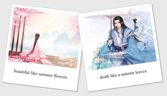
 1 <!DOCTYPE html>
 2 <html>
 3 <head>
 4  <meta charset="utf-8">
 5  <title>photoshow</title>
 6  <style type="text/css">
 7   body
 8   {
 9    margin:30px;
10    background-color: #E9E9E9;
11    text-align: center;
12   }
13   div.box
14   {
15    width:600px;
16   }
17   div.polaroid
18   {
19    width:250px;
20    padding:10px 10px 20px 10px;
21    border:1px solid #BFBFBF;
22    /* add box-shadow */
23    box-shadow: 2px 2px 3px #aaaaaa;
24   }
25   div.rotate_left
26   {
27    float:left;
28          -ms-transform:rotate(7deg); /* IE 9 */
29          -webkit-transform:rotate(7deg); /* Safari and Chrome */
30          transform:rotate(7deg);
31          background-color:white;
32   }
33   div.rotate_right
34   {
35    float:left;
36          -ms-transform:rotate(-8deg); /* IE 9 */
37          -webkit-transform:rotate(-8deg); /* Safari and Chrome */
38          transform:rotate(-8deg);
39          background-color:white;
40         }
41  </style>
42 </head>
43 <body align="center">
44  <div class="box" >
45  <div class="polaroid rotate_left">
46   <img id="first" src="Desktop11.jpg" alt="" width="250px" height="200px"   >
47   <p >beautiful like summer flowers.</p>
48  </div>
49  <div id="second" class="polaroid rotate_right">
50   <img src="Desktop22.jpg" alt="" width="250px" height="200px" >
51   <p >death like a autumn leaves.</p>
52  </div>
53  </div>
54 </body>
55 </html>