源文地址: 巧用Drawable 实现Android UI 元素间距效果
在大部分的移动UI或者Web UI都是基于网格概念而设计的。这种网格一般都是有一些对其的方块组成。然后它们组合成为一个块。
使用网格这种设计原则能够有助于对齐UI元素,提升UI的一致性,同一时候还能让用户更加easy的获取UI上面包括的内容。
简而言之。网格是一个相当的强大的设计工具。
开发人员在使用网格设计原则的时候须要在UI 元素之间加入一些额外的间距,比方padding、margin或者spacing(依据你的设计方案来选择使用哪种间距) 。这些间距有利于在不同的块之间设置清晰的分隔带同一时候不会总体UI的可读性。这些间距对我们Android 开发人员来说也不陌生,我们在设计Android 界面时,也会使用View 的padding 和 margin 来达到类似的效果。在Android 开发中,为了将UI 和业务逻辑分隔,我们会使用 XML来定义UI。这样的做法对于比較固定的UI非常有效果,但当这些UI元素须要依据业务逻辑来确定隐藏或者显示的状态时,这样的做法就有点困难了。这篇文章就依据这样的情况提出了一些Android开发技巧来应对动态的网格UI。
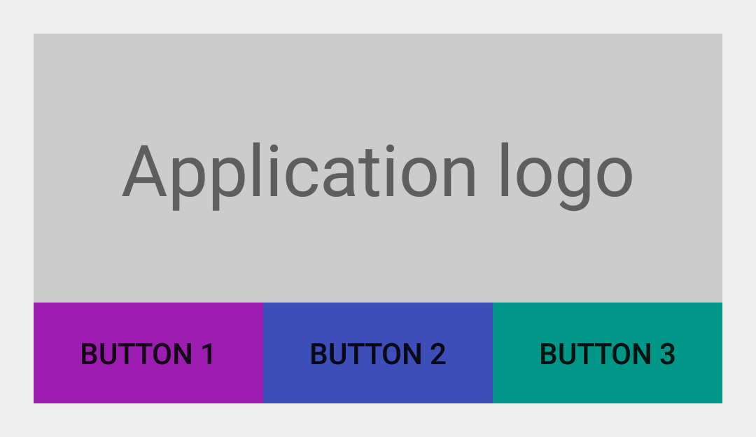
没有间距的UI
首先让我们来看一个简单的样例。我们创建一个简单的 LinearLayout 。
然后我们在TextView (显示“Application logo”)下方再内置一个 LinearLayout 。我们在当中水平依次放置3个Button。
最后得到的效果图例如以下图所看到的:
<LinearLayout xmlns:android="http://schemas.android.com/apk/res/android"
    android:layout_width="match_parent"
    android:layout_height="wrap_content"
    android:orientation="vertical"
    android:padding="@dimen/spacing_medium">

    <TextView
        android:layout_width="match_parent"
        android:layout_height="128dp"
        android:background="@color/light_gray"
        android:gravity="center"
        android:text="@string/application_logo"
        android:textAppearance="@android:style/TextAppearance.Material.Display1" />

    <LinearLayout
        android:id="@+id/buttons_container"
        android:layout_width="match_parent"
        android:layout_height="wrap_content"
        android:orientation="horizontal">

        <Button
            android:id="@+id/btn_first"
            android:layout_width="0dp"
            android:layout_height="wrap_content"
            android:layout_weight="1"
            android:background="@drawable/purple"
            android:text="@string/button_1" />

        <Button
            android:id="@+id/btn_second"
            android:layout_width="0dp"
            android:layout_height="wrap_content"
            android:layout_weight="1"
            android:background="@drawable/indigo"
            android:text="@string/button_2" />

        <Button
            android:id="@+id/btn_third"
            android:layout_width="0dp"
            android:layout_height="wrap_content"
            android:layout_weight="1"
            android:background="@drawable/teal"
            android:text="@string/button_3" />

    </LinearLayout>

</LinearLayout>
加入间距后的UI
上图的所展示的UI就是基于网格设计的。当时UI里面的元素之间都没有间距。为了让用户更好地区分这些UI元素。我们给id 为 @id/buttons_container 的 LinearLayout 加入属性 android:layout_marginTop="@dimen/spacing_medium" ;给id 为 @id/btn_first 和@id/btn_second 的两个 Button 分别加入属性 android:layout_marginRight="@dimen/spacing_medium" ;这时的UI效果例如以下图所看到的:
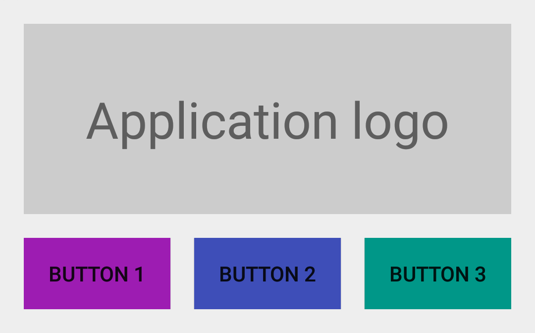
加入了间距之后。总体的UI效果好多了,可读性更强了。
可当我们动态的隐藏某些 View 的时候就会出现一些问题了。
我们如果第三个Button 会依据用户的设备是否安装了 Google Play Services 来决定它的展示。如果这个设备没有 Google Play Services,那我们就把这个 Button to View.GONE 的 visibility 属性设为 View.GONE, 所得效果例如以下图:
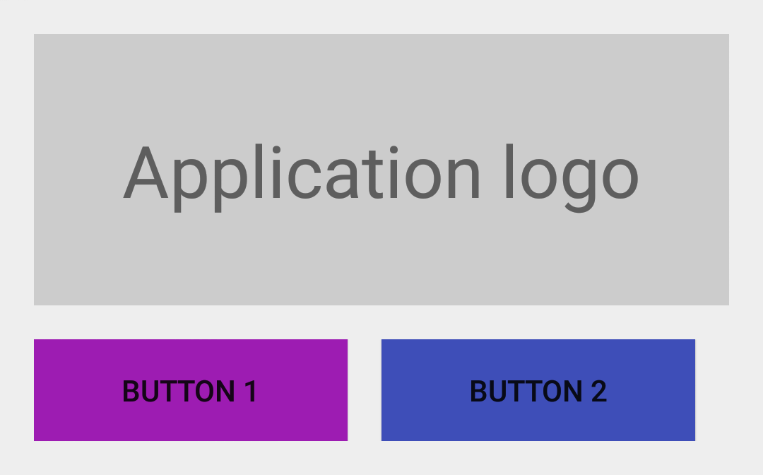
出来的效果与我们预料中的一样,第三个 Button 没有再显示了,可是第二个 Button 的右边没有与上面的TextView 右边对齐。出现这样的问题的解决办法是:拥有 margin 属性的view 会觉得margin相应方向存在邻接 view。比如。每一个拥有right/top margin view会觉得它的 right/top 方向有一个邻接 view,因此,这个相应 margin 也就会生效。就算这个邻接view已经隐藏了。
设置间距的折衷方案——Java 和 GridLayout
一个比較直接的解决方式就是在Java 代码里面手动改变对应的margin 值,但说实话这不是一个好的方案。还有一个方案就是使用可以自己主动处理元素之间的间距的布局。GridLayout 就符合这种要求。可是这个布局让人蛋疼的是元素之间的间距不能自己定义,仅仅能使用默认的间距。
设置间距的最佳方案——LinearLayout 的divider
实际上 LinearLayout 已经有一个处理这样的元素之间的间距的属性了。
这个属性却没怎么被大家发现。一直非常低调,但它的效果相当奇妙。
所以我们说的第三个方案就是使用一个固定高宽的 Drawable 作为 LinearLayout 的 元素分隔线(divider):
<?xml version="1.0" encoding="utf-8"?>
<shape xmlns:android="http://schemas.android.com/apk/res/android"
    android:shape="rectangle">

    <size
        android:width="@dimen/spacing_medium"
        android:height="@dimen/spacing_medium" />

    <solid android:color="@android:color/transparent" />

</shape>
如今你就能够把这个新创建的 Drawable 设为LinearLayout 的 divider。这样这个Drawable 就能让元素之间产生间距了:
<LinearLayout xmlns:android="http://schemas.android.com/apk/res/android"
    android:layout_width="match_parent"
    android:layout_height="wrap_content"
    android:divider="@drawable/spacer_medium"
    android:orientation="vertical"
    android:padding="@dimen/spacing_medium"
    android:showDividers="middle">

    <!-- TextView -->

    <LinearLayout
        android:id="@+id/buttons_container"
        android:layout_width="match_parent"
        android:layout_height="wrap_content"
        android:divider="@drawable/spacer_medium"
        android:orientation="horizontal"
        android:showDividers="middle">

        <!-- Buttons -->

    </LinearLayout>

</LinearLayout>

总结
Android 框架里面有很多的特性能够用来实现一些不常见的方案,并且最后效果出其不意。
定义 Drawable 就是当中一种途径。
假设你能吃透Android 里面的 Drawable ,那么你的代码也可能大大地精简。
注意:文章LinearLayout的divider 属性设置是Android API 11 之后加进去的,这意味着Android API 11之前的设备要使用这个divider须要LinearLayoutCompat。
本文翻译自:Grid
Spacing on Android 原文作者:Cyril
Mottier