matplotlib图像绘制 / matplotlib image description
目录
- 关于matplotlib
- matplotlib库
- 补充内容
- Figure和AxesSubplot的生成方式
- 子图的两种生成方式
- 折线图的绘制
- 柱状图的绘制
- 箱图的绘制
- 散点图的绘制
- 直方图的绘制
- 细节设置
1 关于matplotlib / About matplotlib
Matplotlib 是一个 Python 的 2D绘图库,它以各种硬拷贝格式和跨平台的交互式环境生成出版质量级别的图形。相应内容可参考 matplotlib 官网。
Matplotlib基础知识
1. Matplotlib中的基本图表包括的元素
- x轴和y轴: 水平和垂直的轴线
- x轴和y轴刻度: 刻度标示坐标轴的分隔,包括最小刻度和最大刻度
- x轴和y轴刻度标签: 表示特定坐标轴的值
- 绘图区域: 实际绘图的区域
2. hold属性
- hold属性默认为True,允许在一幅图中绘制多个曲线;将hold属性修改为False,每一个plot都会覆盖前面的plot。
- 但是目前不推荐去动hold这个属性,这种做法(会有警告)。因此使用默认设置即可。
3. 网格线与grid方法
- grid方法: 使用grid方法为图添加网格线
- 设置grid参数(参数与plot函数相同): .lw代表linewidth,线的粗细,.alpha表示线的明暗程度
4. axis方法
- 如果axis方法没有任何参数,则返回当前坐标轴的上下限
5. xlim方法和ylim方法
- 除了plt.axis方法,还可以通过xlim,ylim方法设置坐标轴范围
6. legend
- 注释图标
7. Figure和AxesSubplot
- fig: 一个图表的整体结构,所有需要绘制图像的ax都将置于fig上
- ax: 绘制图像的区域
2 matplotlib库 / matplotlib Library
环境安装:
pip install matplotlib
2.1 常量 / Constants
Pass
2.2 函数 / Function
Pass
2.3 类 / Class
2.3.1 Figure类
类实例化:fig = plt.figure(fig_name, figsize=)
类的功能:用于生成Figure
传入参数: fig_name, figsize
fig_name: str类型,Figure的名称
figsize: tuple类型,确定fig的长宽大小
返回参数: fig
fig: Figure类型,<class 'matplotlib.figure.Figure'>,生成的Figure
2.3.1.1 add_subplot()方法
函数调用:ax = fig.add_subplot(r, c, p)
函数功能:生成绘图区域子图
传入参数: r, c, p
r: int类型,fig区域等分行数
c: int类型,fig区域等分列数
p: int类型,ax所在fig位置处
返回参数: ax
ax: AxesSubplot类型,<class 'matplotlib.axes._subplots.AxesSubplot'>,生成的AxesSubplot
2.3.2 AxesSubplot类
类实例化:ax = plt.subplot(r, c, p) / fig.add_subplot(r, c, p)
类的功能:生成绘图区域
传入参数: r, c, p
r: int类型,fig区域等分行数
c: int类型,fig区域等分列数
p: int类型,ax所在fig位置处
返回参数: ax
ax: AxesSubplot类型,<class 'matplotlib.axes._subplots.AxesSubplot'>,生成的AxesSubplot
Note: 实际上plt.subplot()函数最终调用的也是fig.add_subplot()函数
2.3.2.1 plot()方法
函数调用: ax.plot(x_list, y_list, c=, label=)
函数功能:绘制曲线图
传入参数: x_list, y_list, c, label
x_list: list类型,所有需要绘制的点的横坐标列表
y_list: list类型,所有需要绘制的点的纵坐标列表
c: str/tuple类型,设置线条的颜色,可以使用名称‘red’/缩写‘r’/RGB(1, 0, 0),其中RGB元组中的所有值为x/255,在0-1之间
label: str类型,线条的标签名(在legend上显示)
返回参数: 无
2.3.2.2 bar / barh()方法
函数调用: ax.bar / barh(bar_position, bar_height, bar_width)
函数功能:绘制柱状图(纵向或者横向)
传入参数: bar_position, bar_height, bar_width
bar_position: list类型,所有需要绘制的柱形的横坐标位置列表
bar_height: list类型,所有需要绘制的柱形的高度列表
bar_ int类型,柱形的宽度
返回参数: 无
2.3.2.3 boxplot()方法
函数调用: ax.boxplot(data)
函数功能:绘制箱图
传入参数: data
data: array/a sequence of vector类型,进行绘图的二维数组,按列分组
返回参数: 无
2.3.2.4 scatter()函数
函数调用: ax.scatter(x, y)
函数功能:绘制散点图
传入参数: x, y
x: list/Series类型,绘制散点图的x坐标集合
y: list/Series类型,绘制散点图的y坐标集合
返回参数: 无
2.3.2.5 hist()方法
函数调用: ax.hist(x, bins=None, range=None)
函数功能:绘制histogram直方图
传入参数: x, bins, range
x: array/a sequence of array类型,数据点集合,不要求同长度
bins: int类型,绘制的直方图分割数量
range: tuple类型,需要绘制直方图的数据范围
返回参数: 无
2.3.2.6 set_xticks / set_yticks()方法
函数调用: ax.set_xticks / set_yticks(posi_list)
函数功能:设置ticks的位置
传入参数: posi_list
posi_list: list类型,各个ticks离原点坐标的距离
返回参数: 无
2.3.2.7 set_xticklabels / set_yticklabels()方法
函数调用: ax.set_xticklabels / set_yticklabels(name_list, rotation=0)
函数功能:设置ticks的名称
传入参数: name_list, rotation
name_list: list类型,各个ticks的名称
rotation: int类型,label顺时针旋转的角度
返回参数: 无
2.3.2.8 set_xlabel / set_ylabel()方法
函数调用: ax.set_xlabel / set_ylabel(name)
函数功能:设置label的名称
传入参数: name
name: str类型,label的名称
返回参数: 无
2.3.2.9 set_title()方法
函数调用: ax.set_title(name)
函数功能:设置title的名称
传入参数: name
name: str类型,title的名称
返回参数: 无
2.3.2.10 set_xlim / set_ylim()方法
函数调用: ax.set_xlim / set_ylim(left, right)
函数功能:设置x/y轴的数值限制
传入参数: left, right
left: int类型,数据的左端极值
right: int类型,数据的右端极值
返回参数: 无
2.3.2.11 tick_params()方法
函数调用: ax.tick_params(axis=‘both’, **kwarge)
函数功能:改变ticks或ticks的显示状态
传入参数: axis, **kwarge
axis: str类型,‘x’/‘y’/‘both’确定目标轴
**kwarge: 传入包括color/bottom/top/left/right/length/width等参数进行设置
返回参数: 无
2.3.2.12 spines属性
属性调用: sp = ax.spines
属性功能:获取所有坐标轴的一个类
属性参数: sp
sp: obj类型,包含所有坐标轴(left, right, bottom, top)信息的类
Note: 对于获取到的sp,可以通过for key, spine in sp.items()获得各个spine,并利用spine的set_visible(False)函数隐藏所有的spine
2.4 模块 / Module
2.4.1 pyplot模块
from matlibplot import pyplot as plt
2.4.1.1 常量
Pass
2.4.1.2 函数
2.4.1.2.1 figure()函数
函数调用:fig = plt.figure(fig_name, figsize=)
函数功能:用于生成Figure
传入参数: fig_name, figsize
fig_name: str类型,Figure的名称
figsize: tuple类型,确定fig的长宽大小
返回参数: fig
fig: Figure类型,<class 'matplotlib.figure.Figure'>,生成的Figure
2.4.1.2.2 subplot()函数
类实例化:ax = plt.subplot(r, c, p)
类的功能:生成绘图区域AxesSubplot
传入参数: r, c, p
r: int类型,fig区域等分行数
c: int类型,fig区域等分列数
p: int类型,ax所在fig位置处
返回参数: ax
ax: AxesSubplot类型,<class 'matplotlib.axes._subplots.AxesSubplot'>,生成的AxesSubplot
Note: 实际上plt.subplot()函数最终调用的也是fig.add_subplot()函数
2.4.1.2.3 subplots()函数
类实例化:fig, ax = plt.subplots(nrows=1, ncols=1, sharex=False, sharey=False)
类的功能:生成图像Figure以及相应数量的绘图区域子图AxesSubplot
传入参数: nrows, ncols, sharex, sharey
nrows: int类型,fig区域等分行数,即nrows个子图在一行
ncols: int类型,fig区域等分列数,即ncols列子图
sharex: bool类型,所有子图是否共享x轴
sharey: bool类型,所有子图是否共享y轴
返回参数: fig, ax
fig: Figure类型,生成的当前Figure
ax: AxesSubplot / list类型,当ax数量大于1时,ax为所有子图组成的ndarray
2.4.1.2.4 plot()函数
函数调用: plt.plot(x_list, y_list, c=, label=)
函数功能:对需要绘制的图像点进行绘制处理(会对ax进行设置)
传入参数: x_list, y_list, c, label
x_list: list类型,所有需要绘制的点的横坐标列表
y_list: list类型,所有需要绘制的点的纵坐标列表
c: str/tuple类型,设置线条的颜色,可以使用名称‘red’/缩写‘r’/RGB(1, 0, 0),其中RGB元组中的所有值为x/255,在0-1之间
label: str类型,线条的标签名(在legend上显示)
返回参数: 无
2.4.1.2.5 xticks / yticks()函数
函数调用: plt.xticks / yticks(loc, name, rotation=0)
函数功能:对最近一个ax设置ticks(轴标记)
传入参数: loc, name, rotation
loc: list类型,包含了每个ticks到零点的距离
name: list类型,每个ticks的名称
rotation: ticks的旋转角度
返回参数: 无
2.4.1.2.6 xlabel / ylabel()函数
函数调用: plt.xlabel / ylabel(name)
函数功能:对最近一个ax设置label名称
传入参数: name
name: str类型,label的名称
返回参数: 无
2.4.1.2.7 title()函数
函数调用: plt.title(name)
函数功能:对最近一个ax设置title名称
传入参数: name
name: str类型,title的名称
返回参数: 无
2.4.1.2.8 legend()函数
函数调用: plt.legend(loc=‘upper right’)
函数功能:对最近一个ax设置legend图例参数
传入参数: loc
loc: str类型,legend所在位置
返回参数: 无
Note:
loc - int or string or pair of floats, default: 'upper right'
The location of the legend. Possible codes are:
=============== =============
Location String Location Code
=============== =============
'best' 0
'upper right' 1
'upper left' 2
'lower left' 3
'lower right' 4
'right' 5
'center left' 6
'center right' 7
'lower center' 8
'upper center' 9
'center' 10
=============== =============
2.4.1.2.9 show()函数
函数调用: plt.show()
函数功能:对所有的Figure类进行图像显示
传入参数: 无
返回参数: 无
3.1 plt函数的作用范围
对于plt函数,其实质依旧是调用了最近的ax的内部函数实现对title/legend/label等的设置,因此直接使用plt函数时需注意代码位置,或者通过特定ax进行直接调用则不需要注意位置问题。
3.2 颜色数组RGB
在matplotlib中的颜色数组RGB内各个值的范围均为0-1,求值的方式为x/255,下面是各个颜色的参考RGB值,除以255后可在matplotlib中使用。

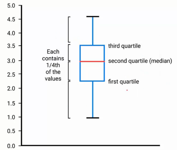
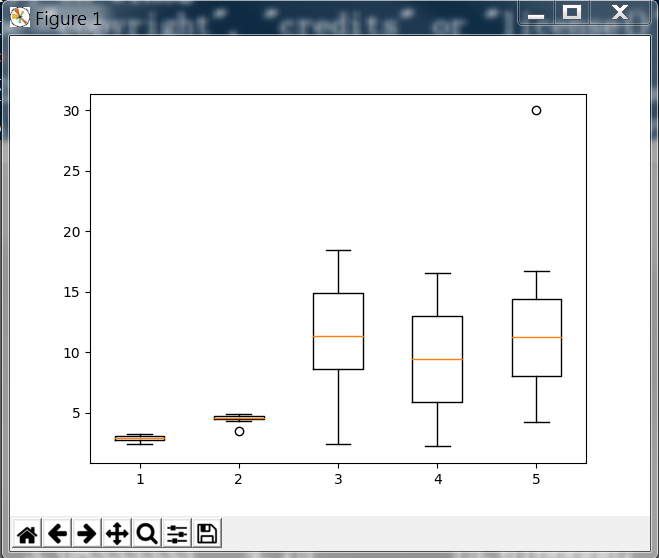
3.3 箱图
箱图boxPlot是一种统计常用的图形,能够充分显示数据分布的状况。下图中包括了中位数,1/4位数,3/4位数的位置,过大或过小的点将以点形式额外表示出来。
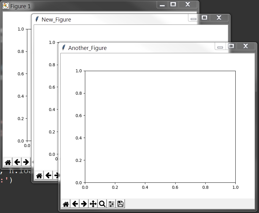
绘制图像的第一步在于生成相应的fig和ax,此处有3种方法用于生成fig与ax
首先导入模块,
1 from matplotlib import pylab as plt
(1) 利用plt的subplots()函数直接同时生成fig和ax
1 fig, ax = plt.subplots()
2 print(fig, ax)
(2) 利用plt的figure()函数生成fig,再利用fig的add_subplot()函数生成ax
1 fig = plt.figure('New_Figure')
2 ax = fig.add_subplot(1, 1, 1)
3 print(fig, ax)
(3) 利用plt的figure()函数生成fig,再利用plt的subplot()函数生成ax
1 fig = plt.figure('Another_Figure')
2 ax = plt.subplot(1, 1, 1)
3 print(fig, ax)
最后使用show函数可以得到3张图像,分别对应上面的名称
1 plt.show()
子图的生成方式有以下两种,
- 利用plt.subplots方法直接生成,并从返回的子图列表中获取各个子图实例
- 利用fig实例的fig.add_subplot方法进行添加
 1 # Two ways to create a figure with subplot
 2 # First one: subplots
 3 # plt.subplots(nrow, ncol)
 4 # sharex and sharey decide whether all the subplot should to share the axis label
 5 # If multi subplots, ax will be a array contains all subplots
 6 fig, ax = plt.subplots(2, 2, sharex=False, sharey=False)
 7 ax_1 = ax[0][0]
 8 ax_2 = ax[0][1]
 9 ax_3 = ax[1][0]
10 ax_4 = ax[1][1]
11 # Second one: use figure
12 fig = plt.figure('figure_name', figsize=(7, 7))
13 ax_1 = fig.add_subplot(2, 2, 1)
14 ax_2 = fig.add_subplot(2, 2, 2)
15
16 plt.show()
显示结果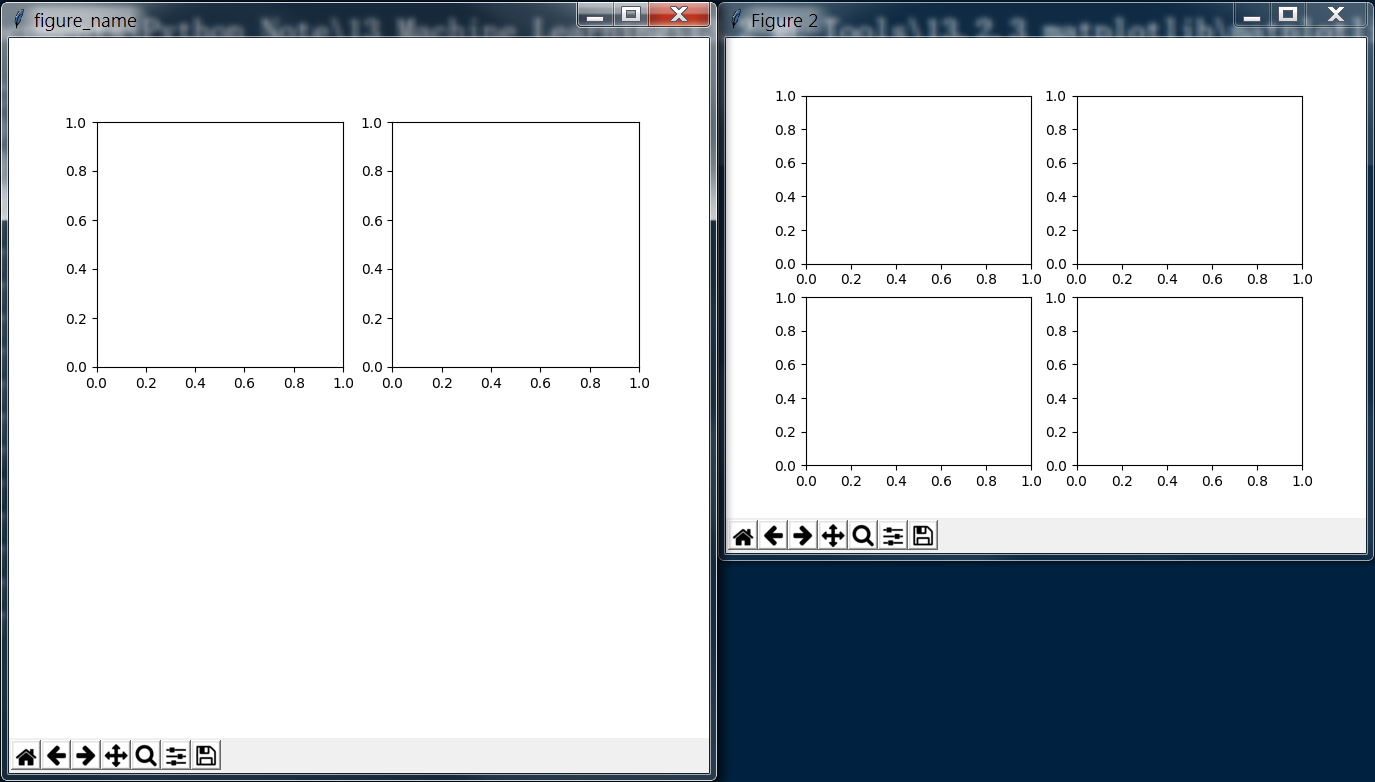
完整代码


 1 import pandas as pd
 2 import numpy as np
 3 import matplotlib.pyplot as plt
 4
 5 curve = pd.read_csv('curve.csv')
 6 print(curve)
 7 print('------------')
 8 # Change format to datetime format
 9 curve['DATE'] = pd.to_datetime(curve['DATE'])
10 print(curve)
11
12 # matplotlib inline
13 # If plot nothing and show, it will plot and show a blank board
14 # plt.plot()
15 # plt.show()
16 # Similar to pyqtgraph, plot(x_list, y_list)
17 plt.plot(curve['DATE'], curve['VALUE'])
18 # If the tick is too long, use rotation to adjust
19 plt.xticks(rotation=-45)
20 plt.xlabel('Month')
21 plt.ylabel('Rate')
22 plt.title('Unemployment Rate')
23 #plt.show()
24
25 # Sub figure
26 # figsize decide the size of figure window
27 fig = plt.figure('figure_name', figsize=(7, 7))
28 # add_subplot(row, column, location)
29 # add_subplot will divide fig into several part(according to row and column) and place the subplot in input location
30 ''' fig divided like that:
31 [1 ... x
32  .     .
33  .     .
34  .     .
35  y ... x*y]
36 '''
37 # May course some overlap if the shape(row/column) is different
38 ax1 = fig.add_subplot(2, 2, 1)
39 ax2 = fig.add_subplot(2, 2, 2)
40 ax4 = fig.add_subplot(2, 2, 4)
41 ax3 = plt.subplot(2, 2, 3)
42
43 ax1.plot(np.random.randint(1, 5, 5), np.arange(5))
44 # Note np.arange(10)*3 will return an array shape(1, 10) with each element * 3
45 ax2.plot(np.arange(10)*3, np.arange(10))
46 ax4.plot(np.random.randint(1, 10, 10), np.random.randint(1, 10, 10))
47
48 month = curve['DATE'].dt.month
49 value = curve['VALUE']
50 # If no new fig here, the curve will be plot on the latest fig(ax4 here)
51 fig = plt.figure(figsize=(9, 7))
52 plt.plot(month[0:6], value[0:6], c='red', label='first half year') # c='r'/c=(1, 0, 0)
53 plt.plot(month[6:12], value[6:12], c='blue', label='second half year')
54 # If not call legend function, the label would not show
55 # loc='best' will place the label in a best location
56 '''
57 loc : int or string or pair of floats, default: 'upper right'
58         The location of the legend. Possible codes are:
59
60             ===============   =============
61             Location String   Location Code
62             ===============   =============
63             'best'            0
64             'upper right'     1
65             'upper left'      2
66             'lower left'      3
67             'lower right'     4
68             'right'           5
69             'center left'     6
70             'center right'    7
71             'lower center'    8
72             'upper center'    9
73             'center'          10
74             ===============   =============
75 '''
76 plt.legend(loc='best')
77 plt.xlabel('Month')
78 plt.ylabel('Rate')
79 plt.title('My rate curve')
80
81 plt.show()
分段解释
首先导入需要用到的 numpy 和 pandas 模块,读取所需要的数据,转变为指定的时间格式,
 1 import pandas as pd
 2 import numpy as np
 3 import matplotlib.pyplot as plt
 4
 5 curve = pd.read_csv('curve.csv')
 6 print(curve)
 7 print('------------')
 8 # Change format to datetime format
 9 curve['DATE'] = pd.to_datetime(curve['DATE'])
10 print(curve)
输出结果如下
         DATE  VALUE         A     B          C          D      E
0    1/1/1948    3.4  2.400000  4.50   2.400000   2.200000   5.60
1    2/1/1948    3.8  2.700000  3.50   8.800000   3.400000   4.20
2    3/1/1948    4.2  2.500000  4.60   4.300000   4.100000   7.30
3    4/1/1948    5.1  2.633333  4.30   7.066667   5.133333   7.40
4    5/1/1948    1.9  2.683333  4.35   8.016667   6.083333   8.25
5    6/1/1948    2.4  2.733333  4.40   8.966667   7.033333   9.10
6    7/1/1948    3.2  2.783333  4.45   9.916667   7.983333   9.95
7    8/1/1948    4.4  2.833333  4.50  10.866667   8.933333  10.80
8    9/1/1948    5.2  2.883333  4.55  11.816667   9.883333  11.65
9   10/1/1948    3.2  2.933333  4.60  12.766667  10.833333  12.50
10  11/1/1948    2.1  2.983333  4.65  13.716667  11.783333  13.35
11  12/1/1948    1.2  3.033333  4.70  14.666667  12.733333  14.20
12   1/1/1949    5.5  3.083333  4.75  15.616667  13.683333  15.05
13   2/1/1949    3.2  3.133333  4.80  16.566667  14.633333  15.90
14   3/1/1949    6.2  3.183333  4.85  17.516667  15.583333  16.75
15   4/1/1949    1.3  3.233333  4.90  18.466667  16.533333  30.00
------------
         DATE  VALUE         A     B          C          D      E
0  1948-01-01    3.4  2.400000  4.50   2.400000   2.200000   5.60
1  1948-02-01    3.8  2.700000  3.50   8.800000   3.400000   4.20
2  1948-03-01    4.2  2.500000  4.60   4.300000   4.100000   7.30
3  1948-04-01    5.1  2.633333  4.30   7.066667   5.133333   7.40
4  1948-05-01    1.9  2.683333  4.35   8.016667   6.083333   8.25
5  1948-06-01    2.4  2.733333  4.40   8.966667   7.033333   9.10
6  1948-07-01    3.2  2.783333  4.45   9.916667   7.983333   9.95
7  1948-08-01    4.4  2.833333  4.50  10.866667   8.933333  10.80
8  1948-09-01    5.2  2.883333  4.55  11.816667   9.883333  11.65
9  1948-10-01    3.2  2.933333  4.60  12.766667  10.833333  12.50
10 1948-11-01    2.1  2.983333  4.65  13.716667  11.783333  13.35
11 1948-12-01    1.2  3.033333  4.70  14.666667  12.733333  14.20
12 1949-01-01    5.5  3.083333  4.75  15.616667  13.683333  15.05
13 1949-02-01    3.2  3.133333  4.80  16.566667  14.633333  15.90
14 1949-03-01    6.2  3.183333  4.85  17.516667  15.583333  16.75
15 1949-04-01    1.3  3.233333  4.90  18.466667  16.533333  30.00
绘制折线图
 1 # matplotlib inline
 2 # If plot nothing and show, it will plot and show a blank board
 3 # plt.plot()
 4 # plt.show()
 5 # Similar to pyqtgraph, plot(x_list, y_list)
 6 plt.plot(curve['DATE'], curve['VALUE'])
 7 # If the tick is too long, use rotation to adjust
 8 plt.xticks(rotation=-45)
 9 plt.xlabel('Month')
10 plt.ylabel('Rate')
11 plt.title('Unemployment Rate')
12 #plt.show()
显示图形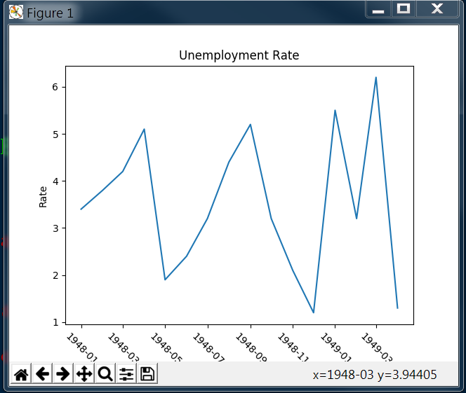
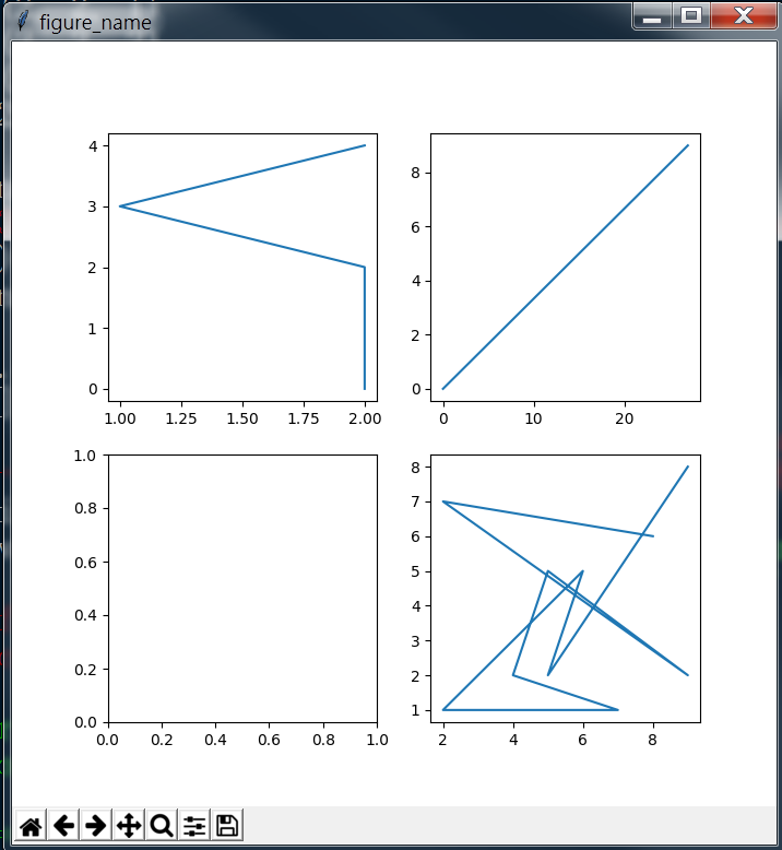
接着绘制带有子图的折线图
其中子图的顺序如代码中注释所示
 1 # Sub figure
 2 # figsize decide the size of figure window
 3 fig = plt.figure('figure_name', figsize=(7, 7))
 4 # add_subplot(row, column, location)
 5 # add_subplot will divide fig into several part(according to row and column) and place the subplot in input location
 6 ''' fig divided like that:
 7 [1 ... x
 8  .     .
 9  .     .
10  .     .
11  y ... x*y]
12 '''
13 # May course some overlap if the shape(row/column) is different
14 ax1 = fig.add_subplot(2, 2, 1)
15 ax2 = fig.add_subplot(2, 2, 2)
16 ax4 = fig.add_subplot(2, 2, 4)
17 ax3 = plt.subplot(2, 2, 3)
18
19 ax1.plot(np.random.randint(1, 5, 5), np.arange(5))
20 # Note np.arange(10)*3 will return an array shape(1, 10) with each element * 3
21 ax2.plot(np.arange(10)*3, np.arange(10))
22 ax4.plot(np.random.randint(1, 10, 10), np.random.randint(1, 10, 10))
显示图形
最后,尝试将两条折线绘制在同一个图上,
Note: 第四行生成了一个新的fig,如果此处没有新生成一个fig,则图像会被显示在最近的一个fig上(此处为之前的ax4)
 1 month = curve['DATE'].dt.month
 2 value = curve['VALUE']
 3 # If no new fig here, the curve will be plot on the latest fig(ax4 here)
 4 fig = plt.figure(figsize=(9, 7))
 5 plt.plot(month[0:6], value[0:6], c='red', label='first half year') # c='r'/c=(1, 0, 0)
 6 plt.plot(month[6:12], value[6:12], c='blue', label='second half year')
 7 # If not call legend function, the label would not show
 8 # loc='best' will place the label in a best location
 9 '''
10 loc : int or string or pair of floats, default: 'upper right'
11         The location of the legend. Possible codes are:
12
13             ===============   =============
14             Location String   Location Code
15             ===============   =============
16             'best'            0
17             'upper right'     1
18             'upper left'      2
19             'lower left'      3
20             'lower right'     4
21             'right'           5
22             'center left'     6
23             'center right'    7
24             'lower center'    8
25             'upper center'    9
26             'center'          10
27             ===============   =============
28 '''
29 plt.legend(loc='best')
30 plt.xlabel('Month')
31 plt.ylabel('Rate')
32 plt.title('My rate curve')
33
34 plt.show()
显示图形
完整代码
 1 import pandas as pd
 2 import matplotlib.pyplot as plt
 3 import numpy as np
 4
 5 curve = pd.read_csv('curve.csv')
 6 cols = ['A', 'B', 'C', 'D', 'E']
 7 para = curve[cols]
 8 print(para)
 9 print(para[:1])
10 print('-----------')
11 # ix function can fetch the data in certain position by index
12 # ix[row, column], row/column can be a number/list/key_list
13 # Bar height decide the height of bar graph
14 bar_height = para.ix[0, cols].values # para.ix[0, cols] type is Series
15 # Bar position decide the x distance to base point
16 bar_position = np.arange(5) + 1
17 # subplots function return a figure and only one subplot
18 # fig to set figure style, ax(axis) for graph draw
19 fig, ax = plt.subplots()
20 # bar(position_list, height_list, width_of_bar)
21 ax.bar(bar_position, bar_height, 0.3)
22 # Use barh to create a horizonal bar figure
23 ax.barh(bar_position, bar_height, 0.3)
24 # Set position of ticks
25 ax.set_xticks(range(1, 6))
26 # Set x tick labels name and rotation
27 ax.set_xticklabels(cols, rotation=45)
28 # Set x/y label name
29 ax.set_xlabel('Type')
30 ax.set_ylabel('Rate')
31 ax.set_title('This is a test figure')
分段解释
首先导入各个模块,并读取数据,
 1 import pandas as pd
 2 import matplotlib.pyplot as plt
 3 import numpy as np
 4
 5 curve = pd.read_csv('curve.csv')
 6 cols = ['A', 'B', 'C', 'D', 'E']
 7 para = curve[cols]
 8 print(para)
 9 print(para[:1])
10 print('-----------')
输出结果为
           A     B          C          D      E
0   2.400000  4.50   2.400000   2.200000   5.60
1   2.700000  3.50   8.800000   3.400000   4.20
2   2.500000  4.60   4.300000   4.100000   7.30
3   2.633333  4.30   7.066667   5.133333   7.40
4   2.683333  4.35   8.016667   6.083333   8.25
5   2.733333  4.40   8.966667   7.033333   9.10
6   2.783333  4.45   9.916667   7.983333   9.95
7   2.833333  4.50  10.866667   8.933333  10.80
8   2.883333  4.55  11.816667   9.883333  11.65
9   2.933333  4.60  12.766667  10.833333  12.50
10  2.983333  4.65  13.716667  11.783333  13.35
11  3.033333  4.70  14.666667  12.733333  14.20
12  3.083333  4.75  15.616667  13.683333  15.05
13  3.133333  4.80  16.566667  14.633333  15.90
14  3.183333  4.85  17.516667  15.583333  16.75
15  3.233333  4.90  18.466667  16.533333  30.00
     A    B    C    D    E
0  2.4  4.5  2.4  2.2  5.6
-----------
随后根据数据绘制柱状图
 1 # ix function can fetch the data in certain position by index
 2 # ix[row, column], row/column can be a number/list/key_list
 3 # Bar height decide the height of bar graph
 4 bar_height = para.ix[0, cols].values # para.ix[0, cols] type is Series
 5 # Bar position decide the x distance to base point
 6 bar_position = np.arange(5) + 1
 7 # subplots function return a figure and only one subplot
 8 # fig to set figure style, ax(axis) for graph draw
 9 fig, ax = plt.subplots()
10 # bar(position_list, height_list, width_of_bar)
11 ax.bar(bar_position, bar_height, 0.3)
12 # Use barh to create a horizonal bar figure
13 ax.barh(bar_position, bar_height, 0.3)
14 # Set position of ticks
15 ax.set_xticks(range(1, 6))
16 # Set x tick labels name and rotation
17 ax.set_xticklabels(cols, rotation=45)
18 # Set x/y label name
19 ax.set_xlabel('Type')
20 ax.set_ylabel('Rate')
21 ax.set_title('This is a test figure')
得到图形

 1 import pandas as pd
 2 import matplotlib.pyplot as plt
 3 import numpy as np
 4
 5 curve = pd.read_csv('curve.csv')
 6 cols = ['A', 'B', 'C', 'D', 'E']
 7
 8 fig, ax = plt.subplots()
 9 ax.boxplot(curve[cols].values) # curve[cols].values is ndarray
10 print(curve[cols].values)
11 plt.show()
输出数据
[[  2.4          4.5          2.4          2.2          5.6       ]
 [  2.7          3.5          8.8          3.4          4.2       ]
 [  2.5          4.6          4.3          4.1          7.3       ]
 [  2.63333333   4.3          7.06666667   5.13333333   7.4       ]
 [  2.68333333   4.35         8.01666667   6.08333333   8.25      ]
 [  2.73333333   4.4          8.96666667   7.03333333   9.1       ]
 [  2.78333333   4.45         9.91666667   7.98333333   9.95      ]
 [  2.83333333   4.5         10.86666667   8.93333333  10.8       ]
 [  2.88333333   4.55        11.81666667   9.88333333  11.65      ]
 [  2.93333333   4.6         12.76666667  10.83333333  12.5       ]
 [  2.98333333   4.65        13.71666667  11.78333333  13.35      ]
 [  3.03333333   4.7         14.66666667  12.73333333  14.2       ]
 [  3.08333333   4.75        15.61666667  13.68333333  15.05      ]
 [  3.13333333   4.8         16.56666667  14.63333333  15.9       ]
 [  3.18333333   4.85        17.51666667  15.58333333  16.75      ]
 [  3.23333333   4.9         18.46666667  16.53333333  30.        ]]
显示图形
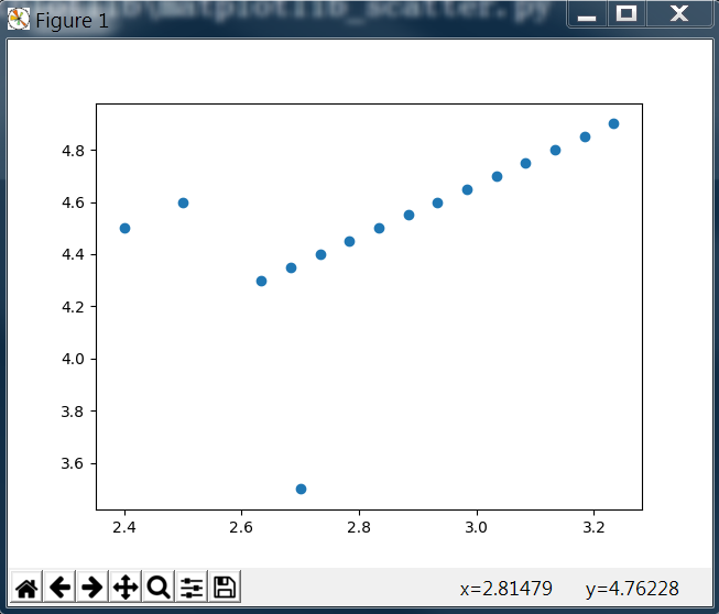
1 import matplotlib.pyplot as plt
2 import numpy as np
3 import pandas as pd
4
5 curve = pd.read_csv('curve.csv')
6 fig, ax = plt.subplots()
7 # scatter(x, y) x for x axis para list/Series, y for y axis para list/Series
8 ax.scatter(curve['A'], curve['B'])
9 plt.show()
输出图形
 1 import pandas as pd
 2 import matplotlib.pyplot as plt
 3 import numpy as np
 4
 5 curve = pd.read_csv('curve.csv')
 6 cols = ['A', 'B', 'C', 'D', 'E']
 7 # value_counts function will return the number of each value
 8 print(curve['C'].value_counts())
 9 fig, ax = plt.subplots()
10 # hist(Series, range=, bins=)
11 # Series is the data to be plotted, range is the plot range, bins is the number of plot hists in range
12 ax.hist(curve['C'], range=(1,20), bins=20)
13 # Set the x/y axis limit range
14 ax.set_xlim(0, 20)
15 ax.set_ylim(0, 5)
16 plt.show()
输出结果
15.616667    1
18.466667    1
12.766667    1
8.800000     1
2.400000     1
16.566667    1
9.916667     1
8.016667     1
10.866667    1
17.516667    1
7.066667     1
4.300000     1
11.816667    1
8.966667     1
14.666667    1
13.716667    1
Name: C, dtype: int64
显示图形

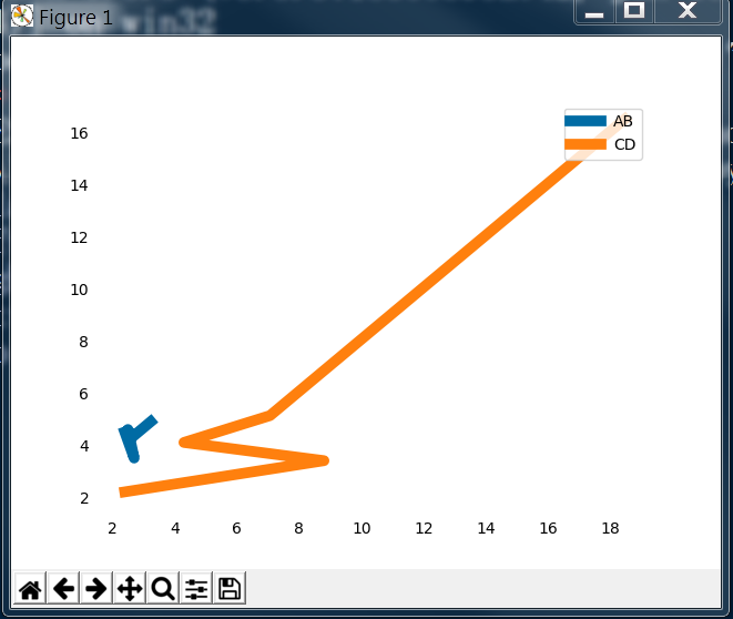
利用matplotlib还可以对图形的细节进行相应的设置
 1 import pandas as pd
 2 import matplotlib.pyplot as plt
 3 import numpy as np
 4
 5 curve = pd.read_csv('curve.csv')
 6
 7 fig, ax = plt.subplots()
 8
 9 # Hide the tick params
10 ax.tick_params(bottom='off', top='off', left='off', right='off')
11 # Hide spine
12 print(type(ax.spines))
13 for key, spine in ax.spines.items():
14     print(key, spine)
15     spine.set_visible(False)
16 # Set the color, (R, G, B) the value should be between (0, 1)
17 color_dark_blue = (0/255, 107/255, 164/255)
18 color_orange = (255/255, 128/255, 14/255)
19 ax.plot(curve['A'], curve['B'], c=color_dark_blue, label='AB', linewidth=7)
20 ax.plot(curve['C'], curve['D'], c=color_orange, label='CD', linewidth=7)
21 plt.legend(loc='upper right')
22 plt.show()
输出图形
相关阅读
1. numpy 的使用
2. pandas 的使用