一、包含块(Containing Block)
要讲position,首先就涉及到一个概念:包含块。
1、包含块介绍
包含块简单理解就是一个定位参考块,就是"大盒子里套小盒子"中那个大盒子。元素有positon属性就必然涉及到包含块。先简单总结一下。
1、初始包含块(Initial containing block),即根元素的包含框。 在浏览器中是原点与 canvas 原点重合、大小与 viewport 相同的矩形。
2、position:static|relative 元素包含块为最近的块级【block|list-item|table】父元素的内容框content-box
3、positon:absolute 先找absolute最近已定位祖先元素【没有的话包含块就是初始包含块】
- 如果祖先元素是块级元素,则包含块是祖先元素的padding框。
- 如果祖先元素是内联元素,包含块取决于祖先元素的direction属性
- dirrection:ltr,祖先元素的第一个盒子的上、左padding框边界是包含块的上和左,祖先元素最后一个盒子的下、右padding边界是包含块的下和右。
- direction:rtl,祖先元素第一个盒子的上、右padding框边界是包含块的上右,祖先元素最后一个元素的下、左padding框边界是包含块的下、左。
4、positon:fixed 元素的包含块是由viewport决定的,和根元素无关。
2、static和包含块
举例:没有设置postion,所以标签position都是默认的static。
<!DOCTYPE html>
<html>
<head>
    <meta charset="utf-8"/>
    <title>包含块 by starof</title>
</head>
<body>
    <div id="div1">
        <p id="p1">第一段内容</p>
        <p id="p2">
            这些文字是
            <em id="em1">第 <strong id="strong1">二</strong>段</em>
            内容
        </p>
    </div>
</body>
</html>
产生盒子的元素——》包含块
body——》initial C.B.(UA-dependent)
div1——》body
p1——》div1
p2——》div1
em1——》p2
strong1——》p2
3、absolute和包含块
主要介绍一下祖先元素是内联元素的情况。
举例:direction:ltr
包含块的上,左是祖先元素span生成的第一个框的上,左padding 框,包含块下右是祖先元素span的最后一个line box的下右padding框。
<p style="border:1px solid red; 200px; padding:20px;">
    TTT
    <span style="background-color:#C0C0C0; position:relative;padding:10px;">
        这段文字从左向右排列,红 XX 和 蓝 XX 和黄 XX 都是绝对定位元素,它的包含块是相对定位的SPAN。
 可以通过它们绝对定位的位置来判断它们包含块的边缘。 <em style="position:absolute; color:red; top:0; left:0;">XX</em> <em style="position:absolute; color:yellow; top:20px; left:0;">XX</em>
        <em style="position:absolute; color:blue; bottom:0; right:0;">XX</em>
    </span>
</p>
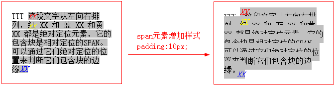
包含块的宽度可以为负,行内元素的第一个框的起始位置位于最后一个框结束位置的右侧,这时包含块为负值。
我增删几个字符来看看效果如下


<p style="border:1px solid red; 200px; padding:20px;">
    TTTTT
    <span style="background-color:#C0C0C0;position:relative;padding:10px;">
        这段文字从左向右排列,红XX 和 蓝 XX 和黄 XX 都是绝对定位元素,它的包含块是相对定位的SPAN。
 可以通过它们绝对定位的位置来判断它们包含块 <em style="position:absolute; color:red; top:0; left:0;">XX</em> <em style="position:absolute; color:yellow; top:20px; left:0;">XX</em>
        <em style="position:absolute; color:blue; bottom:0; right:0;">XX</em>
    </span>
</p>
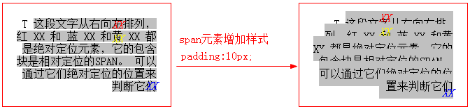
举例:direction:rtl
包含块的上,右是祖先元素第一个框的上,右padding框,包含块的下左是祖先元素最后一个line box的下左padding同理。
<p style="border:1px solid red; 200px; padding:20px; direction:rtl;">
    T
    <span style="background-color:#C0C0C0; position:relative;padding:10px;">
        这段文字从右向左排列,红 XX 和 蓝 XX 和黄 XX 都是绝对定位元素,它的包含块是相对定位的SPAN。
可以通过它们绝对定位的位置来判断它们 <em style="position:absolute; color:red; top:0; left:0;">XX</em> <em style="position:absolute; color:yellow; top:20px; left:0;">XX</em>
        <em style="position:absolute; color:blue; bottom:0; right:0;">XX</em>
    </span>
</p>
其他情况相对简单,不做介绍。接下来是position各取值细节。
二、position:static
static是默认值,表示元素没有别"positioned",position其它值表示元素被"positioned"。所以"已定位元素"表示的就是设置position属性为除static之外的值的元素。position:static元素的布局就是按照盒子模型在正常流中来布局。
使用:
一般不用显示指定,除非想要覆盖之前设置的定位,让元素回归到正常流。
三、position:relative
relative表现和static一样,除非添加了top|right|bottom|left属性。//lxy可以理解为relative是从static到absolute的一个过渡属性状态。就像在inline和block中间过渡有一个inline-block。
相对定位元素属性设置top|right|bottom|left偏离正常位置后,其他元素不会调整位置来弥补偏离后剩下的空间。也可以理解为仍然占据原来空间,所以不影响其他元素布局,可能会覆盖别的元素。
总结:relative元素仍然处于正常流,且不改变display属性,可能会覆盖页面其他元素。
举例:
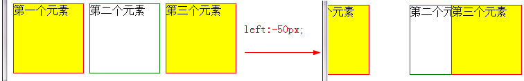
<style>
div{
    display: inline-block;
}
.red{
    width: 100px;
    height: 100px;
    border:1px solid red;
    position: relative;
    background-color: yellow;
}
.green{
    width: 100px;
    height: 100px;
    border:1px solid green;
}
/*.left{
    left: -50px;
}*/
</style>
<body>
    <div class="red left">第一个元素</div>
    <div class="green">第二个元素</div>
    <div class="red left">第三个元素</div>
</body>
取消注释查看设置偏移后的对比效果:
四、position:absolute
position:absolute相对于最近的"positioned" 祖先元素定位。如果没有“positioned”祖先元素,那么它是相对于文档的 body 元素,并且它会随着页面滚动而移动。
绝对定位元素的定位值发生冲突时的解决方法:
- 如果同时指定
top和bottom(非auto),优先采用top。 - 如果同时指定
left和right,若包含块的direction为ltr(英语、汉语等),则优先采用left;若包含块的direction为rtl(阿拉伯语、希伯来语等),则优先采用right。
总结几点:
position:absolute和margin,padding都不冲突,可同时生效。
position:absolute会改变display值,所以会产生包裹性。
position:absolute的元素脱离正常流。所以会产生破坏性。
position:absolute存在时【不加top,right,bottom,left】,float不起作用,所以可以用来去浮动。
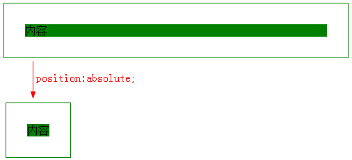
1、包裹性
设置了position:absolute的元素,其尺寸会收缩正好容纳内容。
因为position:absolute会改变元素的display属性【类似浮动】,inline变成block,比如下面例子。
<style>
.container{
    border: 1px solid green;
    padding: 30px;
    background-color: green;
    background-clip: content-box;/*将背景裁剪到内容框,方便看绝对定位元素效果*/
    position: absolute;
}
</style>
<div class="container">内容</div>
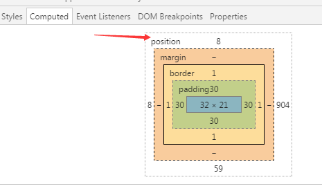
块状元素设置position:absolute后,chrome下top,right,bottom,left变为auto,而ff下直接是计算出的宽度。
补充:【update20170419】
chrome 55.0.2883.87 下设置了position:absolute的元素的top,right,bottom,left也变成了计算值。
下图中盒模型中position盒子的值即为top,right,bottom,left的值。
2、破坏性
举例:子元素absolute,父元素高度塌陷。
<style>
.father{
border:1px solid red;
}
.son{
background-color: green;
position: absolute;
/*float: left;*/
}
</style>
</head>
<body>
    <div class="father">
        <div class="son" >元素内容</div>
    </div>
</body>
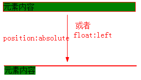
原理:和float一样,position:absolute让元素脱离正常流,而父元素还在正常流中,它们已经是两个世界的东东了,自然撑不起父元素高度。
Note:设置position:absolute后再设置float:left不生效,且最终计算的float值还是none而不是设置的值。
3、不受relative控制的position:absolute举例
不使用top,right,bottom,left中任何一个属性或者使用auto作为值。
一般都是用absolute加margin调整位置。
举例:hot图片始终在求课文字右上角。
<style type="text/css">
.icon-hot {
  position: absolute;
  width: 28px;
  height: 11px;
  margin: -6px 0 0 2px;
  background-color: red;
  background: url(img/new.jpg);
}
</style>
<body>
  <h3>
    <a href="#">
      新项目 <i class="icon-hot"></i>
    </a>
  </h3>
  <a href="#">新项目</a><img src="img/new.jpg" style="margin-bottom:15px;">
</body>

分析:因为position:absolute让<i>标签的display值从inline变成block,所以可以设置宽高。通过margin调整位置。
类似例子:
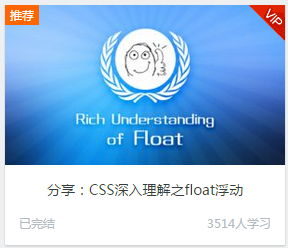
<!doctype html>
<html>
<head>
<meta charset="utf-8">
<title>图标定位二三事</title>
<style>
body { font: 14px/1.4 "Microsoft YaHei"; background-color: #EDEFF0; }
body, h3, h5 { margin: 0; }
img { border: 0 none; vertical-align: bottom; }
.l { float: left; }.r { float: right; }
.constr { width: 1200px; margin-left: auto; margin-right: auto; }

.course { padding-top: 10px; }
.course-list { float: left; width: 280px; height: 240px; margin: 5px 10px 15px; border-radius: 0 0 1px 1px; background-color: #F7FAF9; background-color: rgba(255,255,255,1); box-shadow: 0 1px 2px #c5c5c5; text-decoration: none; }
.course-list-img { background-color: #6396F1; }
.course-list-h { line-height: 50px; font-size: 14px; font-weight: 400; color: #363d40; text-align: center; }
.course-list-tips { margin: 0 14px; font-size: 12px; color: #b4bbbf; overflow: hidden; }

.icon-recom { position: absolute; line-height: 20px; padding: 0 5px; background-color: #f60; color: #fff; font-size: 12px; }
.icon-vip { position: absolute; width: 36px; height: 36px; margin-left: -36px; background: url(http://img.mukewang.com/5453048000015d8800360036.gif); text-indent: -9em; overflow: hidden; }
</style>
</head>

<body>

<div class="main">
    <div class="constr">
        <div class="course">
            <a href="http://www.imooc.com/view/121" class="course-list">
                <div class="course-list-img">
                    <span class="icon-recom">推荐</span>
                    <img width="280" height="160" alt="分享:CSS深入理解之float浮动" src="http://img.mukewang.com/53d74f960001ae9d06000338-300-170.jpg"><!--
                    --><i class="icon-vip">vip</i>
                </div>
                <h5 class="course-list-h">分享:CSS深入理解之float浮动</h5>
                <div class="course-list-tips">
                    <span class="l">已完结</span>
                    <span class="r">3514人学习</span>
                </div>
            </a>
        </div>
    </div>
</div>
</body>
</html>
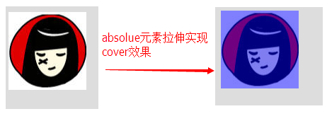
4、无固定宽高容器内绝对定位元素拉伸
举例:实现遮罩效果
<style>
body {
    background-color: #ddd;
}
img {
    vertical-align: bottom;
}
.container {
    display: inline-block;
    position: relative;
}
.cover {
    position: absolute;
    left: 0; top: 0; right: 0; bottom: 0;
    background-color: blue;
    opacity: .5; filter: alpha(opacity=50);
}
</style>
<body>
<span class="container">
    <i class="cover"></i>
    <img src="img/wb.jpg">
</span>
</body>
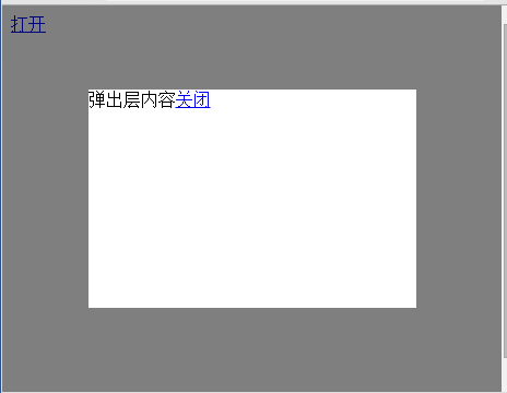
同样的原理实现:全屏自适应遮罩层效果,切加上margin:auto可实现水平且直居中。
<!doctype html>
<html>
<head>
    <meta charset="utf-8">
    <title>没有宽度和高度声明实现的全屏自适应效果by starof</title>
<style>
html, body {
    height: 100%;
}
.overlay {
    display: none;
    position: absolute;
    left: 0;
    top: 0;
    right: 0;
    bottom: 0;
    background-color: rgba(0, 0, 0, 0.5);
}
.content {
    position: absolute;
    width: 300px;
    height: 200px;
    margin: auto;
    left: 0;
    top: 0;
    right: 0;
    bottom: 0;
    background-color: #fff;
}
</style>
</head>

<body>
    <div class="overlay" id="overlay">
        <div class="content">
            弹出层内容
            <a href="javascript:void(0);" id="close">关闭</a>
        </div>
    </div>
    <a href="javascript:void(0);" id="open">打开</a>
<script>
var  openA=document.getElementById("open");
var overlay=document.getElementById("overlay");
var  closeA=document.getElementById("close");
openA.onclick=function(){
overlay.style.display="block";
}
closeA.onclick=function(){
overlay.style.display="none";
}
</script>
</body>
</html>
五、position:fixed
fixed是absolute的特例,相对于视窗来定位,所以页面滚动它还是停靠在相对位置。
所以fixed也会改变元素的display属性,会让元素脱离正常流。
六、position和float的关系
1、position:static;position:relative和float属性可共存。
3、同时设置position:absolute和float,float无效。
4、设置position:absolute的元素可能会覆盖float元素。
举例:
<style>
.float{
    width: 300px;
    height: 150px;
    background: green;
    float:left;
}
.abs{
    width: 150px;
    background-color: red;
    position: absolute;
    top:50px;
}
</style>
</head>
<body>
    <div class="float">我是float:left的DIV</div>
    <div class="abs">我是一个应用了position:absolute的DIV。</div>
</body>
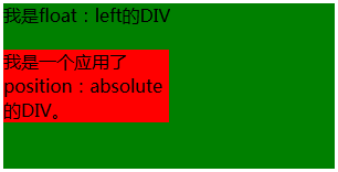
为什么绝对定位元素可能会覆盖浮动元素,因为浏览器渲染的时候相同堆叠上下文中,先渲染非定位元素,再渲染浮动元素,最后渲染已定位元素。
关键问题是,此时设置float元素的z-index来覆盖absolute无效。因为z-index值只适用于已经定位的元素(即position:relative/absolute/fixed),对浮动元素不起作用的。
可将float元素的position属性值设置为relative,然后设置z-index。因为已定位元素并且z-index不是默认的auto的话会生成一个新的堆叠上下文。
如果上面说的还不是很懂,或者想更深入了解z-index原理,可参考:z-index堆叠规则
七、资源链接
KB012: 绝对定位( Absolute positioning )
http://w3help.org/zh-cn/causes/RM1020
http://w3help.org/zh-cn/kb/008/
本文作者starof,因知识本身在变化,作者也在不断学习成长,文章内容也不定时更新,为避免误导读者,方便追根溯源,请诸位转载注明出处:http://www.cnblogs.com/starof/p/4617776.html有问题欢迎与我讨论,共同进步。