(转载)currentColor 让 CSS 更简短
本文转载自 w3cplus 的 currentColor让CSS更简短(2015-05-08 的文章)
- 文章写的不错,原文转载,未做修改
其实currentColor已经出现了有一段时间了,但我是几个月前在阅读Dudley Storey的文章时才听说了currentColor的。Dudley Storey指出currentColor的浏览器 (包括IE9+)支持是非常好的。这对于我把它用于生产已经是非常足够的了,而且我非常惊讶地发现这个关键字其实非常好用:它有助于让CSS代码变得更简洁和智能。
在深入探讨具体的实例之前,先来看一段简短的理论知识。这是MDN中对currentColor的描述:
currentColor关键字表示元素color属性的计算值。它能让原本不能默认通过属性或子元素继承的颜色属性继承。
SVG
SVG是我最喜欢的。举一个在Web上很常见的例子——包含SVG图标以及title的按钮。我的网站上面也有这些按钮:
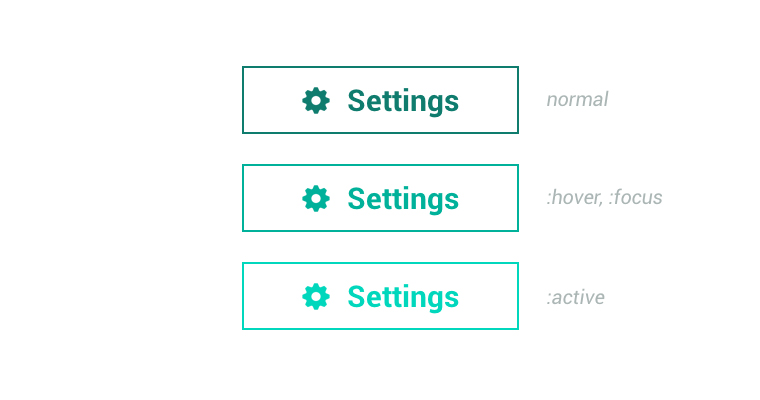
当然,如果你是一个非常负责的网页设计师,为了更好地与用户交互,你为按钮的各个状态(:hover, :focus, :active)设置了不同的样式。你的代码通常会这样写:
.button{
    color: #000;
    border: 2px solid #000;
}
.button:hover,
.button:focus{
    color: #333;
    border-color: #333;
}
.button:active{
    color: #666;
    border-color: #666;
}
.button svg{
    fill: #000;
}
.button:hover svg,
.button:focus svg{
    fill: #333;
}
.button:active svg{
    fill: #666;
}
目前我在为一个客户的电子商务网站写前端代码,做了几个不同的按钮设计。此外,还为几个锚点添加了:visited状态的样式。还有很多其它相似的SVG应用案例(工具栏等),其中SVG的文本必须是有设置颜色的。currentColor帮助我们做了两次代码精简:
/* 把这个放在你的设置默认样式的CSS文件中 */
svg{
    fill: currentColor;
}

/* 现在你完全不需要为SVG设置样式以及边框颜色 */
.button{
    color: #000;
    border: 2px solid currentColor;
}
.button:hover,
.button:focus{
    color: #333;
}
.button:active{
    color: #666;
}
渐变
currentColor关键字可以在任何定义了颜色值的地方使用,包括渐变。在前面的文章中我谈到了如何为超链接加上漂亮的下划线:

通常的CSS渐变样式以及交互状态:
a{
    text-shadow: 2px 0 0 #fff, -2px 0 0 #fff;
    color: #000;
    background-image: -webkit-linear-gradient( left, #000 0%, #000 100% );
    background-image: linear-gradient( to right, #000 0%, #000 100% );
    background-repeat: repeat-x;
    background-position: 0 95%;
    -webkit-background-size: 100% 1px;
    background-size: 100% 1px;
}
a:hover,
a:focus{
    color: #333;
    background-image: -webkit-linear-gradient( left, #333 0%, #333 100% );
    background-image: linear-gradient( to right, #333 0%, #333 100% );
}
a:focus{
    color: #666;
    background-image: -webkit-linear-gradient( left, #666 0%, #666 100% );
    background-image: linear-gradient( to right, #666 0%, #666 100% );
}
a:visited{
    color: #999;
    background-image: -webkit-linear-gradient( left, #999 0%, #999 100% );
    background-image: linear-gradient( to right, #999 0%, #999 100% );
}
background-image是对应下划线的,它有和文本相同的颜色。代码看起来很繁琐。然而,你通常不会把链接都限制为一种颜色。以我个人的经验,它们至少需要有三种颜色:一般链接的颜色、灰色、白色(在背景比较暗的时候),这意味着3倍的代码量。但在这里,currentColor可以创造神奇。
a{
    text-shadow: 2px 0 0 #fff, -2px 0 0 #fff;
    color: #000;
    background-image: -webkit-linear-gradient( left, currentColor 0%, currentColor 100% );
    background-image: linear-gradient( to right, currentColor 0%, currentColor 100% );
    background-repeat: repeat-x;
    background-position: 0 95%;
    -webkit-background-size: 100% 1px;
    background-size: 100% 1px;
}
a:hover,
a:focus     { color: #333; }
a:focus     { color: #666; }
a:visited   { color: #999; }


/* grey links */

.grey-links a           { color: #999; }
.grey-links a:hover,
.grey-links a:focus     { color: #666; }
.grey-links a:active    { color: #333; }
伪元素
我相信你对于CSS三角形应该是非常熟悉的,而且也已多次使用它们。我也是,而且我经常用它们来丰富链接的样式,如下:

CSS伪元素::after在这里是一个三角形。通过使用currentColor,你不需要为三角形以及它的交互状态进行重复的颜色设置:
a           { color: #000; }
a:hover,
a:focus     { color: #333; }
a:active    { color: #666; }

a::after{
     0;
    height: 0;
    border: 0.5em solid transparent;
    border-right: none;
    content: '';
    display: inline-block;
}
a::after,
a:hover::after,
a:focus::after,
a:active::after{
    border-left-color: currentColor;
}
水平线
这不是一个关于如何写更少的CSS代码的例子,它更像是一个写更高效而且可维护的代码的示例。水平线<hr />用于分隔内容的不同部分,我认为水平线的出现不应该是干扰,而是辅助:
Dudley已经在他的示例中提到了这一点,所以我只是重复一下,并为它添加一点修改:
.post{
    color: #000;
}
.post hr{
     33%;
    height: 0.313.em; /* 5px */
    border: none;
    background-color: currentColor;
    opacity: .2;
}
这段代码的智能之处在于,如果你改动了文本的颜色,你就不需要再去更改水平线的颜色,它会自动地随着文本的颜色改变。在工作中我们总是寻求自动化,我们写的代码越多,我们就会越重视自动化的解决方案。
在我走之前
你有更多关于currentColor的实例、或者是用它来精简代码的方法吗?来一起分享吧~~
扩展阅读
本文根据@Osvaldas Valutis的《》所译,整个译文带有我们自己的理解与思想,如果译得不好或有不对之处还请同行朋友指点。如需转载此译文,需注明英文出处:http://osvaldas.info/keeping-css-short-with-currentcolor。
如需转载,烦请注明出处:https://www.w3cplus.com/css3/keeping-css-short-with-currentcolor.html
著作权归作者所有。
商业转载请联系作者获得授权,非商业转载请注明出处。
原文: https://www.w3cplus.com/css3/keeping-css-short-with-currentcolor.html © w3cplus.com