菜单导航
7、背景属性:image、origin、clip、position、size
一、CSS遗漏点
link属性:链接的颜色(如果改成白色什么都看不见)
alink属性:active点击之后的链接的颜色
vlink属性:visited点击之后的颜色
bgcolor属性:背景颜色
word-break:break-all; /* 表示强制换行 */
overflow: auto /* 当内容溢出,显示滚动条 */
@import url(xx.css): 在一个css中,添加对其他css文件的引用
box-sizing: 值content-box (元素的宽高=内容宽高+内边距+边框);
值border-box (元素的宽高=内容宽高, 即增加padding和border之后要想保证盒子元素的宽高不变, 系统会自动减去一部分内容的宽度和高度)
二、块级标签、行内标签、块级-行内标签


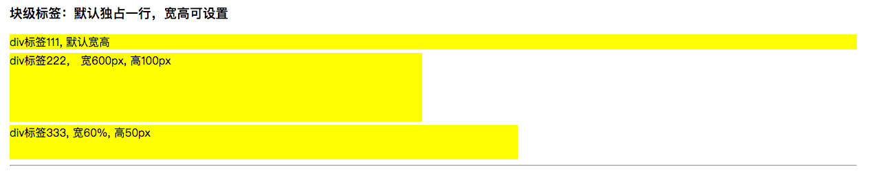
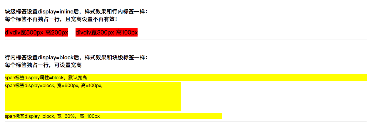
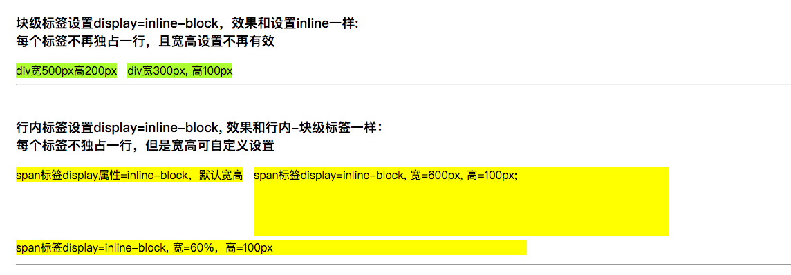
<!DOCTYPE html>
<html lang="cn">
<head>
    <meta charset="UTF-8">
    <title>HTML块级标签和行级标签</title>
    <style type="text/css">
        /*
        HTML标签主要可以分为3大类:
        1、块级标签:
            a、独占一行; b、能随时设置宽度和高度;
            c、代表标签有div、p、h1-h6、ul、li
        2、行内标签(内联标签)
            a、多个行内标签能同时显示在一行
            b、宽度和高度取决于内容的尺寸
            c、代表标签有span、a、label
        3、行内-块级标签(内联-块级标签):具有块级标签和行内标签的特点
            a、多个行内-块级标签可以显示在同一行
            b、能随时设置宽度和高度,代表标签有:input、button


       CSS中有个display属性,能够修改标签的显示类型:
       none: 隐藏标签
       block: 让标签变成块级标签
       inline: 让标签变成行内标签
       inline-block: 让标签变成行内-块级标签(内联-块级标签)
        */

        /** 1、块级标签:默认独占一行,宽高可设置 */
        .divOne { background-color:yellow; margin-bottom: 5px; }
        #divIDOne { width: 600px; height: 100px;}
        #divIDTwo { width: 60%; height: 50px; }

        /** 2、行内标签:默认多个行内标签显示在一行; 宽高取决于内容的尺寸,不可设置 */
        .spanOne { background-color: greenyellow; margin-right: 10px; }
        #spanIDOne { width: 600px; height: 100px; } /* 发现行内标签设置宽高没有作用 */

        /** 3、行内-块级标签:默认多个标签显示在一行;可以设置宽高 */
        .block-inlineOne {border: 5px solid red; margin-right: 10px; }
        #block-inlineIDOne, #block-inlineIDTwo { width: 300px; height: 50px; }

        /** 4、块级标签设置display=inline后,特性就变成了行内标签一样 */
        .divFour { display: inline; background-color: red; font-size: 20px; margin-right: 20px; }
        #divIDFour { width: 500px; height: 200px; }
        #divIDFour2 { width: 300px; height: 200px; }

        /** 5、行内标签设置display=block后,样式特性就和块级标签一样 */
        .spanFive { display: block; background-color: yellow; margin-bottom: 5px; }
        #spanIDFive { width:600px; height: 100px; }
        #spanIDFive2 { width: 60%; heigh: 100px; }

        /** 6、块级标签设置display=inline-block: 效果和设置=inline一样,默认多个标签一行,宽高不可设置 */
        .divSix { display: inline-block; background-color: greenyellow; margin-right: 10px; }
        #dividsix { width: 500px; height: 200px; }
        #dividsix2 { width: 300px; height: 100px; }


        /** 7、行内标签设置display=inline-block:效果和行内标签一样:不独占一行,宽高可设置 */
        .spanSeven { display:inline-block; background-color: yellow; margin-right: 10px; margin-bottom: 5px;}
        #spanIDSeven { width:600px; height: 100px; }
        #spanIDSeven2 { width: 60%; heigh: 100px; }

    </style>
</head>
<body>
    <div style="padding:50px;">
        <!-- 1、块级标签演示 -->
        <h3>块级标签:默认独占一行,宽高可设置</h3>
        <div class="divOne">div标签111, 默认宽高</div>
        <div class="divOne" id="divIDOne">div标签222, 宽600px, 高100px</div>
        <div class="divOne" id="divIDTwo">div标签333, 宽60%, 高50px</div>
        <hr/><br/>

        <!-- 2、行内标签演示 -->
        <h3>行内标签:默认多个行内标签显示在一行; 宽高取决于内容的尺寸,自定义设置无效</h3>
        <span class="spanOne">span11111, 默认宽高</span>
        <span class="spanOne" id="spanIDOne">span标签222, 设置宽600px, 高100px</span>
        <hr/><br/>

        <!-- 3、行内-块级标签 -->
        <h3>行内-块级标签:默认多个标签显示在一行;可设置宽高</h3>
        <input class="block-inlineOne" value="文本框111,默认宽高"/>
        <input class="block-inlineOne" id="block-inlineIDOne" value="文本框222, 宽300px, 高50px"/>
        <button class="block-inlineOne" id="block-inlineIDTwo">按钮222, 宽300px, 高50px</button>
        <hr/><br/>

        <!-- 4、块级标签样式像行内标签一样 -->
        <h3>块级标签设置display=inline后,样式效果和行内标签一样:<br/>每个标签不再独占一行,且宽高设置不再有效!</h3>
        <div class="divFour" id="divIDFour">divdiv宽500px 高200px</div>
        <div class="divFour" id="divIDFour2">divdiv宽300px 高100px</div>
        <hr/><br/>

        <!-- 5、行内标签样式特性像块级标签一样 -->
        <h3>行内标签设置display=block后,样式效果和块级标签一样:<br/>每个标签独占一行,可设置宽高</h3>
        <span class="spanFive">span标签display属性=block,默认宽高</span>
        <span class="spanFive" id="spanIDFive">span标签display=block, 宽=600px, 高=100px;</span>
        <span class="spanFive" id="spanIDFive2">span标签display=block, 宽=60%,高=100px</span>
        <hr/><br/>

        <!-- 6、块级标签特性像行内-块级标签一样:不换行可设宽高 -->
        <h3>块级标签设置display=inline-block,效果和设置inline一样: <br/>每个标签不再独占一行,且宽高设置不再有效</h3>
        <div class="divSix" id="divIDSix">div宽500px高200px</div>
        <div class="divSix" id="divIDSix2">div宽300px, 高100px</div>
        <hr/><br/>

        <!-- 7、行内标签设置display=inline-block -->
        <h3>行内标签设置display=inline-block, 效果和行内-块级标签一样:<br/>每个标签不独占一行,但是宽高可自定义设置</h3>
        <span class="spanSeven">span标签display属性=inline-block,默认宽高</span>
        <span class="spanSeven" id="spanIDSeven">span标签display=inline-block, 宽=600px, 高=100px;</span>
        <span class="spanSeven" id="spanIDSeven2">span标签display=inline-block, 宽=60%,高=100px</span>
        <hr/><br/>
    </div>
</body>
</html>
效果截图:

三、CSS之float
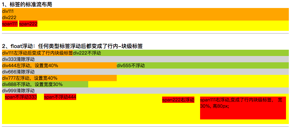
1、默认情况下,所有的网页标签都在标准流布局中,遵循规则:
标签排列从上到下,从左到右
垂直排版, 如果元素是块级元素, 那么就会垂直排版
水平排版, 如果元素是行内元素/行内块级元素, 那么就会水平排版
2、脱离标准流的方法有:
1)、浮动:float属性,取值有left和right。即脱离标准流,浮动在父标签的最左边和最右边
浮动流只有一种排版方式, 就是水平排版. 它只能设置某个元素左对齐或者右对齐;
在浮动流中是不区分块级元素/行内元素/行内块级元素的;
无论是块级元素/行内元素/行内块级元素都可以水平排版;
在浮动流中无论是块级元素/行内元素/行内块级元素都可以设置宽高,浮动流中的元素和标准流中的行内块级元素很像
清除浮动:{clear: both;}
2)、定位:postion属性,配合left、right、top、bottom属性一起使用;
position的取值有:
static: 默认值,没有定位,元素出现在正常的流中;
absolute: 绝对定位,相对于static定位以外的第一个元素进行定位;元素的位置通过left、top、right、bottom属性进行规定;
fixed: 决定定位,相对于浏览器窗口进行定位,元素的位置通过left、top、right、bottom属性进行规定;
relative: 生成相对定位的元素,相对于其正常位置进行定位;
inherit: 规定应该从父元素集成的position属性的值
》》》》》》》》》》》》》》》》》》》》》》》》》》》》》》》》》》》》》》》》
3.1、浮动属性float测试:
<!DOCTYPE html>
<html lang="cn">
<head>
    <meta charset="UTF-8">
    <title>CSS 浮动float和定位position属性测试</title>
    <style type="text/css">

        h3 { margin: 0px; }

        /** 1、标签的标准流布局 */
        .divOne { background-color: yellow; height: 80px; }
        .divOne div { background-color: orange; }
        .divOne span { background-color: red; }


        /** 2、标签的浮动float */
        .divTwo { background-color: yellow; height: 260px; }
        .divTwoLeft { float:left; background-color: orange; }
        .divTwoNormal { background-color: yellowgreen; }
        .divTwoClear { clear: both; background-color: lightgray; } /** 清除浮动 */
        .divTwo span { background-color: red; margin: 10px; }
        .spanTwoRight { float: right; }

    </style>
</head>
<body>
    <div class="content">
        <h3>1、标签的标准流布局</h3>
        <div class="divOne">
            <div>div111</div>
            <div>div222</div>
            <span>span111</span>
            <span>span222</span>
        </div>
        <hr/><br/>

        <h3>2、float浮动:任何类型标签浮动后都变成了行内-块级标签</h3>
        <div class="divTwo">
            <div class="divTwoLeft">div111左浮动后变成了行内块级标签</div>
            <div class="divTwoNormal">div222不浮动</div>
            <div class="divTwoClear">div333清除浮动</div>
            <div class="divTwoLeft" style=" 40%;">div444左浮动,设置宽40%</div>
            <div class="divTwoNormal">div555不浮动</div>
            <div class="divTwoClear">div666清除浮动</div>
            <div class="divTwoLeft" style=" 40%;">div777左浮动,设置宽40%</div>
            <div class="divTwoNormal" style=" 30%;">div888不浮动,设置宽度30%</div>
            <div class="divTwoClear">div999清除浮动</div>
            <span class="spanTwoRight" style=" 30%; height: 80px;">span111右浮动,变成了行内块级标签, 宽30%, 高80px;</span>
            <span class="spanTwoRight">span222右浮动</span>
            <span>span不浮动333</span>
            <span>span不浮动444</span>
        </div>
        <hr/><br/>
    </div>
</body>
</html>
效果截图:
定位postion属性测试
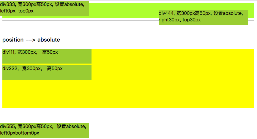
3.2、position之absolute测试
<!DOCTYPE html>
<html lang="cn">
<head>
    <meta charset="UTF-8">
    <title>CSS样式之position</title>
    <style type="text/css">
        /** 3、position */
        .divOne { background-color: yellow; height: 200px; }
        .divOne > div { background-color: yellowgreen; width: 300px; height: 50px; margin-bottom: 5px; }
        .divOne3 { position: absolute; left:0px; top:0px; }
        .divOne4 { position: absolute; right:30px; top:30px; }
        .divOne5 { position: absolute; left:0px; bottom: 0px; }
    </style>
</head>
<body>
    <div>
        <div style="height: 50px; background-color:greenyellow;">divdivdiv高度50px</div>
        <hr/><br/>

        <h3>position --> absolute</h3>
        <div class="divOne">
            <div>div111, 宽300px, 高50px</div>
            <div>div222,宽300px, 高50px</div>
            <div class="divOne3">div333, 宽300px高50px, 设置absolute, left0px, top0px</div>
            <div class="divOne4">div444, 宽300px高50px, 设置absolute, right30px, top30px</div>
            <div class="divOne5">div555, 宽300px高50px,设置absolute, left0pxbottom0px</div>
        </div>
    </div>
</body>
</html>
效果截图:
3.3、postion之fixed
把上面打代码改下,position=absolute改成position=fixed, 发现fixed和absolute效果差不多;
这是在页面没有滚动条的情况下,当页面元素内容比较多有滚动条的情况下,absolute和fixed的区别就出来了。
可以这么理解,fixed:固定在当前window不动,不管页面有多长,fixed设定的元素一直在那个位置,不随滚动而滚动;
absolute:会随参照对象元素的高度和宽度变化而变化;
<!DOCTYPE html>
<html lang="cn">
<head>
    <meta charset="UTF-8">
    <title>CSS样式之position</title>
    <style type="text/css">
        /** 3、position */
        .divOne { background-color: yellow; height: 200px; }
        .divOne > div { background-color: yellowgreen; width: 300px; height: 50px; margin-bottom: 5px; }
        .divOne3 { position: fixed; left:0px; top:0px; }
        .divOne4 { position: fixed; right:30px; top:30px; }
        .divOne5 { position: fixed; left:0px; bottom: 0px; }
    </style>
</head>
<body>
<div>
    <div style="height: 50px; background-color:greenyellow;">divdivdiv高度50px</div>
    <hr/><br/>
    <h3>position --> fixed</h3>
    <div class="divOne">
        <div>div111, 宽300px, 高50px</div>
        <div>div222,宽300px, 高50px</div>
        <div class="divOne3">div333, 宽300px高50px, 设置fixed, left0px, top0px</div>
        <div class="divOne4">div444, 宽300px高50px, 设置fixed, right30px, top30px</div>
        <div class="divOne5">div555, 宽300px高50px,设置fixed, left0pxbottom0px</div>
    </div>
    <p style="height:1000px;background-color:yellow;">p标签,height1000px</p>
</div>
</body>
</html>
效果截图:

3.4、postion之relative
相对于元素之前的位置的移动。当relative配合left/top进行移动后,之前的位置会有一个占位
<!DOCTYPE html>
<html lang="cn">
<head>
    <meta charset="UTF-8">
    <title>CSS样式之position</title>
    <style type="text/css">
        /** 3、position */
        .divOne { background-color: yellow; height: 300px; }
        .divOne > div { background-color: yellowgreen; width: 300px; height: 50px; margin-bottom: 5px; }
        .divOne3 { position: relative; left:0px; top:0px; }
        .divOne4 { position: relative; left:100px; top:50px; }
        .divOne5 { position: relative; right:-400px; bottom: 200px; }
    </style>
</head>
<body>
<div>
    <div style="height: 50px; background-color:greenyellow;">divdivdiv高度50px</div>
    <hr/><br/>
    <h3>position --> relative: 相对于当前元素之前位置的位移</h3>
    <div class="divOne">
        <div>div111, 宽300px, 高50px</div>
        <div>div222,宽300px, 高50px</div>
        <div class="divOne3">div333, 宽300px高50px, 设置relative, left0px, top0px</div>
        <div class="divOne4">div444, 宽300px高50px, 设置relative, left100px, top50px</div>
        <div class="divOne5">div555, 宽300px高50px,设置relative, right-400px, bottom200px</div>
    </div>
</div>
</body>
</html>
效果截图:
3.5、相对定位里面的绝对定位(子绝对父相对)
1)、默认情况下所有的绝对定位的元素, 无论有没有父元素, 都会以body作为参考点,所以元素的位置会随着浏览器的宽度高度的变化而变化;
2)、而相对定位不会脱离标准流, 会继续在标准流中占用一份空间, 所以不利于布局界面
3)、但是如果一个绝对定位的元素的父级元素也是定位流(绝对/相对/固定,不能是静态定位), 那么这个元素的绝对定位就会以父级元素为参考点;
4)、如果嵌套的父级元素都是定位流,那么绝对定位的元素以离它最近的父级元素为参考点
5)、对于嵌套的元素都是定位流,则定位流中的子元素会忽略父级元素的padding属性,即定位流父级元素的pading将不会起作用
<!DOCTYPE html>
<html lang="cn">
<head>
    <meta charset="UTF-8">
    <title>CSS样式之position</title>
    <style type="text/css">
        /** 3、position */
        .divOne { background-color: yellow; height: 200px; }
        .divOne > div { background-color: yellowgreen; width: 300px; height: 50px; margin-bottom: 5px; }
        .divOne3 { position: absolute; left:0px; top:0px; }
        .divOne4 { position: absolute; right:30px; top:30px; }
        .divOne5 { position: absolute; left:0px; bottom: 0px; }


        /** 相对定位里面的子标签绝对定位 */
        .testDiv { margin-left: 300px; position:relative; height: 500px; width: 60%; background-color:greenyellow; }
        .testDiv2 { position: absolute; left: 20px; top:50px; color: red; border: 3px solid red; }


        /** 子绝对父相对的应用 */
        .testUL { list-style:none; border: 1px solid red; height: 100%; text-align:center; }
        .testUL li { float:left; padding: 0px 20px; border: 1px dashed blue; }
        .testUL li:nth-of-type(4) { background-color: mediumpurple; }
        /* 相对定位的弊端,会继续在标准流中占用空间 */
       /* .testUL img { position:relative; left: -48px; top: -16px; } */
        /** 绝对定位的弊端:以body为参考点,宽高会随着浏览器的宽高而变化 */
        /*.testUL img { position:absolute; left: 345px; top: 1200px; }*/

        /** 父相对,子绝对结合使用 */
        .testUL li:nth-of-type(4) { position: relative; }
        .testUL img { position:absolute; left: 42px; top: 22px; }
    </style>
</head>
<body>
    <div>
        <div style="height: 50px; background-color:greenyellow;">divdivdiv高度50px</div>
        <hr/><br/>

        <h3>position --> absolute</h3>
        <div class="divOne">
            <div>div111, 宽300px, 高50px</div>
            <div>div222,宽300px, 高50px</div>
            <div class="divOne3">div333, 宽300px高50px, 设置absolute, left0px, top0px</div>
            <div class="divOne4">div444, 宽300px高50px, 设置absolute, right30px, top30px</div>
            <div class="divOne5">div555, 宽300px高50px,设置absolute, left0px, bottom0px</div>
        </div>
    </div>

    <!--
    1.规律
    1.默认情况下所有的绝对定位的元素, 无论有没有祖先元素, 都会以body作为参考点

    2.如果一个绝对定位的元素有祖先元素, 并且祖先元素也是定位流, 那么这个绝对定位的元素就会以定位流的那个祖先元素作为参考点
    2.1只要是这个绝对定位元素的祖先元素都可以
    2.2指的定位流是指绝对定位/相对定位/固定定位
    2.3定位流中只有静态定位不行

    3.如果一个绝对定位的元素有祖先元素, 并且祖先元素也是定位流, 而且祖先元素中有多个元素都是定位流, 那么这个绝对定位的元素会以离它最近的那个定位流的祖先元素为参考点
    -->
    <br/><hr/><br/>
    <h1>测试父标签相对定位,子标签绝对定位</h1>
    <div style="border:1px solid red;">
        <div class="testDiv">
            <h3>我是testDiv里面的h2, testDiv相对定位,width60%, margin-left=300px, height=500px</h3>
            <div class="testDiv2">testDiv子标签testDiv2,
                position: absolute; left: 20px; top:50px; color: red; border: 3px solid red;
            </div>
        </div>
    </div>

    <!--
    相对定位弊端:
    相对定位不会脱离标准流, 会继续在标准流中占用一份空间, 所以不利于布局界面

    绝对定位弊端:
    默认情况下绝对定位的元素会以body作为参考点, 所以会随着浏览器的宽度高度的变化而变化

    结合这两种定位的优势,通常一起使用
    -->
    <br/><hr/><br/>
    <h1>子绝对父相对的应用示例</h1>
    <div style="background-color:yellow; height: 100px;line-height: 100px;">
        <ul class="testUL">
            <li>京东商场</li>
            <li>天猫</li>
            <li>淘宝</li>
            <li>苏联易购
                <img src="img/hot.png"/>
            </li>
            <li>国美电器</li>
            <li>一号店</li>
            <li>名创优品</li>
        </ul>
    </div>
</body>
</html>
4、元素过渡动画效果:transition
css3的transition属性(过渡动画)效果主要有四个属性:*-property; *-duration; *-timing-function; *-delay;
- 需要过渡的属性,多个用逗号隔开--> transition-property: width, height, color, transform;
- 过渡时间,不同属性的过渡时间可以设置不一样--> transition-duration: 1s, 2s, 3s, 1s;
- 过渡运行速度,默认为ease(开始和结束缓慢,中间加快)--> transition-timing-function: ease,linear,ease-in,ease-out;
- 过渡延迟时间,默认为0--> transition-delay: 0, 0, 0, 0;
简写形式:tansition: width 1s linear 0, height 2s ease 0, color 3s ease-in 0; //分别设置多个属性过渡
transition: all 3s; //设置所有的属性都使用过渡,时间设置统一,其他运行速度和延时可以省略使用默认
截图,看下过渡的应用效果:


完整测试代码:
<!DOCTYPE html>
<html lang="cn">
<head>
    <meta charset="UTF-8">
    <title>过渡transition</title>
    <style type="text/css">
        /*
        设置过渡元素效果transition, Safari需要前缀-webkit-, css3过渡是元素从一种样式逐渐改变为另一种的效果
        要实现这一点,必须规定两项内容: 规定你希望吧效果添加到哪个css属性上;规定效果的时长
        transition-property: none|all|property;  设置css需要过渡的属性的名称,none表示没有属性会获得过渡效果,all表示所有属性获得过渡效果,
            property表示定义应用过渡效果的css属性名称列表,列表以逗号分隔。
        transition-duration: 0; 定义过渡效果花费的时间,默认为0
        transition-timing-function: ease|linear|ease-in|ease-out|ease-in-out; 定义过渡运行速度,默认ease开始和结束慢速,中间加快,linear表示匀速
        transition-delay: 0s; 延迟时间

        过渡连写格式transition: 过渡属性 过渡时长 运动速度 延迟时间;
        过渡连写注意点
        1和分开写一样, 如果想给多个属性添加过渡效果也是用逗号隔开即可
        2连写的时可以省略后面的两个参数, 因为只要编写了前面的两个参数就已经满足了过渡的三要素
        3如果多个属性运动的速度/延迟的时间/持续时间都一样, 那么可以简写为 transition:all 0s;
        transition: transform 1s;  transition: width 1s,height 2s;   transition: all 3s;
         */
        .durationClass {
            height: 50px;
            width: 100px;
            background-color: red;
            /* 设置需要过渡的元素, 多个过度元素用逗号隔开 */
            transition-property: width, background-color;
            /* 设置过渡元素的时间 */
            transition-duration: 3s, 3s;
            /* 延迟动画时间 */
            /*transition-delay: 2s;*/
        }
        .durationClass:hover{ width: 300px; background-color: purple; }

        /* 过渡动画其他元素 */
        .testUL { padding: 10px 0px; background-color:yellow; width:590px; height: 200px; }
        .testUL li {
            width: 90px; height: 30px; line-height: 30px; text-align: center; color: #ffffff; font-size: 14px;
            background-color: green;
            margin: 10px 0px;
            list-style: none;
            transition-property: margin-left;
            transition-duration: 5s;
        }
        .testUL:hover li { margin-left: 500px; }
        .testUL li:nth-child(1) { transition-timing-function: linear; }
        .testUL li:nth-child(2) { transition-timing-function: ease; }
        .testUL li:nth-child(3) { transition-timing-function: ease-in;}
        .testUL li:nth-of-type(4) { transition-timing-function: ease-out; }
        .testUL li:nth-child(5) { transition-timing-function: ease-in-out; }

        /* 元素动画变大 */
        .divToBig {
            float:left;
            background-color: red; width: 100px; height: 50px;
            transition-property: width, height, background-color;
            transition-duration: 5s, 5s, 10s;
        }
        .divToBig:hover { width: 500px; height: 300px; background-color:green;}

        /* 元素过渡的简写: transition: 过渡属性 过渡时长 运动速度 延迟时间; */
        .divFour {
            float: left; margin-left: 10px;
            background-color: black;
            width: 100px; height: 50px;
            transition: width 5s linear 0s, height 5s linear 0s, background-color 10s linear 0s;
        }
        .divFour:hover { width: 500px; height: 300px; background-color:green; }

        /* 元素过渡的另一种简写方法,针对所有的属性,且所有属性过渡时长相同 */
        .divFive {
            float:left; margin-left: 10px;
            background-color: gray;
            width: 100px; height: 50px;
            transition: all 5s;
        }
        .divFive:hover { width: 500px; height: 300px; background-color:orangered; }

        /* 字体变大,高度变高 */
        .divSix {
            background-color:orange;
            width: 880px;
            text-align: center;
            margin: 10px;
            padding: 10px;
            cursor:pointer;
        }
        .divSix span { transition: all 10s; }
        .divSix:hover span { margin: 0 12px; font-size: 80px; color:blue; }

        /* 手风琴效果 480/6=80 480-300 = 180/5=36 */
        .imgUL{
            width: 480px; height: 168px; border: 1px solid black;
            margin: 20px 0px; list-style: none; padding:0px; overflow: hidden;
        }
        .imgUL li { float:left; height: 100%; width: 80px; padding:0px; transition: all 0.5s; }
        .imgUL li img { width: 300px; }
        .imgUL:hover li{ width: 36px; }
        .imgUL li:hover { width: 300px; }
    </style>
</head>
<body>

    <h2>过渡元素注意要点:</h2>
    <div>1、过渡效果一定要有属性发生变化,哪个属性需要过渡</div>
    <div>2、过渡效果一定要有过渡时间</div>
    <div class="durationClass"></div><br/><hr/><br/>
    <ul class="testUL">
        <li>linear</li><li>ease</li><li>ease-in</li><li>ease-out</li><li>ease-in-out</li>
    </ul><br/><hr/><br/>

    <div>
        <div class="divToBig">div</div>
        <div class="divFour"></div>
        <div class="divFive"></div>
        <div style="clear:both;"></div>
        <div class="divSix">
            <span>H</span><span>e</span><span>l</span><span>l</span><span>o</span><span>, </span>
            <span>w</span><span>o</span><span>r</span><span>l</span><span>d</span>
        </div><br/><hr/><br/>
    </div>

    <div>
        <h3>手风琴效果</h3>
        <ul class="imgUL">
            <li><img src="../img/star/0.jpg" /></li>
            <li><img src="../img/star/2.jpg" /></li>
            <li><img src="../img/star/8.jpg" /></li>
            <li><img src="../img/star/14.jpg" /></li>
            <li><img src="../img/star/19.jpg" /></li>
            <li><img src="../img/star/21.jpg" /></li>
        </ul>
    </div>

    <div style="100%;height:200px;"></div>
</body>
</html>
5、动画animation
动画animation的属性主要有:
- 规定动画 --> @keyframes xxx { from {} to {} } 或 @keyframes xxx { 0% {} 50% {} 100%{} }
- 动画名字 --> animation-name: xxx
- 动画持续时间 --> animation-duration: 2s;
- 动画的速度曲线 --> animation-timing-function: ease | linear | ease-in | ease-out | ease-in-out; //默认ease
- 动画延迟时间 --> animation-delay: 0s;
- 动画播放次数 --> animation-iteration-count: number | infinite; //具体的几次或者无穷次(infinite)
- 动画下一次运行是否逆向地播放 --> animation-direction: normal | alternate; //默认normal, alternate表示往返播放
- 动画播放状态,是否正在运行或暂停 --> animation-play-state: running | paused; //默认running
- 动画结束后的状态 --> animation-fill-mode: none | forwards | backwards | both;
动画简写形式 --> animation: 动画名字 持续时间 动画速度 延迟时间 执行次数 是否往返
看下动画的应用效果图:

使用动画实现的一个无限轮播图效果

具体实现代码:
<!DOCTYPE html>
<html lang="cn">
<head>
    <meta charset="UTF-8">
    <title>动画animation</title>
    <style type="text/css">
        /* 1、过渡动画 */
        .divOne { width: 100px; height: 50px; background-color:red; transition: margin-left 5s; }
        .divOne:hover { margin-left: 300px; }

        /* 2、动画animation
        动画animation和过渡transition的区别:都需要变化的属性、时间;另外动画自动执行,过渡需要触发执行
         */
        .divTwo { width: 100px; height: 50px; background-color: blue;
            animation-name: twoAnim; /* 设置动画名字 */
            animation-duration: 5s; /* 设置动画时间 */
        }
        @keyframes twoAnim {
            from{ margin-left: 0px; }
            to { margin-left: 300px; }
        }

        /* 3、动画animation的其他属性,语法:animation: name duration timing-function delay iteration-count direction */
        .divThree { width: 100px; height: 50px; background-color: green;
            animation-name:threeAnim;
            animation-duration: 2s;
            animation-delay: 2s; /* 设置延迟时间 */
            /* animation-iteration-count:动画迭代次数:n | infinite --> n次或无限次 */
            animation-iteration-count: 3; /* 设置动画执行次数, 设置infinite为无限次  */
            /* animation-timing-function:动画的速度曲线:
            linear匀速/
            ease默认(低速开始,然后加快,在结束前变慢)
            ease-in: 动画以低速开始
            ease-out: 动画以低速结束
            ease-in-out: 动画以低速开始和结束
            */
            animation-timing-function: ease-out; /* 设置速度 */
            /* animation-direction 告诉系统是否需要执行往返动画
            取值:
            normal, 默认的取值, 执行完一次之后回到起点继续执行下一次
            alternate, 往返动画, 执行完一次之后往回执行下一次
            */
            animation-direction: alternate;
            animation-play-state: running; /* 设置动画执行状态,默认是running, 还有一个值为暂停paused */
        }
        @keyframes threeAnim {
            from { margin-left: 0px; }
            to { margin-left: 300px; }
        }
        .divThree:hover { animation-play-state: paused; }

        /* 4、div动画设置多个点移动 */
        .divFour{
            width: 50px; height: 50px; background-color: purple;
            margin: 10px;
            animation-name: fourAnim;
            animation-duration: 5s;
            position: relative;
            animation-iteration-count: 3;
            animation-direction: alternate;
        }
        .divFour:hover { animation-play-state: paused; }
        @keyframes fourAnim {
            0% { left: 0px; top:0px; }
            25% { left: 500px; top:0px; }
            50% { left: 500px; top: 300px; }
            75% { left: 0px; top: 300px; }
            100% { left: 0px; top: 0px; }
        }

        /* 5、动画的保持状态 */
        .divFive {
            width: 200px; height: 200px; background-color: yellow;
            border-top: 5px solid red; border-left: 5px dashed black;
            border-bottom: 5px solid blue; border-right: 5px dashed purple;
            margin: 10px auto;
            animation-name: fiveAnim;
            animation-duration: 5s;
            animation-delay: 1s;
            /*
            动画状态:
            1.等待状态
            2.执行状态
            3.结束状态

            animation-fill-mode作用:
            指定动画等待状态和结束状态的样式
            取值:
            none: 不改变默认行为(动画结束时保持最后一帧状态)
            forwards: 让元素结束状态保持动画最后一帧的样式
            backwards: 动画结束时显示动画第一帧的状态
            both: 让元素等待状态显示动画第一帧的样式, 让元素结束状态保持动画最后一帧的样式
            */
            /*backwards要配合延迟才能看出效果*/
            /*animation-fill-mode: backwards;*/
            animation-fill-mode: forwards;
            /*animation-fill-mode: both;*/
        }
        .divFive:hover { animation-play-state: paused; }
        @keyframes fiveAnim {
            0% { transform: rotate(60deg); }
            25% { transform: rotate(90deg); }
            50% { transform: rotate(120deg); }
            75% { transform: rotate(180deg); }
            100% { transform: rotate(240deg); }
        }

        /* 6、动画的连写:animation: 动画名称 动画时间 动画速度 延迟时间 执行次数 是否交替往返 */
        .divSix { width:50px; height: 50px; position: relative; border: 10px solid red;
            animation: sixAnim 5s linear 2s 3;
        }
        @keyframes sixAnim {
            0% { left: 100px; top: 0px; }
            25% { left: 500px; top: 0px; }
            50% { left: 500px; top: 100px; }
            75% { left: 250px; top: 100px; }
            100% { left: 0px; top: 0px; }
        }

        /* 7、云层移动演示 */
        .ulSeven {
            height:400px; margin:50px; background-color: skyblue; list-style: none;
            position: relative; overflow: hidden;
            /* 设置动画:动画名称 动画执行时间 延迟时间 动画运行速度 执行次数(无限次) 执行效果(往返执行)  */
            animation: cloudUL 30s 0s linear infinite alternate;
        }
        .ulSeven li {
            position: absolute; left: 0; top: 0;
            width: 400%; height: 100%;
        }
        .ulSeven li:nth-child(1) {
            background-image: url('img/cloud_one.png');
            background-position-y: -50px;
            animation: cloudOne 30s 0s linear infinite alternate;
        }
        .ulSeven li:nth-child(2) {
            background-image: url('img/cloud_one.png');
            background-position-y: -50px;
            animation: cloudTwo 30s 0s linear infinite alternate;
        }
        .ulSeven li:nth-child(3) {
            background-image: url('img/cloud_one.png');
            background-position-y: -50px;
            animation: cloudThree 30s 0s linear infinite alternate;
        }

        @keyframes cloudUL { /* ul云层背景颜色变化 */
            from { background-color: skyblue; }
            to { background-color: black; }
        }

        @keyframes cloudOne {
            from { margin-left:0%; }
            to { margin-left: -100%; }
        }
        @keyframes cloudTwo {
            from { margin-left:0%; }
            to { margin-left: -200%; }
        }
        @keyframes cloudThree {
            from { margin-left:0%; }
            to { margin-left: -300%; }
        }


        /* 8、无限循环图片滚动演示 */
        .divEight { width:670px;height: 150px; margin: 10px auto; overflow: hidden;  }
        .ulEight {
            list-style: none; width: 2100px; height: 150px;
            margin:0px; padding:0px;
            animation: imgMove 10s 0s linear infinite normal;
        }
        .ulEight li { float: left; width: 335px; margin:0px; padding:0px; }
        .ulEight li img { width: 335px; display: block !important; }
        .ulEight:hover { animation-play-state: paused; }
        .ulEight:hover li { opacity: 0.5; }
        .ulEight li:hover { opacity: 1; }

        @keyframes imgMove {
            from { margin-left: 0px; }
            to { margin-left: -1340px; }
        }
    </style>
</head>
<body>
    <div class="content">
        <div class="divOne"></div>
        <div class="divTwo"></div>
        <div class="divThree"></div>
        <div class="divFour"></div>
        <div class="divFive">111</div>
        <div class="divSix"></div>
        <br/><hr/><br/>
        <!-- 云层滚动演示 -->
        <ul class="ulSeven"><li></li><li></li><li></li></ul>
        <hr/><br/>
        <h3>使用动画实现图片无限轮播</h3>
        <div class="divEight">
            <ul class="ulEight">
                <li><img src="../img/star/0.jpg" /></li>
                <li><img src="../img/star/1.jpg" /></li>
                <li><img src="../img/star/2.jpg" /></li>
                <li><img src="../img/star/3.jpg" /></li>
                <li><img src="../img/star/0.jpg" /></li>
                <li><img src="../img/star/1.jpg" /></li>
            </ul>
        </div>
    </div>
    <div style=" 100%; height: 200px;"></div>
</body>
</html>
6、形变transform之2d和3D,及透视效果
6.1 形变transform之2D常用属性和方法
- transform :向元素应用2D或3D转换
- transform-origin :允许你改变被转换元素的位置
- - - - - - -
- translate(x,y) :定义2D转换,沿着X和Y轴移动元素
- translateX(n) :定义2D转换,沿着X轴移动元素
- translateY(n) :定义2D转换,沿着Y轴移动元素
- scale(x, y) :定义2D缩放转换,改变元素的宽度和高度
- scaleX(n) :定义2D缩放转换,改变元素的宽度
- scaleY(n) :定义2D缩放转换,改变元素的高度
- rotate(angle) :定义2D旋转,在参数中规定角度
- skew(x-angle, y-angle) :定义2D倾斜转换,沿着X和Y轴
- skewX(angle) :定义2D倾斜转换,沿着X轴
- skewY(angle) :定义2D倾斜转换,沿着Y轴
6.2 transform之3D常用转换属性和方法
- transform :向元素应用2D或3D转换
- transform-origin :允许改变被转换元素的位置
- transform-style :flat | preserve-3d; //规定被嵌套元素如何在3D空间中显示
- perspective :number | none; //规定的3D元素的透视效果
- perspective-origin :规定3D元素的底部位置
- backface-visibility :visible | hidden; //定义元素在不面对屏幕时是否可见
- - - - - - -
- translate3d(x, y, z) :定义3d转换
- translateX(x) :定义3D转换,仅使用用于X轴的值
- translateY(y) :定义3D转换,仅使用用于Y轴的值
- translateZ(z) :定义3D转换,仅使用用于Z轴的值
- scale3d(x, y, z) :定义3D缩放转换
- scaleX(x) :定义3D缩放转换,通过给定一个X轴的值
- scaleY(y) :定义3D缩放转换,通过给定一个Y轴的值
- scaleZ(z) :定义3D缩放转换,通过给定一个Z轴的值
- rotate3d(x, y, z, angle) :定义3D旋转
- rotateX(angle) :定义沿X轴的3D旋转
- rotateY(angle) :定义Y轴的3D旋转
- rotateZ(angle) :定义Z轴的3D旋转
- perspective(n) :定义3D转换元素的透视视图
6.3 测试示例
形变中心点位置变化,及3D形变效果,透视效果
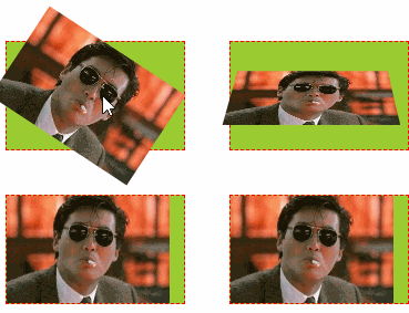
示例代码:
<!DOCTYPE html> <html lang="cn"> <head> <meta charset="UTF-8"> <title>2D转换和阴影、形变</title> <style type="text/css"> ul, li{ margin: 0px; padding: 0px; list-style:none; } /* 1、演示形变属性:旋转、移动、缩放 */ .testUL{ float: left; border: 1px solid red; width: 300px; text-align: center; } .testUL li { background-color: red; width: 100px; line-height: 30px; margin: 50px; } .testUL li:nth-child(2){ /* 顺时针旋转45度,deg是角度 */ transform: rotate(45deg); } .testUL li:nth-of-type(3){ /* 移动 translate(100px, 50px) //第一个参数是水平方向平移,第二个参数是竖直方向平移 */ transform: translate(100px, -50px); } .testUL li:nth-of-type(4){ /* 缩放:scale(2, 0.5) // 水平放大2倍,数值缩小0.5倍 scale(2) 表示水平数值都放大2倍 */ transform: scale(2, 1.5); } .testUL li:nth-child(5){ /* 注意点: 1.如果需要进行多个转换, 那么用空格隔开 2.2D的转换模块会修改元素的坐标系, 所以旋转之后再平移就不是水平平移的 */ transform: rotate(45deg) translate(100px, -50px) scale(2, 1.5); } /* 2、演示形变的参考点设置 */ /* 旋转形变中心点: 正常旋转是以各自的中心为参照点进行旋转 */ .testULTwo, .testULThree{ float: left; margin-top: 100px; margin-left: 50px; padding: 10px; position:relative; border: 1px solid black; width: 200px; height: 200px; } .testULTwo li, .testULThree li{ width: 200px; height: 200px; position:absolute; left:0px; top: 0px; } .testULThree { margin-left: 200px; } .testULThree li { /* 形变中心点设置:transform-origin: 第一个参数水平方向,第二个方向竖直方向 有三种取值形式:百分比, 具体像素,左右 transform-origin: 50% 50%; //默认形变中心点就是50% 50% transform-origin: 100px 100px; transform-origin: center top; */ transform-origin: left top; } .testULTwo li:nth-child(1),.testULThree li:nth-child(1){ background-color: red; transform: rotate(20deg); } .testULTwo li:nth-child(2),.testULThree li:nth-child(2){ background-color: yellow; transform: rotate(40deg); } .testULTwo li:nth-child(3),.testULThree li:nth-child(3){ background-color: blue; transform: rotate(60deg); } /* 3、形变3D翻转:X/Y/Z轴 */ /* 形变翻转:x轴、y轴、z轴,默认以z轴翻转: rotateZ */ .testULFour li{ float: left; margin: 20px; border: 1px dashed red; width: 160px; height: 97px; background-color: yellowgreen; /* 透视:近大远小 注意点:透视属性必须加在要显示透视效果的元素的父元素上 */ perspective: 500px; } .testULFour li img { height: 100%; transition: transform 1s; /* 设置过渡元素 */ } .testULFour li:nth-child(2) img { transform: rotateZ(60deg); /* 默认就是围绕z轴旋转 */ } .testULFour li:nth-child(3) img { transform: rotateX(60deg); /* 设置围绕X轴旋转 */} .testULFour li:nth-of-type(4) img{ transform: rotateY(60deg);/* 设置围绕Y轴旋转 */ } .testULFour li:nth-child(2):hover img { transform: rotateZ(0deg); } .testULFour li:nth-child(3):hover img { transform: rotateX(0deg); } .testULFour li:nth-child(4):hover img { transform: rotateY(0deg); } .testULFour li:nth-of-type(5) img { transform-origin: left bottom; } /* 改变形变默认中心点为左和底部 */ .testULFour li:nth-of-type(5):hover img { transform: rotateX(60deg); } .testULFour li:nth-child(6) img { transform-origin:left top; } /* 改变默认形变中心点为左和顶部 */ .testULFour li:nth-child(6):hover img { transform: rotateY(60deg); } /* 4、照片墙 */ .testULFour li:nth-child(7), .testULFour li:nth-child(8) { box-shadow: 0 0 10px; /* 设置阴影 */ border: 10px solid white; transition: transform 1s; } .testULFour li:nth-child(7) { transform: rotate(30deg) scale(0.5);} .testULFour li:nth-child(8) { transform: rotate(-30deg) scale(0.5); } .testULFour li:nth-child(7):hover, .testULFour li:nth-child(8):hover { transform: none; } /* 过渡效果全演示 */ .testULFour .css3-transition { width: 100px; height: 60px; line-height: 60px; background-color: green; color: #ffffff; text-align: center; margin-top: 50px; transition: all 2s; /* 设置所有css过渡 */ } .testULFour .css3-transition:hover { background-color: yellow; color: red; font-weight: bold; border-radius: 50%; transform: rotateZ(720deg) scale(2); /* 旋转3圈,放大2倍 */ } /* 5、盒子阴影和文字阴影 */ .testDivFive div { margin: 10px 20px; float:left; background-color: red; font-size: 30px; width: 200px; line-height: 100px; text-align:center; } .testDivFive div:nth-child(1) { /* 1.如何给盒子添加阴影 box-shadow: 水平偏移 垂直偏移 模糊度 阴影扩展 阴影颜色 内外阴影; 2.注意点 2.1盒子的阴影分为内外阴影, 默认情况下就是外阴影 2.2快速添加阴影只需要编写三个参数即可 box-shadow: 水平偏移 垂直偏移 模糊度; 默认情况下阴影的颜色和盒子内容的颜色一致 3.如何给文字添加阴影 text-shadow: 水平偏移 垂直偏移 模糊度 阴影颜色 ; */ /*box-shadow: -10px -10px 10px 10px yellow inset;*/ box-shadow: -10px -10px 10px yellow } .testDivFive div:nth-child(2){ text-shadow: 10px 20px 5px blue; } /* 6、演示翻转菜单 */ .divSix { margin-top: 50px; margin-left: 100px; } .ulSix { width: 420px; text-align:center; height: 36px; background-color:black; padding-left: 20px; } .txtDivSix { width: 440px; background-color:red; height: 200px; } .ulSix > li { float:left; margin-right: 20px; width: 120px; line-height: 36px; height: 36px; background-color: green; position: relative; } .ulSix > li span { display: inline-block; cursor: pointer; width: 100%; } .subUL li { background-color: yellow; line-height: 36px; opacity: 0; transform: rotateY(180deg); /* Y轴翻转180度 */ transition: all 1s; } .ulSix > li:hover .subUL li { opacity: 1; transform: none; } /* 设置过渡动画延迟 */ .ulSix > li:hover li:nth-child(1) { transition-delay: 200ms; } .ulSix > li:hover li:nth-child(2) { transition-delay: 400ms; } .ulSix > li:hover li:nth-child(3) { transition-delay: 600ms; } .ulSix > li:hover li:nth-child(4) { transition-delay: 800ms; } .ulSix > li:hover li:nth-child(5) { transition-delay: 1s; } /* 设置过渡消失动画延时 */ .ulSix > li li:nth-child(1) { transition-delay: 1000ms; } .ulSix > li li:nth-child(2) { transition-delay: 800ms; } .ulSix > li li:nth-child(3) { transition-delay: 600ms; } .ulSix > li li:nth-child(4) { transition-delay: 400ms; } .ulSix > li li:nth-child(5) { transition-delay: 200ms; } </style> </head> <body> <div>形变的变化旋转演示 <ul class="testUL"><li>正常</li><li>旋转</li><li>平移</li><li>缩放</li><li>综合</li></ul> <ul class="testULTwo"><li></li><li></li><li></li></ul> <ul class="testULThree"><li></li><li></li><li></li></ul> <div style="clear:both;"></div> </div><br/><br/><hr/><br/><br/> <div> <h3> 形变之3D变化和过渡效果(transform--3d--transition)</h3> <ul class="testULFour"> <li><img src="../img/star/6.jpg"/></li> <li><img src="../img/star/6.jpg" title="Z轴旋转60度"/></li> <li><img src="../img/star/6.jpg" title="X轴转60度"/></li> <li><img src="../img/star/6.jpg" title="Y轴转60度"/></li> <li><img src="../img/star/6.jpg" title="形变中心改成左&底"/></li> <li><img src="../img/star/6.jpg" title="形变中心改成左&顶"/></li> <!-- 照片墙 --> <li><img src="../img/star/6.jpg" title="过渡效果形变:照片墙"/></li> <li><img src="../img/star/6.jpg" title="过渡效果形变:照片墙"/></li> <!-- 过渡效果演示 --> <li class="css3-transition">CSS3过渡</li> </ul> <div style="clear:both;"></div> </div> <hr/><hr/><hr/> <h3>盒子阴影和文字阴影</h3> <div class="testDivFive"><div>盒子阴影</div><div>文字阴影</div></div> <div style="clear:both;"></div> <hr/><hr/><hr/> <h3>翻转菜单练习</h3> <div class="divSix"> <ul class="ulSix"> <li> <span>一级菜单</span> <ul class="subUL"> <li>二级菜单</li> <li>二级菜单</li> <li>二级菜单</li> <li>二级菜单</li> <li>二级菜单</li> </ul> </li> <li> <span>一级菜单</span> <ul class="subUL"> <li>二级菜单</li> <li>二级菜单</li> <li>二级菜单</li> <li>二级菜单</li> <li>二级菜单</li> </ul> </li> <li> <span>一级菜单</span> <ul class="subUL"> <li>二级菜单</li> <li>二级菜单</li> <li>二级菜单</li> <li>二级菜单</li> <li>二级菜单</li> </ul> </li> </ul> <div class="txtDivSix">惜秦皇汉武,略输文采;唐宗宋祖,稍逊风骚;一代天骄,成吉思汗,只识弯弓射大雕;俱往矣,数风流人物,还看今朝! 惜秦皇汉武,略输文采;唐宗宋祖,稍逊风骚;一代天骄,成吉思汗,只识弯弓射大雕;俱往矣,数风流人物,还看今朝! 焚我残躯,熊熊烈火;生亦何欢,死亦何苦?去恶为善,唯光明故;喜乐哀愁,皆归尘土;怜我世人,忧患实多;怜我世人,忧患实多! 焚我残躯,熊熊烈火;生亦何欢,死亦何苦?去恶为善,唯光明故;喜乐哀愁,皆归尘土;怜我世人,忧患实多;怜我世人,忧患实多! Hello, World ! </div> </div> </body> </html>
3d转换模型
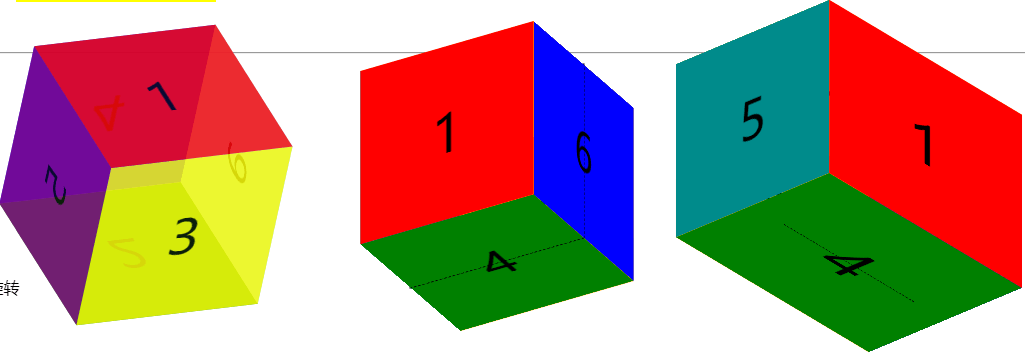
示例代码:
<!DOCTYPE html> <html lang="cn"> <head> <meta charset="UTF-8"> <title>3D转换模型</title> <style type="text/css"> * { margin:0px; padding:0px; } /* 1、元素的3D属性 */ .divOne { margin: 50px; width: 200px; height: 200px; transition: transform 10s; background-color: yellow; position: relative; perspective: 100px; /* 在父级元素设置3d属性 */ transform-style: preserve-3d; } .subDivOne { width: 100px; height: 100px; background-color: green; position: absolute; left:50%; top: 50%; margin-left: -50px; margin-top: -50px; transform: rotateY(45deg); } .divOne:hover { transform: rotateY(180deg); } /* 2、画正方体模型:正方体每面先平移,再翻转 */ .ulTwo { float: left; list-style:none; width: 200px; height: 200px; position: relative; margin-left: 80px; transform-style: preserve-3d; /* 设置3d属性 */ transform: rotateX(53deg) rotateY(10deg) rotateZ(337deg); } .ulTwo li { float:left; text-align: center; line-height: 200px; width: 200px;height: 200px; font-size: 60px; position: absolute; opacity: 0.8; } .ulTwo li:nth-child(1) { background-color: red; transform: translateZ(100px); } .ulTwo li:nth-child(2) { background-color: green; transform: translateZ(-100px) rotateX(180deg);} .ulTwo li:nth-child(3) { background-color: yellow; transform: translateY(100px) rotateX(-90deg); } .ulTwo li:nth-child(4) { background-color: blue; transform: translateY(-100px) rotateX(90deg);} .ulTwo li:nth-child(5) { background-color: purple; transform: translateX(-100px) rotateY(90deg); } .ulTwo li:nth-child(6) { background-color: skyblue; transform: translateX(100px) rotateY(-90deg); } /* 3、正方体模型:每面先翻转,再平移 */ .ulThree { float: left; margin-left: 150px; position: relative; width: 200px; height: 200px; list-style: none; border: 1px dashed black; transform-style: preserve-3d; transform: rotateX(30deg) rotateY(-30deg) rotateZ(0deg); } .ulThree li { font-size: 60px; width: 200px; height: 200px; position: absolute; left: 0; top:0; line-height: 200px; text-align: center; } .ulThree li:nth-of-type(1) { background-color: red; transform: translateZ(100px); } /* 形变第一个变化后,坐标系的方向也会发生变化,可以看做左边系和页面固定位置不能动 */ .ulThree li:nth-of-type(2) { background-color: orange; transform: rotateX(-180deg) translateZ(100px); } /* 上面:先翻转90度,再z轴正方向平移100px */ .ulThree li:nth-of-type(3) { background-color: yellow; transform: rotateX(90deg) translateZ(100px);} .ulThree li:nth-of-type(4) { background-color: green; transform: rotateX(-90deg) translateZ(100px); } .ulThree li:nth-of-type(5) { background-color: darkcyan; transform: rotateY(-90deg) translateZ(100px); } .ulThree li:nth-of-type(6) { background-color: blue; transform: rotateY(90deg) translateZ(100px); } /* 记录:沿着X轴旋转,对着X轴方向,顺时针为正向旋转,逆时针为反向旋转; 沿着Y轴旋转,对着Y轴方向,顺时针为反向旋转,逆时针为正向旋转 */ /* 4、长方体 */ .ulFour { float: left; margin-left: 150px; position: relative; width: 200px; height: 200px; list-style: none; border: 1px dashed black; transform-style: preserve-3d; transform: rotateX(30deg) rotateY(50deg) rotateZ(0deg); } .ulFour li { font-size: 60px; width: 200px; height: 200px; position: absolute; left: 0; top:0; line-height: 200px; text-align: center; } .ulFour li:nth-of-type(1) { background-color: red; transform: scale(1.5, 1) translateZ(100px); } /* 形变第一个变化后,坐标系的方向也会发生变化,可以看做左边系和页面固定位置不能动 */ .ulFour li:nth-of-type(2) { background-color: orange; transform: scale(1.5, 1) rotateX(-180deg) translateZ(100px); } /* 上面:先翻转90度,再z轴正方向平移100px */ .ulFour li:nth-of-type(3) { background-color: yellow; transform: scale(1.5, 1) rotateX(90deg) translateZ(100px);} .ulFour li:nth-of-type(4) { background-color: green; transform: scale(1.5, 1) rotateX(-90deg) translateZ(100px); } .ulFour li:nth-of-type(5) { background-color: darkcyan; transform: rotateY(-90deg) translateZ(150px); } .ulFour li:nth-of-type(6) { background-color: blue; transform: rotateY(90deg) translateZ(150px); } /* 5、设置背景图片 3D旋转模型 */ .divFive { perspective: 500px; } .ulFive { margin: 100px auto; box-sizing: border-box; position: relative; width: 200px; height: 200px; list-style: none; transform-style: preserve-3d; transform: rotateX(0deg) rotateY(0deg); animation: sport 10s 0s linear infinite normal; } .ulFive li { font-size: 60px; width: 200px; height: 200px; position: absolute; left: 0; top:0; line-height: 200px; text-align: center; } .ulFive li:nth-of-type(1) { background: url('../img/star/0.jpg') no-repeat center / cover; transform: translateZ(100px) scale(2, 1); } .ulFive li:nth-of-type(2) { background: url('../img/star/1.jpg') no-repeat center / cover; transform: rotateX(-180deg) translateZ(100px) scale(2, 1); } .ulFive li:nth-of-type(3) { background: url('../img/star/2.jpg') no-repeat center / cover; transform: rotateX(90deg) translateZ(100px) scale(2, 1);} .ulFive li:nth-of-type(4) { background: url('../img/star/3.jpg') no-repeat center / cover; transform: rotateX(-90deg) translateZ(100px) scale(2, 1); } @keyframes sport { from { transform: rotateX(0deg); } to { transform: rotateX(360deg); } } </style> </head> <body> <div class="content"> <div class="divOne"><div class="subDivOne"> </div> </div> <hr/><br/> <ul class="ulTwo"><li>1</li><li>2</li><li>3</li><li>4</li><li>5</li><li>6</li></ul> <ul class="ulThree"><li>1</li><li>2</li><li>3</li><li>4</li><li>5</li><li>6</li></ul> <ul class="ulFour"><li>1</li><li>2</li><li>3</li><li>4</li><li>5</li><li>6</li></ul> <div style="clear:both;"></div> <div class="divFive">3D旋转 <ul class="ulFive"> <li></li> <li></li> <li></li> <li></li> </ul> </div> </div> </body> </html>
3d播放器效果

示例代码:
<!DOCTYPE html>
<html lang="en">
<head>
    <meta charset="UTF-8">
    <title>3D播放器</title>
    <style type="text/css">
        * { margin: 0px; padding: 0px; }
        /* 设置背景图片根据浏览器大小自动调整 */
        body {
            background: url("img/jacky/bg.jpg") no-repeat;
            background-size:cover;
        }

        .ulOne {
            width: 200px; height: 200px;
            position: absolute;
            left: 50%; bottom: 120px;
            margin-left: -100px;
            list-style:none;
            transform-style: preserve-3d;
            transform: rotateX(-30deg);
            animation: imgScroll 10s 0s linear infinite normal;
        }
        .ulOne li {
            width:200px; height:200px;
            position:absolute; left:0; top:0;
            background-color: black;
        }
        .ulOne li img {
            width:200px; height:200px; border: 5px solid skyblue;
            box-sizing: border-box;
        }
        .ulOne:hover { animation-play-state: paused; }
        .ulOne:hover li img{ opacity:0.3; }
        .ulOne li:hover img{ opacity: 1; }

        .ulOne li:nth-child(1){ transform: rotateY(0deg) translateZ(200px); }
        .ulOne li:nth-child(2){ transform: rotateY(60deg) translateZ(200px); }
        .ulOne li:nth-child(3){ transform: rotateY(120deg) translateZ(200px); }
        .ulOne li:nth-child(4){ transform: rotateY(180deg) translateZ(200px); }
        .ulOne li:nth-child(5){ transform: rotateY(240deg) translateZ(200px); }
        .ulOne li:nth-child(6){ transform: rotateY(300deg) translateZ(200px); }

        @keyframes imgScroll {
            from { transform: rotateX(-30deg) rotateY(0deg); }
            to { transform: rotateX(-30deg) rotateY(360deg); }
        }


        /* 图片动画变化 */
        .imgOne {
            position: absolute;
            animation: imgMove 10s 0s linear infinite normal;
        }
        @keyframes imgMove {
            0% { left: 10%; bottom: 20%; opacity: 1; }
            20% { left: 30%; bottom: 70%; opacity: 0; }
            40% { left: 60%; bottom: 90%; opacity: 1; }
            60% { left: 90%; bottom: 60%; opacity: 0; }
            80% { left: 70%; bottom: 40%; opacity: 1; }
            100% { left: 40%; bottom: 20%; opacity: 0; }
        }
    </style>
</head>
<body>
    <div class="content">
        <!-- 快捷方式写:ul.ulOne>li{$}*6 按下tab键 -->
        <ul class="ulOne">
            <li><img src="img/jacky/1.jpg" /></li>
            <li><img src="img/jacky/2.jpg" /></li>
            <li><img src="img/jacky/3.jpg" /></li>
            <li><img src="img/jacky/4.jpg" /></li>
            <li><img src="img/jacky/5.jpg" /></li>
            <li><img src="img/jacky/6.jpg" /></li>
        </ul>
        <img src="img/jacky/xin.png" class="imgOne"/>
        <audio src="../img/file/Friendships.mp3" autoplay="autoplay" loop="loop" />
    </div>
</body>
</html>
7、背景属性:size、image、origin、clip、position
背景元素
1)、background-size: 背景图片尺寸,
值设置类型有具体px值 / 百分比 / 宽或高设置具体px, 另外一个设置auto, 自动等比缩放
/ cover : 背景图片等比填充宽和高 / contain: 背景图片等比填充宽 或 高,即只要宽或高有一个被填充满了,就不再填充
2)、background-origin: 设置背景图片的开始位置,取值有:border-box / padding-box / content-box, 默认值为padding-box
3)、background-clip : 设置背景的绘制区域(背景颜色/图片),取值有border-box / padding-box / content-box , 默认值为border-box
4)、新特性,一个标签可以设置多张背景图盘。注意,先设置的图片会覆盖后设置的图片,所以大图放到后面设置。
<!DOCTYPE html>
<html>
<head>
    <meta charset="UTF-8">
    <title>C3背景新特性</title>
    <style type="text/css">
        * { margin: 0px; padding: 0px; }
        .ulOne {
            margin: 20px auto;
            width: 90%;
            list-style: none;
        }
        .ulOne li {
            float: left; width: 300px; height: 300px;
            border: 1px solid black; margin: 10px;
            text-align: center; line-height: 500px;
            background: url('img/dog.jpg') no-repeat;
            color: red; font-weight: bold;
        }
        .ulOne li:nth-child(1) {  }
        .ulOne li:nth-child(2) { background-size: 200px 200px; }
        .ulOne li:nth-child(3) { background-size: 50% 50%; }
        .ulOne li:nth-child(4) { background-size: 200px auto; }
        .ulOne li:nth-child(5) { background-size: auto 200px; }
        .ulOne li:nth-child(6) { background-size: cover; }
        .ulOne li:nth-child(7) { background-size: contain; }
        /*
        记录:
        1、background-size: 取值有具体的px / 百分比 / 只设置一个宽或高,另外一个设置auto, 等比适配
            / cover: 背景图片等比填充宽和高
            / contain : 背景图片等比填充宽 或者 高,意思是只要宽或者高有一个被填充满了,就不再填充

        2、background-origin: 设置背景图片的开始位置:默认是从填充位置开始
            值有:border-box / padding-box / content-box

        3、background-clip: 设置背景的绘制区域:背景颜色/图片,默认是从border开始
            取值有:border-box / padding-box / content-box

        4、多张背景图片的设置:先设置的背景图片会覆盖后设置的背景图片,所以大图放到后面设置
        */

        /* 2、背景图片的开始位置:background-origin */
        .ulTwo { margin: 10px auto; width: 90%; list-style:none; }
        .ulTwo li {
            float: left; width: 200px; height: 200px;
            background-color: yellow;
            border: 20px dashed black;
            padding: 50px; margin: 20px;
            background: url('img/dog.jpg') no-repeat;
            line-height: 200px;
        }
        .ulTwo li:nth-child(2) { background-origin: border-box; }
        .ulTwo li:nth-child(3) { background-origin: padding-box; }
        .ulTwo li:nth-child(4) { background-origin: content-box; }

        /* 3、背景的绘制区域:background-clip */
        .ulThree { margin: 10px auto; width: 90%; list-style:none; }
        .ulThree li {
            float: left; width: 200px; height: 200px;
            border: 20px dashed black;
            padding: 50px; margin: 20px;
            background: yellow url('img/dog.jpg') no-repeat;
            line-height: 200px;
        }
        .ulThree li:nth-child(2) { background-clip: border-box; }
        .ulThree li:nth-child(3) { background-clip: padding-box; }
        .ulThree li:nth-child(4) { background-clip: content-box; }


        /* 4、设置多张背景图片 */
        .divFour {
            margin: 20px auto;
            width: 60%; border: 1px solid black; height: 300px;

            /* 第一种写法: */
            /*background:url('img/dog.jpg') no-repeat left top, url('img/hot.png') no-repeat right top, url('img/jacky/xin.png') no-repeat left bottom;*/

            /* 第二种写法:推荐 */
            background-image: url('img/dog.jpg'), url('img/hot.png'), url('img/jacky/xin.png');
            background-repeat: no-repeat, no-repeat, no-repeat;
            background-position: left top, right top, left bottom;
        }

        /* 5、多背景图片动画示例 */
        .divFive {
            margin: 20px auto;
            width: 800px; height: 200px; border: 1px solid black;
            background-image: url('img/bg/bg-plane.png'), url('img/bg/bg-sun.png'), url('img/bg/bg-clouds.png');
            background-repeat: no-repeat, no-repeat, no-repeat;
            background-size: auto 20px, auto 30px, auto 200px;
            animation: bgScroll 5s 0s linear infinite normal;
        }
        @keyframes bgScroll {
            from { background-position: 120px 180px, 600px 20px, 0 0; }
            to { background-position: 666px 10px, 600px 20px, -500px 0px; }
        }
    </style>
</head>
<body>
    <h3>1、背景图片的尺寸设置情况:background-size</h3>
    <ul class="ulOne">
        <li>1、默认情况</li>
        <li>2、具体的px: 200px 200px</li>
        <li>3、百分比: 50% 50% </li>
        <li>4、高度随宽度等比适配:200px auto</li>
        <li>5、宽度随高度等比适配: auto 200px</li>
        <li>6、cover (等比填充宽和高)</li>
        <li>7、contain (等比填充宽或高)</li>
    </ul>
    <div style="clear:both;"></div>
    <hr/><br/>

    <h3>2、背景图片的开始位置:background-origin, 默认从padding开始</h3>
    <ul class="ulTwo">
        <li>1、默认</li>
        <li>2、border-box</li>
        <li>3、padding-box</li>
        <li>4、content-box</li>
    </ul>
    <div style="clear:both;"></div>
    <hr/><br/>

    <h3>3、背景的绘制区域:background-clip: 注意看背景颜色,背景颜色默认从border开始</h3>
    <ul class="ulThree">
        <li>1、默认</li>
        <li>2、border-box</li>
        <li>3、padding-box</li>
        <li>4、content-box</li>
    </ul>
    <div style="clear:both;"></div>
    <hr/><br/>

    <h3>4、设置多张背景图片</h3>
    <div class="divFour"></div>
    <div class="divFive"></div>
</body>
</html>
5)、背景设置的简写形式:
8、像素
PPI(pixels per inch) : 屏幕像素密度,即每英寸像素个数
2)、CSS像素 = 设备独立像素 = 逻辑像素,设备独立像素(DIP: device independent pixel)
3)、设备像素比(DPR: device pixels ratio):windows对象有一个devicePixelRatio属性,
表示物理像素和设备独立像素的比例,也就是devicePixelRatio = 物理像素 / 独立像素,
当这个比率是1:1时,使用一个设备像素显示1个CSS像素;
当这个比率是2:1时,使用4个设备像素显示1个CSS像素;
当这个比率是3:1时,使用9个设备像素显示1个CSS像素
DEMO下载路径:https://github.com/xiaotanit/Tan_HtmlDemo