zoukankan      html  css  js  c++  java
  • CSS3_边框 border 详解_一个 div 的阴阳图

    (面试题)

    怎么样通过 CSS 画一个三角形:

    1. 元素的 width 和 height 设置为 0


    2. 边框 足够大

    •    


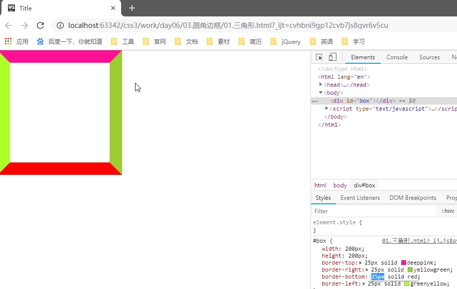
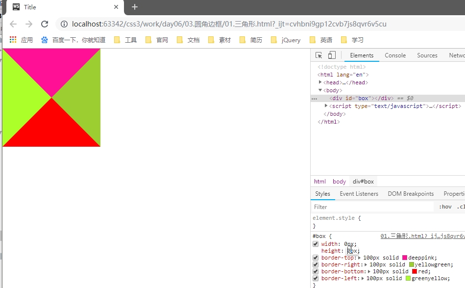
    3. 需要的三角形的部分, border-top-color 设置为 有色


    4. 不需要的部分 border-right-color,border-bottom-color,border-left-color,设置为 透明色

    • color: rgba(0,0,0,0);
      
      // 或者
      color: #0000;
      
      // 或者
      color: transparent;


    圆角边框(支持所有元素,无论块元素,还是行内元素)

    • 尽管,border-radius 将 元素 变成了圆形,但是里面的文本子元素,仍旧沿着矩形盒子进行排列。


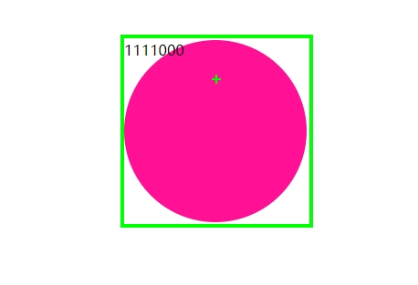
    • CSS3 提供的特性: 尽管盒子的外形和位置发生了变换,但是元素在文档流中的位置是不变的


    • border-radius: 50%;    // 百分比参照盒子自身。
      • 当 width = height 时,会画一个圆形。
      • 当 width 不等于 height 时,会画一个椭圆形。
        • 椭圆形
          #box {
              width: 300px;
              height: 200px;  
              border-radius: 150px/100px;    // x 轴半径 / y 轴半径
          }


    • 语法:
      • #box {
            border-radius: 30px 10px 50px 0;    // 左上 右上 右下 左下
            border-radius: 30px 10px 50px;
            border-radius: 30px 10px;
            border-radius: 30px;
        }


    • 用 CSS 画一个半圆
    • #box {
          width: 100px;
          hright: 200px;
      
          border-radius: 0  100% 100% 0;
          // border-radius: 100% 0 0 100%;
      }
      
      #box {
          width: 200px;
          hright: 100px;
      
          border-radius: 100% 100% 0 0 ;
          // border-radius: 0 0 100% 100%;
      }


    • 用 CSS 画一个扇形
      • #box {
            width: 100px;
            hright: 100px;
        
            border-radius: 100% 0 0 0;
            // border-radius: 0 100% 0 0 0;
            // border-radius: 0 0 100% 0;
            // border-radius: 0 0 0 100%;
        }
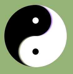
    • 用 CSS 画一个太极图
      • <!DOCTYPE html>
        <html>
            <head>
                <meta charset="UTF-8" />
                <title>太极图</title>
                <style type="text/css">
                    #test_box {
                        width: 200px;
                        height: 200px;
                        border-radius: 50%;
                        margin: 30px auto;
                        
                        background-color: red;
                        position: relative;
                    }
                    
                    #test_box #left_box,
                    #test_box #right_box {
                        width: 100px;
                        height: 200px;
                        
                        float: left;
                    }
                    
                    #test_box #left_box {
                        background-color: #000;
                        border-radius: 100px 0 0 100px;
                    }
                    
                    #test_box #right_box {
                        background-color: #fff;
                        border-radius:  0 100px 100px 0;
                    }
                    
                    #test_box #top_box,
                    #test_box #bottom_box {
                        width: 100px;
                        height: 100px;
                        border-radius: 50%;
                        
                        position: absolute;
                        left: 50%;
                        margin-left: -50px;
                    }
                    
                    #test_box #top_box {
                        top: 0;
                        background-color: #000;
                    }
                    
                    #test_box #bottom_box {
                        bottom: 0;
                        background-color: #fff;
                    }
                    
                    #test_box #top_box #white_dot,
                    #test_box #bottom_box #black_dot {
                        width: 20px;
                        height: 20px;
                        border-radius: 50%;
                        position: absolute;
                        top: 0;
                        left: 0;
                        bottom: 0;
                        right: 0;
                        margin: auto;
                    }
                    
                    #test_box #top_box #white_dot {
                        background-color: #fff;
                    }
                    
                    #test_box #bottom_box #black_dot {
                        background-color: #000;
                    }
                </style>
            </head>
            
            <body>
                
                <div id="test_box"> 
                    <div id="left_box">
                    </div>
                    
                    <div id="right_box">
                    </div>
                    
                    <div id="top_box">
                        <div id="white_dot"></div>
                    </div>
                    
                    <div id="bottom_box">
                        <div id="black_dot"></div>
                    </div>
                </div>
        
            </body>
        </html>


    只用一个 <div> 画太极阴阳图 

    • <!DOCTYPE html>
      <html>
          <head>
              <meta charset="UTF-8" />
              <title>神分阴阳</title>
      
              <style type="text/css">
                  body {
                      width: 100%;
                      color: #000;
                      background: #96b377;
                      font: 14px Helvetica, Arial, sans-serif;
                  }
                  #test_box {
                      width: 100px;
                      height: 200px;
                      border-right: 100px solid #fff;
                      border-radius: 50%;
                      margin: 30px auto;
                      
                      background-color: #000;
                      position: relative;
                      top: 0px;
                      left: 0px;
                  }
                  
                  #test_box:before {
                      content: "";
                      
                      width: 20px;
                      height: 20px;
                      
                      border: 40px solid #000;
                      border-radius: 50%;
                      background-color: #fff;
                      
                      position: absolute;
                      top: 0px;
                      left: 100%;
                      margin-left: -50px;
                      
                              /* 左右 上下 模糊 颜色 */
                      box-shadow: 4px 0px 4px #a66fe2;
                  }
                  
                  #test_box:after {
                      content: "";
                      
                      width: 20px;
                      height: 20px;
                      
                      border: 40px solid #fff;
                      border-radius: 50%;
                      background-color: #000;
                      
                              /* 左右 上下 模糊 颜色 */
                      box-shadow: -5px 0px 4px #c4d0a7;
                      
                      position: absolute;
                      bottom: 0px;
                      left: 100%;
                      margin-left: -50px;
                  }
              </style>
          </head>
          
          <body>
              
              <div id="test_box">
                  
              </div>
      
          </body>
      </html>


    • 弧形凹陷 评论框
      • <!DOCTYPE html>
        <html>
            <head>
                <meta charset="UTF-8" />
                <title>弧形凹陷 评论框</title>
        
                <style type="text/css">
                    body {
        background-color: #96b377;

        #test_box
        { width: 800px; height: 300px; margin: 300px auto 0px; border: 1px solid red; background-color: skyblue; position: relative; top: 0px; left: 0px; } #test_box #arc { width: 100px; height: 100px; border-radius: 50%; background-color: #96b377; border: 1px solid red; position: absolute; top: -70px; left: 70px; } #test_box #arc #mask { width: 102px; height: 100px; background-color: #96b377; position: absolute; top: -32px; left: -1px; } #test_box #arc #circle_login { width: 70px; height: 70px; border-radius: 50%; background-color: #ccc; text-align: center; line-height: 70px; font-size: 24px; position: absolute; z-index: 2; top: 0; left: 0; bottom: 0; right: 0; margin: auto; } </style> </head> <body> <div id="test_box"> <div id="arc"> <div id="mask"></div> <div id="circle_login"> 登录 </div> </div> </div> </body> </html>


    • 四叶草 旋转     初探 CSS3 动画
      • <!DOCTYPE html>
        <html>
            <head>
                <meta charset="UTF-8" />
                <title>四叶草旋转 初探 CSS 动画</title>
        
                <style type="text/css">
                    body {
                        width: 100%;
                        color: #000;
                        background: #96b377;
                        font: 14px Helvetica, Arial, sans-serif;
                    }
        
                    #test_box {
                        width: 624px;
                        height: 624px;
                        margin: 60px auto;
                        list-style: none;
                        
        animation: turnAround 1s linear infinite;
                    }
        
        @keyframes turnAround {
            from {transform: rotate(0deg)}
            to {transform: rotate(360deg)}
        }
                    
                    #test_box li {
                        float: left;
                        width: 300px;
                        height: 300px;
                        margin: 5px;
                        
                        border: 1px solid red;
                        background-color: #eee;
                    }
                    
                    #test_box li:nth-child(1),
                    #test_box li:nth-child(4) {
                        border-radius: 0 230px 0 230px;
                    }
                    
                    #test_box li:nth-child(2),
                    #test_box li:nth-child(3) {
                        border-radius: 230px 0 230px 0;
                    }
                    
                </style>
            </head>
            
            <body>
                
                <ul id="test_box"> 
                    <li></li>
                    <li></li>
                    <li></li>
                    <li></li>
                </ul>
        
            </body>
        </html>
    --------小尾巴 ________一个人欣赏-最后一朵颜色的消逝-忠诚于我的是·一颗叫做野的心.决不受人奴役.怒火中生的那一刻·终将结束...
  • 相关阅读:
    MOSS 2010 修改管理员密码 欧阳锋
    MOSS2010 中“找不到位于xxxx的web应用程序”的解决办法 欧阳锋
    MSSQL 2008 无法修改表问题的解决 欧阳锋
    不是每个在你身上拉屎的都是你的敌人 欧阳锋
    笑一笑 欧阳锋
    隐藏MOSS2010 左边的导航 欧阳锋
    爱情与婚姻的区别 欧阳锋
    两年后,我们怎么办
    C#控件的闪烁问题解决方法总结
    Linux内核编译配置过程
  • 原文地址:https://www.cnblogs.com/tianxiaxuange/p/9934320.html
Copyright © 2011-2022 走看看