一、CSS简介
CSS是Cascading Style Sheets的简称,中文称为层叠样式表。
CSS的引入方式:
  行内式是在标签的style属性中设定CSS样式。
  <div style="color:red"></div>
<head>
    ...
    <style type="text/css">
       a {color:red:}
       .....
    </style>
</head>
<head>
    ...
    <style type="text/css">
        @import "My.css"; 此处注意.css文件的路径
    </style>
</head>
<head>
    ...
    <link href="My.css" rel="stylesheet" type="text/css">
</head>
CSS样式的应用顺序:就近原则
- 同一个属性,最靠近目标元素的那个属性值生效。
-
!important 指定这个属性的样式规则应用最优先。
二、选择器
基本选择器:
1.通用元素选择器
* 表示应用到所有的标签。(此种方法影响所有元素,不推荐使用)
* {color: red}
2.元素选择器
匹配所有使用 div 标签的元素(可以匹配所有标签)
div {color: red}
3.类选择器
匹配所有class属性中包含info的元素。
语法:.类名{样式}(类名不能以数字开头,类名要区分大小写。)
.Mycolor {color: yellow}
<h3 class="Mycolor">test</h3>
4.ID选择器
使用id属性来调用样式,在一个网页中id的值都是唯一的(是W3C规范而不是规则,所以不会报错)。
语法:#ID名{样式}(ID名不能以数字开头)
#Mycolor {color: yellow}
<h3 id="Mycolor">test</h3>
组合选择器:(标黄部分被选择器匹配到)
1.多元素选择器
同时匹配a,p标签,之间用逗号分隔。
a,p{color: yellow;}
<a>test1</a>
<p>test2</p>
2、子元素选择器
子元素选择器,之间用>分隔。
  div > p {color: yellow;}

<div>
    <p>test1</p>
    <p>test2</p>
  <div>
    <p>test</p>
  </div>
</div>
3、后代元素选择器
后代元素选择器,之间用空格分隔。
    div p {color: yellow;}

<div>
    <p>test1</p>
    <div>
        <p>test2</p>
    </div>
</div>
3、相邻兄弟选择器
可选择紧接在另一元素后的元素,且二者有相同父元素。感觉交楼下兄弟选择器更好。只能选楼下那个,楼上的不能选。
匹配所有紧随div标签之后的同级标签P,之间用+分隔
div + p {color: yellow;}

<div>test1</div>
<p>test2</p>
属性选择器:
属性选择器可以根据元素的属性及属性值来选择元素,具体表示方法入下表:
| 选择器 | 描述 |
| [attribute] | 用于选取带有指定属性的元素。 |
| [attribute=value] | 用于选取带有指定属性和值的元素。 |
| [attribute~=value] | 用于选取属性值中包含指定词汇的元素。 |
| [attribute|=value] | 用于选取带有以指定值开头的属性值的元素,该值必须是整个单词。 |
| [attribute^=value] | 匹配属性值以指定值开头的每个元素。 |
| [attribute$=value] | 匹配属性值以指定值结尾的每个元素。 |
| [attribute*=value] | 匹配属性值中包含指定值的每个元素。 |
例子 1
如果您希望把包含标题(title)的所有元素变为红色,可以写作:
[title] {color:red;}
例子 2
与上面类似,可以只对有 href 属性的锚(a 元素)应用样式:
a[href] {color:red;}
例子 3
还可以根据多个属性进行选择,只需将属性选择器链接在一起即可。
例如,为了将同时有 href 和 title 属性的 HTML 超链接的文本设置为红色,可以这样写:
a[href][title] {color:red;}
例子4
例如,假设希望将指向 Web 服务器上某个指定文档的超链接变成红色,可以这样写:
a[href="http://www.w3school.com.cn/about_us.asp"] {color: red;}
伪类选择器:
| 属性 | 描述 |
| :active | 向被激活的元素添加样式。 |
| :focus | 向拥有键盘输入焦点的元素添加样式。 |
| :hover | 当鼠标悬浮在元素上方时,向元素添加样式。 |
| :link | 向未被访问的链接添加样式。 |
| :visited | 向已被访问的链接添加样式。 |
| :first-child | 向元素的第一个子元素添加样式。 |
| :lang | 向带有指定 lang 属性的元素添加样式。 |
a:link {color: #FF0000}		/* 未访问的链接 */
a:visited {color: #00FF00}	/* 已访问的链接 */
a:hover {color: #FF00FF}	/* 鼠标移动到链接上 */
a:active {color: #0000FF}	/* 选定的链接 */
提示:在 CSS 定义中,a:hover 必须被置于 a:link 和 a:visited 之后,才是有效的。
提示:在 CSS 定义中,a:active 必须被置于 a:hover 之后,才是有效的。
提示:伪类名称对大小写不敏感。
2. before、after
- P:before 在每个<p>元素的内容之前插入内容;
- P:after 在每个<p>元素的内容之后插入内容。
p {
        color: yellow;
    }
    p:before{
        content: "before...";
    }
    p:after{
        content: "after...";
    }

<p> test</p>
三、常用样式
1. 颜色属性:
color
- HEX(十六进制色:color: #FFFF00 --> 缩写:#FF0)
- RGB(红绿蓝,使用方式:color:rgb(255,255,0)或者color:rgb(100%,100%,0%))
- RGBA(红绿蓝透明度,A是透明度在0~1之间取值。使用方式:color:rgba(255,255,0,0.5))
- HSL(CSS3有效,H表示色调,S表示饱和度,L表示亮度,使用方式:color:hsl(360,100%,50%))
- HSLA(和HSL相似,A表示Alpha透明度,取值0~1之间。)
transparent
- 全透明,使用方式:color: transparent;
opacity
- 元素的透明度,语法:opacity: 0.5;
- 属性值在0.0到1.0范围内,0表示透明,1表示不透明。
- filter滤镜属性(只适用于早期的IE浏览器,语法:filter:alpha(opacity:20);)。
2. 字体属性:
font-style: 用于规定斜体文本
- normal 文本正常显示
- italic 文本斜体显示
- oblique 文本倾斜显示
font-weight: 设置文本的粗细
- normal(默认)
- bold(加粗)
- bolder(相当于<strong>和<b>标签)
- lighter (常规)
- 100 ~ 900 整百(400=normal,700=bold)
font-size: 设置字体的大小
- 默认值:medium
- <absolute-size>可选参数值:xx-small、 x-small、 small、 medium、 large、 x-large、 xx-large
- <relative-size>相对于父标签中字体的尺寸进行调节。可选参数值:smaller、 larger
- <percentage>百分比指定文字大小。
- <length>用长度值指定文字大小,不允许负值。
font-family:字体名称
- 使用逗号隔开多种字体(优先级从前向后,如果系统中没有找到当前字体,则往后面寻找)
font:简写属性
- 语法:font:字体大小/行高 字体等以上属性;
3. 文本属性:
white-space: 设置元素中空白的处理方式
- normal:默认处理方式。
- pre:保留空格,当文字超出边界时不换行
- nowrap:不保留空格,强制在同一行内显示所有文本,直到文本结束或者碰到br标签
- pre-wrap:保留空格,当文字碰到边界时换行
- pre-line:不保留空格,保留文字的换行,当文字碰到边界时换行
direction: 规定文本的方向
- ltr 默认,文本方向从左到右。
- rtl 文本方向从右到左。
text-align: 文本的水平对齐方式
- left
- center
- right
line-height: 文本行高
- normal 默认,(该属性设置和容器高度一样,可使文字上下居中,且文字块充满高度)
vertical-align: 文本所在行高的垂直对齐方式
- baseline 默认
- sub 垂直对齐文本的下标,和<sub>标签一样的效果
- super 垂直对齐文本的上标,和<sup>标签一样的效果
- top 对象的顶端与所在容器的顶端对齐
- text-top 对象的顶端与所在行文字顶端对齐
- middle 元素对象基于基线垂直对齐
- bottom 对象的底端与所在行的文字底部对齐
- text-bottom 对象的底端与所在行文字的底端对齐
text-indent: 文本缩进
letter-spacing: 添加字母之间的空白
word-spacing: 添加每个单词之间的空白
text-transform: 属性控制文本的大小写
- capitalize 文本中的每个单词以大写字母开头。
- uppercase 定义仅有大写字母。
- lowercase 定义仅有小写字母。
text-overflow: 文本溢出样式
- clip 修剪文本。
- ellipsis 显示省略符号...来代表被修剪的文本。
- string 使用给定的字符串来代表被修剪的文本。


<!DOCTYPE html>
<html lang="en">
<head>
    <meta charset="UTF-8">
    <title>Title</title>
    <!--<link href="cc2.css" rel="stylesheet" type="text/css">-->
    <style>
        div {
            width: 100px;
            height: 100px;
            white-space: nowrap;
            overflow: hidden;
            text-overflow: ellipsis;
        }
    </style>
</head>
<body>
    <div>test test test test test test test test test test test test test test test test test test test test test test test test test test test test test test test test test test test test test test test test test test test test test </div>
</body>
</html>
text-decoration: 文本的装饰
- none 默认。
- underline 下划线。
- overline 上划线。
- line-through 中线。
a {
    text-decoration: none;
    /*去除a标签下划线*/
}
text-shadow:文本阴影
- 第一个参数是左右位置
- 第二个参数是上下位置
- 第三个参数是虚化效果
- 第四个参数是颜色
- text-shadow: 5px 5px 5px #888;
word-wrap:自动换行
- word-wrap: break-word;自动换行
<!DOCTYPE html>
<html lang="en">
<head>
    <meta charset="UTF-8">
    <title>Title</title>
    <style>
        p {
            width: 120px;
            height: 120px;
            background-color: #FFA500;
            /*边框阴影*/
            box-shadow: 10px 10px 5px #888;
            /*自动换行*/
            overflow: hidden;
        }
        h1 {
            text-shadow: 5px 5px 5px #888;
        }
    </style>
</head>
<body>
    <h1>锄禾</h1>
    <p>
        锄禾日当午,锄禾日当午,锄禾日当午,锄禾日当午,锄禾日当午,锄禾日当午,锄禾日当午,锄禾日当午,锄禾日当午,锄禾日当午,锄禾日当午
    </p>

</body>
</html>
break-word:控制是否断词
- normal:是默认情况,英文单词不被拆开。
- break-all,是断开单词。在单词到边界时,下个字母自动到下一行。主要解决了长串英文的问题。
- keep-all,是指Chinese, Japanese, and Korean不断词。即只用此时,不用word-wrap,中文就不会换行了。(英文语句正常。)
4. 背景属性
背景颜色
background-image :设置图像为背景
- url("http://images.cnblogs.com/cnblogs_com/suoning/845162/o_ns.png"); 图片地址
- linear-gradient(green,blue,yellow,red,black); 直线渐变
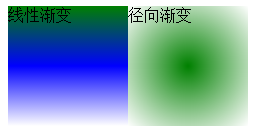
- background-image: radial-gradient(green,white);圆形径向渐变
background-position 设置背景图像的位置坐标
- background-position: center center; 图片置中,x轴center,y轴center
- 1px -195px 截取图片某部分,分别代表坐标x,y轴
background-repeat 设置背景图像不重复平铺
- no-repeat 设置图像不重复,常用
-
round 自动缩放直到适应并填充满整个容器
- space 以相同的间距平铺且填充满整个容器
background-attachment 背景图像是否固定或者随着页面的其余部分滚动
background 简写
- background: url("o_ns.png") no-repeat 0 -196px;
-
background: url("o_ns.png") no-repeat center bottom 15px;
-
background: url("o_ns.png") no-repeat left 30px bottom 15px;
<!DOCTYPE html>
<html lang="en">
<head>
    <meta charset="UTF-8">
    <title>Title</title>
    <style>
        .linear {
            width: 120px;
            height: 120px;
            background-image: linear-gradient(green,blue,white);
            float: left;
        }
        .radial {
            width: 120px;
            height: 120px;
            background-image: radial-gradient(green,white);
            float: left;
        }
    </style>
</head>
<body>
    <div class="linear">
        线性渐变
    </div>
    <div class="radial">径向渐变</div>
</body>
</html>
<!DOCTYPE html>
<html>
<head>
    <meta http-equiv="Content-Type" content="text/html; charset=UTF-8"/>

<style type="text/css">
    body{
        margin: 0;
    }
    .c1{
        width:20px;
        height: 20px;
        background:url("v_hd_bg1.png") no-repeat 0 74px   ;

    }


</style>
</head>

<body>
<div class="c1">

</div>


</body>
</html>
原图: ,显示效果图
 ,
,
通过此方法可以将页面许多小图标集中在一张大图里面显示,从而加快速加载度,减少HTTP连接。
通过background-position 设置背景图像的位置坐标,来实现此效果。
5. 列表属性
list-style-type: 列表项标志的类型
- none 去除标志
- decimal-leading-zero; 02.
- square; 方框
- circle; 空心圆
- upper-alph; & disc; 实心圆
list-style-image:将图象设置为列表项标志
list-style-position:列表项标志的位置
- inside
- outside
list-style:缩写
6、CSS轮廓
轮廓(outline)是绘制于元素周围的一条线,位于边框边缘的外围,可起到突出元素的作用。CSS outline 属性规定元素轮廓的样式、颜色和宽度。
- outline:在一个声明中设置所有的轮廓属性。
- outline-color :设置轮廓的颜色。
- outline-style :设置轮廓的样式。
- outline-width: 设置轮廓的宽度。
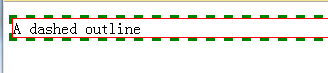
<!DOCTYPE html>
<html>
<head>
<style type="text/css">
p {
border: red solid thin;
}
p.dashed {
    outline-style: dashed;
    outline-color: green;
    outline-width: 3px;
}
</style>
</head>
<body>
<p class="dashed">A dashed outline</p>
</body>
</html>
7. cursor 鼠标的类型形状
url 需使用的自定义光标的 URL。
注释:请在此列表的末端始终定义一种普通的光标,以防没有由 URL 定义的可用光标。
default 默认光标(通常是一个箭头)
auto 默认。浏览器设置的光标。
crosshair 光标呈现为十字线。
pointer 光标呈现为指示链接的指针(一只手)
move 此光标指示某对象可被移动。
e-resize 此光标指示矩形框的边缘可被向右(东)移动。
ne-resize 此光标指示矩形框的边缘可被向上及向右移动(北/东)。
nw-resize 此光标指示矩形框的边缘可被向上及向左移动(北/西)。
n-resize 此光标指示矩形框的边缘可被向上(北)移动。
se-resize 此光标指示矩形框的边缘可被向下及向右移动(南/东)。
sw-resize 此光标指示矩形框的边缘可被向下及向左移动(南/西)。
s-resize 此光标指示矩形框的边缘可被向下移动(南)。
w-resize 此光标指示矩形框的边缘可被向左移动(西)。
text 此光标指示文本。
wait 此光标指示程序正忙(通常是一只表或沙漏)。
help 此光标指示可用的帮助(通常是一个问号或一个气球)。
8. 边框
border-style:边框样式
- solid 默认,实线
- double 双线
- dotted 点状线条
- dashed 虚线
border-color:边框颜色
border-width:边框宽度
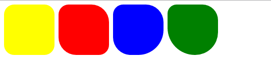
border-radius:圆角
- 1个参数:四个角都应用
- 2个参数:第一个参数应用于 左上、右下;第二个参数应用于 左下、右上
- 3个参数:第一个参数应用于 左上;第二个参数应用于 左下、右上;第三个参数应用于右下
- 4个参数:左上、右上、右下、左下(顺时针)
border: 简写
- border: 2px yellow solid;
box-shadow:边框阴影
- 第一个参数是左右位置
- 第二个参数是上下位置
- 第三个参数是虚化效果
- 第四个参数是颜色
- box-shadow: 10px 10px 5px #888;
<!DOCTYPE html>
<html lang="en">
<head>
    <meta charset="UTF-8">
    <title>Title</title>
    <style>
        .radius1 {
            display: inline-block;
            width: 100px;
            height: 100px;
            background-color: yellow;
            border-radius: 20px;
        }
        .radius2 {
            display: inline-block;
            width: 100px;
            height: 100px;
            background-color: red;
            border-radius: 20px 35px;
        }
        .radius3 {
            display: inline-block;
            width: 100px;
            height: 100px;
            background-color: blue;
            border-radius: 20px 35px 50px;
        }
        .radius4 {
            display: inline-block;
            width: 100px;
            height: 100px;
            background-color: green;
            border-radius: 20px 35px 50px 60px;
        }
    </style>
</head>
<body>
    <div>
        <span class="radius1"></span>
        <span class="radius2"></span>
        <span class="radius3"></span>
        <span class="radius4"></span>
    </div>
</body>
</html>
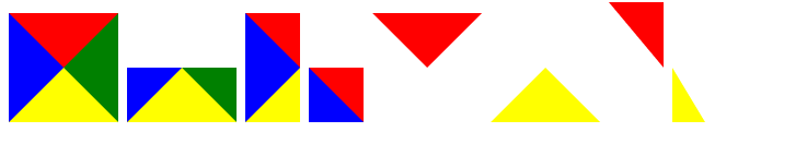
<!DOCTYPE html>
<html lang="en">
<head>
    <meta charset="UTF-8">
    <title>Title</title>
    <style>
        .triangle-one {
            display: inline-block;
            border-top: 50px red solid;
            border-right: 50px green solid;
            border-bottom: 50px yellow solid;
            border-left: 50px blue solid;
        }
        .triangle-two {
            display: inline-block;
            border-top: 0 red solid;
            border-right: 50px green solid;
            border-bottom: 50px yellow solid;
            border-left: 50px blue solid;
        }
        .triangle-stree {
            display: inline-block;
            border-top: 50px red solid;
            border-right: 0 green solid;
            border-bottom: 50px yellow solid;
            border-left: 50px blue solid;
        }
        .triangle-four {
            display: inline-block;
            border-top: 50px red solid;
            border-right: 0 green solid;
            border-bottom: 0 yellow solid;
            border-left: 50px blue solid;
        }

        .triangle-five {
            display: inline-block;
            border: 50px transparent solid;
            border-top: 50px red solid;
        }
        .triangle-six {
            display: inline-block;
            border: 50px transparent solid;
            border-bottom: 50px yellow solid;
        }
        .triangle-seven {
            display: inline-block;
            border: 50px transparent solid;
            border-top: 60px red solid;
            border-right: 0;
        }
        .triangle-eight {
            display: inline-block;
            border: 50px transparent solid;
            border-left: 30px yellow solid;
            border-bottom: 0;
        }
    </style>
</head>
<body>
    <div class="triangle-one"></div>
    <div class="triangle-two"></div>
    <div class="triangle-stree"></div>
    <div class="triangle-four"></div>
    <div class="triangle-five"></div>
    <div class="triangle-six"></div>
    <div class="triangle-seven"></div>
    <div class="triangle-eight"></div>
</body>
</html>
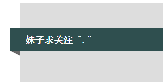
<!DOCTYPE html>
<html lang="en">
<head>
    <meta charset="UTF-8">
    <title>Title</title>
    <style>
        .back {
            width: 1000px;
            height: 1000px;
            margin: 0 auto;
            background-color: #ddd;
            position: relative;
        }
        .back-in {
            position: absolute;
            width: 1020px;
            height: 45px;
            left: -20px;
            top: 50px;
            background-color: #2F4F4F;
        }
        .back-img {
            border: 20px solid transparent;
            border-top: 10px solid dimgrey;
            border-right: 0;
            display: inline-block;
            position: absolute;
            top: 95px;
            left: -20px;
        }
        .back-font {
            line-height: 9px;
            margin-left: 30px;
            color: white;
        }
    </style>
</head>
<body>
    <div class="back">
        <div class="back-in"><h3 class="back-font">妹子求关注 ^.^</h3></div>
        <div class="back-img"></div>
    </div>
</body>
</html>
四、盒子模型
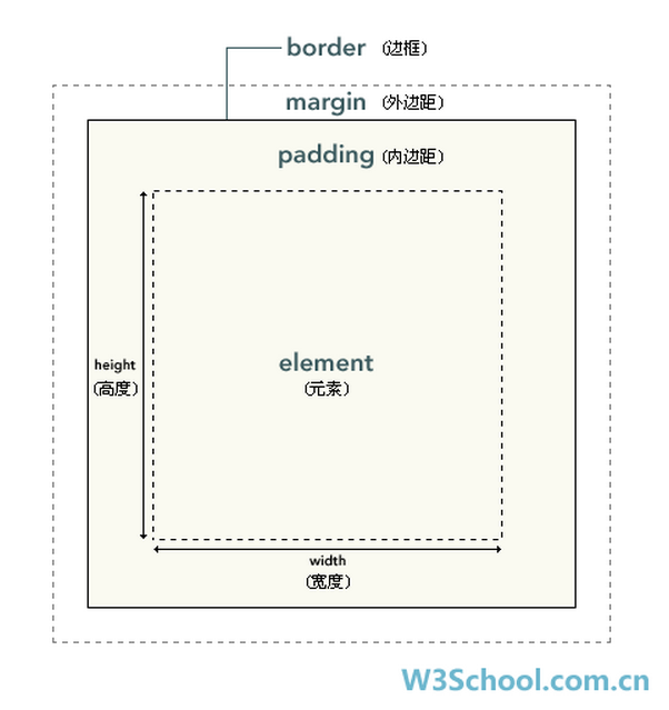
在 CSS 中,width 和 height 指的是内容区域的宽度和高度。增加内边距、边框和外边距不会影响内容区域的尺寸,但是会增加元素框的总尺寸。
假设框的每个边上有 10 个像素的外边距和 5 个像素的内边距。如果希望这个元素框达到 100 个像素,就需要将内容的宽度设置为 70 像素,请看下图:
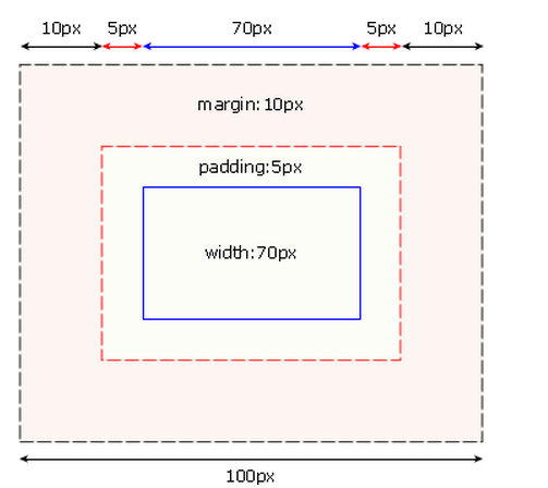
#box {
   70px;
  margin: 10px;
  padding: 5px;
}
提示:内边距、边框和外边距可以应用于一个元素的所有边,也可以应用于单独的边。
提示:外边距可以是负值,而且在很多情况下都要使用负值的外边距。
| padding、margin | 表示上右下左都应用 |
| padding-top、margin-top | 上 |
| padding-right、margin-right | 右 |
| padding-bottom、margin-bottom | 下 |
| padding-left、margin-left | 左 |
- 一个参数,应用于四边。
- 两个参数,第一个用于上、下,第二个用于左、右。
- 三个参数,第一个用于上,第二个用于左、右,第三个用于下。
边框在默认情况下会定位于浏览器窗口的左上角,但是并没有紧贴着浏览器的窗口的边框,这是因为body本身也是一个盒子,外层还有html,
在默认情况下,body距离html会有若干像素的margin,所以body中的盒子不会紧贴浏览器窗口的边框了。

解决方法:
body {
    margin: 0;
}

浏览器窗口最外层边框缝隙
五、定位相关
1、float浮动
浮动最初的诞生是用于实现文字环绕图片效果的。
float 属性定义元素在哪个方向浮动。以往这个属性总应用于图像,使文本围绕在图像周围,不过在 CSS 中,任何元素都可以浮动。浮动元素会生成一个块级框,而不论它本身是何种元素。
如果浮动非替换元素,则要指定一个明确的宽度;否则,它们会尽可能地窄。
注释:假如在一行之上只有极少的空间可供浮动元素,那么这个元素会跳至下一行,这个过程会持续到某一行拥有足够的空间为止。
设置浮动的元素会脱离文档流。设置浮动的元素会自动变成块元素,可以设置宽和高等块元素属性
float设置浮动
- none
- left 左浮动
- right 右浮动
clear 清除浮动:
- none : 默认值。允许两边都可以有浮动对象
- left : 不允许左边有浮动对象
- right : 不允许右边有浮动对象
- both : 不允许两边有浮动对象
<!DOCTYPE html>
<html>
<head>
    <meta http-equiv="Content-Type" content="text/html; charset=UTF-8"/>

<style type="text/css">
img
{
float:right
}
</style>
</head>

<body>
<p>在下面的段落中,我们添加了一个样式为 <b>float:right</b> 的图像。结果是这个图像会浮动到段落的右侧。</p>
<p>
<img src="http://www.w3school.com.cn/i/eg_cute.gif" />
This is some text. This is some text. This is some text.
This is some text. This is some text. This is some text.
This is some text. This is some text. This is some text.
This is some text. This is some text. This is some text.
This is some text. This is some text. This is some text.
This is some text. This is some text. This is some text.
This is some text. This is some text. This is some text.
This is some text. This is some text. This is some text.
This is some text. This is some text. This is some text.
This is some text. This is some text. This is some text.
</p>
</body>

</html>
<style type="text/css">
span
{
float:left;
width:0.7em;
font-size:400%;
font-family:algerian,courier;
line-height:80%;
}
</style>
</head>

<body>
<p>
<span>T</span>his is some text.
This is some text. This is some text.
This is some text. This is some text. This is some text.
This is some text. This is some text. This is some text.
This is some text. This is some text. This is some text.
This is some text. This is some text. This is some text.
This is some text. This is some text. This is some text.
This is some text. This is some text. This is some text.
</p>

<p>
在上面的段落中,文本的第一个字母包含在一个 span 元素中。这个 span 元素的宽度是当前字体尺寸的 0.7 倍。span 元素的字体尺寸是 400%,行高是 80%。span 中的字母字体是 "Algerian"
</p>

</body>
</html>
<!DOCTYPE html>
<html>
<head>
    <meta http-equiv="Content-Type" content="text/html; charset=UTF-8"/>

<style type="text/css">
ul
{
float:left;
width:100%;
padding:0;
margin:0;
list-style-type:none;
}
a
{
float:left;
width:7em;
text-decoration:none;
color:white;
background-color:purple;
padding:0.2em 0.6em;
border-right:1px solid white;
}
a:hover {background-color:#ff3300}
li {display:inline}
</style>
</head>

<body>
<ul>
<li><a href="#">Link one</a></li>
<li><a href="#">Link two</a></li>
<li><a href="#">Link three</a></li>
<li><a href="#">Link four</a></li>
</ul>

<p>
在上面的例子中,我们把 ul 元素和 a 元素浮向左浮动。li 元素显示为行内元素(元素前后没有换行)。这样就可以使列表排列成一行。ul 元素的宽度是 100%,列表中的每个超链接的宽度是 7em(当前字体尺寸的 7 倍)。我们添加了颜色和边框,以使其更漂亮。
</p>

</body>
</html>
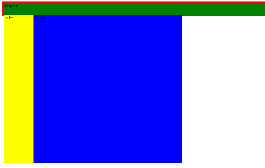
<!DOCTYPE html>
<html>
<head>
    <meta http-equiv="Content-Type" content="text/html; charset=UTF-8"/>

<style type="text/css">
    .container{
        padding: 5px;
        width:100%;
        background-color: red;
    }
    .header{
        width:100%;
        height:40px;
        background-color: green;
    }
    .left{
        width:100px;
        height:500px;
        background-color: yellow;
        float: left;
    }
    .right{
        width:500px;
        height:500px;
        background-color: blue;
        float: left;
    }
    /*.clearfix{*/
        /*clear: both;*/
    /*}*/
</style>
</head>

<body>
<div class="container">
    <div class="header">header</div>
    <div class="left">left</div>
    <div class="right">right</div>
    <div class="clearfix"></div>

</div>

</body>
</html>
<!DOCTYPE html>
<html>
<head>
    <meta http-equiv="Content-Type" content="text/html; charset=UTF-8"/>

<style type="text/css">
    .container{
        padding: 5px;
        width:100%;
        background-color: red;
    }
    .header{
        width:100%;
        height:40px;
        background-color: green;
    }
    .left{
        width:100px;
        height:500px;
        background-color: yellow;
        float: left;
    }
    .right{
        width:500px;
        height:500px;
        background-color: blue;
        float: left;
    }
    .clearfix{
        clear: both;
    }
</style>
</head>

<body>
<div class="container">
    <div class="header">header</div>
    <div class="left">left</div>
    <div class="right">right</div>
    <div class="clearfix"></div>

</div>

</body>
</html>
设置后成功撑起容器高度达到我们想要的布局效果。
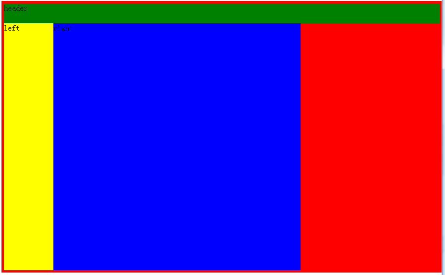
修复方法一:
需要设置在最后一个浮动元素后设置个空元素。<div class="clearfix"></div>,并设置其clear:both
修复方法二:
<!DOCTYPE html>
<html>
<head>
    <meta http-equiv="Content-Type" content="text/html; charset=UTF-8"/>

<style type="text/css">
    .container{
        padding: 5px;
        width:100%;
        background-color: red;
    }
    .header{
        width:100%;
        height:40px;
        background-color: green;
    }
    .left{
        width:100px;
        height:500px;
        background-color: yellow;
        float: left;
    }
    .right{
        width:500px;
        height:500px;
        background-color: blue;
        float: left;
    }
    .clearfix:after{
        content: "clearfix";
        display: block;
        height: 0;
        visibility: hidden;
        clear: both;
    }
</style>
</head>

<body>
<div class="container clearfix">
    <div class="header">header</div>
    <div class="left">left</div>
    <div class="right">right</div>

</div>

</body>
</html>
在浮动元素的父元素中设置clearfix类后可实现相同的目的(推荐使用该方法)
.clearfix:after{
    content: "clearfix";
    display: block;
    height: 0;
    visibility: hidden;
    clear: both;
}
2、postion
这个属性定义建立元素布局所用的定位机制。任何元素都可以定位,不过绝对或固定元素会生成一个块级框,而不论该元素本身是什么类型。相对定位元素会相对于它在正常流中的默认位置偏移。
| 值 | 描述 |
|---|---|
| absolute |
生成绝对定位的元素,相对于 static 定位以外的第一个父元素进行定位。 元素的位置通过 "left", "top", "right" 以及 "bottom" 属性进行规定。 |
| fixed |
生成绝对定位的元素,相对于浏览器窗口进行定位。 元素的位置通过 "left", "top", "right" 以及 "bottom" 属性进行规定。 |
| relative |
生成相对定位的元素,相对于其正常位置进行定位。 因此,"left:20" 会向元素的 LEFT 位置添加 20 像素。 |
| static | 默认值。没有定位,元素出现在正常的流中(忽略 top, bottom, left, right 或者 z-index 声明)。 |
| inherit | 规定应该从父元素继承 position 属性的值。 |
fixed属性生成绝对定位元素,相对于浏览器窗口进行定位。fixed会使元素脱离正常文档流。
absolute生成绝对定位的元素,相对于 static 定位以外的第一个包含postion的父元素进行定位。元素的位置通过 "left", "top", "right" 以及 "bottom" 属性进行规定。
relative生成相对定位的元素,相对于其正常位置进行定位。相对与自身位置进行移动,并且原来的位置不会被占领。
fixed
<!DOCTYPE html>
<html>
<head>
    <meta http-equiv="Content-Type" content="text/html; charset=UTF-8"/>

<style type="text/css">
    body{
        margin: 0;
    }
    .container{
        padding-top: 40px;
        width:100%;
        background-color: red;
        height: 1000px;
    }
    .header{
        width:100%;
        height:40px;
        background-color: green;
        position:fixed;
    }
    .left{
        width:100px;
        height:500px;
        background-color: yellow;
        float: left;
    }
    .right{
        width:500px;
        height:500px;
        background-color: blue;
        float: left;
    }
    .clearfix:after{
        content: "clearfix";
        display: block;
        height: 0;
        visibility: hidden;
        clear: both;
    }
</style>
</head>

<body>
<div class="header">header</div>
<div class="container clearfix">
    <div class="left">left</div>
    <div class="right">right</div>

</div>

</body>
</html>
<!DOCTYPE html>
<html>
<head>
    <meta http-equiv="Content-Type" content="text/html; charset=UTF-8"/>

<style type="text/css">
    body{
        margin: 0;
    }
    .c1{
        width:300px;
        height: 300px;
        background-color: red;
        position: relative;
    }
    .motai {
        position: absolute;
        top: 50px;
        right: 50px;
        bottom: 50px;
        left: 50px;
        background-color: rgba(0, 0, 0, 0.5);
    }
     .btn{
         position: absolute;
         top: 50px;
        right: 50px;
        bottom: 50px;
        left: 50px;
         background-color: white;
     }


</style>
</head>

<body>
<div class="c1">
    hover出现模态框
    <div class="motai">
        <div class="btn">这是个按钮</div>
    </div>
</div>


</body>
</html>
参考文章:
http://www.w3school.com.cn/cssref/index.asp
http://www.cnblogs.com/suoning/p/5625582.html,很多现成的例子直接copy过来了,排版真好。