from kivy.app import App
from kivy.lang import Builder
from kivy.uix.boxlayout import BoxLayout
from kivy.uix.behaviors import ToggleButtonBehavior
from kivy.core.window import Window
from kivy.utils import get_color_from_hex
# 静止全屏显示
Window.fullscreen = False
# 设置窗体背景颜色为白色
Window.clearcolor = get_color_from_hex('#ffffff')
其他模块时出现运行的一些基本模块,窗体的一些配置,还要布局容器
class RadioButton(ToggleButtonBehavior, BoxLayout):
    def on_change_checkbox(self):
        ToggleButtonBehavior._do_press(self.children[1])

class ToomaxWindow(BoxLayout):
    pass
#:import C kivy.utils.get_color_from_hex
<RadioButton>:
    id: radiobtn
    orientation: 'horizontal'
    group: 'btn'
    size_hint: 1, None
    height: 50
    on_touch_down: self.on_change_checkbox()
    CheckBox: # 这里使用了kivy自带的checkbox控件,只要添加group属性值,就能起到单选按钮的功能
        group: "checkbox"
        size_hint: None, None
        size: lab.height, lab.height
    Label:
        id: lab
        text: "RadioButton"
        color: 0, 0, 0, 1
        size_hint: None, None
        size: self.texture_size
<ToomaxWindow>:
    orientation: 'vertical'
    spacing: 2
    RadioButton:
    RadioButton:
怎么运行我这里就贴出代码了,就是定义一个App类,并重写build()方法,然后调用App类实例的run()即可。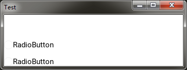
从运行结果可知,两个单选按钮都没有被选中,我们希望在程序运行后,有一个是默认选中的,那么如何解决这个问题呢?
这里就需要用到控件的自定义属性来进行配置,在RadioButton中自定义一个selected属性,用于设置单选按钮的状态。
class RadioButton(ToggleButtonBehavior, BoxLayout):
    selected = BooleanProperty(False)
    def on_change_checkbox(self):
        ToggleButtonBehavior._do_press(self.children[1])
        self.selected = True
<RadioButton>:
    id: radiobtn
    orientation: 'horizontal'
    group: 'btn'
    size_hint: 1, None
    height: 32
    valign: 'middle'
    on_touch_down: self.on_change_checkbox()
    CheckBox:
        group: "checkbox"
        # 使用selected属性来判断checkbox的状态
        state: 'down' if self.parent.selected else 'normal'
        size_hint: None, None
        size: lab.height, lab.height
    Label:
        id: lab
        text: "RadioButton"
        color: 0, 0, 0, 1
        size_hint: None, None
        size: self.texture_size
<ToomaxWindow>:
    orientation: 'vertical'
    spacing: 2
    RadioButton:
        # 将第一个单选按钮设置为选中状态
        selected: True
    RadioButton:
再次运行后第一个单选按钮就会被选中。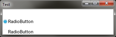
有的时候,我们在开发类似单选按钮功能时,前面的图标会用其他的字体图标来替代,那么如何实现这个需求呢?
比如我们将checkbox改成label控件,我们只需要将label的text属性设置为字体图标,就可以实现定制化。
class ToomaxWindow(BoxLayout):
    pass

class RadioButton(ToggleButtonBehavior, BoxLayout):
    selected = BooleanProperty(False)
    text = StringProperty('')
    # 重写on_state事件处理方法,当state值发生变化后执行
    def on_state(self, widget, value):
        if value == 'down':
            self.selected = True
        else:
            self.selected = False
    # 重写_do_press方法,当单选容器被点击后执行,其目的就是解决togglebutton被选中后再次点击就会取消选中的问题
    def _do_press(self):
        if self.state == 'normal':
            ToggleButtonBehavior._do_press(self)
            self.selected = True
    pass

class TestApp(App):
    def __init__(self, **kwargs):
        super(TestApp, self).__init__(**kwargs)
        # 注册字体图标,需要导入kivy.core.text.LabelBase模块
        LabelBase.register(name='font_mp', fn_regular='./fonts/modernpics.otf')
    def build(self):
        Builder.load_string(kv)
        return ToomaxWindow()

TestApp().run()
#:import C kivy.utils.get_color_from_hex
<RadioButton>:
    id: radiobtn
    orientation: 'horizontal'
    group: 'btn'
    size_hint: 1, None
    height: 32
    # 根据selected属性来确定选中状态
    state: 'down' if self.selected else 'normal'
    Label:
        # 使用字体图标
        text: '[font=font_mp][size=32]>[/size][/font]'
        # 根据父控件的selected属性来设置字体图标的颜色
        color: C('#ff0000') if self.parent.selected else C('#000000')
        size_hint: None, None
        size: lab.height, lab.height
        markup: True
    Label:
        id: lab
        # 在父控件中增加了text属性,用来定义单选按钮的文本内容,没有则使用默认值
        text: self.parent.text if self.parent.text else 'RadioButton'
        color: 0, 0, 0, 1
        size_hint: None, None
        size: self.texture_size

<ToomaxWindow>:
    orientation: 'vertical'
    spacing: 2
    RadioButton:
        selected: True
        text: 'good'
    RadioButton:
运行效果:
-
-
利用好behaviors模块中的各种行为类
-