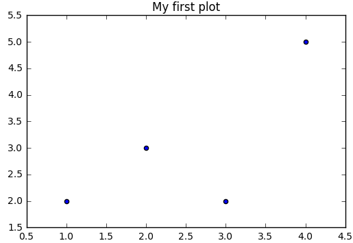
import matplotlib.pyplot as plt
plt.scatter([1,2,3,4],[2,3,2,5])
plt.title('My first plot')
plt.show()
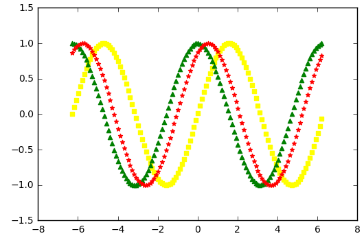
import numpy as np
import pandas as pd
import matplotlib.pyplot as plt
from mpl_toolkits.mplot3d import Axes3D
x = np.arange(-2*np.pi,2*np.pi,0.1)
y = np.sin(x)
y1 = np.sin(x+np.pi/2)
y2 = np.sin(x+np.pi/3)
plt.scatter(x,y,marker='s',color='yellow')
plt.scatter(x,y1,marker='^',color='green')
plt.scatter(x,y2,marker='*',color='red')
plt.show()
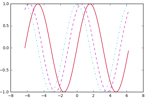
import numpy as np
import pandas as pd
import matplotlib.pyplot as plt
from mpl_toolkits.mplot3d import Axes3D
x = np.arange(-2*np.pi,2*np.pi,0.1)
y = np.sin(x)
y1 = np.sin(x+np.pi/2)
y2 = np.sin(x+np.pi/3)
plt.plot(x,y)
plt.plot(x,y1,'-.')
plt.plot(x,y2,'--')
plt.show()
import numpy as np
import pandas as pd
import matplotlib.pyplot as plt
from mpl_toolkits.mplot3d import Axes3D
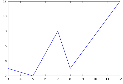
x = np.array([3,5,6,7,8,12])
y = np.array([3,2,5,8,3,12])
plt.plot(x,y)
plt.show()
import numpy as np
import pandas as pd
import matplotlib.pyplot as plt
from mpl_toolkits.mplot3d import Axes3D
x = np.arange(-4*np.pi,4*np.pi,0.1)
y = np.sin(x)
plt.subplot(211)
plt.plot(x,y,'-.')
plt.subplot(212)
plt.plot(x,y,'--',color='red')
plt.show()

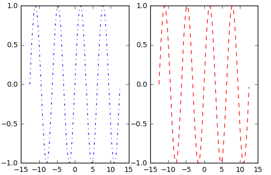
import numpy as np
import pandas as pd
import matplotlib.pyplot as plt
from mpl_toolkits.mplot3d import Axes3D
x = np.arange(-4*np.pi,4*np.pi,0.1)
y = np.sin(x)
plt.subplot(121)
plt.plot(x,y,'-.')
plt.subplot(122)
plt.plot(x,y,'--',color='r')
plt.show()
import numpy as np
import pandas as pd
import matplotlib.pyplot as plt
from mpl_toolkits.mplot3d import Axes3D
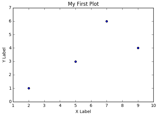
x = np.array([2,5,7,9])
y = np.array([1,3,6,4])
plt.scatter(x,y)
plt.title('My First Plot')
plt.xlabel('X Label')
plt.ylabel('Y Label')
plt.show()
import numpy as np
import pandas as pd
import matplotlib.pyplot as plt
from mpl_toolkits.mplot3d import Axes3D
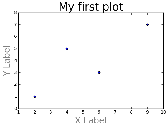
x = np.array([2,4,6,9])
y = np.array([1,5,3,7])
plt.scatter(x,y)
plt.title('My first plot',fontsize=25)
plt.xlabel('X Label',fontsize=20,color='gray')
plt.ylabel('Y Label',fontsize=20,color='gray')
plt.show()
import numpy as np
import pandas as pd
import matplotlib.pyplot as plt
from mpl_toolkits.mplot3d import Axes3D
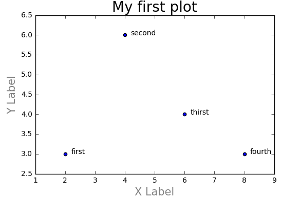
x = np.array([2,4,6,8])
y = np.array([3,6,4,3])
plt.scatter(x,y)
plt.text(2+0.2,3,'first')
plt.text(4+0.2,6,'second')
plt.text(6+0.2,4,'thirst')
plt.text(8+0.2,3,'fourth')
plt.title('My first plot',fontsize=20)
plt.xlabel('X Label',fontsize=15,color='gray')
plt.ylabel('Y Label',fontsize=15,color='gray')
plt.show()
import numpy as np
import pandas as pd
import matplotlib.pyplot as plt
from mpl_toolkits.mplot3d import Axes3D
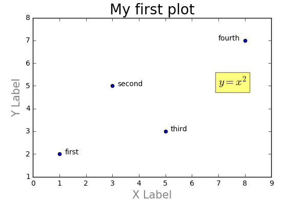
x = np.array([1,3,5,8])
y = np.array([2,5,3,7])
plt.scatter(x,y)
plt.text(1.2,2,'first')
plt.text(3.2,5,'second')
plt.text(5.2,3,'third')
plt.text(7,7,'fourth')
plt.title('My first plot',fontsize=20)
plt.xlabel('X Label',fontsize=15,color='gray')
plt.ylabel('Y Label',fontsize=15,color='gray')
plt.text(7,5,r'$y=x^2$',fontsize=15,bbox={'facecolor':'yellow','alpha':0.5})
plt.show()
import numpy as np
import pandas as pd
import matplotlib.pyplot as plt
from mpl_toolkits.mplot3d import Axes3D
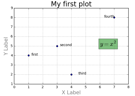
x = np.array([1,3,4,7])
y = np.array([4,5,2,8])
plt.scatter(x,y)
plt.text(1.2,4,'first')
plt.text(3.2,5,'second')
plt.text(4.5,2,'third')
plt.text(6.3,8,'fourth')
plt.text(6,5,r'$y=x^2$',fontsize=18,bbox={'facecolor':'green','alpha':0.5})
plt.title('My first plot',fontsize=20)
plt.xlabel('X Label',fontsize=15,color='gray')
plt.ylabel('Y Label',fontsize=15,color='gray')
plt.grid(True)
plt.show()
import numpy as np
import pandas as pd
import matplotlib.pyplot as plt
from mpl_toolkits.mplot3d import Axes3D
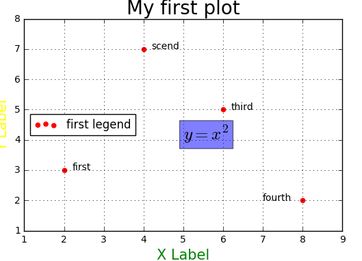
x = np.array([2,4,6,8])
y = np.array([3,7,5,2])
plt.scatter(x,y,color='red')
plt.text(2.2,3,'first')
plt.text(4.2,7,'scend')
plt.text(6.2,5,'third')
plt.text(7,2,'fourth')
plt.text(5,4,r'$y=x^2$',fontsize=18,bbox={'facecolor':'blue','alpha':0.5})
plt.title('My first plot',fontsize=20)
plt.xlabel('X Label',fontsize=15,color='green')
plt.ylabel('Y Label',fontsize=15,color='yellow')
plt.legend(['first legend'],loc=6)
plt.grid(True)
plt.show()
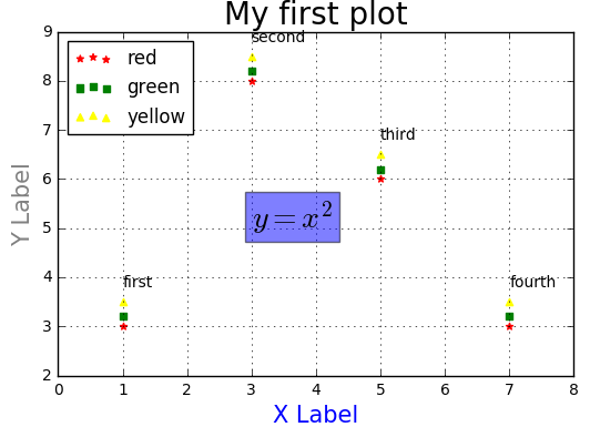
import numpy as np
import pandas as pd
import matplotlib.pyplot as plt
from mpl_toolkits.mplot3d import Axes3D
x = np.array([1,3,5,7])
y = np.array([3,8,6,3])
y1 = np.array([3.2,8.2,6.2,3.2])
y2 = np.array([3.5,8.5,6.5,3.5])
plt.scatter(x,y,color='red',marker='*')
plt.scatter(x,y1,color='green',marker='s')
plt.scatter(x,y2,color='yellow',marker='^')
plt.text(1,3.8,'first')
plt.text(3,8.8,'second')
plt.text(5,6.8,'third')
plt.text(7,3.8,'fourth')
plt.text(3,5,r'$y=x^2$',fontsize=20,bbox={'facecolor':'blue','alpha':0.5})
plt.title('My first plot',fontsize=20)
plt.xlabel('X Label',fontsize=15,color='blue')
plt.ylabel('Y Label',fontsize=15,color='gray')
plt.legend(['red','green','yellow'],loc=2)
plt.grid(True)
plt.show()
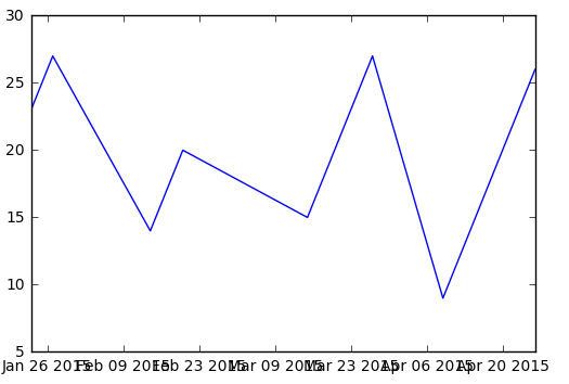
import numpy as np
import pandas as pd
import matplotlib.pyplot as plt
import datetime
from mpl_toolkits.mplot3d import Axes3D
x = [datetime.date(2015,1,23),datetime.date(2015,1,27),
datetime.date(2015,2,14),datetime.date(2015,2,20),
datetime.date(2015,3,15),datetime.date(2015,3,27),
datetime.date(2015,4,9),datetime.date(2015,4,26)]
y = [23,27,14,20,15,27,9,26]
plt.plot(x,y)
plt.show()
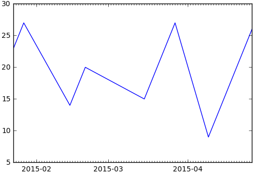
import numpy as np
import pandas as pd
import matplotlib.pyplot as plt
import datetime
import matplotlib.dates as mdates
from mpl_toolkits.mplot3d import Axes3D
x = [datetime.date(2015,1,23),datetime.date(2015,1,27),
datetime.date(2015,2,14),datetime.date(2015,2,20),
datetime.date(2015,3,15),datetime.date(2015,3,27),
datetime.date(2015,4,9),datetime.date(2015,4,26)]
y = [23,27,14,20,15,27,9,26]
months = mdates.MonthLocator()
days = mdates.DayLocator()
timeFmt = mdates.DateFormatter('%Y-%m')
fig,ax = plt.subplots()
ax.xaxis.set_major_locator(months)
ax.xaxis.set_major_formatter(timeFmt)
ax.xaxis.set_minor_locator(days)
plt.plot(x,y)
plt.show()
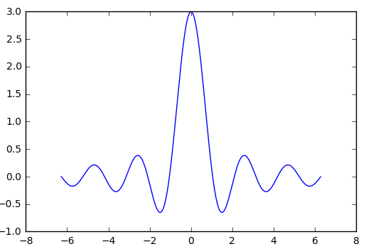
import numpy as np
import pandas as pd
import matplotlib.pyplot as plt
import matplotlib.dates as mdates
import datetime
from mpl_toolkits.mplot3d import Axes3D
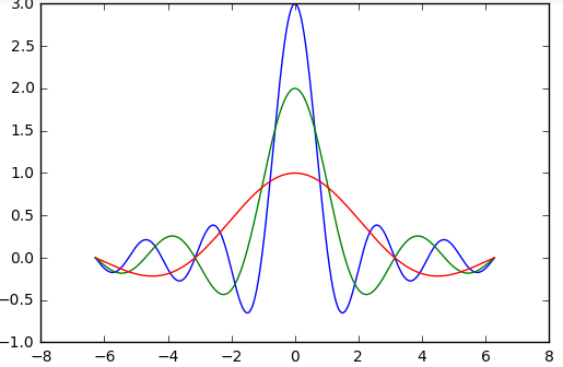
x = np.arange(-2*np.pi,2*np.pi,0.01)
y = np.sin(3*x)/x
plt.plot(x,y)
plt.show()
import numpy as np
import pandas as pd
import datetime
import matplotlib.pyplot as plt
import matplotlib.dates as mdates
from mpl_toolkits.mplot3d import Axes3D
x = np.arange(-2*np.pi,2*np.pi,0.01)
y = np.sin(3*x)/x
y1 = np.sin(2*x)/x
y2 = np.sin(x)/x
plt.plot(x,y)
plt.plot(x,y1)
plt.plot(x,y2)
plt.show()
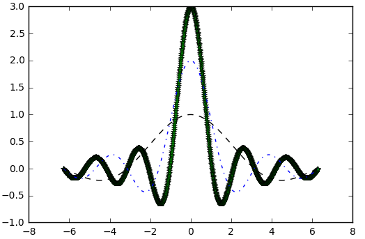
import numpy as np
import matplotlib.pyplot as plt
x = np.arange(-2*np.pi,2*np.pi,0.01)
y = np.sin(3*x)/x
y1 = np.sin(2*x)/x
y2 = np.sin(x)/x
plt.plot(x,y,'*',color='green')
plt.plot(x,y1,'-.',color='blue')
plt.plot(x,y2,'k--')
plt.show()
import numpy as np
import pandas as pd
import matplotlib.pyplot as plt
x = np.arange(-2*np.pi,2*np.pi,0.01)
y = np.sin(3*x)/x
y1 = np.sin(2*x)/x
y2 = np.sin(x)/x
plt.plot(x,y,color='red')
plt.plot(x,y1,color='green')
plt.plot(x,y2,color='blue')
plt.xticks([-2*np.pi,-np.pi,0,np.pi,2*np.pi],[r'$-2pi$',r'$-pi$',r'$0$',r'$+pi$',r'$+2pi$'])
plt.yticks([-1,0,+1,+2,+3],[r'$-1$',r'$0$',r'$+1$',r'$+2$',r'$+3$'])
plt.show()
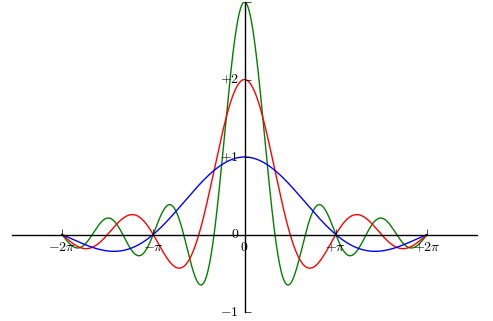
import numpy as np
import pandas as pd
import matplotlib.pyplot as plt
x = np.arange(-2*np.pi,2*np.pi,0.01)
y = np.sin(3*x)/x
y1 = np.sin(2*x)/x
y2 = np.sin(x)/x
plt.plot(x,y,color='green')
plt.plot(x,y1,color='red')
plt.plot(x,y2,color='blue')
plt.xticks([-2*np.pi,-np.pi,0,np.pi,2*np.pi],[r'$-2pi$',r'$-pi$',r'$0$',r'$+pi$',r'$+2pi$'])
plt.yticks([-1,0,1,2,3],[r'$-1$',r'$0$',r'$+1$',r'$+2$'])
ax = plt.gca()
ax.spines['top'].set_color('none')
ax.spines['right'].set_color('none')
ax.spines['bottom'].set_position(('data',0))
ax.spines['left'].set_position(('data',0))
ax.xaxis.set_ticks_position('bottom')
ax.yaxis.set_ticks_position('left')
plt.show()
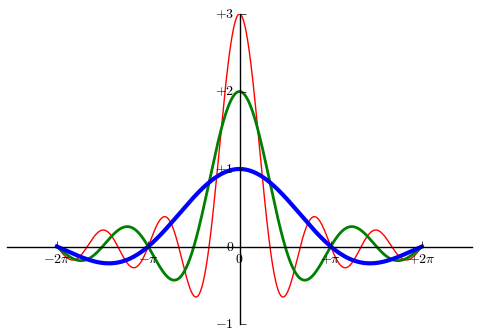
import numpy as np
import pandas as pd
import matplotlib.pyplot as plt
x = np.arange(-2*np.pi,2*np.pi,0.01)
y = np.sin(3*x)/x
y1 = np.sin(2*x)/x
y2 = np.sin(x)/x
plt.plot(x,y,color='red',linewidth=1)
plt.plot(x,y1,color='green',linewidth=2)
plt.plot(x,y2,color='blue',linewidth=3)
plt.xticks([-2*np.pi,-np.pi,0,np.pi,2*np.pi],[r'$-2pi$',r'$-pi$',r'$0$',r'$+pi$',r'$+2pi$'])
plt.yticks([-1,0,1,2,3],[r'$-1$',r'$0$',r'$+1$',r'$+2$',r'$+3$'])
ax = plt.gca()
ax.spines['top'].set_color('none')
ax.spines['right'].set_color('none')
ax.spines['bottom'].set_position(('data',0))
ax.spines['left'].set_position(('data',0))
ax.xaxis.set_ticks_position('bottom')
ax.yaxis.set_ticks_position('left')
plt.show()
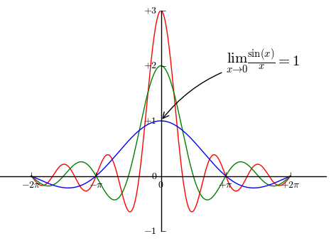
import numpy as np
import pandas as pd
import matplotlib.pyplot as plt
x = np.arange(-2*np.pi,2*np.pi,0.01)
y = np.sin(3*x)/x
y1 = np.sin(2*x)/x
y2 = np.sin(x)/x
plt.plot(x,y,color='red')
plt.plot(x,y1,color='green')
plt.plot(x,y2,color='blue')
plt.xticks([-2*np.pi,-np.pi,0,np.pi,2*np.pi],[r'$-2pi$',r'$-pi$',r'$0$',r'$+pi$',r'$+2pi$'])
plt.yticks([-1,0,1,2,3],[r'$-1$',r'$0$',r'$+1$',r'$+2$',r'$+3$'])
ax = plt.gca()
ax.spines['top'].set_color('none')
ax.spines['right'].set_color('none')
ax.spines['bottom'].set_position(('data',0))
ax.spines['left'].set_position(('data',0))
ax.xaxis.set_ticks_position('bottom')
ax.yaxis.set_ticks_position('left')
plt.annotate(r'$lim_{x o 0}frac{sin(x)}{x}=1$',xytext=[np.pi,2],xy=[0,1],
fontsize=15,arrowprops={'arrowstyle':'->','connectionstyle':'arc3,rad=0.2'})
plt.show()
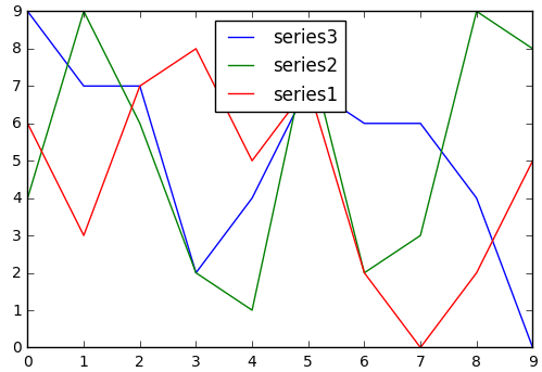
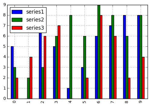
import numpy as np
import pandas as pd
import matplotlib.pyplot as plt
x1 = np.random.randint(0,10,10)
x2 = np.random.randint(0,10,10)
x3 = np.random.randint(0,10,10)
data = {'series1':x1,
'series2':x2,
'series3':x3}
x = np.arange(10)
df = pd.DataFrame(data)
plt.plot(x,df)
plt.legend(data,loc=9)
plt.show()
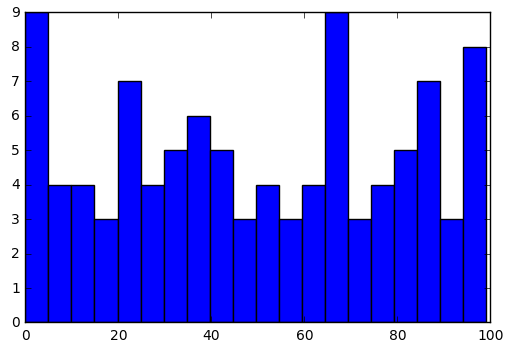
import numpy as np
import pandas as pd
import matplotlib.pyplot as plt
data = np.random.randint(0,100,100)
plt.hist(data,bins=20)
plt.show()
import numpy as np
import pandas as pd
import matplotlib.pyplot as plt
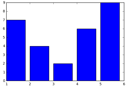
x = np.array([1,2,3,4,5])
y = np.array([7,4,2,6,9])
plt.bar(x,y)
plt.show()
import numpy as np
import pandas as pd
import matplotlib.pyplot as plt
x = np.array([1,2,3,4,5])
y = np.array([7,4,2,6,9])
plt.bar(x,y)
plt.xticks(x+0.4,['A','B','C','D','E'])
plt.show()

import numpy as np
import pandas as pd
import matplotlib.pyplot as plt
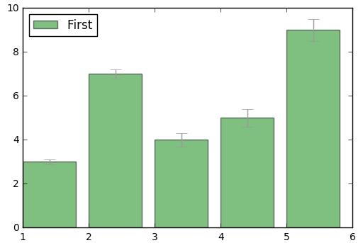
x = np.array([1,2,3,4,5])
y = np.array([3,7,4,5,9])
err = np.array([0.1,0.2,0.3,0.4,0.5])
plt.bar(x,y,yerr=err,error_kw={'ecolor':'0.6','capsize':6},color='green',alpha=0.5)
plt.legend(['First'],loc=2)
plt.show()
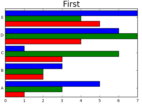
import numpy as np
import pandas as pd
import matplotlib.pyplot as plt
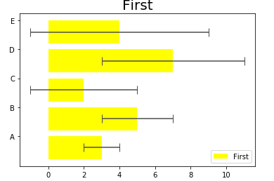
x = np.array([1,2,3,4,5])
y = np.array([3,5,2,7,4])
err = np.array([1,2,3,4,5])
plt.barh(x,y,xerr=err,error_kw={'ecolor':'0.3','capsize':6},color='yellow')
plt.legend(['First'],loc=4)
plt.title('First',fontsize=20)
plt.yticks(x+0.4,['A','B','C','D','E'])
plt.show()
import numpy as np
import pandas as pd
import matplotlib.pyplot as plt
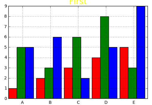
b=0.3
x = np.array([1,2,3,4,5])
y = np.array([1,2,3,4,5])
y1 = np.array([5,3,6,8,3])
y2 = np.array([5,6,2,5,9])
plt.bar(x,y,b,color='red')
plt.bar(x+b,y1,b,color='green')
plt.bar(x+2*b,y2,b,color='blue')
plt.xticks(x+0.5,['A','B','C','D','E'])
plt.title('First',color='yellow',fontsize=20)
plt.grid(True)
plt.show()
import numpy as np
import pandas as pd
import matplotlib.pyplot as plt
bw=0.3
x = np.array([1,2,3,4,5])
y = np.array([1,2,3,4,5])
y1 = np.array([3,2,6,7,4])
y2 = np.array([5,3,1,6,7])
plt.barh(x,y,bw,color='red')
plt.barh(x+bw,y1,bw,color='green')
plt.barh(x+2*bw,y2,bw,color='blue')
plt.yticks(x+0.5,['A','B','C','D','E'])
plt.title('First',fontsize=20)
plt.show()
import numpy as np
import pandas as pd
import matplotlib.pyplot as plt
x1 = np.random.randint(0,10,10)
x2 = np.random.randint(0,10,10)
x3 = np.random.randint(0,10,10)
data = {'series1':x1,
'series2':x2,
'series3':x3}
df = pd.DataFrame(data)
df.plot(kind='bar')
plt.grid(True)
plt.show()
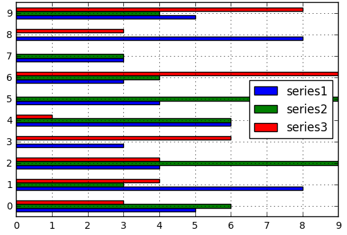
import numpy as np
import pandas as pd
import matplotlib.pyplot as plt
x1 = np.random.randint(0,10,10)
x2 = np.random.randint(0,10,10)
x3 = np.random.randint(0,10,10)
data = {'series1':x1,
'series2':x2,
'series3':x3}
df = pd.DataFrame(data)
df.plot(kind='barh')
plt.grid(True)
plt.show()
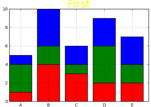
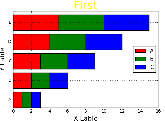
import numpy as np
import pandas as pd
import matplotlib.pyplot as plt
x = np.array([1,2,3,4,5])
y = np.array([1,4,3,2,2])
y1 = np.array([3,2,1,4,2])
y2 = np.array([1,4,2,3,3])
plt.bar(x,y,color='red')
plt.bar(x,y1,bottom=y,color='green')
plt.bar(x,y2,bottom=y+y1,color='blue')
plt.xticks(x+0.4,['A','B','C','D','E'])
plt.grid(True)
plt.title('First',color='yellow',fontsize=25)
plt.show()
import numpy as np
import pandas as pd
import matplotlib.pyplot as plt
x = np.array([1,2,3,4,5])
y = np.array([1,2,3,4,5])
y1 = np.array([1,2,3,4,5])
y2 = np.array([1,2,3,4,5])
plt.barh(x,y,color='red')
plt.barh(x,y1,left=y,color='green')
plt.barh(x,y2,left=y1+y,color='blue')
plt.yticks(x+0.4,['A','B','C','D','E'])
plt.grid(True)
plt.legend(['A','B','C'],loc=5)
plt.title('First',fontsize=25,color='yellow')
plt.xlabel('X Lable',fontsize=15)
plt.ylabel('Y Lable',fontsize=15)
plt.show()
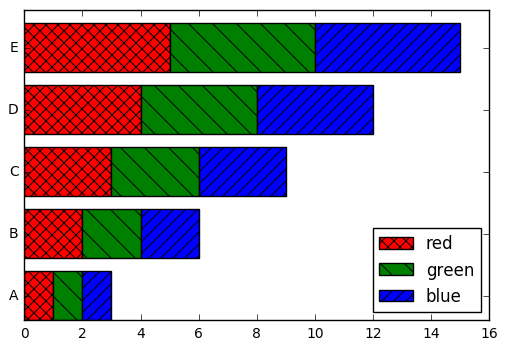
import numpy as np
import pandas as pd
import matplotlib.pyplot as plt
x = np.array([1,2,3,4,5])
y = np.array([1,2,3,4,5])
y1 = np.array([1,2,3,4,5])
y2 = np.array([1,2,3,4,5])
plt.barh(x,y,color='red',hatch='xx')
plt.barh(x,y1,left=y,color='green',hatch='\')
plt.barh(x,y2,left=y1+y,color='blue',hatch='//')
plt.yticks(x+0.4,['A','B','C','D','E'])
plt.legend(['red','green','blue'],loc=4)
plt.show()
import numpy as np
import pandas as pd
import matplotlib.pyplot as plt
x1 = np.array([1,2,3,4,5])
x2 = np.array([1,2,3,4,5])
x3 = np.array([1,2,3,4,5])
x4 = np.array([1,2,3,4,5])
data = {'series1':x1,
'series2':x2,
'series3':x3,
'series4':x4}
df = pd.DataFrame(data)
df.plot(kind='bar',stacked=True)
plt.show()

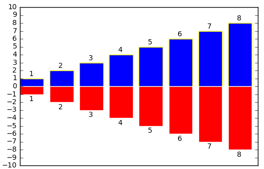
import numpy as np
import pandas as pd
import matplotlib.pyplot as plt
x = np.array([1,2,3,4,5,6,7,8])
y = np.array([1,2,3,4,5,6,7,8])
plt.bar(x,y,edgecolor='yellow')
plt.bar(x,-y,facecolor='red',edgecolor='w')
plt.xticks(())
for i,j in zip(x,y):
plt.text(i+0.3,j+0.3,'%d' % j)
for i,j in zip(x,y):
plt.text(i+0.3,-j-0.9,'%d' % j)
plt.yticks(np.arange(-10,11))
plt.show()
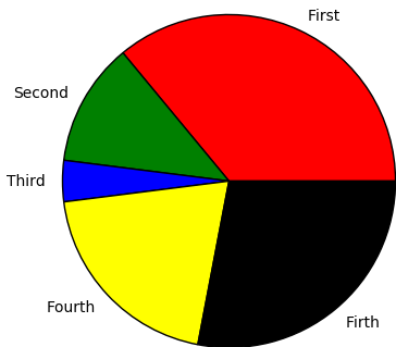
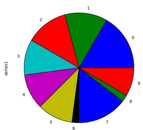
import numpy as np
import pandas as pd
import matplotlib.pyplot as plt
value = np.random.randint(1,10,5)
labels = ['First','Second','Third','Fourth','Firth']
colors = ['red','green','blue','yellow','black']
plt.pie(value,labels=labels,colors=colors)
plt.axis('equal')
plt.show()
import numpy as np
import pandas as pd
import matplotlib.pyplot as plt
value = np.random.randint(1,10,10)
labels = ['one','two','three','four','five','six','secen','eight','nice','tex']
explode = [0,0,0,0.3,0,0,0,0,0,0]
plt.pie(value,labels=labels,explode=explode,startangle=90)
plt.axis('equal')
plt.title('A pie',fontsize=25)
plt.show()

import numpy as np
import pandas as pd
import matplotlib.pyplot as plt
value = np.random.randint(1,10,10)
labels = ['one','two','three','four','five','six','seven','eight','nice','ten']
explode = [0,0,0,0,0,0,0.2,0,0,0]
plt.pie(value,labels=labels,explode=explode,shadow=True,startangle=90,autopct='%1.1f%%')
plt.axis('equal')
plt.title('A pie',fontsize=25)
plt.show()

import numpy as np
import pandas as pd
import matplotlib.pyplot as plt
x1 = np.random.randint(1,10,10)
x2 = np.random.randint(1,10,10)
x3 = np.random.randint(1,10,10)
x4 = np.random.randint(1,10,10)
data = {'series1':x1,
'series2':x2,
'series3':x3,
'series4':x4}
df = pd.DataFrame(data)
df['series1'].plot(kind='pie',figsize=(6,6))
plt.show()
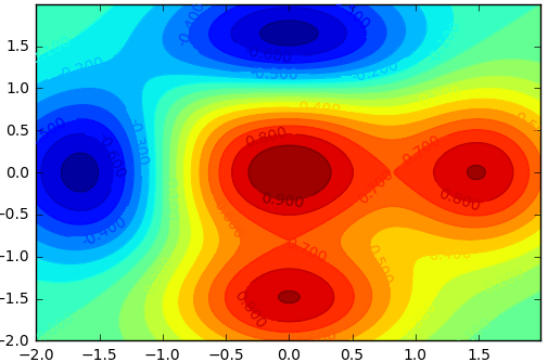
import numpy as np
import matplotlib.pyplot as plt
dx = 0.01
dy = 0.01
x = np.arange(-2.0,2.0,dx)
y = np.arange(-2.0,2.0,dy)
X,Y = np.meshgrid(x,y)
def f(x,y):
return (1-y**5+x**5)*np.exp(-x**2-y**2)
C = plt.contour(X,Y,f(X,Y),20,color='black')
plt.contourf(X,Y,f(X,Y),20)
plt.clabel(C,inline=1,fontsize=10)
plt.show()
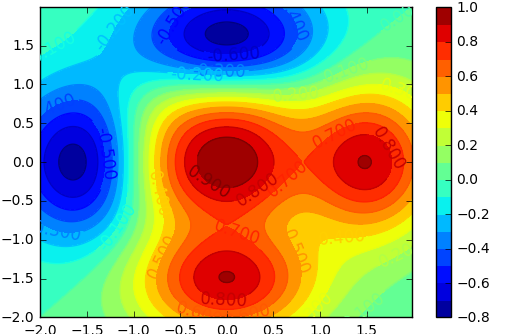
import numpy as np
import matplotlib.pyplot as plt
dx = 0.01
dy = 0.01
x = np.arange(-2.0,2.0,dx)
y = np.arange(-2.0,2.0,dy)
X,Y = np.meshgrid(x,y)
def f(x,y):
return (1-y**5+x**5)*np.exp(-x**2-y**2)
C = plt.contour(X,Y,f(X,Y),20,color='black')
plt.contourf(X,Y,f(X,Y),20)
plt.clabel(C,inline=1,fontsize=12)
plt.colorbar()
plt.show()
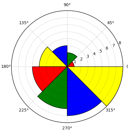
import numpy as np
import matplotlib.pyplot as plt
N = 8
x = np.arange(0.0,2*np.pi,2*np.pi/N)
y = np.array([1,2,3,4,5,6,7,8])
plt.axes([0.025,0.025,0.95,0.95],polar=True)
color = ['red','green','blue','yellow']
plt.bar(x,y,color=color,width=(2*np.pi/N))
plt.show()
import numpy as np
import matplotlib.pyplot as plt
N = 8
x = np.arange(0.0,2*np.pi,2*np.pi/N)
y = np.array([1,2,3,4,5,6,7,8])
plt.axes([0.025,0.025,0.95,0.95],polar=True)
color=['red','green','blue','yellow']
plt.bar(x,y,color=color,width=(2*np.pi/N),bottom=0.5,label=['te','te','te','te','te'])
plt.show()
import numpy as np
import matplotlib.pyplot as plt
from mpl_toolkits.mplot3d import Axes3D
x = np.arange(-2,2,0.01)
y = np.arange(-2,2,0.01)
X,Y = np.meshgrid(x,y)
def f(x,y):
return (1-y**5+x**5)*np.exp(-x**2-y**2)
fig = plt.figure()
ax = Axes3D(fig)
ax.plot_surface(X,Y,f(X,Y),cstride=10,rstride=10)
plt.show()
import numpy as np
import matplotlib.pyplot as plt
from mpl_toolkits.mplot3d import Axes3D
x = np.arange(-3,3,0.01)
y = np.arange(-3,3,0.01)
X,Y = np.meshgrid(x,y)
def f(x,y):
return (1-y**5+x**5)*np.exp(-x**2-y**2)
C = plt.contour(X,Y,f(X,Y),20,color='black')
plt.contourf(X,Y,f(X,Y),20)
plt.clabel(C,inline=1,fontsize=10)
fig = plt.figure()
ax = Axes3D(fig)
ax.plot_surface(X,Y,f(X,Y),rstride=10,cstride=10,cmap=plt.cm.CMRmap_r)
ax.view_init(elev=30,azim=125)
plt.show()

import numpy as np
import matplotlib.pyplot as plt
from mpl_toolkits.mplot3d import Axes3D
x1 = np.random.randint(30,40,100)
x2 = np.random.randint(20,30,100)
x3 = np.random.randint(10,20,100)
y1 = np.random.randint(50,60,100)
y2 = np.random.randint(30,40,100)
y3 = np.random.randint(50,70,100)
z1 = np.random.randint(10,30,100)
z2 = np.random.randint(40,50,100)
z3 = np.random.randint(40,50,100)
fig = plt.figure()
ax = Axes3D(fig)
ax.scatter(x1,y1,z1)
ax.scatter(x2,y2,z2,color='red',marker='^')
ax.scatter(x3,y3,z3,color='green',marker='s')
plt.show()

import numpy as np
import matplotlib.pyplot as plt
from mpl_toolkits.mplot3d import Axes3D
x = np.arange(8)
y = np.random.randint(0,10,8)
y1 = y+np.random.randint(0,3,8)
y2 = y1+np.random.randint(0,3,8)
y3 = y2+np.random.randint(0,3,8)
y4 = y3+np.random.randint(0,3,8)
y5 = y4+np.random.randint(0,3,8)
color = ['red','green','blue','yellow']
fig = plt.figure()
ax = Axes3D(fig)
ax.bar(x,y,0,zdir='y',color=color)
ax.bar(x,y1,10,zdir='y',color=color)
ax.bar(x,y2,20,zdir='y',color=color)
ax.bar(x,y3,30,zdir='y',color=color)
ax.bar(x,y4,40,zdir='y',color=color)
ax.bar(x,y5,50,zdir='y',color=color)
ax.view_init(elev=40,azim=30)
plt.show()
import numpy as np
import matplotlib.pyplot as plt
fig = plt.figure()
ax = fig.add_axes([0.1,0.1,0.8,0.8])
innerAx = fig.add_axes([0.6,0.6,0.25,0.25])
plt.show()
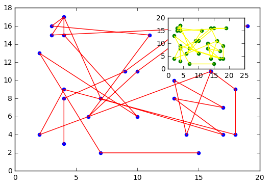
import numpy as np
import matplotlib.pyplot as plt
x = np.random.randint(1,20,30)
y = np.random.randint(1,20,30)
fig = plt.figure()
ax1 = fig.add_axes([0.1,0.1,0.8,0.8])
ax2 = fig.add_axes([0.6,0.6,0.25,0.25])
ax1.plot(x,y,color='red')
ax1.scatter(x,y,color='blue')
ax2.plot(x,y,color='yellow')
ax2.scatter(x,y,color='green')
plt.show()
import numpy as np
import matplotlib.pyplot as plt
gs = plt.GridSpec(3,3)
fig = plt.figure(figsize=(6,6))
fig.add_subplot(gs[2,0])
fig.add_subplot(gs[2,1:])
fig.add_subplot(gs[1,:2])
fig.add_subplot(gs[0,:2])
fig.add_subplot(gs[0:2,2])
plt.show()
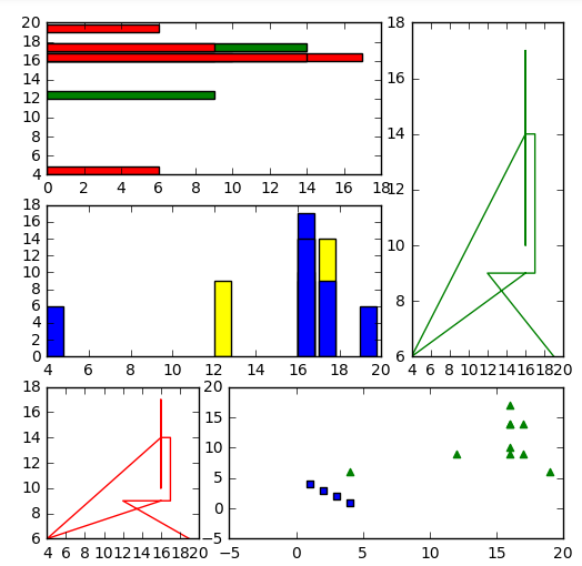
import numpy as np
import matplotlib.pyplot as plt
x = np.random.randint(1,20,10)
y = np.random.randint(1,20,10)
gs = plt.GridSpec(3,3)
fig = plt.figure(figsize=(6,6))
t1 = fig.add_subplot(gs[2,0])
t2 = fig.add_subplot(gs[2,1:])
t3 = fig.add_subplot(gs[1,:2])
t4 = fig.add_subplot(gs[0,:2])
t5 = fig.add_subplot(gs[:2,2])
t1.plot(x,y,color='red')
t2.scatter(x,y,color='green',marker='^')
t2.scatter([1,2,3,4],[4,3,2,1],marker='s')
t3.bar(x,y,color=['yellow','blue'])
t4.barh(x,y,color=['green','red'])
t5.plot(x,y,color='green')
plt.show()