# This Python 3 environment comes with many helpful analytics libraries installed
# It is defined by the kaggle/python docker image: https://github.com/kaggle/docker-python
# For example, here's several helpful packages to load in

import numpy as np # linear algebra
import pandas as pd # data processing, CSV file I/O (e.g. pd.read_csv)

# Input data files are available in the "../input/" directory.
# For example, running this (by clicking run or pressing Shift+Enter) will list the files in the input directory
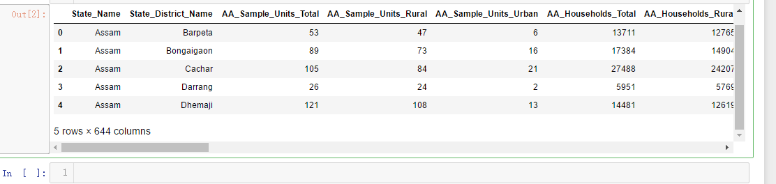
df=pd.read_csv('F:\kaggleDataSet\Key_indicator_districtwise\Key_indicator_districtwise.csv')
df.head()
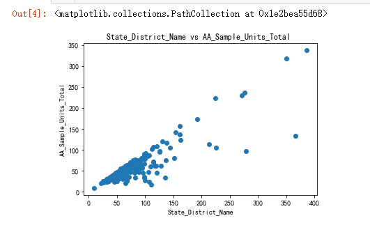
x=df['AA_Sample_Units_Total']
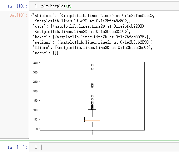
y=df['AA_Sample_Units_Rural']
z=df['AA_Population_Urban']
import matplotlib.pyplot as plt
import seaborn as sns
plt.title('State_District_Name vs AA_Sample_Units_Total ')
plt.xlabel('State_District_Name')
plt.ylabel('AA_Sample_Units_Total')
plt.scatter(x,y)
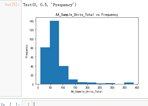
plt.hist(x)
plt.title('AA_Sample_Units_Total vs Frequency')
plt.xlabel('AA_Sample_Units_Total')
plt.ylabel('Frequency')
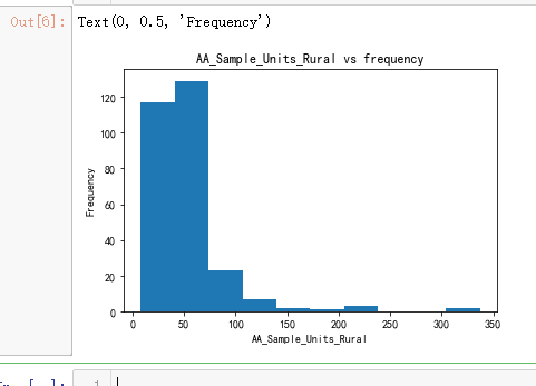
plt.hist(y)
plt.title('AA_Sample_Units_Rural vs frequency')
plt.xlabel('AA_Sample_Units_Rural')
plt.ylabel('Frequency')
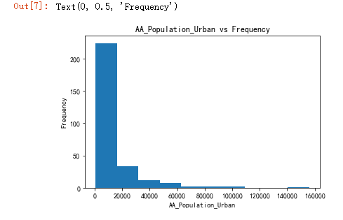
plt.hist(z)
plt.title('AA_Population_Urban vs Frequency')
plt.xlabel('AA_Population_Urban')
plt.ylabel('Frequency')
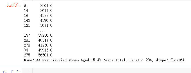
q=df['AA_Ever_Married_Women_Aged_15_49_Years_Total']
q
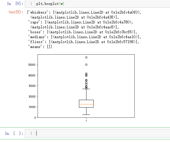
w=q.sort_values()
w
import matplotlib.pyplot as plt
import numpy as np
from sklearn import datasets, linear_model, metrics
# load the boston dataset
boston = datasets.load_boston(return_X_y=False)
# defining feature matrix(X) and response vector(y)
X = boston.data
y = boston.target
# splitting X and y into training and testing sets
from sklearn.model_selection import train_test_split
X_train, X_test, y_train, y_test = train_test_split(X, y, test_size=0.4,
random_state=1)
# create linear regression object
reg = linear_model.LinearRegression()
# train the model using the training sets
reg.fit(X_train, y_train)
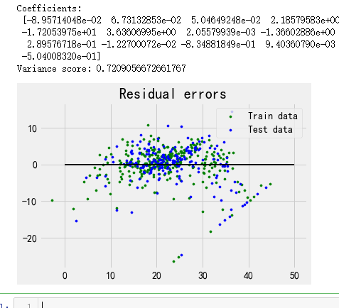
# regression coefficients
print('Coefficients:
', reg.coef_)
# variance score: 1 means perfect prediction
print('Variance score: {}'.format(reg.score(X_test, y_test)))
# plot for residual error
## setting plot style
plt.style.use('fivethirtyeight')
## plotting residual errors in training data
plt.scatter(reg.predict(X_train), reg.predict(X_train) - y_train,
color = "green", s = 10, label = 'Train data')
## plotting residual errors in test data
plt.scatter(reg.predict(X_test), reg.predict(X_test) - y_test,
color = "blue", s = 10, label = 'Test data')
## plotting line for zero residual error
plt.hlines(y = 0, xmin = 0, xmax = 50, linewidth = 2)
## plotting legend
plt.legend(loc = 'upper right')
## plot title
plt.title("Residual errors")
## function to show plot
plt.show()