总结前端知识点后的随笔...
页面样式
页面代码
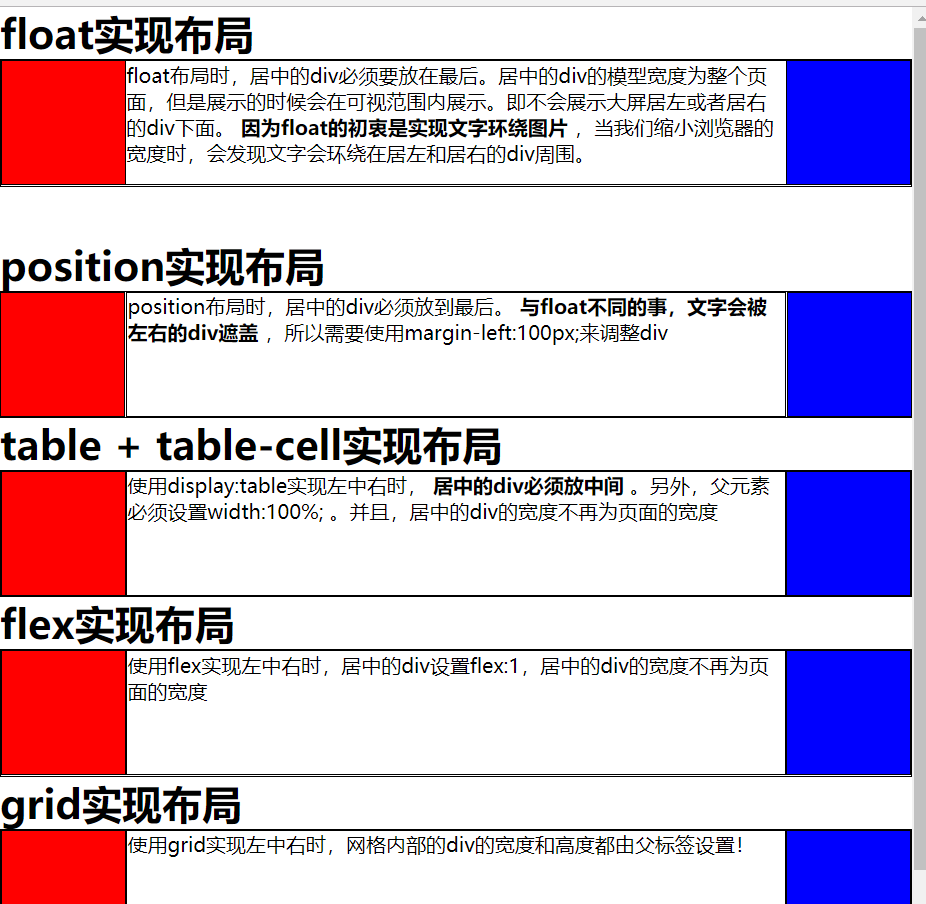
<!DOCTYPE html>
<html>
<head>
    <title></title>
    <style type="text/css">
        *{
            margin:0px;
            border: 0px;
            box-sizing:border-box;
        }
        div{
            border: 1px solid black;
        }
        .left{
            height: 100px;
            width: 100px;
            background-color: red;
        }
        .right{
            height: 100px;
            width: 100px;
            background-color: blue;
        }
        .center{
            height: 100px;
        }

        .floatDiv .left{
            float: left;
        }
        .floatDiv .right{
            float: right;
        }
        .floatDiv .center{

        }

        .positionDiv .left{
            position: absolute;
            left: 0px;
        }
        .positionDiv .right{
            position: absolute;
            right: 0px;
        }
        .positionDiv .center{
            margin-left: 100px;
            margin-right: 100px;
        }

        .tableDiv{
            display: table;
            width:100%;
        }
        .tableDiv .left{
            display: table-cell;
        }
        .tableDiv .right{
            display: table-cell;
        }
        .tableDiv .center{
            display: table-cell;
        }

        .flexDiv{
            display:flex;
        }
        .flexDiv .left{

        }
        .flexDiv .right{

        }
        .flexDiv .center{
            flex:1;
        }

        .gridDiv{
            display: grid;
            width: 100%;
            grid-template-rows:100px;
            grid-template-columns:100px auto 100px;
        }
        .gridDiv .left{

        }
        .gridDiv .right{

        }
        .gridDiv .center{

        }

    </style>
</head>
<body>
    <h1>float实现布局</h1>
    <div class="floatDiv">
        <div class="left"></div>
        <div class="right"></div>
        <div class="center">
            float布局时,居中的div必须要放在最后。居中的div的模型宽度为整个页面,但是展示的时候会在可视范围内展示。即不会展示大屏居左或者居右的div下面。
            <strong>
                因为float的初衷是实现文字环绕图片
            </strong>
            ,当我们缩小浏览器的宽度时,会发现文字会环绕在居左和居右的div周围。
        </div>
    </div>
    <br/><br/>
    <h1>position实现布局</h1>
    <div class="positionDiv">
        <div class="left"></div>
        <div class="right"></div>
        <div class="center">
            position布局时,居中的div必须放到最后。
            <strong>
                与float不同的事,文字会被左右的div遮盖
            </strong>
            ,所以需要使用margin-left:100px;来调整div
        </div>
    </div>

    <h1>table + table-cell实现布局</h1>
    <div class="tableDiv">
        <div class="left"></div>
        <div class="center">
            使用display:table实现左中右时,
            <strong>
                居中的div必须放中间
            </strong>
            。另外,父元素必须设置100%; 。并且,居中的div的宽度不再为页面的宽度
        </div>
        <div class="right"></div>
    </div>

    <h1>flex实现布局</h1>
    <div class="flexDiv">
        <div class="left"></div>
        <div class="center">
            使用flex实现左中右时,居中的div设置flex:1,居中的div的宽度不再为页面的宽度
        </div>
        <div class="right"></div>
    </div>

    <h1>grid实现布局</h1>
    <div class="gridDiv">
        <div class="left"></div>
        <div class="center">
            使用grid实现左中右时,网格内部的div的宽度和高度都由父标签设置!
        </div>
        <div class="right"></div>
    </div>

</body>
</html>