下图注册按钮的边框有渐变效果,如果让你来实现,你会怎么做呢

个人觉得,省事的做法,直接让UI给背景图片就可以了,如下图

不过这种做法感觉不太灵活,如果要修改border的渐变颜色,就需要UI重新做图。那应该怎么做呢?
我首先想到的方法就是用CSS3的border-image属性
border-image有2种用法
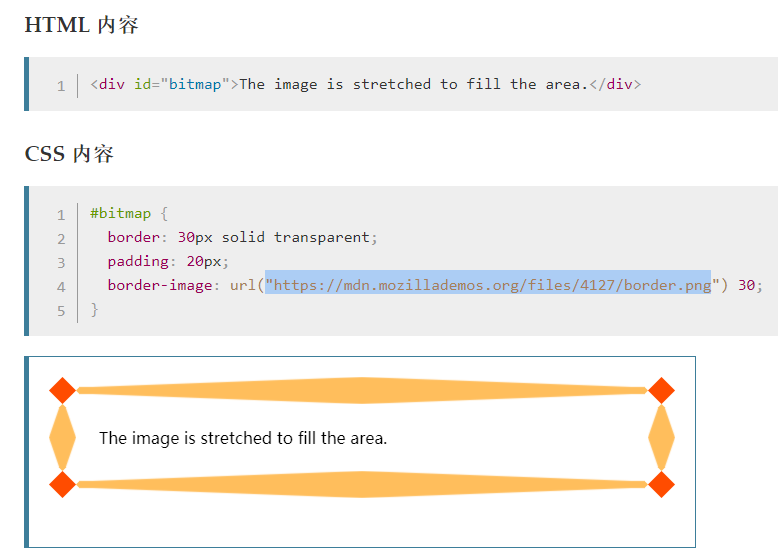
①:使用图片 
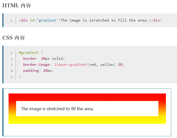
②:使用渐变
注:然后我选择使用上面第二种方法,渐变来实现。但遇到一个问题——border-raduis圆角属性设置无效
后来经过多番查找,终于找到了解决方法,截图和demo如下

<!DOCTYPE html>
<html>

    <head>
        <meta charset="UTF-8">
        <meta name="viewport" content="width=device-width,initial-scale=1,minimum-scale=1,maximum-scale=1,user-scalable=no" />
        <title></title>
        <style>
            .border {
            position: relative;
            outline: 0;
            width: 100%;
            text-align: center;
            border: 4px solid transparent;
            border-radius: 16px;
            background: linear-gradient(orange, violet);
            background-clip: padding-box;
            padding: 10px;
            /* just to show box-shadow still works fine */
            box-shadow: 0 3px 9px black, inset 0 0 9px white;
        }

        .border::after {
            position: absolute;
            top: -4px;
            bottom: -4px;
            left: -4px;
            right: -4px;
            background: linear-gradient(red, blue);
            content: '';
            z-index: -1;
            border-radius: 16px;
        </style>
    </head>

    <body>
        <button class="border">点我</button>
    </body>

</html>
原文链接:https://segmentfault.com/q/1010000006613100/a-1020000006619501
补充:然后我根据这个demo和UI给的设计图注册按钮做了小的调整,效果截图和demo如下
 因为我是自己取的色,可能会有偏差,尽力还原了,见谅
<!DOCTYPE html>
<html>

    <head>
        <meta charset="UTF-8">
        <meta name="viewport" content="width=device-width,initial-scale=1,minimum-scale=1,maximum-scale=1,user-scalable=no" />
        <title></title>
        <style>
            body {
                /* 只是为了更好的查看效果添加的背景颜色  */
                background-color: #090909;
            }
            .border {
            position: relative;
            outline: 0;
            width: 100%;
            text-align: center;
            border: 1px solid transparent;
            border-radius: 16px;
            background-color: #3B3933;
            background-clip: padding-box;
            color: #F6DFB4;
            padding: 10px;
        }

        .border::after {
            position: absolute;
            top: -4px;
            bottom: -4px;
            left: -4px;
            right: -4px;
            background: linear-gradient(#AB8124,#F0DF67,#2F1F08);
            content: '';
            z-index: -1;
            border-radius: 16px;
        </style>
    </head>

    <body>
        <button class="border">注册</button>
    </body>

</html>