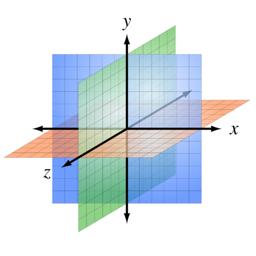
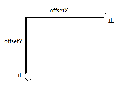
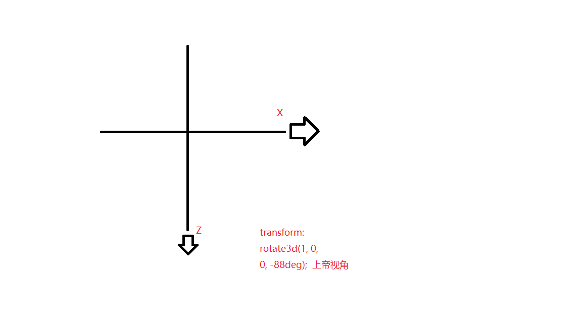
--------------------属性选择器-------------------------
/*1.E[attr]:查找指定的拥有attr属性的E标签。如查找拥有style属性的li标签*/
        li[style]{
            text-decoration: underline;
        }
 /*2.E[attr=value]:查找拥有指定的Attr属性并且属性值为value的E标签。如想查找拥有class属性并且值为Red的li标签   =是严格匹配*/
        li[class=red]{
            /*font-size: 30px;*/
        }
        /*3.E[attr*=value]:查找拥有指定的attr属性并且属性值中包含(可以在任意位置)value的E标签*/
        li[class*=red]{
            /*font-size: 30px;*/
        }
        /*4.E[attr^=value]:查找拥有指定的attr属性并且属性值以value开头的E标签*/
        li[class^=blue]{
            font-size: 30px;
        }
        /*5.E[attr$=value]:查找拥有指定的attr属性并且属性值以value开结束的E标签*/
        li[class$=blue]{
            /*font-size: 30px;*/
        }
-------------兄弟选择器-----------------------
    .first{
            color: red;
        }
        /*兄弟伪类:
        +:获取当前元素的相邻的满足条件的元素
        ~:获取当前元素的满足条件的兄弟元素*/


        .class+标签 只会查找下面拥有class属性子元素的子元素
        .first + li{
            color: blue;
        }

        /*下面样式查找添加了.first样式的元素的所有兄弟li元素  他只能查找下面的兄弟元素
        1.必须是指定类型的元素*/
        .first ~ li{
            color: pink;
        }
-----------伪类选择器--------------
  /* first 下面所有li进行选中  */
        /* .first ~ li{
            color:red;
        } */
        /* 只会查找current 下面的第一个元素 */
       /* .first + li{
           color: blue;
       } */
       /* 选择属于父元素的第一个子元素的每个 <p> 元素。
       li:first-child{
         color:red;
       } */
 /* 选择属于父元素的最后一个子元素的每个 <p> 元素。 */
      /* li:last-child{
          background-color: aqua;
      }  */
      /* 选择属于其父元素的首个 <p> 元素的每个 <p> 元素。只找一个元素 */
      /* li:first-of-type{
         background-color: red;
      } */
---------------------------------
      /* 选择属于其父元素的最后 <p> 元素的每个 <p> 元素。
      li:last-of-type{
        background-color: red;
      } */
      /* 选择属于其父元素的第N个子元素的每个 <p> 元素。
      li:nth-child(5){
          background: red;
      } */
      /* 查找所有的偶数 选择属于其父元素的第N个子元素的每个 <p> 元素。*/
      /* li:nth-child(even){
          background-color: red;
      } */
      /* 查找所有的奇数 选择属于其父元素的第N个子元素的每个 <p> 元素。*/
      /* li:nth-child(odd){
        background-color: red;
      } */
      /* 选择属于其父元素第N个 <p> 元素的每个 <p> 元素。 */
      /* li:nth-of-type(2){
          background-color: red;
      } */
      /* 最后一个子元素开始计数。N=0
      li:nth-last-of-type(-n+5){
          background-color: red;
      } */
      /* 选择属于其父元素第N个 <li> 元素的每个 <p> 元素。从头开始找
      li:nth-of-type(-n+5){
          background-color: red;
      } */
      /* 选择没有子元素的每个 <p> 元素(包括文本节点)。包括空格 */
    /* li:empty{
        background-color: red;
    } */

------------------------------
p::selection{
color:red
}
他只能设置样式显示,不能改变内容大小
-------------
获取第一个字符元素
    p::first-letter{
        color: red;
    }
----------
 /*获取第一行内容:如果设置了::first-letter,那么无法同时设置它的样式*/
    /* p::first-line{
        color: red;
    } */
----------
/*设置当前选中内容的样式,鼠标选中它只能设置显示的样式,而不能设置内容大小*/
    P::selection{
        background-color: red;
    }

 /*通过opacity设置透明度:如果设置父容器,那么父容器中的所有子元素也会透明*/
            opacity: 0.1;

----------------------
内减盒子
 box-sizing: border-box;

/*content-box:你设置的width属性值仅仅是内容的宽度,盒子的最终的宽高值在width的基础上再加上padding和border的宽度*/
            /*border-box:你设置的width属性值就是盒子的最终的宽度,包含了border和padding和内容。如果添加了padding和border,那么真正放置内容的区域会减小--但是它可以稳固页面的结构*/

------阴影---------------------------
/*添加阴影 text-shadow:offsetX offsetY blur color*/
立体感:.dome5{
            text-shadow: -1px -1px 0 #eee,-2px -2px 0 #ddd,-3px -3px 0 #ccc,-4px -4px 0 #bbb,-5px -5px 0 #aaa;
        }


<!--文本阴影:text-shadow:offsetX offsetY blur color-->
<!--边框阴影:box-shadow:h v blur spread color inset
h:水平方向的偏移值
v:垂直方向的偏移值
blur:模糊--可选,默认0
spread:阴影的尺寸,扩展和收缩阴影的大小--可选 默认0
color:颜色--可选,默认黑色
inset:内阴影--可选,默认是外阴影-->
----------------------------------------------
线性渐变:
 /*linear-gradient(方向,开始颜色 位置,颜色2 位置,颜色3 位置...);*/
            /*方向:
            to top:0deg
            to right:90deg
            to bottom:180deg --默认值
            to left:270deg*/

            /*background: linear-gradient(to right,red,blue)*/;
            background: linear-gradient(to right,red 0%,red 50%,blue 50%,blue 100%);

---------------------
径向渐变
/*语法:radial-gradient(形状 大小 坐标,颜色1,颜色2...)
形状shape:circle:产生正方形的渐变色   ellipse:适配当前的形状,如果是正方形的容器,两者效果一样.如果宽高不一样,默认效果切换到ellipse
            at position:坐标,默认在正中心。可以赋值坐标(参照元素的左上角),也可以赋值关键字(left center right top bottom)
            大小size: closest-side:最近边; farthest-side:最远边; closest-corner:最近角; farthest-corner:最远角。默认是最远的角farthest-corner*/
            /*background: radial-gradient(circle,red,blue);*/
            /*background: radial-gradient(circle farthest-side at 50px 50px,red,blue);*/
            /*background: radial-gradient(at left top,red,blue);*/

center:渐变起点的位置,可以为百分比,默认是图形的正中心。

shape:渐变的形状,ellipse表示椭圆形,circle表示圆形。默认为ellipse,如果元素形状为正方形的元素,则ellipse和circle显示一样。
size:渐变的大小,即渐变到哪里停止,它有四个值。 closest-side:最近边; farthest-side:最远边; closest-corner:最近角; farthest-corner:最远角
--------------重复渐变-----
        div:first-of-type{
            width: 300px;
            height: 300px;
            /*background: radial-gradient(
                    #fff 0%,#fff 10%,
                    #000 10%,#000 20%,
                    #fff 20%,#fff 30%,
                    #000 30%,#000 40%);*/
            background: repeating-radial-gradient(circle closest-side at center center,
            #fff 0%,#fff 10%,
            #000 10%,#000 20%);
        }
        div:last-of-type{
            width: 200px;
            height: 800px;
            background: repeating-linear-gradient(45deg,
                    #fff 0%,#fff 10%,
                    #000 10%,#000 20%);
        }
------------------------------------
::before
::after  content必写属性  行内元素  JS无法操作


--------------background-----------------
 /*3.设置背景平铺
            round:会将图片进行缩放之后再平铺
            space:图片不会缩放平铺,只是会在图片之间产生相同的间距值*/
  /*background-repeat: space;*/
            /*4.设置在滚动容器的背景的行为:跟随滚动/固定
            fixed:背景图片的位置固定不变
            scroll:当滚动容器的时候,背景图片也会跟随滚动*/

            /*local和scroll的区别:前提是滚动当前容器的内容
            local:背景图片会跟随内容一起滚动
            scroll:背景图片不会跟随内容一起滚动*/
background-attachment: scroll;

overflow: scroll; 可以加小窗口

 /*cover:与contain刚好相反,背景图片会按比例缩放自 适应整个背景区域,如果背景区域不足以包含所有背景图片,图片内容会溢出
            1.图片大于容器:等比例缩小,会填满整个背景区域,有可能造成图片的某些区域不可见
            2.图片小于容器:等比例放大,填满整个背景区域,图片有可能造成某个方向上内容的溢出*/
background-size:conat  有空白
cover

让长图片居中 用背景定位居中 cover  CSS/进行连接

 border-box:从border的位置开始填充背景,会与border重叠
            padding-box:从padding的位置开始填充背景,会与padding重叠
            content-box:从内容的位置开始填充背景*/
            background-origin: content-box;

 /*添加边框图片*/
            border-image-source: url("../images/btn_bg.png");
            /*设置受保护的区域大小*/
            border-image-slice: 10 fill;
            /*设置边框图片的宽度
            1.明确圆角的大小
            2.明确受保护的区域的大小*/
            border-image- 10px;
            /*设置背景平铺效果  默认是stretch:拉伸*/
            border-image-repeat: stretch;


------------------------------------------------

div:active{}点击
-----------过度动画-----------
/*简写:transition:属性名称 过渡时间  时间函数  延迟*/
            /*transition: left 2s linear 0s;*/
/*为多个样式同时添加过渡效果*/
            /*transition: left 2s linear 0s,background-color 5s linear 0s;*/

            /*为所有样式添加过渡效果 all:所有样式
            1.所有样式的过渡效果一样
            2.效率低下,它会去查询所有添加的样式
            3.建议:以后不要这么写
            4.steps(4):可以让过渡效果分为指定的几次来完成*/
            transition:all 2s steps(4);
            -moz-transition: all 2s steps(4);
            -webkit-transition: all 2s steps(4);
            -o-transition: all 2s steps(4);
----------------------------------------------------------------------------------------------------
二维变换:

/*移动translate*/

 /*添加过渡效果  css样式名称 耗时*/
            transition: transform 2s;

div{
            width: 100px;
            height: 100px;
            background-color: red;
            margin-left: 200px;
            margin-top:10px;
            /*添加过渡效果  css样式名称 耗时*/
            transition: transform 2s;
        }


 /*添加三维移动--3D移动*/
        div:first-of-type:active{
            /*translate3d(X方向的偏移,Y方向的偏移,Z方向的偏移)*/
            /*transform: translate3d(400px,0,0);*/
            /*transform: translate3d(400px,400px,0);*/
            transform: translate3d(0px,0px,400px);
        }

 div:first-of-type:active{
            /*使用transform实现元素的移动 a.移动是参照元素的左上角 b.执行完毕之后会恢复到原始状态
            1.如果只有一个参数就代表x方向
            2.如果有两个参数就代表x/y方向*/
            /*transform: translate(100px);*/
            /*transform: translate(400px,500px);*/
            /*transform: translate(0px,500px);*/

            /*添加水平或者垂直方向的移动*/
            /*transform:translateX(300px);*/
            transform:translateY(300px);
        }
-------------------------------
  /*缩放:scale*/

/*实现缩放  1指不缩放,>1.01放大  <0.99缩小  参照元素的几何中心
            1.如果只有一个参数,就代表x和y方向都进行相等比例的缩放
            2.如果有两个参数,就代表x/y方向*/
            /*transform: scale(2);*/
            /*transform: scale(2,1);*/
            /*缩放指定的方向 */
            /*transform:scaleX(0.5);*/
            transform:scaleY(0.5);
 /*transform:rotate(-90deg);
            transform: translateX(700px);*/
            /*同时添加多个transform属性值*/
-------------------------
/*旋转:rotate*/
           /*旋转:rotate*/
        div:nth-of-type(3){
----------------------------------
            /*设置旋转轴心
            1.x y
            2.关键字:left top right bottom center*/
            background-color: purple;
            transform-origin: left top;
        }
----------------------------------------------
        div:nth-of-type(3):active{
            /*transform:rotate(-90deg);
            transform: translateX(700px);*/
            /*同时添加多个transform属性值*/
            transform: translateX(700px) rotate(-90deg);
            /*transform: rotate(-90deg) translateX(700px);*/
实现任意元素居中:
 /*使用transform实现元素的居中  百分比是参照元素本身的宽高*/
            transform: translate(-50%,-50%);
            /*transform: translate(-50px,-50px);*/
--------------------
 /*斜切:skew*/
 div:nth-of-type(4):active{
            background-color: blue;
            /*如果角度为正,则往当前轴的负方向斜切,如果角度为,则往当前轴的正方向斜切*/
            transform:skew(-30deg);
            /*transform:skew(30deg,-30deg);*/
            /*设置某个方向的斜切值*/
            /*transform:skewX(30deg);*/
            /*transform:skewY(30deg);*/
        }

---------------------三维移动----------------------------------------
    div{
            width: 100px;
            height: 100px;
            background-color: red;
            margin-left: 200px;
            margin-top:10px;
            /*添加过渡*/
             transform: rotate3d(1,1,0,30deg);
            /*让子元素保留3d变换之后的效果*/
            transform-style: preserve-3d;
            transition: transform 2s;
        }
        /*添加三维移动--3D移动*/
        div:first-of-type:active{
            /*translate3d(X方向的偏移,Y方向的偏移,Z方向的偏移)*/
            /*transform: translate3d(400px,0,0);*/
            /*transform: translate3d(400px,400px,0);*/
            transform: translate3d(0px,0px,400px);
        }
        /*添加三维缩放*/
        div:nth-of-type(2):active{
            /*scale3d(x方向上的缩放,y方向的缩放,z方向的缩放)
            >1.01 放大   <0.99 缩小*/
            /*transform:scale3d(2,0.5,10);*/
            transform:scale3d(1,1,10);
        }
        /*添加三维旋转*/
        div:nth-of-type(3):active{
            /*rotate3d(x,y,z,angle):
            x:代表x轴方向上的一个向量值
            y:代表y轴方向上的一个向量值
            z:代表z轴方向上的一个向量值*/
            transform: rotate3d(1,1,1,330deg);
        }

---------------
        .box{
            width: 200px;
            height: 200px;
            margin:100px auto;
            position: relative;
            /*让box默认旋转,方便观察*/
            transform: rotate3d(1,1,0,0deg);
            /*让子元素保留3d变换之后的效果*/
            transform-style: preserve-3d;
            /*添加透视景深效果*/
            perspective: 0px;
            /*设置透视的观察角度*/
            perspective-origin: 0px 0px;
        }

----------------------------------------
div {
            width: 200px;
            height: 100px;
            background-color: pink;
            /* transition: 要过渡的属性  花费时间  运动曲线  何时开始; */
            transition: width 0.6s ease 0s, height 0.3s ease-in 1s;
            /* transtion 过渡的意思  这句话写到div里面而不是 hover里面 */


}
div:hover {  /* 鼠标经过盒子,我们的宽度变为400 */

            width: 600px;
            height: 300px
}

transition: all 0.6s;  /* 所有属性都变化用all 就可以了  后面俩个属性可以省略 */

animation: rotate 2s linear infinite;//旋转
        -webkit-transform: rotate(360deg);
            -moz-transform: rotate(360deg);
            -ms-transform: rotate(360deg);
            -o-transform: rotate(360deg);
            transform: rotate(360deg);

-------------------旋转----------------
@-webkit-keyframes rotation{
from {-webkit-transform: rotate(0deg);}
to {-webkit-transform: rotate(360deg);}
}

.Rotation{
-webkit-transform: rotate(360deg);
animation: rotation 3s linear infinite;
-moz-animation: rotation 3s linear infinite;
-webkit-animation: rotation 3s linear infinite;
-o-animation: rotation 3s linear infinite;
}

focus 聚焦


!important  我最大  层级级别最高

transition    过渡动画
    transform    2D变形
    translate     位移
    rotate       旋转
    scale        缩放
    skew        斜切
    transform-origin  旋转中心点
    perspective    透视


---------------------------------------动画------------
动画可以添加多个关键帧


--------------------------
设置列数
column-count:3;
-----------------------伸缩布局--------------
 /*flex-flow:是flex-wrap和flex-direction的综合
            flex-wrap:控制子元素是否换行显示,默认不换行
                nowrap:不换行--则收缩
                wrap:换行
                wrap-reverse:翻转,原来是从上到下,翻转后就是从下到上来排列*/
            /*flex-wrap: wrap;*/
            /*flex-direction:设置子元素的排列方向:就是用来主轴方向,默认主轴方向是row(水平方向)
                row:水平排列方向,从左到右
                row-reverse:水平排列方向,从右到左
                column:垂直排列方向,从上到下
                column-reverse:垂直排列方向,从下到上*/
            /*flex-direction: column-reverse;*/

----------------伸缩------计算剩余空间------------
/*flow-grow:可以来扩展子元素的宽度:设置当前元素应该占据剩余空间的比例值
            比例值计算 :当前空间的flex-grow/所有兄弟元素的flex-grow的和
            flex-grow的默认是0:说明子元素并不会去占据剩余的空间*/
            flex-grow: 1;
----------------伸缩------收缩------------
/*设置父容器为盒子:会使每一个子元素自动变成伸缩项
             当子元素的宽度和大于父容器宽度的时候,子元素会自动平均收缩*/
            display: flex;
            /*设置子元素的主轴方向上的排列方式*/
            justify-content: space-around;
/*flex-shrink:定义收缩比例,通过设置的值来计算收缩空间
             比例值计算 :当前空间的flex-shrink/所有兄弟元素的flex-shrink的和
            默认值为1*/
            flex-shrink: 2;

计算公式:把所有子元素的和 - 父元素/flex-shrink: 2 =分配的值
------------------------------flex-------------------


.box{
            width: 100%;
            height: 500px;
            background-color: #ccc;
            margin:0 auto;
            /*设置父容器的为伸缩盒子*/
            display: flex;
            /*设置子元素在主轴方向上的排列方式*/
            /*justify-content: flex-start;*/
        }
        .left{
            /*flex是用来设置当前伸缩子项占据剩余空间的比例值*/
            flex: 1;
            height: 500px;
            background-color: red;
        }
        .right{
            flex: 4;
            height: 500px;
            background-color: blue;
        }

---------------------------------------------
            /*设置父容器为盒子:会使每一个子元素自动变成伸缩项
             当子元素的宽度和大于父容器宽度的时候,子元素会自动平均收缩*/
            display: flex;
            /*设置子元素的主轴方向上的排列方式*/
            justify-content: space-around;
            /*align-items:设置子元素(伸缩项)在侧轴方向上的对齐方式
            center:设置在侧轴方向上居中对齐
            flex-start:设置在侧轴方向上顶对齐
            flex:end:设置在侧轴方向上底对齐
            stretch:拉伸:让子元素在侧轴方向上进行拉伸,填充满整个侧轴方向>> 默认值
            baseline:文本基线*/
------------------------------------------

  2D:
                transition:  属性名   过渡时间  延迟时间  动画速度  (steps(2))
                transform: translate(x,y)
                transform: rotate(30deg)
                transform: scale(2)
                transform: skew(20deg)   了解

            3d:
                transform-style:preserve-3d;

---------------------------------------------
        1、动画的实现
            animation-name: moveTest;
            animation-duration: 2s;
        scale放大
            @keyframes  moveTest{
                0%{}
                20%{}
                100%{}
            }


        2、animation-fill-mode
            有延迟
                animation-fill-mode:forwards    0%动画不会立刻执行,结束时会停留在结束状态
                animation-fill-mode:backwards   0%动画会立刻执行,  结束时不会停留在结束状态
                animation-fill-mode:both        0%动画会立刻执行,  结束时会停留在结束状态

            没有延迟
                animation-fill-mode:forwards     0%动画会立刻执行,结束时会停留在结束状态
                animation-fill-mode:backwards    0%动画会立刻执行,  结束时不会停留在结束状态
                animation-fill-mode:both         0%动画会立刻执行,  结束时会停留在结束状态


 list-style: none;
            /*1.设置的名称*/
            animation-name: move;
            /*2.设置动画的耗时*/
            animation-duration: 7s;
            /*3.市场无限循环*/
            animation-iteration-count: infinite;
            /*4.设置时间函数*/
            animation-timing-function: linear;
        3、animation:动画名 动画时间  动画的延迟时间  动画的速度  次数(infinite)  forwards

            @keyframes  动画名{
                0%{}=====from{}
                100%{}=====to{}
            }
-------------------------------------------
        @keyframes Animation{
            from{
                transform: rotate3d(1,1,1,-30deg)  rotateY(0);
            }
            to{
                transform: rotate3d(1,1,1,-140deg) rotateY(360deg);
            }
        }
----------------------------------------------------------
        4、弹性布局    开启弹性布局===============display:flex
        父元素:
            display:flex
            justify-content:flex-start || flex-end ||  center || space-around(两边会有间距) ||  space-between(两边不会有间距)
            flex-wrap:wrap  显示换行
            flex-direction:column   竖直方向变成主轴水平方向变成侧轴       默认是flex-direction:row 水平方向为主轴

            align-items:flex-start  ||  center || flex-end
        子元素:
            flex-grow ||  flex-shrink     (不需要记住)
            flex:1    这个是占父盒子剩余空间的
            align-self: flex-start  ||  center || flex-end

        justify-content  左中右
        align-items     上中下


        使用animation+@keyframes   不需要你使用transition     因为@keyframes 有关键帧可以使动画连续
        a:active{
            加上旋转  此时不会产生有连续的动画  ====需要加上属性transition
        }

-------------------------
border-left-color: red;
            border-right-color: black;
            border-top-color: yellow;
给边框加颜色
----------------------------
div { 200px;height: 100px;background-color: pink;/* transition: 要过渡的属性 花费时间 运动曲线 何时开始; */transition: width 0.6s ease 0s, height 0.3s ease-in 1s;/* transtion 过渡的意思 这句话写到div里面而不是 hover里面 */ }div:hover { /* 鼠标经过盒子,我们的宽度变为400 */
600px;height: 300px}
transition: all 0.6s; /* 所有属性都变化用all 就可以了 后面俩个属性可以省略 */
animation: rotate 2s linear infinite;//旋转 -webkit-transform: rotate(360deg); -moz-transform: rotate(360deg); -ms-transform: rotate(360deg); -o-transform: rotate(360deg); transform: rotate(360deg);
-------------------旋转----------------@-webkit-keyframes rotation{from {-webkit-transform: rotate(0deg);}to {-webkit-transform: rotate(360deg);}}
.Rotation{-webkit-transform: rotate(360deg);animation: rotation 3s linear infinite;-moz-animation: rotation 3s linear infinite;-webkit-animation: rotation 3s linear infinite;-o-animation: rotation 3s linear infinite;}
focus 聚焦
!important 我最大 层级级别最高
transition 过渡动画transform 2D变形translate 位移rotate 旋转scale 缩放skew 斜切transform-origin 旋转中心点perspective 透视
---------------------------------------动画------------动画可以添加多个关键帧
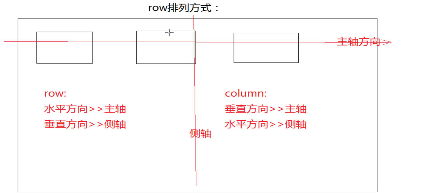
--------------------------设置列数column-count:3;-----------------------伸缩布局-------------- /*flex-flow:是flex-wrap和flex-direction的综合 flex-wrap:控制子元素是否换行显示,默认不换行 nowrap:不换行--则收缩 wrap:换行 wrap-reverse:翻转,原来是从上到下,翻转后就是从下到上来排列*/ /*flex-wrap: wrap;*/ /*flex-direction:设置子元素的排列方向:就是用来主轴方向,默认主轴方向是row(水平方向) row:水平排列方向,从左到右 row-reverse:水平排列方向,从右到左 column:垂直排列方向,从上到下 column-reverse:垂直排列方向,从下到上*/ /*flex-direction: column-reverse;*/
----------------伸缩------计算剩余空间------------/*flow-grow:可以来扩展子元素的宽度:设置当前元素应该占据剩余空间的比例值 比例值计算 :当前空间的flex-grow/所有兄弟元素的flex-grow的和 flex-grow的默认是0:说明子元素并不会去占据剩余的空间*/ flex-grow: 1;----------------伸缩------收缩------------/*设置父容器为盒子:会使每一个子元素自动变成伸缩项 当子元素的宽度和大于父容器宽度的时候,子元素会自动平均收缩*/ display: flex; /*设置子元素的主轴方向上的排列方式*/ justify-content: space-around;/*flex-shrink:定义收缩比例,通过设置的值来计算收缩空间 比例值计算 :当前空间的flex-shrink/所有兄弟元素的flex-shrink的和 默认值为1*/ flex-shrink: 2;
计算公式:把所有子元素的和 - 父元素/flex-shrink: 2 =分配的值------------------------------flex-------------------
.box{ 100%; height: 500px; background-color: #ccc; margin:0 auto; /*设置父容器的为伸缩盒子*/ display: flex; /*设置子元素在主轴方向上的排列方式*/ /*justify-content: flex-start;*/ } .left{ /*flex是用来设置当前伸缩子项占据剩余空间的比例值*/ flex: 1; height: 500px; background-color: red; } .right{ flex: 4; height: 500px; background-color: blue; }
--------------------------------------------- /*设置父容器为盒子:会使每一个子元素自动变成伸缩项 当子元素的宽度和大于父容器宽度的时候,子元素会自动平均收缩*/ display: flex; /*设置子元素的主轴方向上的排列方式*/ justify-content: space-around; /*align-items:设置子元素(伸缩项)在侧轴方向上的对齐方式 center:设置在侧轴方向上居中对齐 flex-start:设置在侧轴方向上顶对齐 flex:end:设置在侧轴方向上底对齐 stretch:拉伸:让子元素在侧轴方向上进行拉伸,填充满整个侧轴方向>> 默认值 baseline:文本基线*/------------------------------------------
2D: transition: 属性名 过渡时间 延迟时间 动画速度 (steps(2)) transform: translate(x,y) transform: rotate(30deg) transform: scale(2) transform: skew(20deg) 了解
3d: transform-style:preserve-3d;
--------------------------------------------- 1、动画的实现 animation-name: moveTest; animation-duration: 2s;scale放大 @keyframes moveTest{ 0%{} 20%{} 100%{} }
2、animation-fill-mode 有延迟 animation-fill-mode:forwards 0%动画不会立刻执行,结束时会停留在结束状态 animation-fill-mode:backwards 0%动画会立刻执行, 结束时不会停留在结束状态 animation-fill-mode:both 0%动画会立刻执行, 结束时会停留在结束状态
没有延迟 animation-fill-mode:forwards 0%动画会立刻执行,结束时会停留在结束状态 animation-fill-mode:backwards 0%动画会立刻执行, 结束时不会停留在结束状态 animation-fill-mode:both 0%动画会立刻执行, 结束时会停留在结束状态
list-style: none; /*1.设置的名称*/ animation-name: move; /*2.设置动画的耗时*/ animation-duration: 7s; /*3.市场无限循环*/ animation-iteration-count: infinite; /*4.设置时间函数*/ animation-timing-function: linear; 3、animation:动画名 动画时间 动画的延迟时间 动画的速度 次数(infinite) forwards
@keyframes 动画名{ 0%{}=====from{} 100%{}=====to{} }------------------------------------------- @keyframes Animation{ from{ transform: rotate3d(1,1,1,-30deg) rotateY(0); } to{ transform: rotate3d(1,1,1,-140deg) rotateY(360deg); } }---------------------------------------------------------- 4、弹性布局 开启弹性布局===============display:flex 父元素: display:flex justify-content:flex-start || flex-end || center || space-around(两边会有间距) || space-between(两边不会有间距) flex-wrap:wrap 显示换行 flex-direction:column 竖直方向变成主轴水平方向变成侧轴 默认是flex-direction:row 水平方向为主轴
align-items:flex-start || center || flex-end 子元素: flex-grow || flex-shrink (不需要记住) flex:1 这个是占父盒子剩余空间的 align-self: flex-start || center || flex-end
justify-content 左中右 align-items 上中下
使用animation+@keyframes 不需要你使用transition 因为@keyframes 有关键帧可以使动画连续 a:active{ 加上旋转 此时不会产生有连续的动画 ====需要加上属性transition }
-------------------------border-left-color: red; border-right-color: black; border-top-color: yellow;给边框加颜色----------------------------