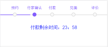
比较粗糙,效果如图
这个是写微信页面时写的,pc 也是一样的效果
代码如下:
<div class="time_line_box">
            <div class="time_line" style="100%;">
                <ol>
                    <li>
                        <a class="order_item" style="left:10%;">预约</a>
                    </li>
                    <li>
                        <a class="order_item selected" style="left:25%;">行家确认</a>
                    </li>
                    <li>
                        <a class="order_item" style="left:45%;">付款</a>
                    </li>
                    <li>
                        <a class="order_item" style="left:65%;">见面</a>
                    </li>
                    <li>
                        <a class="order_item" style="left:85%;">评价</a>
                    </li>
                </ol>
                <span class="filling_line" style="transform: scaleX(0.28);"></span>
            </div>
        </div>
        <div class="time_tip">
                付款剩余时间:23:58
        </div>
css:
.time_line_box{
        position: relative;
        height: 60px;
        overflow: hidden;
    }
    .time_line{
        position: absolute;
    z-index: 1;
    left: 0;
    top: 49px;
    height: 2px;
    background: #dfdfdf;
    -webkit-transition: -webkit-transform 0.4s;
    -moz-transition: -moz-transform 0.4s;
    transition: transform 0.4s;
    }
    .order_item{
        position: absolute;
    bottom: 0;
    z-index: 2;
    text-align: center;
    font-size: 13px;
    padding-bottom: 15px;
    color: #825FFB;
    }
    .order_item:after{
        content: '';
    position: absolute;
    left: 50%;
    right: auto;
    transform: translateX(-50%);
    bottom: -5px;
    height: 10px;
     10px;
    border-radius: 50%;
    border: 2px solid #dfdfdf;
    background-color: #f8f8f8;
    }
    .selected:after{
        background-color: #845FFD;
    border-color: #845FFD;
    }
    .filling_line{
        position: absolute;
    z-index: 1;
    left: 0;
    top: 0;
    height: 100%;
     100%;
    background-color: #845FFD;
    transform-origin: left center;
    transition-property: transform;
    transition-duration: 0.3s;
    transition-timing-function: initial;
    transition-delay: initial;
    }
    .time_tip{
         100%;
        height: 100px;
        line-height: 70px;
        text-align: center;
        color: #151BFD;
        border-bottom: 1px solid #ddd;
    }
ps:没有写jquey 代码,因为目前写的项目是vux 框架 ,基于vue 和 we_ui,写jquery比较麻烦
进度的渲染是根据.filling_line 的transform scaleX值 变化 ,所以如果写js 的话 根据不同
状态改变相应的值就可以,如果 用的话,相关样式自行修改