【实施Java控件美化使用】
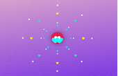
【点击开心有散开效果】
【源代码展示】
<!DOCTYPE html>
<html lang="en" >
<head>
<meta charset="UTF-8">
<title>CSS3 SVG 爱心按钮 单击散开</title>
<style>
* {
  margin: 0;
  padding: 0;
  box-sizing: border-box;
  position: relative;
}
svg.like {
  position: fixed;
  z-index: 10;
  top: calc(50vh - 160px);
  left: calc(50vw - 160px);
  border-radius: 100%;
  -webkit-transform: scale(0.3);
          transform: scale(0.3);
  -webkit-transform-origin: 50% 50%;
          transform-origin: 50% 50%;
  box-shadow: 0 0 250px rgba(0, 0, 0, 0.4);
  background: #212121;
  cursor: pointer;
}
svg.fly {
  position: fixed;
  top: calc(50vh - 55px);
  left: calc(50vw - 55px);
  fill: #18FFFF;
}
svg.h {
  position: fixed;
  z-index: 8;
  top: calc(50vh - 20px);
  left: calc(50vw - 20px);
  fill: #fbff00;
}
svg.h.h-5, svg.h.h-6, svg.h.h-7, svg.h.h-8 {
  fill: #00ffb8;
}
div.dot {
  width: 12px;
  height: 12px;
  background: white;
  position: fixed;
  z-index: 9;
  border-radius: 100%;
  top: calc(50vh - 6px);
  left: calc(50vw - 6px);
}
div.dot:before {
  content: "";
  width: 8px;
  height: 8px;
  border-radius: 100%;
  top: -20px;
  left: 2px;
  position: absolute;
  background: white;
}
div.dot:after {
  content: "";
  width: 11px;
  height: 11px;
  border-radius: 100%;
  top: -160px;
  left: 2px;
  position: absolute;
  background: white;
  display: none;
}
body {
  background-image: linear-gradient(-10deg, #7028e4 0%, #e5b2ca 100%);
  width: 100vw;
  height: 100vh;
}
body.liked svg.like {
  -webkit-animation: blink 1s forwards;
          animation: blink 1s forwards;
}
body.liked svg.fly.fly-1 {
  -webkit-animation: fly-1 1s 0.1s;
          animation: fly-1 1s 0.1s;
}
body.liked svg.fly.fly-2 {
  -webkit-animation: fly-2 1s 0.1s;
          animation: fly-2 1s 0.1s;
}
body.liked svg.h {
  transition: margin cubic-bezier(0.165, 0.84, 0.44, 1) 1.4s, fill 0.2s 1s, opacity 0.2s 1.2s, -webkit-transform 0.2s 1s;
  transition: margin cubic-bezier(0.165, 0.84, 0.44, 1) 1.4s, transform 0.2s 1s, fill 0.2s 1s, opacity 0.2s 1.2s;
  transition: margin cubic-bezier(0.165, 0.84, 0.44, 1) 1.4s, transform 0.2s 1s, fill 0.2s 1s, opacity 0.2s 1.2s, -webkit-transform 0.2s 1s;
  opacity: 0;
}
body.liked svg.h.h-5, body.liked svg.h.h-6, body.liked svg.h.h-7, body.liked svg.h.h-8 {
  -webkit-transform: scale(1.5);
          transform: scale(1.5);
  fill: white;
}
body.liked svg.h.h-1 {
  margin-top: -200px;
}
body.liked svg.h.h-2 {
  margin-left: 200px;
}
body.liked svg.h.h-3 {
  margin-top: 200px;
}
body.liked svg.h.h-4 {
  margin-left: -200px;
}
body.liked svg.h.h-5 {
  margin-top: -140px;
  margin-left: 140px;
}
body.liked svg.h.h-6 {
  margin-top: 140px;
  margin-left: 140px;
}
body.liked svg.h.h-7 {
  margin-top: -140px;
  margin-left: -140px;
}
body.liked svg.h.h-8 {
  margin-top: 140px;
  margin-left: -140px;
}
body.liked div.dot {
  opacity: 0;
  -webkit-transform: translateY(-100px);
          transform: translateY(-100px);
  background: #00e5ff;
  transition: opacity 0.5s 1s, background 0.1s 0.2s, -webkit-transform 1s;
  transition: transform 1s, opacity 0.5s 1s, background 0.1s 0.2s;
  transition: transform 1s, opacity 0.5s 1s, background 0.1s 0.2s, -webkit-transform 1s;
}
body.liked div.dot:after {
  display: block;
}
body.liked div.dot.dot-2 {
  -webkit-transform: rotate(45deg) translateY(-100px);
          transform: rotate(45deg) translateY(-100px);
}
body.liked div.dot.dot-3 {
  -webkit-transform: rotate(90deg) translateY(-100px);
          transform: rotate(90deg) translateY(-100px);
}
body.liked div.dot.dot-4 {
  -webkit-transform: rotate(135deg) translateY(-100px);
          transform: rotate(135deg) translateY(-100px);
}
body.liked div.dot.dot-5 {
  -webkit-transform: rotate(180deg) translateY(-100px);
          transform: rotate(180deg) translateY(-100px);
}
body.liked div.dot.dot-6 {
  -webkit-transform: rotate(225deg) translateY(-100px);
          transform: rotate(225deg) translateY(-100px);
}
body.liked div.dot.dot-7 {
  -webkit-transform: rotate(270deg) translateY(-100px);
          transform: rotate(270deg) translateY(-100px);
}
body.liked div.dot.dot-8 {
  -webkit-transform: rotate(305deg) translateY(-100px);
          transform: rotate(305deg) translateY(-100px);
}
@-webkit-keyframes blink {
  10% {
    -webkit-transform: scale(0.42);
            transform: scale(0.42);
    background: #8815b7;
  }
  100% {
    background: #e01f4f;
  }
}
@keyframes blink {
  10% {
    -webkit-transform: scale(0.42);
            transform: scale(0.42);
    background: #8815b7;
  }
  100% {
    background: #e01f4f;
  }
}
@-webkit-keyframes fly-1 {
  25% {
    margin: -100px 0 0 100px;
  }
  75% {
    margin: 100px 0 0 -100px;
    z-index: 5;
  }
  100% {
    z-index: 11;
  }
}
@keyframes fly-1 {
  25% {
    margin: -100px 0 0 100px;
  }
  75% {
    margin: 100px 0 0 -100px;
    z-index: 5;
  }
  100% {
    z-index: 11;
  }
}
@-webkit-keyframes fly-2 {
  25% {
    margin: -100px 0 0 -100px;
  }
  75% {
    margin: 100px 0 0 100px;
    z-index: 5;
  }
  100% {
    z-index: 11;
  }
}
@keyframes fly-2 {
  25% {
    margin: -100px 0 0 -100px;
  }
  75% {
    margin: 100px 0 0 100px;
    z-index: 5;
  }
  100% {
    z-index: 11;
  }
}
</style>
</head>
<body>
<svg height="320" width="320" class="like" onclick="document.body.classList.toggle('liked')">
    <path class="path" d="M 160 145 c 15 -90 170 -20 0 90 m 0 -90 c -15 -90 -170 -20 0 90" fill="white"> <!-- 80 by 70 -->
</svg>
<div class="dot dot-1"></div>
<div class="dot dot-2"></div>
<div class="dot dot-3"></div>
<div class="dot dot-4"></div>
<div class="dot dot-5"></div>
<div class="dot dot-6"></div>
<div class="dot dot-7"></div>
<div class="dot dot-8"></div>
<svg height="40" width="40" viewBox="0 0 320 320" class="h h-1"><path class="path" d="M 160 145 c 15 -90 170 -20 0 90 m 0 -90 c -15 -90 -170 -20 0 90"></svg>
<svg height="40" width="40" viewBox="0 0 320 320" class="h h-2"><path class="path" d="M 160 145 c 15 -90 170 -20 0 90 m 0 -90 c -15 -90 -170 -20 0 90"></svg>
<svg height="40" width="40" viewBox="0 0 320 320" class="h h-3"><path class="path" d="M 160 145 c 15 -90 170 -20 0 90 m 0 -90 c -15 -90 -170 -20 0 90"></svg>
<svg height="40" width="40" viewBox="0 0 320 320" class="h h-4"><path class="path" d="M 160 145 c 15 -90 170 -20 0 90 m 0 -90 c -15 -90 -170 -20 0 90"></svg>
<svg height="40" width="40" viewBox="0 0 320 320" class="h h-5"><path class="path" d="M 160 145 c 15 -90 170 -20 0 90 m 0 -90 c -15 -90 -170 -20 0 90"></svg>
<svg height="40" width="40" viewBox="0 0 320 320" class="h h-6"><path class="path" d="M 160 145 c 15 -90 170 -20 0 90 m 0 -90 c -15 -90 -170 -20 0 90"></svg>
<svg height="40" width="40" viewBox="0 0 320 320" class="h h-7"><path class="path" d="M 160 145 c 15 -90 170 -20 0 90 m 0 -90 c -15 -90 -170 -20 0 90"></svg>
<svg height="40" width="40" viewBox="0 0 320 320" class="h h-8"><path class="path" d="M 160 145 c 15 -90 170 -20 0 90 m 0 -90 c -15 -90 -170 -20 0 90"></svg>
<svg height="110" width="110" viewBox="0 0 320 320" class="fly fly-1"><path class="path" d="M 160 145 c 15 -90 170 -20 0 90 m 0 -90 c -15 -90 -170 -20 0 90"></svg>
<svg height="110" width="110" viewBox="0 0 320 320" class="fly fly-2"><path class="path" d="M 160 145 c 15 -90 170 -20 0 90 m 0 -90 c -15 -90 -170 -20 0 90"></svg>
<script>
document.body.onkeypress = function(){document.body.classList.toggle('liked')}
</script>
</body>
</html>
----------------------------------------------------------------------------------------------------------------------------感谢观看!期待您的下次光临!