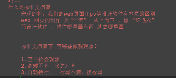
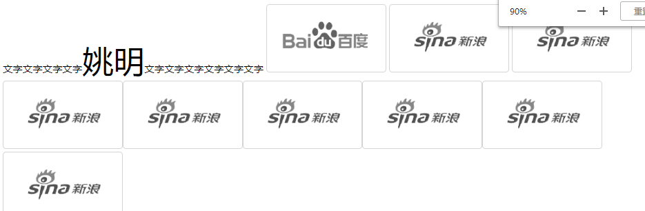
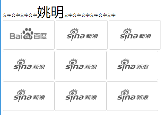
1、标准文档流
<!DOCTYPE html>
<html lang="en">
<head>
    <meta charset="UTF-8">
    <title></title>
    <style type="text/css">
        span{
            font-size: 50px;
        }
    </style>
</head>
<body>

     <div>
         文字文字文字文字<span>姚明</span>文字文字文字文字文字文字
         <img src="./images/企业1.png" alt="">
         <img src="./images/企业2.png" alt="">
        <img src="./images/企业2.png" alt="">
        <img src="./images/企业2.png" alt=""><img src="./images/企业2.png" alt=""><img src="./images/企业2.png" alt=""><img src="./images/企业2.png" alt=""><img src="./images/企业2.png" alt=""><img src="./images/企业2.png" alt="">
     </div>


</body>
</html>
2、display:行内元素与块级元素的转换

<!DOCTYPE html>
<html lang="cn">
<head>
    <meta charset="UTF-8">
    <title>display</title>
    <style type="text/css">
        div{
            width: 100px;
            height: 100px;
            background-color: red;

            /* 控制元素隐藏 不占位置 */
            /*display: none;*/

            /*控制元素隐藏 占位置 影响后面盒子的布局*/
            /*visibility: hidden;*/

            /*转为 行内块元素*/
            /*display: inline-block;*/

            /*将 块级元素转换为 行内元素 不能设置宽高*/
            display: inline;
        }
        a{
            /*display: block;*/
            /*display: inline-block;*/
            width: 300px;
            height: 300px;
            background-color: yellow;
        }

        img{
            /* 行内块元素 一般转化块级元素 */
            /*display: block;*/
            display: inline;  /*转为行内元素 依然可设置宽高 没必要转换  */
            width: 100px;
            height: 100px;

        }
    </style>
</head>
<body>
    <div>123</div>
    <div>987</div>
    <a href="#">百度一下</a>
    <img src="./images/homesmall1.png" alt="python">
</body>
</html>
3、浮动
<!DOCTYPE html>
<html lang="cn">
<head>
    <meta charset="UTF-8">
    <title>浮动</title>
    <style type="text/css">
        .wrap div{
            width: 200px;
            height: 200px;
            background-color: red;
            border: 1px solid black;

            /*
            文档流:可见元素在文档中的显示位置;
            浮动产生的效果:
                浮动可以使元素按指定位置排列,直到遇到父元素的边界或者另一个元素的边界停止
            */

            /* left 左浮动 左侧为起始,从左往右依次排列*/
            float: left;

            /* right 右浮动 右侧为起始,从右往左依次排列  */
            /*float: right;*/


            /*float: none;*/

        }
    </style>
</head>
<body>
    <div class="wrap">
        <div>1</div>
        <div>2</div>
        <div>3</div>
        <div>4</div>
        <div>5</div>
        <div>6</div>
        <div>7</div>
        <div>8</div>
        <div>9</div>
    </div>
</body>
</html>
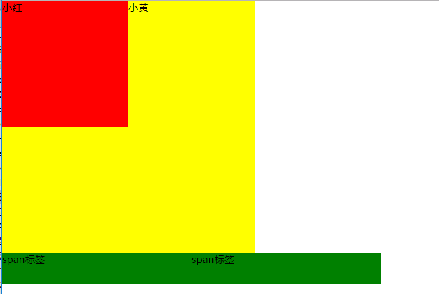
(1)脱离了标准文档流
<!DOCTYPE html>
<html lang="en">
<head>
    <meta charset="UTF-8">
    <title>浮动</title>
    <style type="text/css">
        *{
            padding: 0;
            margin: 0;
        }

        .box1{
            width: 200px;
            height: 200px;
            background-color: red;
            float: left;

        }
        .box2{
            width: 400px;
            height: 400px;
            background-color: yellow;

        }
        span{
            background-color: green;
            float: left;
            width: 300px;
            height: 50px;
        }
    </style>
</head>
<body>

    <!--
        脱标: 脱离了标准文档流

        小红盒子浮动了,脱离了标准流,此时小黄这个盒子就是标准文档流中的第一个盒子。所以就渲染到了左上方。  浮动元素 “飘起来了”


     -->

     <div class="box1">小红</div>
     <div class="box2">小黄</div>

    <!--
        span标签不需要转成块级元素,也能够设置宽高。


        所有的标签一旦设置浮动,能够并排,都不区分行内、块状元素,设置宽高
     -->
     <span>span标签</span>
     <span>span标签</span>


</body>
</html>
(2)互相贴靠
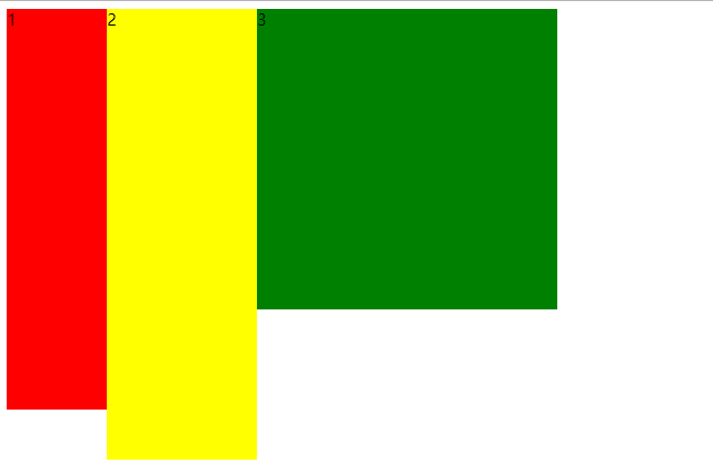
<!DOCTYPE html>
<html lang="en">
<head>
    <meta charset="UTF-8">
    <title></title>
    <style type="text/css">
        span{
            background-color: red;
            float: left;
        }
        .box1{
            width: 100px;
            height: 400px;
            float: left;
            background-color: red;
        }
        .box2{
            width: 150px;

            height: 450px;
            float: left;
            background-color: yellow;
        }
        .box3{
            width: 300px;
            height: 300px;
            float: left;
            background-color: green;
        }
    </style>
</head>
<body>
    <!-- <span>文字</span>
        <span>文字</span> -->

    <!--
        如果父元素有足够的空间,那么3哥紧靠着2哥,2哥紧靠着1哥,1哥靠着边。
        如果没有足够的空格,那么就会靠着1哥,如果没有足够的空间靠着1哥,自己往边靠
     -->

    <div class="box1">1</div>
    <div class="box2">2</div>
    <div class="box3">3</div>


</body>
</html>
(3)字围效果
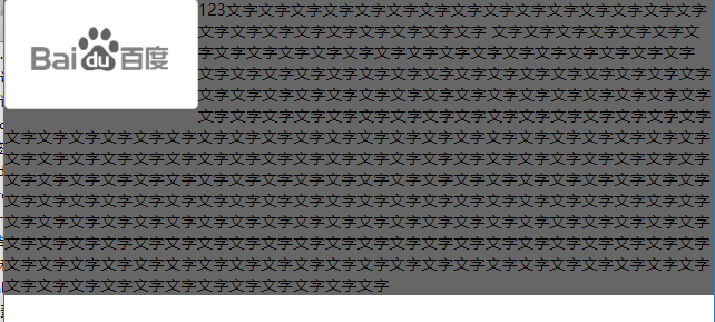
<!DOCTYPE html>
<html lang="en">
<head>
    <meta charset="UTF-8">
    <title></title>
    <style type="text/css">
        *{
            padding: 0;
            margin: 0;
        }
        div{
            float: left;
        }
        p{
            background-color: #666;
        }
    </style>
</head>
<body>

    <!-- 所谓字围效果:
        当div浮动,p不浮动
        div挡住了p,div的层级提高,但是p中的文字不会被遮盖,此时就形成了字围效果

        关于浮动我们强调一点,浮动这个元素,我们初期一定要遵循一个原则

        永远不是一个盒子单独浮动,要浮动就要一起浮动。
     -->
    <div>
        <img src="./images/企业1.png" alt="">
    </div>
    <p>
        123文字文字文字文字文字文字文字文字文字文字文字文字文字文字文字文字文字文字文字文字文字文字文字文字
        文字文字文字文字文字文字文字文字文字文字文字文字文字文字文字文字文字文字文字文字文字文字
        文字文字文字文字文字文字文字文字文字文字文字文字文字文字文字文字文字文字文字文字文字文字文字文字文字文字文字文字文字文字文字文字文字文字文字文字文字文字文字文字文字文字文字文字文字文字文字文字文字文字文字文字文字文字文字文字文字文字文字文字文字文字文字文字文字文字文字文字文字文字文字文字文字文字文字文字文字文字文字文字文字文字文字文字文字文字文字文字文字文字文字文字文字文字文字文字文字文字文字文字文字文字文字文字文字文字文字文字文字文字文字文字文字文字文字文字文字文字文字文字文字文字文字文字文字文字文字文字文字文字文字文字文字文字文字文字文字文字文字文字文字文字文字文字文字文字文字文字文字文字文字文字文字文字文字文字文字文字文字文字文字文字文字文字文字文字文字文字文字文字文字文字文字文字文字文字文字文字文字文字文字文字文字文字文字文字文字文字文字文字文字文字文字文字文字文字文字文字文字文字文字文字文字文字文字文字文字文字文字文字文字文字文字文字
    </p>

</body>
</html>
(4)收缩
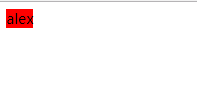
<!DOCTYPE html>
<html lang="en">
<head>
    <meta charset="UTF-8">
    <title>Document</title>
    <style type="text/css">
        div{
            float: left;
            background-color: red;
        }
    </style>
</head>
<body>

    <!-- 收缩:一个浮动元素。如果没有设置width,
    那么就自动收缩为文字的宽度(这点跟行内元素很像)

        如果想制作整个网页,就是通过浮动来实现并排
     -->

    <div>
        alex
    </div>

</body>
</html>
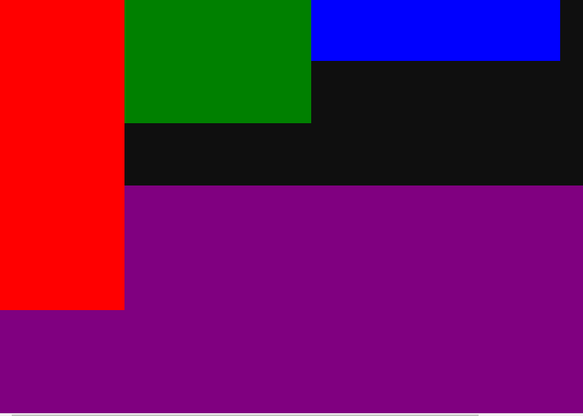
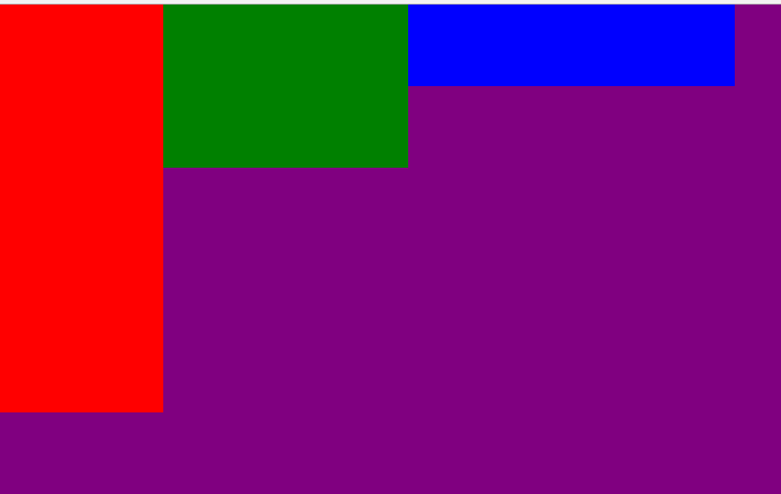
4、浮动产生的问题

<!DOCTYPE html>
<html lang="en">
<head>
    <meta charset="UTF-8">
    <title></title>
    <style type="text/css">

        *{
            padding: 0;
            margin: 0;

        }
        .father{
            width: 1126px;
            /*子元素浮动 父盒子一般不设置高度*/
              /* 通常页面布局时,父盒子的高度不需要设置,通过子盒子 自动填充父盒子;*/

            /*出现这种问题,我们要清除浮动带来影响*/
            /*height: 300px;*/
            background-color: #0f0f0f;

        }
        .box1{
            width: 200px;

            height: 500px;
            float: left;
            background-color: red;
        }
        .box2{
            width: 300px;
            height: 200px;
            float: left;
            background-color: green;
        }
        .box3{
            width: 400px;
            float: left;
            height: 100px;
            background-color: blue;
        }
        .father2{
            width: 1126px;
            height: 600px;
            background-color: purple;
        }
    </style>
</head>
<body>

    <div class="father">
        <div class="box1"></div>
        <div class="box2"></div>
        <div class="box3"></div>
    </div>

    <div class="father2"></div>


</body>
</html>
5、清除浮动
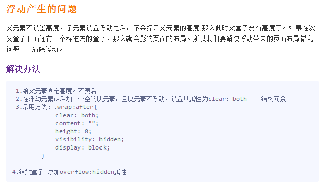
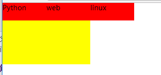
(1)父元素设定高度


<!DOCTYPE html>
<html lang="en">
<head>
    <meta charset="UTF-8">
    <title></title>
    <style type="text/css">

        *{
            padding: 0;
            margin: 0;
        }
        div{
            width: 400px;

            /*给父盒子设置高度,这种方式不灵活。如果哪天公司产品突然要改,
            要求父盒子高度变大,而且不仅一个地方哦,那么我们不可能去找源码去手动修改*/

            /*固定导航栏*/
            /*height: 40px;*/
        }
        ul{
            list-style: none;
            height: 40px;
        }

        div ul li {
            float: left;
            width: 100px;
            height: 40px;
            background-color: red;
        }
        .box{
            width: 200px;
            height: 100px;
            background-color: yellow;
        }
    </style>
</head>
<body>

    <div>
        <ul>
            <li>Python</li>
            <li>web</li>
            <li>linux</li>

        </ul>
    </div>
    <div class="box">

    </div>
</body>
</html>
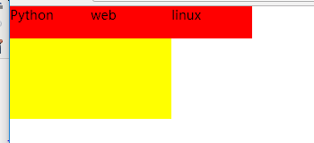
(2)内墙法
<!DOCTYPE html>
<html lang="en">
<head>
    <meta charset="UTF-8">
    <title></title>
    <style type="text/css">

        *{
            padding: 0;
            margin: 0;
        }
        ul{
            list-style: none;

        }


        div{
            width: 400px;

        }


        div ul li {
            float: left;
            width: 100px;
            height: 40px;
            background-color: red;
        }
        .box{
            width: 200px;
            height: 100px;
            background-color: yellow;
        }
        .clear{
            clear: both;
        }
    </style>
</head>
<body>

    <div>
        <ul>
            <li>Python</li>
            <li>web</li>
            <li>linux</li>
            <!-- 给浮动元素最后面加一个空的div 并且该元素不浮动 ,然后设置clear:both,就会撑开盒子,清除别人对我的浮动影响-->
            <!-- 内墙法 -->
            <!-- 无缘无故加了div元素  结构冗余 -->

        </ul>
        <div class="clear"></div>
    </div>
    <div class="box">

    </div>
</body>
</html>

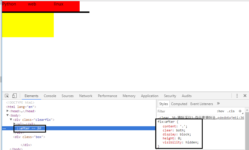
(3)伪元素after法
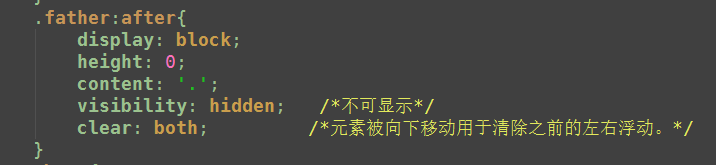
<!DOCTYPE html>
<html lang="en">
<head>
    <meta charset="UTF-8">
    <title>伪元素清除法(常用)</title>
    <style type="text/css">

        *{
            padding: 0;
            margin: 0;
        }
        ul{
            list-style: none;

        }


        div{
            width: 400px;
        }


        div ul li {
            float: left;
            width: 100px;
            height: 40px;
            background-color: red;
        }
        .box{
            width: 200px;
            height: 100px;
            background-color: yellow;
        }
        /*伪元素选择器*/
        .clearfix:after{
            /*必须要写这三句话*/
            content: '.';
            clear: both;
            display: block;
            height: 0;
            visibility: hidden;

            /*
            新浪首页清除浮动伪元素方法
             content: ".";
                display: block;
                height: 0;
                clear: both;
                visibility: hidden

            */
        }

    </style>
</head>
<body>

    <div class="clearfix">
        <ul>
            <li>Python</li>
            <li>web</li>
            <li>linux</li>

        </ul>

    </div>
    <div class="box">

    </div>
</body>
</html>
(4)overflow:hidden 推荐
<!DOCTYPE html>
<html lang="en">
<head>
    <meta charset="UTF-8">
    <title>伪元素清除法(常用)</title>
    <style type="text/css">

        *{
            padding: 0;
            margin: 0;
        }
        ul{
            list-style: none;

        }


        .box{
            width: 400px;
            /*父元素不添加高度*/
            overflow: hidden;
        }


        .box ul li {
            float: left;
            width: 100px;
            height: 40px;
            background-color: red;
        }
        .box2{
            width: 200px;
            height: 100px;
            background-color: yellow;
        }


    </style>
</head>
<body>

    <div class="box">
        <ul>
            <li>Python</li>
            <li>web</li>
            <li>linux</li>

        </ul>

    </div>
    <div class="box2">

    </div>
</body>
</html>
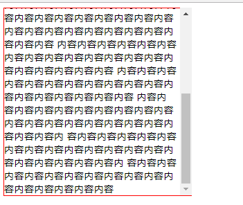
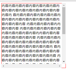
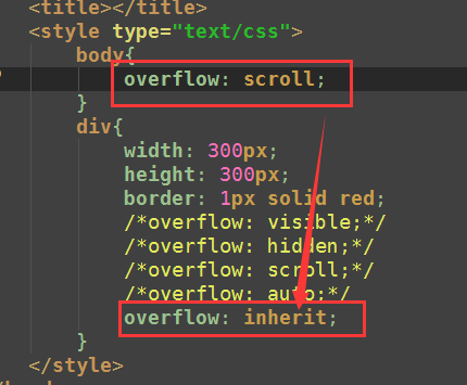
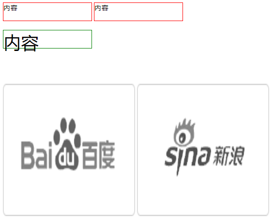
6.overflow属性
<!DOCTYPE html>
<html lang="en">
<head>
    <meta charset="UTF-8">
    <title></title>
    <style type="text/css">
        body{
            overflow: scroll;
        }
        div{
            width: 300px;
            height: 300px;
            border: 1px solid red;
            /*overflow: visible;*/
            /*overflow: hidden;*/
            /*overflow: scroll;*/
            /*overflow: auto;*/
            overflow: inherit;
        }
    </style>
</head>
<body>
    <div>
        内容内容内容内容内容内容内容内容内容内容内容内容内容内容内容内容内容内容内
        容内容内容内容内容内容内容内容内容内内容内容内容内容内容内容内容内容内容内容
        内容内容内容内容内内容内容内容
        内容内容内容内容内容内容内容内容内容内容内容内内容内容内容内容内容内容内容内容
        内容内容内容内容内容内容内容内容内容内容内容内容内容内容内容内容内容内容内容内
        容内容内容内容内容内容内容内容内容内容内容内容内容内容内容内容内容内容
        内容内容内容内容内容内容内容内容内容内容内容内容内容内容内容内容内容内容内容内容
        内容内容内容内容内容内容内容内容内容内容内容内容内容内容内容内容内容内容内容内容
        内容内容内容内容内容内容内容内容内容内容内容内容内容内容内容内容内容内容    内容内
        容内容内容内容内容内容内容内容内容内容内容内容内容内容内容内容内容内容内容内容内
        容内容内容内容内容内容内容内容内容内容内容内容内容内容内容内容内容内容内容内容内
        容内容内容内容内容内容内容内容内容内容内容内容内容内容内容内容内容
    </div>

</body>
</html>