前言
本篇文章将会持续更新,我会将我遇见的一些问题,和我看到的实用的CSS技巧记录下来,本篇文章会以图文混排的方式写下去。具体什么时候写完我也不清楚,反正我的目标是写100个。
本案例都是经本人实测,并附加全部案例下载地址。http://pan.baidu.com/s/1geUcAcF
1、背景图片清晰度不够,明明原图很清楚,但是在浏览器看不清楚。
解决方案
#login-main {
  width: 100%;
  height: 100%;
  background: url("../img/login-ba2.jpg") no-repeat center;
  background-size: 100% 100%;  //加上这句话就行啦。
}
2、img标签怎么居中
讲解:设置父元素为相对定位,子元素绝对定位。然后设置子元素的 top:50% right:50%, 在减去子元素自身的 margin-top,和margin-left。
<div id="tow">
    <img src="img/img-100px.jpg" alt="">
</div>
#tow {
  width: 200px;
  height: 200px;
  background-color: blueviolet;
  position: relative;
  img {
    width: 100px;
    height: 100px;
    position: absolute;
    top: 50%;
    left: 50%;
    margin: -50px 0 0 -50px;
  }
}
最终效果

3、背景图怎么实现当屏幕缩小时,自动从左右两侧裁剪。
在写pc端的时候,遇见一些大的banner图一般是1920px,但是又不能写成自适应影响效果,当遇见小屏幕时,右侧会显示不全,我对此问题的解决方案是从左右两侧裁切,让图片始终以中心向两侧展开,能展示多少是多少。溢出部分隐藏。
<div id="three">
    <div class="bg-photo "></div>
</div>
#three {
    position: relative;
    top: 0;
    left: 0;
    width: 100%;
    height: 300px;
    overflow: hidden;

    .bg-photo {
        position: absolute;
        top: 0;
        left: 0;
        width: 100%;
        height: 100%;
        overflow: hidden;
        -webkit-background-size: cover !important;
        -moz-background-size: cover !important;
        -o-background-size: cover !important;
        background-size: cover !important;
        background: url('img/index-banner1.jpg') no-repeat center center;
    }
}
另外我对sweiper的滑动banner也做了类似的改进。也可以实现上述效果并保持sweiper的滑动。
注:此方法需要引入 sweiper 不懂的可以去sweiper官网下载
<div class="swiper-container">
    <div class="swiper-wrapper">
        <div class="swiper-slide  swiper-slide1">
            <div class=" swiper-slide1-child img1"></div>
        </div>
        <div class="swiper-slide swiper-slide1">
            <div class="swiper-slide1-child img2"></div>
        </div>
    </div>
    <div class="swiper-pagination"></div>
</div>
//css代码
.swiper-slide1 {
  position: relative;
  top: 0;
  left: 0;
  width: 100%;
  height: 610px;
  overflow: hidden;
  .swiper-slide1-child {
    position: absolute;
    top: 0;
    left: 0;
    width: 100%;
    height: 100%;
    overflow: hidden;
    -webkit-background-size: cover !important;
    -moz-background-size: cover !important;
    -o-background-size: cover !important;
    background-size: cover !important;
    background: url('../img/index-banner1.jpg') no-repeat center center;
  }
  .img1 {
    background: url('../img/index-banner1.jpg') no-repeat center center;
  }
  .img2 {
    background: url('../img/index-banner2.jpg') no-repeat center center;

  }
}
4、placeholder更改默认颜色
<div id="four">
    <input type="text " placeholder="更改颜色">
</div>
#four {
  input::-webkit-input-placeholder {
    color: blue;
  }
  input:-moz-placeholder {
    color: blue;
  }
  input::-moz-placeholder {
    color: blue;
  }
}
最终效果:
5、让图片垂直居中显示
注:但是此方法#five margin将会无效。 除非给#five增加浮动。
<div id="Five">
    <img src="img/login-icon2.png" alt="">
</div>
#Five {
  display: table-cell;
  cursor: pointer;
  margin: 0 30px;
  vertical-align: middle;
  text-align: center;
  width: 40px;
  height: 40px;
  border-radius: 50%;
  border: 1px solid #29639a;
  img {
    margin-top: 5px;
    line-height: 40px;
  }
}
6、巧用1px边框,并解决retina屏幕DPI问题
在一般的项目中有很多元素需要增加1px边框,要是给每一个元素都写一次样式很麻烦,尤其是移动端的retina屏幕DPI的处理会更加麻烦,本案例讲讲解快速增加边框,并且解决retina屏幕。
很简单,只需要在需要边框的元素上增加class名称'border-1px’即可
<div id="Six" class="border-1px"></div>
#Six {
  width: 500px;
  height: 40px;
  background-color: #1a2f5c;
  .border-1px(#f00)

}
//Six 的一像素边框
.border-1px(@color) {
  position: relative;
  &:after {
    display: block;
    position: absolute;
    left: 0;
    bottom: 0;
    width: 100%;
    border-top: 1px solid @color;
    content: ' ';
  }
}
//DPI达到1.5的机型边框缩放0.7 例如 :谷歌Nexus S、三星Galaxy S II等等
@media (-webkit-min-device-pixel-ratio: 1.5),(min-device-pixel-ratio: 1.5) {
   .border-1px {
    &:after {
      -webkit-transform: scaleY(0.7);
      transform: scaleY(0.7);
    }
  }
}
//DPI达到2.0的机型边框缩放0.7 例如 :苹果iPhone 4 、三星Galaxy S三世 等等
@media (-webkit-min-device-pixel-ratio: 2),(min-device-pixel-ratio: 2) {
   .border-1px {
    &:after {
      -webkit-transform: scaleY(0.5);
      transform: scaleY(0.5);
    }
  }
}
7、图片与文字对不齐
如果出现图片与文字对不齐的现象,使用margin-top是不是很low呢,有一种更好用的办法,就是调试图片的基线。

使用vertical-align:middle调整基线,就可以实现图片在父元素中垂直居中,但是有时候我们的结果不满意,vertical-align也接收数字单位的值、top、bottom等值。本案例我就设置vertical-align:-6px; 0位置为top值。
<div id="Seven">
    <img src="img/like-icon.png" alt="">
    <span>猜你喜欢</span>
</div>
#Seven {
  width: 500px;
  height: 44px;
  background-color: #1a2f5c;
  text-align: center;
  margin-top: 4px;
  img {
    width: 28px;
    vertical-align: -6px;
    line-height: 44px;
    max-width: 100%;
  }
  span {
    color: #ffffff;
    display: inline-block;
    line-height: 44px;
  }
}
最终效果-是不是挺好。

8、1px边框全方位版本(上下左右都有)并且解决DPI问题
<div id="Eight"></div>
#Eight {
  position: relative;
  width: 400px;
  height: 20px;
  padding: 8px 10px;
  margin:0  12px 30px;
  background-color: #ffffff;
  border-radius: 4px;
  &:after {
     100%;
    height: 100%;
    position: absolute;
    top: 0;
    left: 0;
    content: '';
    border: 1px solid #cacaca;
    border-radius: 4px;
  }
  @media (-webkit-min-device-pixel-ratio: 2),(min-device-pixel-ratio: 2) {
    &:after {
       200%;
      height: 200%;
      -webkit-transform: scale(.5);
      transform: scale(.5);
      pointer-events: none;
      -webkit-transform-origin: 0 0;
      transform-origin: 0 0;
    }
  }
最终效果

9、使用利用vertical-align:middle,实现元素水平垂直居中。
实现原理主要是是让daughter的基线与son的基线对其并且使用vertical-align:middle进行居中,而且son的高度还是100%,所以就实现了垂直居中,再使用text-align: center;就实现了水平剧中。
<div id="Nine">
    <div class="son">112312323</div>
    <div class="daughter"></div>
</div>
#Nine {
  width: 300px;
  height: 300px;
  left: 0;
  top: 0;
  text-align: center;
  font-size: 0; /*设置font-size为了消除代码换行所造成的空隙*/
  background-color: #1a2f5c;
  .daughter {
    width: 30%;
    height: 30%;
    background-color: white;
    vertical-align: middle;
    display: inline-block;
  }
  .son {
    vertical-align: middle;
    display: inline-block;
    height: 100%;
  }
}
最终效果

10、使用transform实现元素的垂直水平居中。
这个居中的实现原理是子元素对父元素做定位,定位到父元素百分之50的top,和百分之50的left,然后在减去子元素自身left和top的50%。就形成居中了。
<div id="Ten">
    <div>
    </div>
</div>
#Ten {
  position: relative;
  width: 300px;
  height: 300px;
  background-color: #1a2f5c;
  div {
    width: 30%;
    height: 30%;
    position: absolute;
    left: 50%;
    top: 50%;
    -webkit-transform: translate(-50%, -50%);
    transform: translate(-50%, -50%);
    background-color: white;
  }
}
最终效果

11、使用弹性盒模型实现垂直居中方法,最简单粗暴的方法,但是注意浏览器兼容性问题。
如果有同学不知道弹性布局的,我推荐百度搜“阮一峰弹性布局”我记得有两篇文章,一篇像色子似的,另外一个是语法的,建议先看语法再看,色子那篇。
<div id="Eleven">
    <div>
    </div>
</div
#Eleven {
  width: 300px;
  height: 300px;
  background-color: #1a2f5c;
  display: flex;
  justify-content: center;
  align-items: center;

  div {
    width: 30%;
    height: 30%;
    background-color: white;
  }

}

12、使用表格布局实现元素水平居中
实用表格方式实现这个方式有一个弊端就是如果被居中的子元素使用百分比单文那么久必须要给td,tr设置宽高。相对将稍微繁琐了一点点,
<table id="Twelve">
    <tr>
        <td>
            <div class="daughter">
            </div>
        </td>
    </tr>
</table>
#Twelve {
  width: 300px;
  height: 300px;
  text-align: center;
  background-color: #1a2f5c;
  tr, td {
    width: 100%;
    height: 100%;
  }
  .daughter {
    display: inline-block;
    width: 30%;
    height: 30%;
    background-color: white;
  }
}
最终效果

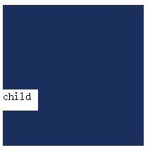
13、解决第一个子元素margin-top越界问题(会把父元素顶下来)
在一些项目中会遇见个给第一个子元素增加margin-top的时候会吧父元素顶下来。很多同学一般都会把margin改成padding,但是那样做很繁琐,现在我给大家带来几种解决方案。
1、给父元素加border——有副作用: 一般父元素Div用来做布局使用,添加border会使用内容的height和width变大
2、给父元素加padding-top:1px——有副作用
3、给父元素加overflow:hidden——有副作用:一旦子元素内容溢出,将会无法显示溢出的内容
4、为父元素添加内容生成:这样的话当前子元素就不在是父元素的第一个子元素这样就可以了,该方法无任何副作用,
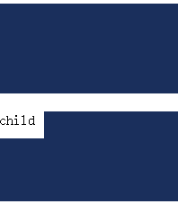
本案例将会使用第四种方法。
<div id="Thirteen">
    <div class="father"></div>
    <div class="father">
        <div class="child">child</div>
    </div>
</div>
#Thirteen {
  .father {
    width: 200px;
    height: 100px;
    background-color: #1a2f5c;
    &:before {
      content: ' ';
      display: table;
    }
    .child {
      width: 50px;
      height: 30px;
      margin-top: 20px;
      background-color: white;
    }
  }
}
最终效果