一:渐变
- 线性渐变(Linear Gradients)- 向下/向上/向左/向右/对角方向 background: linear-gradient(direction, color-stop1, color-stop2, ...);
- 径向渐变(Radial Gradients)- 由它们的中心定义 background: radial-gradient(center, shape size, start-color, ..., last-color);
- 重复的径向渐变 background:repeating-radial-gradient(center, shape size, start-color, ..., last-color);
补充:
shape 参数定义了形状。它可以是值 circle 或 ellipse。其中,circle 表示圆形,ellipse 表示椭圆形。默认值是 ellipse。
size 参数定义了渐变的大小。它可以是以下四个值:
- closest-side
- farthest-side
- closest-corner
- farthest-corner
#grad {
  background: -webkit-radial-gradient(circle, red, yellow, green); /* Safari 5.1 - 6.0 */
  background: -o-radial-gradient(circle, red, yellow, green); /* Opera 11.6 - 12.0 */
  background: -moz-radial-gradient(circle, red, yellow, green); /* Firefox 3.6 - 15 */
  background: radial-gradient(circle, red, yellow, green); /* 标准的语法 */
}
二:currentcolor(css第一变量)
比图想要hr线的颜色和字体颜色保持一致,可以这样写:
hr{
        height:.5em;
        background: currentcolor;
   }
类似这些border-color outline-color text-shadow box-shadow都可以使用
三:border-radius(/”前面的值设置其水平半径,“/”后面值设置其垂直半径。)
border-radius:30px / 20px 40px;
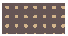
四:波点
<head>
        <meta charset="UTF-8">
        <title></title>
        <style>
            .one {
                 200px;
                height: 100px;
                background:#655;
                background-image: radial-gradient(tan 30%,transparent 0),radial-gradient(tan 30%,transparent 0);  //如果这里只有一项,没有background-position,效果图第二个图
                background-size: 30px 30px;
                background-position:0 0, 15px 15px;
            }
        </style>
    </head>

    <body>
        <div class="box">
            <div class="one"></div>
        </div>
    </body>
效果图:

五:色轮
.two{
        margin-top: 100px;
        200px;
        height: 200px;
        border-radius: 100px;
        background: conic-gradient(red,yellow,lime,aqua,blue,fuchsia,red);
}
效果图:

六:文字垂直居中
加载父元素中,
display: flex;
flex-direction: column;
justify-content: center;