
1.html 部分
<div class="spinner">
  <div class="rect1"></div>
  <div class="rect2"></div>
  <div class="rect3"></div>
  <div class="rect4"></div>
  <div class="rect5"></div>
</div>
2.css 部分
.spinner {
  margin: 100px auto;
   50px;
  height: 60px;
  text-align: center;
  font-size: 10px;
}

.spinner > div {
  background-color: #67CF22;
  height: 100%;
   6px;
  display: inline-block;

  -webkit-animation: stretchdelay 1.2s infinite ease-in-out;
  animation: stretchdelay 1.2s infinite ease-in-out;
}

.spinner .rect2 {
  -webkit-animation-delay: -1.1s;
  animation-delay: -1.1s;
}

.spinner .rect3 {
  -webkit-animation-delay: -1.0s;
  animation-delay: -1.0s;
}

.spinner .rect4 {
  -webkit-animation-delay: -0.9s;
  animation-delay: -0.9s;
}

.spinner .rect5 {
  -webkit-animation-delay: -0.8s;
  animation-delay: -0.8s;
}

@-webkit-keyframes stretchdelay {
  0%, 40%, 100% { -webkit-transform: scaleY(0.4) }
  20% { -webkit-transform: scaleY(1.0) }
}

@keyframes stretchdelay {
  0%, 40%, 100% {
    transform: scaleY(0.4);
    -webkit-transform: scaleY(0.4);
  }  20% {
    transform: scaleY(1.0);
    -webkit-transform: scaleY(1.0);
  }
}

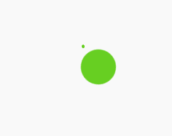
1.html 部分
<div class="spinner"></div>
2.css 部分
.spinner {
   60px;
  height: 60px;
  background-color: #67CF22;

  margin: 100px auto;
  -webkit-animation: rotateplane 1.2s infinite ease-in-out;
  animation: rotateplane 1.2s infinite ease-in-out;
}

@-webkit-keyframes rotateplane {
  0% { -webkit-transform: perspective(120px) }
  50% { -webkit-transform: perspective(120px) rotateY(180deg) }
  100% { -webkit-transform: perspective(120px) rotateY(180deg)  rotateX(180deg) }
}

@keyframes rotateplane {
  0% {
    transform: perspective(120px) rotateX(0deg) rotateY(0deg);
    -webkit-transform: perspective(120px) rotateX(0deg) rotateY(0deg)
  } 50% {
    transform: perspective(120px) rotateX(-180.1deg) rotateY(0deg);
    -webkit-transform: perspective(120px) rotateX(-180.1deg) rotateY(0deg)
  } 100% {
    transform: perspective(120px) rotateX(-180deg) rotateY(-179.9deg);
    -webkit-transform: perspective(120px) rotateX(-180deg) rotateY(-179.9deg);
  }
}
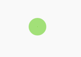
1.html 部分
<div class="spinner">
  <div class="double-bounce1"></div>
  <div class="double-bounce2"></div>
</div>
2.css 部分
.spinner {
   60px;
  height: 60px;

  position: relative;
  margin: 100px auto;
}

.double-bounce1, .double-bounce2 {
   100%;
  height: 100%;
  border-radius: 50%;
  background-color: #67CF22;
  opacity: 0.6;
  position: absolute;
  top: 0;
  left: 0;

  -webkit-animation: bounce 2.0s infinite ease-in-out;
  animation: bounce 2.0s infinite ease-in-out;
}

.double-bounce2 {
  -webkit-animation-delay: -1.0s;
  animation-delay: -1.0s;
}

@-webkit-keyframes bounce {
  0%, 100% { -webkit-transform: scale(0.0) }
  50% { -webkit-transform: scale(1.0) }
}

@keyframes bounce {
  0%, 100% {
    transform: scale(0.0);
    -webkit-transform: scale(0.0);
  } 50% {
    transform: scale(1.0);
    -webkit-transform: scale(1.0);
  }
}
1.html 部分
<div class="spinner">
  <div class="bounce1"></div>
  <div class="bounce2"></div>
  <div class="bounce3"></div>
</div>
2.css 部分
.spinner {
  margin: 100px auto 0;
   150px;
  text-align: center;
}

.spinner > div {
   30px;
  height: 30px;
  background-color: #67CF22;

  border-radius: 100%;
  display: inline-block;
  -webkit-animation: bouncedelay 1.4s infinite ease-in-out;
  animation: bouncedelay 1.4s infinite ease-in-out;
  /* Prevent first frame from flickering when animation starts */
  -webkit-animation-fill-mode: both;
  animation-fill-mode: both;
}

.spinner .bounce1 {
  -webkit-animation-delay: -0.32s;
  animation-delay: -0.32s;
}

.spinner .bounce2 {
  -webkit-animation-delay: -0.16s;
  animation-delay: -0.16s;
}

@-webkit-keyframes bouncedelay {
  0%, 80%, 100% { -webkit-transform: scale(0.0) }
  40% { -webkit-transform: scale(1.0) }
}

@keyframes bouncedelay {
  0%, 80%, 100% {
    transform: scale(0.0);
    -webkit-transform: scale(0.0);
  } 40% {
    transform: scale(1.0);
    -webkit-transform: scale(1.0);
  }
}

1.html 部分
<div class="spinner">
  <div class="spinner-container container1">
    <div class="circle1"></div>
    <div class="circle2"></div>
    <div class="circle3"></div>
    <div class="circle4"></div>
  </div>
  <div class="spinner-container container2">
    <div class="circle1"></div>
    <div class="circle2"></div>
    <div class="circle3"></div>
    <div class="circle4"></div>
  </div>
  <div class="spinner-container container3">
    <div class="circle1"></div>
    <div class="circle2"></div>
    <div class="circle3"></div>
    <div class="circle4"></div>
  </div>
</div>
2.css部分
.spinner {
  margin: 100px auto;
   20px;
  height: 20px;
  position: relative;
}

.container1 > div, .container2 > div, .container3 > div {
   6px;
  height: 6px;
  background-color: #333;

  border-radius: 100%;
  position: absolute;
  -webkit-animation: bouncedelay 1.2s infinite ease-in-out;
  animation: bouncedelay 1.2s infinite ease-in-out;
  -webkit-animation-fill-mode: both;
  animation-fill-mode: both;
}

.spinner .spinner-container {
  position: absolute;
   100%;
  height: 100%;
}

.container2 {
  -webkit-transform: rotateZ(45deg);
  transform: rotateZ(45deg);
}

.container3 {
  -webkit-transform: rotateZ(90deg);
  transform: rotateZ(90deg);
}

.circle1 { top: 0; left: 0; }
.circle2 { top: 0; right: 0; }
.circle3 { right: 0; bottom: 0; }
.circle4 { left: 0; bottom: 0; }

.container2 .circle1 {
  -webkit-animation-delay: -1.1s;
  animation-delay: -1.1s;
}

.container3 .circle1 {
  -webkit-animation-delay: -1.0s;
  animation-delay: -1.0s;
}

.container1 .circle2 {
  -webkit-animation-delay: -0.9s;
  animation-delay: -0.9s;
}

.container2 .circle2 {
  -webkit-animation-delay: -0.8s;
  animation-delay: -0.8s;
}

.container3 .circle2 {
  -webkit-animation-delay: -0.7s;
  animation-delay: -0.7s;
}

.container1 .circle3 {
  -webkit-animation-delay: -0.6s;
  animation-delay: -0.6s;
}

.container2 .circle3 {
  -webkit-animation-delay: -0.5s;
  animation-delay: -0.5s;
}

.container3 .circle3 {
  -webkit-animation-delay: -0.4s;
  animation-delay: -0.4s;
}

.container1 .circle4 {
  -webkit-animation-delay: -0.3s;
  animation-delay: -0.3s;
}

.container2 .circle4 {
  -webkit-animation-delay: -0.2s;
  animation-delay: -0.2s;
}

.container3 .circle4 {
  -webkit-animation-delay: -0.1s;
  animation-delay: -0.1s;
}

@-webkit-keyframes bouncedelay {
  0%, 80%, 100% { -webkit-transform: scale(0.0) }
  40% { -webkit-transform: scale(1.0) }
}

@keyframes bouncedelay {
  0%, 80%, 100% {
    transform: scale(0.0);
    -webkit-transform: scale(0.0);
  } 40% {
    transform: scale(1.0);
    -webkit-transform: scale(1.0);
  }
}