上次用 python 脚本中定期查询数据库,监视订单变化,将时间与处理完成订单的数量进行输入写入日志,虽然省掉了人为定时查看数据库并记录的操作,但是数据不进行分析只是数据,要让数据活起来!
为了方便看出已完成订单的趋势,又不想想到使用Excel, 想到手动绘制表格填入数据就充满了抵触,哈哈,能用代码完成的事绝不手操,不能愧对python!
先确保python环境和pip已经安装好
这个过程分为3步: 安装 jupyter-notebook ——> 安装matplotlib ——> 写代码呗
1. 为什么用 jupyter-notebook ,jupyter安装方便,功能强大,基于浏览器编辑运行,数据可视化支持友好 ....
安装: pip install jupyter notebook
运行: 在cmd 中输入: jupyter-notebook
你将看到如下信息界面:
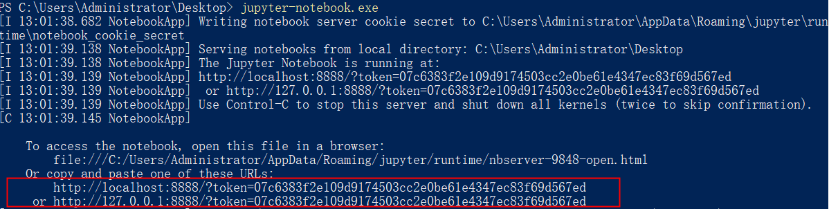
浏览器会默认打开127.0.0.1:8888,如果没有,手动复制红框地址在浏览器打开,然后你就可以愉快地使用jupyter了!
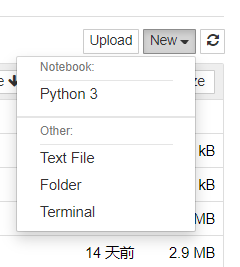
在右上角有个NEW按钮,可以看到jupyter支持创建的类型,python3: 一个交互式的python环境,支持tab 提示补全, Text File:普通文本文件, Folder: 文件夹, Terminal: 比系统cmd更舒服的控制台
还可以用ls ,pwd等linux命令 是不是很强大!
2. 安装matplotlib, Matplotlib 是 Python 的绘图库。 它可与 NumPy 一起使用,提供了一种有效的 MatLab 开源替代方案。 它也可以和图形工具包一起使用,如 PyQt 和 wxPython。
pip install matplotlib
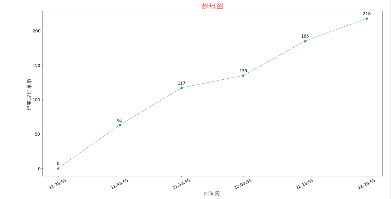
3. 如果有log文件内容如下:
------------------current time: 2019-09-11 11:33:55, finished order count: 0 --------------------
------------------current time: 2019-09-11 11:43:55, finished order count: 63 --------------------
------------------current time: 2019-09-11 11:53:55, finished order count: 117 --------------------
------------------current time: 2019-09-11 12:03:55, finished order count: 135 --------------------
------------------current time: 2019-09-11 12:13:55, finished order count: 185 --------------------
------------------current time: 2019-09-11 12:23:55, finished order count: 218 --------------------
要将时分秒数据作为x轴数据,0,63,117等订单数据作为y轴数据,看代码:
# -*- coding=utf-8 -*-
import re
import pandas
from matplotlib import pyplot as plt

with open('../log.log','r') as f:
    lines = f.readlines()

x = []
y = []
for line in lines:
    date = re.search(r' (d+:d+:d+)',line).group(1)
    x.append(date)
    finishOrder = re.search(r'count: (d+)', line).group(1)
    y.append(int(finishOrder))

plt.figure(figsize=(20,10)) #创建绘图对象  指定figure的宽和高,单位为英寸
plt.plot(x,y,"o--",linewidth=1)  #在当前绘图对象绘图(X轴,Y轴,蓝色虚线,线宽度)
plt.xticks(rotation=25)  # 旋转角度,避免x轴间距不足导致重叠
plt.tick_params(labelsize=14)
for x,y in zip(x,y):
    plt.text(x,y + 5,'%.0f' %y,ha = 'center',fontsize = 14)    #  使折现节点显示具体的值  , +5 表示节点的值位于节点的上下距离高度
plt.xlabel("时间段",fontproperties="SimSun",fontsize = 18) #X轴标签 fontproperties设置字体,不然会中文乱码
plt.ylabel("已完成订单数",fontproperties="SimSun",fontsize = 18)
plt.title("趋势图",fontproperties="SimSun",color='red',fontsize = 24) #图标题
plt.savefig('趋势图.png') # 保存生成的趋势图到本地 必须写在show前面,不然保存的图片是空白的
plt.show() #显示图
看效果: