1、边框图像
<style>
div{
	border:10px solid transparent;
	40px;
	padding:5px 10px;
	-moz-border-image:url(pic/border_image_button.png) 0 14 0 14 stretch;
	-webkit-border-image: url(pic/border_image_button.png) 0 14 0 14 stretch; /* Safari */
	-o-border-image: url(pic/border_image_button.png) 0 14 0 14 stretch; /* Opera */
	border-image: url(pic/border_image_button.png) 0 14 0 14 stretch;

}s
</style>
</head>

<body>
<div>Search</div>
<p>图片</p>
<img src="pic/border_image_button.png" />
</body>
</html>
效果图: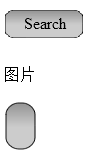
2、盒子投影:box-shadow
box-shadow: h-shadow(必需,水平阴影) v-shadow(必需,垂直阴影) blur(模糊距离) spread(阴影尺寸) color inset(外部阴影->内部阴影);
-ms-transform:(ie内核)
-moz-transform:(火狐内核)
-webkit-transform:(谷歌内核)
3、单元格空隙
border-spacing:有空隙
border-collapse:无空隙
4、光标样式
auto、crosshair、default、pointer、move、text、wait、help、url(cursor.gif);
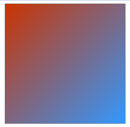
5、渐变背景
<style>
div{
	400px;
	height:400px;
	border:1px solid #666;
	line-height:150px;
	text-align:center;
	font-weight:900;
	font-size:30px;
	color:#fff;
	margin:10px auto;
}
.toTopLeft{
	background-image:linear-gradient(to top left,#39F,#C30);
	background-image:-webkit-linear-gradient(to top left,#39F,#C30);
}
</style>
</head>

<body>
<div class="toTopLeft"></div>
</body>
</html>
效果图: