显示异常问题总结:
1.是否设置自适应布局;
2.是否设置布局最小宽度;
3.是否设置媒体查询隐藏多余内容;
4.是否设置固定长度,不适配小屏展示;
基本设置:
    html,
    body,
    #app {
      height: 100%;
      margin: 0px;
      padding: 0px;
    }

    html {
        box-sizing: border-box;
        line-height: 1.15;
    }
    body {
         overflow: auto;
    }
    #app {
        position: relative;
        height: 100%;
        width: 100%;
    }
全局布局:
.asider{
    transition: width .28s;
    width: 210px!important;
    background-color: #304156;
    height: 100%;
    position: fixed;
    font-size: 0;
    top: 0;
    bottom: 0;
    left: 0;
    z-index: 1001;
    overflow: hidden;
}

.content{
    min-height: 100%;
    transition: margin-left .28s;
    margin-left: 210px;
    position: relative;
}

//主体内容
.hearder{//当设置固定时,添加fixed-header如下,同级添加div添加添加margin-top: 84px即可;
    position: fixed;
    top: 0;
    right: 0;
    z-index: 9;
    width: calc(100% - 210px);
    transition: width .28s;
}
.main{ //无论顶栏是否固定,都需要设置84px的固定间距
    min-height: calc(100vh - 84px);
    width: 100%;
    position: relative;
    overflow: hidden;
}
栅格布局:

<template>
  <div>
    <span class="field-label">方块选择:</span>
    <!-- 选择屏幕框 -->
    <select v-model="selected" @change="selectbj(selected)">
      <option v-for="(option,index) in layouts" :key="index" :value="option.value">{{ option.name }}</option>
    </select>

    <el-main v-model="selected">
      <div class="block" style="height:400px">
        <!-- {{selected}} -->
        <div style="height:100%;100%" v-if="selected==0">
          <!-- 1*1布局 -->
          <el-row :gutter="10" type="flex" class="grid-one-contentheight" justify="center">
            <el-col :span="24"></el-col>
          </el-row>
        </div>
        <!-- 2*1布局 -->
        <div style="height:100%;100%" v-else-if="selected==1">
          <el-row :gutter="10" type="flex" class="row-bg el-row-two" justify="space-between">
            <el-col :span="12">
              <div class="grid-content"></div>
            </el-col>
            <el-col :span="12">
              <div class="grid-content"></div>
            </el-col>
          </el-row>
        </div>
        <!-- 2*2 -->
        <div style="height:100%;100%" v-else-if="selected==2">
          <el-row :gutter="10" type="flex" class="row-bg" justify="center">
            <el-col :span="12">
              <div class="grid-content"></div>
            </el-col>
            <el-col :span="12">
              <div class="grid-content"></div>
            </el-col>
          </el-row>
          <br />
          <el-row :gutter="10" type="flex" class="row-bg" justify="center">
            <el-col :span="12">
              <div class="grid-content"></div>
            </el-col>
            <el-col :span="12">
              <div class="grid-content"></div>
            </el-col>
          </el-row>
        </div>
        <!-- 3*2布局 -->
        <div style="height:100%;100%" v-else-if="selected==3">
          <el-row :gutter="10" type="flex" class="row-bg" justify="center">
            <el-col :span="12">
              <div class="grid-content"></div>
            </el-col>
            <el-col :span="12">
              <div class="grid-content"></div>
            </el-col>
            <el-col :span="12">
              <div class="grid-content"></div>
            </el-col>
          </el-row>
          <br />
          <el-row :gutter="10" type="flex" class="row-bg" justify="center">
            <el-col :span="12">
              <div class="grid-content"></div>
            </el-col>
            <el-col :span="12">
              <div class="grid-content"></div>
            </el-col>
            <el-col :span="12">
              <div class="grid-content"></div>
            </el-col>
          </el-row>
        </div>
        <!-- 3*3模式 -->
        <div style="height:100%;100%" v-else-if="selected==4">
          <el-row :gutter="10" type="flex" class="row-bg" justify="center">
            <el-col :span="8">
              <div class="grid-a-contentWidth"></div>
            </el-col>
            <el-col :span="8">
              <div class="grid-a-contentWidth"></div>
            </el-col>
            <el-col :span="8">
              <div class="grid-a-contentWidth"></div>
            </el-col>
          </el-row>
          <br />
          <el-row :gutter="10" type="flex" class="row-bg" justify="center">
            <el-col :span="8">
              <div class="grid-a-contentWidth"></div>
            </el-col>
            <el-col :span="8">
              <div class="grid-a-contentWidth"></div>
            </el-col>
            <el-col :span="8">
              <div class="grid-a-contentWidth"></div>
            </el-col>
          </el-row>
        </div>
        <!-- 模式 -->
        <div style="height:100%;100%" v-else>
          <el-row :gutter="10" type="flex" class="row-bg" justify="start">
            <el-col :span="8">
              <div class="grid-a-contentWidth"></div>
            </el-col>
            <el-col :span="8">
              <div class="grid-a-contentWidth"></div>
            </el-col>
            <el-col :span="8">
              <div class="grid-a-contentWidth"></div>
            </el-col>
          </el-row>
          <br />
          <el-row :gutter="10" type="flex" class="row-bg" justify="start">
            <el-col :span="8">
              <div class="grid-a-contentWidth"></div>
              <br />
              <div class="grid-a-contentWidth"></div>
            </el-col>
            <el-col :span="16">
              <div class="grid-a-content-a-Width"></div>
            </el-col>
          </el-row>
        </div>
      </div>
    </el-main>
  </div>
</template>

<script>
export default {
  data () {
    return {
      selected: 0,
      layouts: [
        { 'name': '1x1模式', 'value': '0' },
        { 'name': '2x1模式', 'value': '1' },
        { 'name': '2x2模式', 'value': '2' },
        { 'name': '3x2模式', 'value': '3' },
        { 'name': '3x3模式', 'value': '4' },
        { 'name': '1+5模式', 'value': '5' }
      ]
    }
  },
  methods: {
    selectbj (obj) {
      console.log(obj, 111)
    }
  }
}
</script>

<style scoped>
.box-card {
   400px;
  margin: 20px auto;
}
.block {
  padding: 30px 24px;
  background-color: rgb(27, 16, 16);
}
.alert-item {
  margin-bottom: 10px;
}
.tag-item {
  margin-right: 15px;
}
.link-title {
  margin-left: 35px;
}
.components-container {
  position: relative;
  height: 100vh;
}

.left-container {
  background-color: #f38181;
  height: 100%;
}

.right-container {
  background-color: #fce38a;
  height: 200px;
}

.top-container {
  background-color: #fce38a;
   100%;
  height: 100%;
}

.bottom-container {
   100%;
  background-color: #95e1d3;
  height: 100%;
}

.left-container-twoOne {
  background-color: rgb(110, 75, 75);
  height: 100%;
}

.container-onetoOne {
  background-color: rgb(47, 80, 74);
  height: 100%;
   50%;
}

.container-onetoTwo {
  background-color: rgb(61, 19, 56);
  height: 100%;
   50%;
}

.el-col {
  border-radius: 4px;
}
.bg-purple-dark {
  background: #57926b;
}
.bg-purple {
  background: #7e2970;
}
.bg-purple-light {
  background: #071c4d;
}
.grid-content {
  background-color: rgb(44, 143, 121);
  border-radius: 4px;
  min-height: 150px;
  min- 100px;
}
.grid-contentB {
  background-color: rgb(64, 56, 134);
  border-radius: 4px;
  min-height: 150px;
  min- 100px;
}
.grid-a-contentWidth {
  background-color: rgb(44, 143, 121);
  border-radius: 4px;
  min-height: 100px;
}
.grid-a-content-a-Width {
  background-color: rgb(44, 143, 121);
  border-radius: 4px;
  min-height: 220px;
}

.grid-one-contentheight {
  background-color: rgb(44, 143, 121);
  border-radius: 4px;
  min-height: 100%;
}

.el-row-two {
  margin-bottom: 80px;
  margin-top: 80px;
}
</style>
笔记:
row 行概念
<el-row></el-row>col 列概念
<el-col></el-col>col组件的:span属性的布局调整,一共分为24栏:
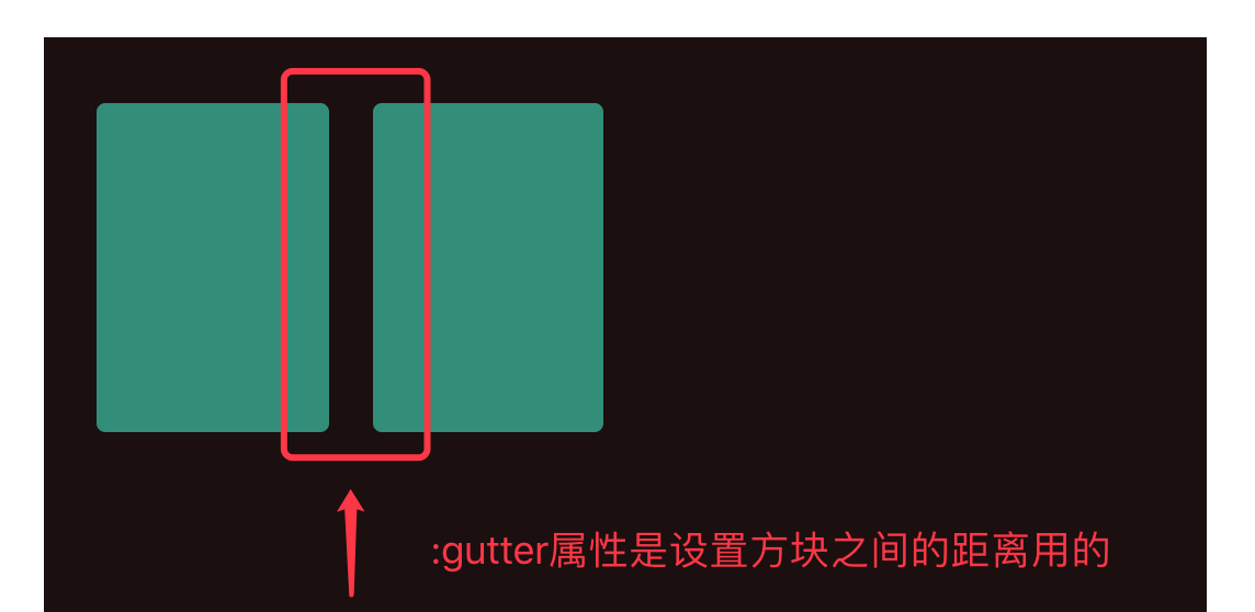
row组件的:gutter属性来调整布局之间的宽度---分栏间隔
<el-row :gutter="20">
<el-col :span="6"><div class="grid-content bg-purple"></div></el-col>
<el-col :span="6"><div class="grid-content bg-purple"></div></el-col>
</el-row>

对齐方式:
row组件的type="flex"启动flex布局,再通过row组件的justify属性调整排版方式,属性值分别有:
justify=center 居中对齐
justify=start 左对齐
justify=end 右对齐
justify=space-between 空格间距在中间对齐
justify=space-around 左右各占半格空格对齐
 <el-row type="flex" class="row-bg" justify="center">
   <el-col :span="6"><div class="grid-content"></div></el-col>
 </el-row>

响应式布局:
参考bootstrap的响应式,预设四个尺寸
- xs <768px
- sm ≥768px
- md ≥992
- lg ≥120
<el-row :gutter="10">
  <el-col :xs="8" :sm="6" :md="4" :lg="3"><div class="grid-content bg-purple"></div></el-col>
  <el-col :xs="4" :sm="6" :md="8" :lg="9"><div class="grid-content bg-purple-light"></div></el-col>
  <el-col :xs="4" :sm="6" :md="8" :lg="9"><div class="grid-content bg-purple"></div></el-col>
  <el-col :xs="8" :sm="6" :md="4" :lg="3"><div class="grid-content bg-purple-light"></div></el-col>
</el-row>