用css3绘制你需要的几何图形
原文出处:http://www.cnblogs.com/wdlhao/p/5751211.html
1.圆形
示例: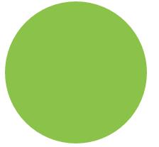
思路:给任何正方形元素设置一个足够大的 border-radius ,就可以把它变成一个圆形.代码如下:
html:
<div class="size example1"></div>
css:
.size{
    width:200px;
    height: 200px;
    background: #8BC34A;
}
.example1{
    border-radius:100px;
}
2、自适应椭圆
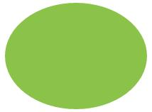
思路:border-radius 这个属性还有另外一个鲜为人知的真相,它不仅可以接受长度值,还可以接受百分比值。这个百分比值会基于元素的尺寸进行解析.这意味着相同的百分比可能会计算出不同的水平和垂直半径。代码如下:
html:
<div class="example3"></div>
css:
.example3{
    width:200px;
    height: 150px;
    border-radius:50%;
    background: #8BC34A;
}
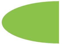
3、自适应的半椭圆:沿横轴劈开的半椭圆
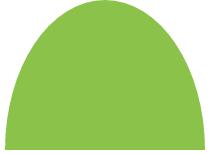
思路:border-radius 的语法比我们想像中灵活得多。你可能会惊讶地发现 border-radius 原来是一个简写属性。第一种方法就是使用它所对应的各个展开式属性:
- border-top-left-radius
- border-top-right-radius
- border-bottom-right-radius
- border-bottom-left-radius
我们甚至可以为所有四个角提供完全不同的水平和垂直半径,方法是在斜杠前指定 1~4 个值,在斜杠后指定另外 1~4 个值。举例来说,当 border-radius 的值为10px / 5px 20px 时,其效果相当于 10px 10px 10px 10px / 5px 20px 5px 20px 。
为 border-radius 属性分别指定4、3、2、1 个由空格分隔的值时,这些值是以这样的规律分配到四个角上的(请注意,对椭圆半径来说,斜杠前和斜杠后最多可以各有四个参数,这两组值是以同样的方法分配到各个角的)
代码如下:自适应的半椭圆:沿横轴劈开的半椭圆
html:
<div class="example4"></div>
css:
.example4{
    width:200px;
    height: 150px;
    border-radius: 50% / 100% 100% 0 0;
    background: #8BC34A;
}
4、自适应的半椭圆:沿纵轴劈开的半椭圆
思路:自适应的半椭圆:沿纵轴劈开的半椭圆
代码如下:
html:
<div class="example5"></div>
css:
.example5{
    width:200px;
    height: 150px;
    border-radius: 100% 0 0 100% / 50%;
    background: #8BC34A;
}
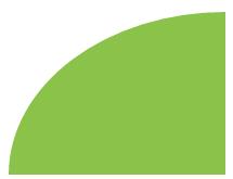
5、四分之一椭圆
思路:其中一个角的水平和垂直半径值都需要是100%,而其他三个角都不能设为圆角。
代码如下:
html:
<div class="example6"></div>
css:
.example6{
    width:160px;
    height: 100px;
    border-radius: 100% 0 0 0;
    background: #8BC34A;
}
6、用椭圆绘制opera浏览器的logo
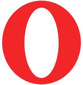
思路:绘制opera浏览器的logo,分析起来不难,就只有两个图层,一个是最底部的椭圆,一个是最上面那层的椭圆。先确定一下最底层的椭圆宽高,量了一下,水平宽度为258px,垂直高度为275px,因为其是一个对称的椭圆,没有倾斜度,故4个角均为水平半径为258px,垂直半径为275px的4个相等椭圆,用同样的办法确定最里面的椭圆的半径,因此,四个角均为水平半径120px,垂直半径为229px的椭圆,代码如下:
html:
<div class="opera">
        <div class="opera-top"></div>
</div>
css:
.opera{
    width:258px;
    height: 275px;
    background: #F22629;
    border-radius:258px 258px 258px 258px /275px 275px 275px 275px;
    position: relative;
}
.opera-top{
    width: 112px;
    height: 231px;
    background: #FFFFFF;
    border-radius: 112px 112px 112px 112px/231px 231px 231px 231px;
    position: absolute;
    left: 50%;
    right: 50%;
    top: 50%;
    bottom: 50%;
    margin-left: -56px;
    margin-top: -115px;
}
7、平行四边形
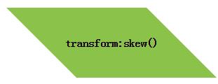
思路:伪元素方案:是把所有样式(背景、边框等)应用到伪元素上,然后再对 伪元素进行变形。因为我们的内容并不是包含在伪元素里的,所以内容并不会受到变形的影响。代码如下:
html:
<div class="button">transform:skew()</div>
css:
.button {
    width:200px;
    height: 100px;
    position: relative;
    left: 100px;
    line-height: 100px;
    text-align: center;
    font-weight: bolder;
}

.button::before {
   content: ''; /* 用伪元素来生成一个矩形 */
              position: absolute;
              top: 0; right: 0; bottom: 0; left: 0;
              z-index: -1;
              transform: skew(45deg);
              background: #8BC34A;
        }
技巧总结:这个技巧不仅对 skew() 变形来说很有用,还适用于其他任何变形样式,当我们想变形一个元素而不想变形它的内容时就可以用到它。
8、菱形
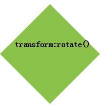
思路:我们把这个技巧针对 rotate() 变形样式稍稍调整一下,再用到一个正方形元素上,就可以很容易地得到一个菱形。代码如下:
html:
<div class="example1">transform:rotate()</div>
css:
.example1 {
    width:140px;
    height: 140px;
    position: relative;
    left: 100px;
    line-height: 100px;
    text-align: center;
    font-weight: bolder;
}
.example1::before {
    content: '';
    position: absolute;
    top: 0; right: 0; bottom: 0; left: 0;
    z-index: -1;
    transform: rotate(45deg);
    background: #8BC34A;
}
技巧总结:这个技巧的关键在于,我们利用伪元素以及定位属性产生了一个方块, 然后对伪元素设置样式,并将其放置在其宿主元素的下层。这种思路同样可 以运用在其他场景中,从而得到各种各样的效果。
9、菱形图片
思路:基于变形的方案,
我们想让图片的宽度与容器的对角线相等,而不是与边长相等。需要用到勾股定理,这个定理告诉我们,一个正方形的对角线长度等于它的边长乘以根号2,约等于1.414 213 562 。因此,把 max-width 的值设置为根号2乘以100%约等于 414.421 356 2% 是很合理的,或者把这个值向上取整为 142% ,因为我们不希望因为计算的舍入问题导致图片在实际显示时稍小(但稍大是没问题的,反正我们都是在裁切图片嘛)
代码如下:
html:
 <div class="picture">
    <img src="./imgs/7.jpg">
 </div>
css:
.picture {
    width: 200px;
    transform: rotate(45deg);
    overflow: hidden;
    margin: 50px;
}
.picture img {
    max-width: 100%;
    transform: rotate(-45deg) scale(1.42);
    z-index: -1;
    position: relative;
}
技巧总结:我们希望图片的尺寸属性保留 100% 这个值,这样当浏览器不支持变 形样式时仍然可以得到一个合理的布局。 通过 scale() 变形样式来缩放图片时,是以它的中心点进行缩放的 (除非我们额外指定了 transform-origin 样式) 。通过 width 属性 来放大图片时,只会以它的左上角为原点进行缩放,从而迫使我们 动用额外的负外边距来把图片的位置调整回来.
10、切角效果
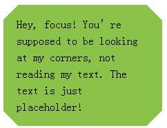
思路:基于background:linear-gradient()的方案:把四个角都做出切角效果了。你需要四层渐变图案,代码如 下所示:
html:
<div class="example2">Hey, focus! You’re supposed to be looking at my corners, not reading my text. The text is just placeholder!</div>
css:
.example2{
    background: #8BC34A;
    background: linear-gradient(135deg, transparent 15px, #8BC34A 0) top left,
                linear-gradient(-135deg, transparent 15px, #8BC34A 0) top right,
                linear-gradient(-45deg, transparent 15px, #8BC34A 0) bottom right,
                linear-gradient(45deg, transparent 15px, #8BC34A 0) bottom left;
    background-size: 50% 50%;
    background-repeat: no-repeat;

    padding: 1em 1.2em;
    max-width: 12em;
    line-height: 1.5em;
}
11、弧形切角
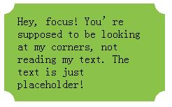
思路:上述渐变技巧还有一个变种,可以用来创建弧形切角(很多人也把这种 效果称为“内凹圆角” ,因为它看起来就像是圆角的反向版本) 。唯一的区别 在于,我们会用径向渐变来替代上述线性渐变,代码如下:
html:
<div class="example3">Hey, focus! You’re supposed to be looking at my corners, not reading my text. The text is just placeholder!</div>
css:
.example3{
    background: #8BC34A;
    background: radial-gradient(circle at top left, transparent 15px, #8BC34A 0) top left,
                radial-gradient(circle at top right, transparent 15px, #8BC34A 0) top right,
                radial-gradient(circle at bottom right, transparent 15px, #8BC34A 0) bottom right,
                radial-gradient(circle at bottom left, transparent 15px, #8BC34A 0) bottom left;
    background-size: 50% 50%;
    background-repeat: no-repeat;

    padding: 1em 1.2em;
    max-width: 12em;
}
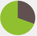
12、简单的饼图
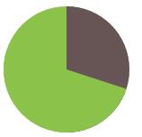
思路:基于 transform 的解决方案:我们现在可以通过一个 rotate() 变形属性来让这个伪元素转起来。 如果我们要显示出 20% 的比率,我们可以指定旋转的值为 72deg (0.2 × 360 = 72) ,写成 .2turn 会更加直观一些。你还可以看到其 他一些旋转值的情况。代码如下:
html:
<div class="pie"></div>
css:
.pie{
    width:140px;
    height: 140px;
    background: #8BC34A;
    border-radius: 50%;
    background-image: linear-gradient(to right,transparent 50%,#655 0);
}
.pie::before{
    content: '';
    display: block;
    margin-left: 50%;
    height: 100%;
    border-radius: 0 100% 100% 0 / 50%;
    background-color: inherit;
    transform-origin: left;
    transform: rotate(.1turn);/*10%*/
    transform: rotate(.2turn);/*20%*/
    transform: rotate(.3turn);/*30%*/
}
提示:在参数中规定角度。turn是圈,1turn = 360deg;另外还有弧度rad,2nrad = 1turn = 360deg。如,transform:rotate(2turn); //旋转两圈
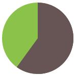
此方法显示 0 到 50% 的比率时运作良好,但如果我们尝试显示 60% 的比率时(比如指定旋转值为 .6turn 时),会出现问题。解决方法:使 用上述技巧的一个反向版本来实现这个范围内的比率:设置一个棕色的伪 元素,让它在 0 至 .5turn 的范围内旋转。因此,要得到一个 60% 比率的饼 图,伪元素的代码可能是这样的:
html:
<div class="pie2"></div>
css:
.pie2{
    width:140px;
    height: 140px;
    background: #8BC34A;
    border-radius: 50%;
    background-image: linear-gradient(to right,transparent 50%,#655 0);
}
.pie2::before{
    content: '';
    display: block;
    margin-left: 50%;
    height: 100%;
    border-radius: 0 100% 100% 0 / 50%;
    background: #655;/*当范围大于50%时,需要改变伪元素的背景颜色为#655;*/
    transform-origin: left;
    transform: rotate(.1turn);
}
用 CSS 动画来实现一个饼图从 0 变化到 100% 的动画,从而得到一个炫酷的进度指示器:
代码如下:
html:
<div class="pie3"></div>
css:
.pie3 {
    width:140px;
    height: 140px;
    border-radius: 50%;
    background: yellowgreen;
    background-image: linear-gradient(to right, transparent 50%, currentColor 0);
    color: #655;
}

.pie3::before {
    content: '';
    display: block;
    margin-left: 50%;
    height: 100%;
    border-radius: 0 100% 100% 0 / 50%;
    background-color: inherit;
    transform-origin: left;
    animation: spin 3s linear infinite, bg 6s step-end infinite;
}

@keyframes spin {
    to { transform: rotate(.5turn); }
}
@keyframes bg {
    50% { background: currentColor; }
}