更多文章
一个弹窗组件通常包含两个部分,分别是遮罩层和内容层。
遮罩层是背景层,一般是半透明或不透明的黑色。
内容层是放我们要展示的内容的容器。
<template>
    <div class="modal-bg" v-show="show">
        <div class="modal-container">
            <div class="modal-header">
                {{ title }}
            </div>
            <div class="modal-main">
                <slot></slot>
            </div>
            <div class="modal-footer">
                <button @click="hideModal">取消</button>
                <button @click="submit">确认</button>
            </div>
        </div>
    </div>
</template>
现在弹窗组件的结构已经搭建出来了。
- 类
modal-bg: 遮罩层 - 类
modal-container: 内容层容器 - 类
modal-header: 内容层头部 - 类
modal-main: 内容层主体部分(用来展示内容) - 类
modal-footer: 内容层脚部 - 属性
v-show: 控制弹窗的展示与关闭 - 属性
title: 标题 - 方法
hideModal: 点击取消的回调函数 - 方法
submit: 点击确认的回调函数 - 插槽
slot: 用来展示内容
定义完 HTML 结构,还得定义组件的 props 属性,用来接收父组件的传参,以方便在父组件通过属性来控制弹窗。
export default {
    name: 'modal',
    props: {
        show: {
            type: Boolean,
            default: false
        },
        title: {
            type: String,
            default: ''
        },
    },
    methods: {
        hideModal() {
            this.$emit('hideModal')
        },

        submit() {
            this.$emit('submit')
        },
    }
}
从上述代码可知,组件只有两个 prop 属性,分别是 show(控制弹窗展示与关闭)和 title(弹窗标题)。
另外还有两个方法,分别是点击取消和确认的回调函数,它们的作用是触发对应的事件。
到这里,一个简单的弹窗组件已经完成了(样式后面再说)。
如何调用
一个组件写完了,要怎么调用呢?
假设这个组件的文件名为 Modal.vue,我们在父组件里这样调用 (假设父组件和弹窗组件在同一文件夹下)。
<Modal :show="show" :title="title" @hideModal="hideModal" @submit="submit">
    <p>这里放弹窗的内容</p>
</Modal>
import Modal from './Modal.vue'
export default {
    data() {
      return {
        title: '弹窗标题',
        show: true,
      }
    },
    components: {
        Modal
    },
    methods: {
        hideModal() {
            // 取消弹窗回调
            this.show = false
        },

        submit() {
            // 确认弹窗回调
            this.show = false
        }
    }
}
把子组件要求的两个属性和两个方法都写上,现在来看看这个弹窗的效果。
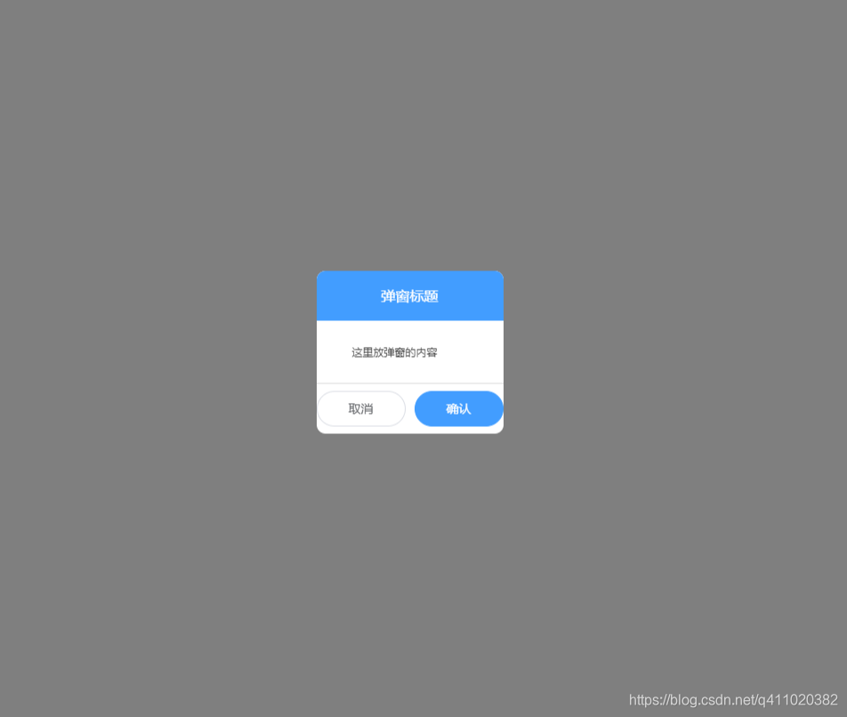
一个简单的弹窗组件就这样完成了。
改进
样式
现在市面上的 UI 库特别多,所以一些通用的组件样式不建议自己写,直接用现成的就好。在这个组件上,我们可以使用 element-ui,改造后变成这样。
<template>
    <div class="modal-bg" v-show="show">
        <div class="modal-container">
            <div class="modal-header">
                {{ title }}
            </div>
            <div class="modal-main">
                <slot></slot>
            </div>
            <div class="modal-footer">
                <el-button round @click="hideModal">取消</el-button>
                <el-button type="primary" round @click="submit">确认</el-button>
            </div>
        </div>
    </div>
</template>
嗯... 看起来只有两个按钮变化了,不过没关系,后面的内容部分肯定还有用得上的时候。
功能
看起来这个简单的弹窗组件真的是非常简单,我们可以在此基础上适当的增加一些功能,例如:拖拽。
一个弹窗组件的拖拽一般通过三个事件来控制,分别是 mousedown、mousemove、mouseup。
mousedown用来获取鼠标点击时弹窗的坐标mousemove用来计算鼠标移动时弹窗的坐标mouseup取消弹窗的移动
先来看代码。
<template>
    <div class="modal-bg" v-show="show" @mousemove="modalMove" @mouseup="cancelMove">
        <div class="modal-container" :class="position">
            <div class="modal-header" @mousedown="setStartingPoint">
                {{ title }}
            </div>
            <div class="modal-main">
                <slot></slot>
            </div>
            <div class="modal-footer">
                <el-button round @click="hideModal">取消</el-button>
                <el-button type="primary" round @click="submit">确认</el-button>
            </div>
        </div>
    </div>
</template>
在弹窗上增加了三个事件 mousedown、mousemove、mouseup,用来控制弹窗移动(点击弹窗头部进行拖拽)。
    data() {
        return {
            x: 0, // 弹窗 X 坐标
            y: 0, // 弹窗 Y 坐标
            node: null, // 弹窗元素
            isCanMove: false // 是否能拖动弹窗
        }
    },
    mounted() {
        // 将弹窗元素赋值给 node
        this.node = document.querySelector('.modal-container')
    },
    setStartingPoint(e) {
        this.x = e.clientX - this.node.offsetLeft
        this.y = e.clientY - this.node.offsetTop
        this.isCanMove = true
    },

    modalMove(e) {
        if (this.isCanMove) {
            this.node.style.left = e.clientX - this.x + 'px'
            this.node.style.top = e.clientY - this.y + 'px'
        }
    },

    cancelMove() {
        this.isCanMove = false
    }
通过这些新增的代码,这个弹窗就具有了拖拽的功能。
最后附上这个弹窗组件的完整代码
<template>
	<div class="modal-bg" v-show="show" @mousemove="modalMove" @mouseup="cancelMove">
        <div class="modal-container">
            <div class="modal-header" @mousedown="setStartingPoint">
                {{ title }}
            </div>
            <div class="modal-main">
                <slot></slot>
            </div>
            <div class="modal-footer">
                <el-button round @click="hideModal">取消</el-button>
                <el-button type="primary" round @click="submit">确认</el-button>
            </div>
        </div>
    </div>
</template>
<script>
export default {
    name: 'modal',
    props: {
        show: {
            type: Boolean,
            default: false
        },
        title: {
            type: String,
            default: ''
        },
    },
    data() {
        return {
            x: 0,
            y: 0,
            node: null,
            isCanMove: false
        }
    },
    mounted() {
        this.node = document.querySelector('.modal-container')
    },
    methods: {
        hideModal() {
            this.$emit('hideModal')
        },

        submit() {
            this.$emit('submit')
        },

        setStartingPoint(e) {
            this.x = e.clientX - this.node.offsetLeft
            this.y = e.clientY - this.node.offsetTop
            this.isCanMove = true
        },

        modalMove(e) {
            if (this.isCanMove) {
                this.node.style.left = e.clientX - this.x + 'px'
			    this.node.style.top = e.clientY - this.y + 'px'
            }
        },

        cancelMove() {
            this.isCanMove = false
        }
    }
}
</script>
<style scoped>
.modal-bg {
    position: fixed;
    top: 0;
    left: 0;
     100%;
    height: 100%;
    background: rgba(0,0,0,.5);
    z-index: 10;
}
.modal-container {
    background: #fff;
    border-radius: 10px;
    overflow: hidden;
    position: fixed;
    top: 50%;
    left: 50%;
    transform: translate(-50%,-50%);
}
.modal-header {
    height: 56px;
    background: #409EFF;
    color: #fff;
    display: flex;
    align-items: center;
    justify-content: center;
    cursor: move;
}
.modal-footer {
    display: flex;
    align-items: center;
    justify-content: center;
    height: 57px;
    border-top: 1px solid #ddd;
}
.modal-footer button {
     100px;
}
.modal-main {
    padding: 15px 40px;
}
</style>