React Native 自定义 底部选择框 实现
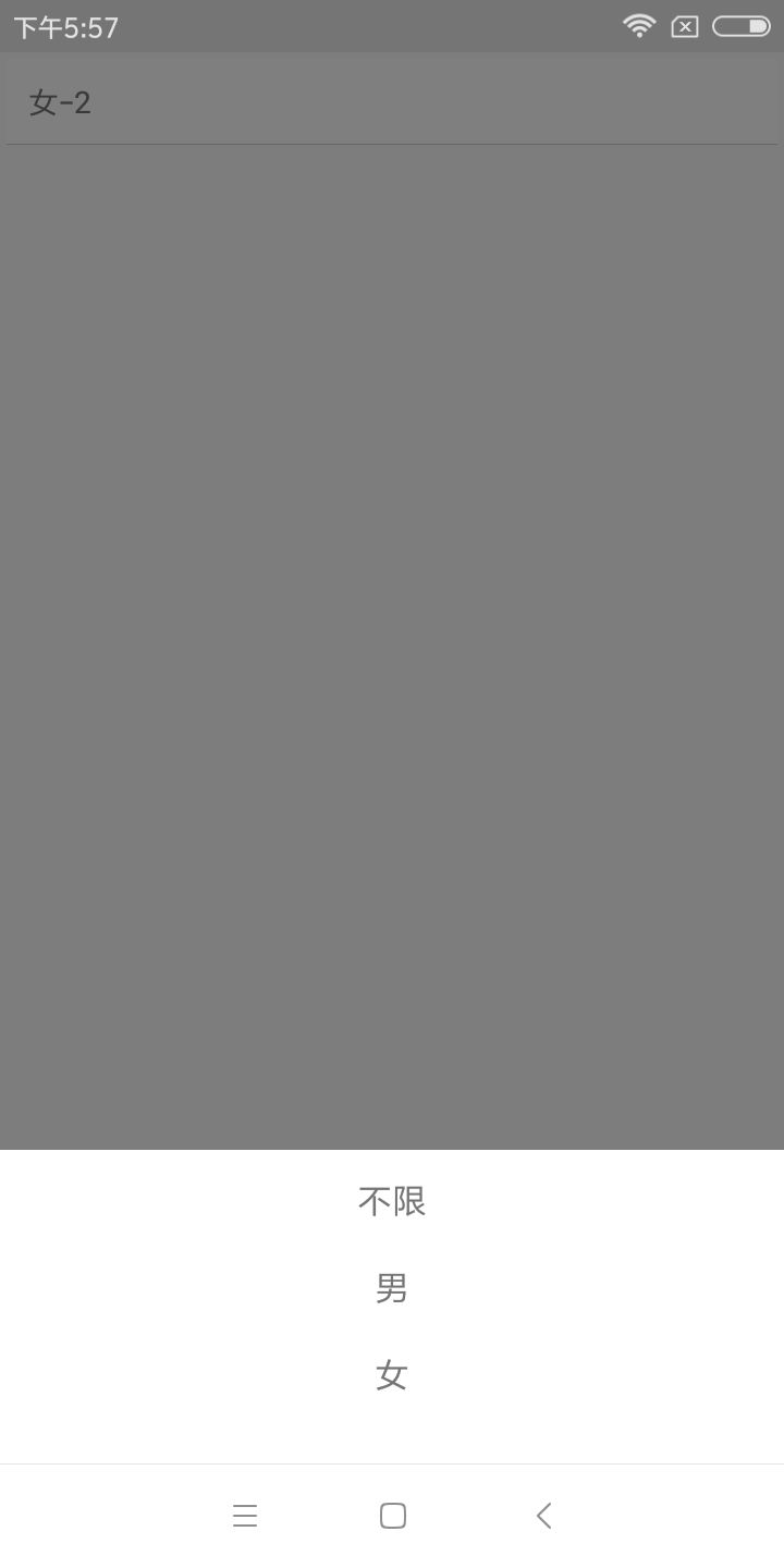
效果如图所示:
实现方法:
一、组件封装
CustomAlertDialog.js
import React, {Component} from 'react';
import {Dimensions, Modal, StyleSheet, Text, TouchableOpacity, View} from 'react-native';

const {width} = Dimensions.get('window');
export default class CustomAlertDialog extends Component {

    constructor(props) {
        super(props);
        this.state = {
            isVisible: this.props.show,
        };
        this.entityList = this.props.entityList;
    }

    componentWillReceiveProps(nextProps) {
        this.setState({isVisible: nextProps.show});
    }

    closeModal() {
        this.setState({
            isVisible: false
        });
        this.props.closeModal(false);
    }

    renderItem(item, i) {
        return (
            <TouchableOpacity key={i} onPress={this.choose.bind(this, i)} style={styles.item}>
                <Text style={styles.itemText}>{item}</Text>
            </TouchableOpacity>
        );
    }

    choose(i) {
        if (this.state.isVisible) {
            this.props.callback(i);
            this.closeModal();
        }
    }

    renderDialog() {
        return (
            <View style={styles.modalStyle}>
                <View style={styles.optArea}>
                    {
                        this.entityList.map((item, i) => this.renderItem(item, i))
                    }
                </View>
            </View>
        )
    }

    render() {
        return (
            <View style={{flex: 1}}>
                <Modal
                    transparent={true}
                    visible={this.state.isVisible}
                    animationType={'fade'}
                    onRequestClose={() => this.closeModal()}>
                    <TouchableOpacity style={styles.container} activeOpacity={1}
                                      onPress={() => this.closeModal()}>
                        {this.renderDialog()}
                    </TouchableOpacity>
                </Modal>
            </View>
        );
    }
}

const styles = StyleSheet.create({
    container: {
        flex: 1,
        backgroundColor: 'rgba(0, 0, 0, 0.5)',
    },
    modalStyle: {
        position: "absolute",
        left: 0,
        bottom: 0,
         width,
        flex: 1,
        flexDirection: "column",
        backgroundColor: '#ffffff',
    },
    optArea: {
        flex: 1,
        flexDirection: 'column',
        marginTop: 12,
        marginBottom: 12,
    },
    item: {
         width,
        height: 40,
        paddingLeft: 20,
        paddingRight: 20,
        alignItems: 'center',
    },
    itemText: {
        fontSize: 16,
    },
    cancel: {
         width,
        height: 30,
        marginTop: 12,
        alignItems: 'center',
        backgroundColor: '#ffffff'
    },
});
使用
TestCustomAlert.js
import React, {Component} from "react";
import {StyleSheet, Text, TouchableHighlight, View,} from 'react-native';
import CustomAlertDialog from "./CustomAlertDialog";

const typeArr = ["不限", "男", "女"];

export default class TestCustomAlert extends Component {
    constructor(props) {
        super(props);
        this.state = {
            typeName: '性别',
            type: 0,
            showTypePop: false,
        }
    }

    _openTypeDialog() {
        this.setState({showTypePop: !this.state.showTypePop})
    }

    render() {

        return (
            <View style={{flex: 1}}>

                <TouchableHighlight onPress={() => this._openTypeDialog()} style={styles.button}
                                    underlayColor="#a5a5a5">
                    <Text>{this.state.typeName}-{this.state.type}</Text>
                </TouchableHighlight>

                <CustomAlertDialog entityList={typeArr} callback={(i) => {
                    this.setState({
                        type: i,
                        typeName: typeArr[i],
                    })
                }} show={this.state.showTypePop} closeModal={(show) => {
                    this.setState({
                        showTypePop: show
                    })
                }}/>
            </View>
        );

    }
}

const styles = StyleSheet.create({
    button: {
        margin: 3,
        backgroundColor: 'white',
        padding: 10,
        borderBottomWidth: StyleSheet.hairlineWidth,
        borderBottomColor: '#cdcdcd'
    },
});
本博客地址: wukong1688
本文原文地址:https://www.cnblogs.com/wukong1688/p/11038382.html
转载请著名出处!谢谢~~