线性渐变
<style>
    div {
        width: 700px;
        height: 100px;
        /*方向:从右向左*/
        /*起始颜色:黄色*/
        /*终止颜色:绿色*/
        background-image: linear-gradient(to left, yellow, green);
    }
</style>
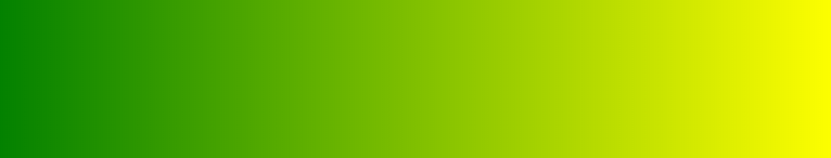
注意事项:
1、方向默认是从上到下
2、方向也可以是角度
3、方向:to left、to right、to bottom、tot op、45deg
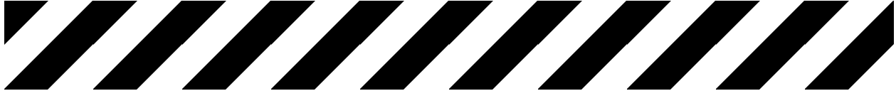
<!DOCTYPE html>
<html lang="en">
<head>
    <meta charset="UTF-8">
    <title>Title</title>
    <style>
        div {
            width: 1000px;
            height: 100px;
            background-image: linear-gradient(135deg,
            #000 0%,
            #000 25%,
            #fff 25%,
            #fff 50%,
            #000 50%,
            #000 75%,
            #fff 75%,
            #fff 100%
            );
            background-size: 100px 100%;
            animation: gun 1s infinite linear;
        }

        @keyframes gun {
            0% {

            }

            100% {
                background-position: 100px 0px;
            }
        }

    </style>
</head>
<body>
<div>

</div>
</body>
</html>
径向渐变
<!DOCTYPE html>
<html>
<head lang="en">
    <meta charset="UTF-8">
    <title></title>
    <style>
        div {
            width: 250px;
            height: 250px;
            border: 1px solid #000;
            margin: 20px auto;
            float: left;
        }

        /*
            径向渐变:
            radial-gradient(辐射半径, 中心的位置,起始颜色,终止颜色);
            中心点位置:at  left  right  center bottom  top
        */
        div:nth-child(1) {
            background-image: radial-gradient(at left top, yellow, green);
        }

        div:nth-child(2) {
            background-image: radial-gradient(at 50px 50px, yellow, green);
        }

        div:nth-child(3) {
            background-image: radial-gradient(100px at center, yellow, green);
        }

        div:nth-child(4) {
            background-image: radial-gradient(100px at center,
            yellow 0%,
            green 30%,
            blue 60%,
            red 100%);
        }

        div:nth-child(5) {
            background-image: radial-gradient(100px 50px at center, yellow, green);
        }


    </style>
</head>
<body>
<div class="box"></div>
<div class="box"></div>
<div class="box"></div>
<div class="box"></div>
<div class="box"></div>
</body>
</html>
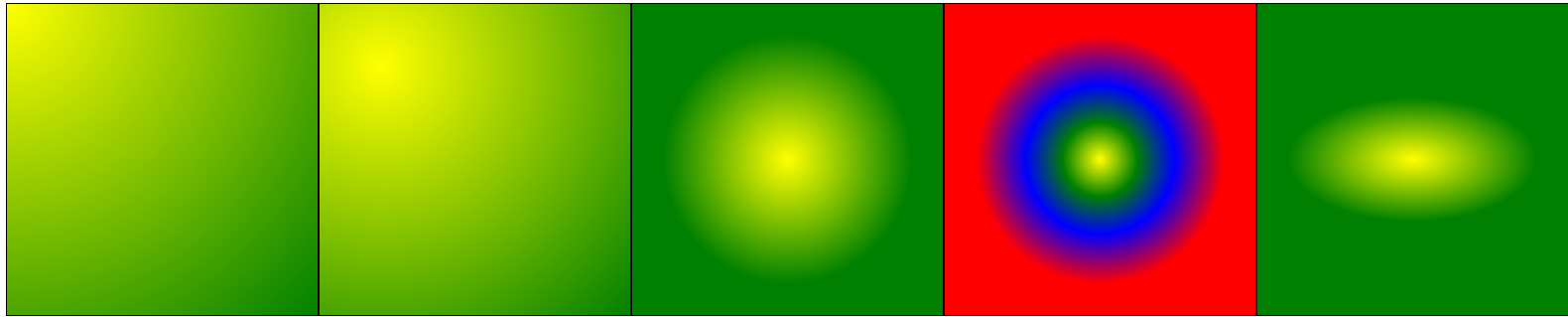
渐变球体
<!DOCTYPE html>
<html lang="en">
<head>
    <meta charset="UTF-8">
    <title>CSS3 渐变</title>
    <style>
        body {
            margin: 0;
            padding: 0;
            background-color: #F7F7F7;
        }

        .radial-gradient {
            width: 200px;
            height: 200px;
            margin: 40px auto;
            border-radius: 100px;
            background-color: blue;
            background-image: radial-gradient(
                200px at 50px 60px,
                rgba(0, 0, 0, 0),
                rgba(0, 0, 0, 0.6)
            );
        }
    </style>
</head>
<body>
    <div class="radial-gradient"></div>
</body>
</html>
