Matplotlib 官网
此篇笔记参考来源为《莫烦Python》
安装同之前所述,参考《Python初学基础》
基本使用
2.1 基本用法

import matplotlib.pyplot as plt
import numpy as np

x = np.linspace(-1, 1, 50) #使用np.linspace定义x:范围是(-1,1);个数是50
y = 2*x + 1

plt.figure()       #定义一个图像窗口
plt.plot(x, y)
plt.show()        #显示图像
2.2 figure 图像
类似于matlab的figure,一个figure为一个单独的显示图片的小窗口,举例如下:
plt.figure()
plt.plot(x,y1)


plt.figure()
plt.plot(x,y2)

plt.show()
2.3 设置坐标轴1
与matlab类似
设置x/y轴的范围
plt.xlim((-1, 2))
plt.ylim((-2, 3))
设置x/y轴的坐标轴名称
plt.xlabel('I am x')
plt.ylabel('I am y')
使用xticks/yticks设置坐标轴刻度
new_ticks = np.linspace(-1, 2, 5)
print(new_ticks)
plt.xticks(new_ticks)

plt.yticks([-2, -1.8, -1, 1.22, 3],[r'$really bad$', r'$bad$', r'$normal$', r'$good$', r'$really good$'])
plt.show()
r'$really bad$'类似于正则表达式,$类似于Latex
2.4 设置坐标轴2
- plt.gca获取当前坐标轴信息
- spines设置边框
- set_color:设置边框颜色,默认白色,下述代码作用为使得上、右边框“消失”
ax = plt.gca()
ax.spines['right'].set_color('none')
ax.spines['top'].set_color('none')
plt.show()
调整坐标轴
使用.xaxis.set_ticks_position设置x坐标刻度数字或名称的位置:bottom.(所有位置:top,bottom,both,default,none)
使用.yaxis.set_ticks_position设置y坐标刻度数字或名称的位置:left.(所有位置:left,right,both,default,none)
ax.xaxis.set_ticks_position('bottom')
ax.yaxis.set_ticks_position('left')
使用.spines设置边框:x轴;使用.set_position设置边框位置:y=0的位置;(位置所有属性:outward,axes,data)
使用.spines设置边框:y轴;使用.set_position设置边框位置:x=0的位置;(位置所有属性:outward,axes,data) 使用plt.show显示图像
ax.spines['bottom'].set_position(('data', 0))
ax.spines['left'].set_position(('data',0))
2.5 Legend 图例
举例说明如下:
plt.plot(x, y1, label='linear line')
plt.plot(x, y2, color='red', linewidth=1.0, linestyle='--', label='square line')
plt.legend()
可进一步对参数进行设置
l1, = plt.plot(x, y1)
l2, = plt.plot(x, y2, color='red', linewidth=1.0, linestyle='--')

plt.legend(handles=[l1, l2], labels=['up', 'down'],  loc='best')
handles中放置的是要显示的线,注意l1和l2要以逗号结尾,因为plt.plot返回的是一个列表。loc表示位置,取值如下:
 'best' : 0,
 'upper right'  : 1,
 'upper left'   : 2,
 'lower left'   : 3,
 'lower right'  : 4,
 'right'        : 5,
 'center left'  : 6,
 'center right' : 7,
 'lower center' : 8,
 'upper center' : 9,
 'center'       : 10,
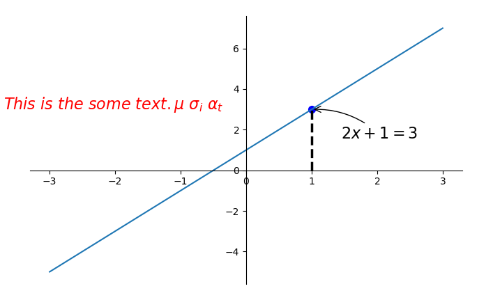
2.6 Annotation 标注
当图线中某些特殊地方需要标注时,我们可以使用 annotation. matplotlib 中的 annotation 有两种方法, 一种是用 plt 里面的 annotate,一种是直接用 plt 里面的 text 来写标注
import matplotlib.pyplot as plt
import numpy as np

x = np.linspace(-3, 3, 50)
y = 2*x + 1

plt.figure(num=1, figsize=(8, 5),)
plt.plot(x, y,)

ax = plt.gca()
ax.xaxis.set_ticks_position('bottom')
ax.spines['bottom'].set_position(('data',0))
ax.yaxis.set_ticks_position('left')
ax.spines['left'].set_position(('data',0))
ax.spines['right'].set_color ('none')
ax.spines['top'].set_color ('none')


x0 = 1
y0 = 2*x0 + 1
plt.scatter([x0,],[y0,],s=50,color='b')
plt.plot([x0,x0],[0,y0],'k--',linewidth=2.5)

#添加注释annotate
plt.annotate(r'$2x+1=%s$'%y0,xy=(x0,y0),xycoords='data'
             ,xytext = (+30,-30),textcoords='offset points',fontsize=16,
             arrowprops=dict(arrowstyle='->',connectionstyle='arc3,rad=.2'))

'''
xycoords='data' 是说基于数据的值来选位置
xytext=(+30, -30) 和 textcoords='offset points' 对于标注位置的描述 xy 偏差值
arrowprops是对图中箭头类型的一些设置
'''

#添加注释text
plt.text(-3.7, 3, r'$This is the some text. mu sigma_i alpha_t$',
         fontdict={'size': 16, 'color': 'r'})

plt.show()
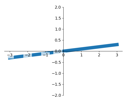
2.7 tick 能见度
对于被遮挡的坐标轴进行调整,使用zorder给plot在z轴方向排序
label.set_fontsize(12)重新调节字体大小,bbox设置目的内容的透明度相关参,facecolor调节 box 前景色,edgecolor 设置边框, 本处设置边框为无,alpha设置透明度
for label in ax.get_xticklabels() + ax.get_yticklabels():
    label.set_fontsize(12)
    # 在 plt 2.0.2 或更高的版本中, 设置 zorder 给 plot 在 z 轴方向排序
    label.set_bbox(dict(facecolor='white', edgecolor='None', alpha=0.7, zorder=2))
plt.show()
画图种类
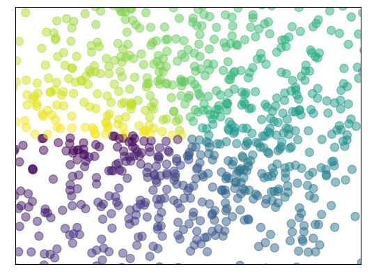
3.1 Scatter 散点图
import matplotlib.pyplot as plt
import numpy as np

#生成1024个呈标准正态分布的二维数据组
n = 1024
X = np.random.normal(0,1,n)
Y = np.random.normal(0,1,n)
#每个点的颜色用T值来表示
T = np.arctan2(Y,X)

plt.scatter(X,Y,s=75,c=T,alpha=.5)

plt.xlim(-1.5,1.5)
#隐藏坐标轴
plt.xticks(())
plt.ylim(-1.5,1.5)
plt.yticks(())

plt.show()
3.2 Bar 柱状图
举例:
plt.bar(X,Y,facecolr='#9999ff',edgecolor='white')
3.3 Contours 等高线图
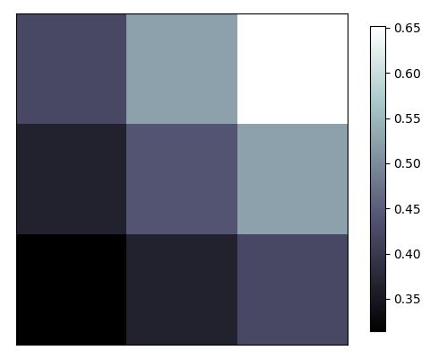
3.4 Image 图片
import matplotlib.pyplot as plt
import numpy as np

a = np.array([0.313660827978, 0.365348418405, 0.423733120134,
              0.365348418405, 0.439599930621, 0.525083754405,
              0.423733120134, 0.525083754405, 0.651536351379]).reshape(3,3)

#origin='lower'代表选择的原点的位置
#interpolation表示相应的内插法
plt.imshow(a,interpolation='nearest',cmap='bone',origin='lower')
#添加colorbar 并使其长度为原来的92%
plt.colorbar(shrink=.92)

plt.xticks(())
plt.yticks(())
plt.show()
3.5 3D 数据
多图合并显示
4.1 Subplot 多合一显示
和matlab相似
plt.subplot(2,2,1)
plt.plot([0,1],[0,1])
4.2 Subplot 分格显示
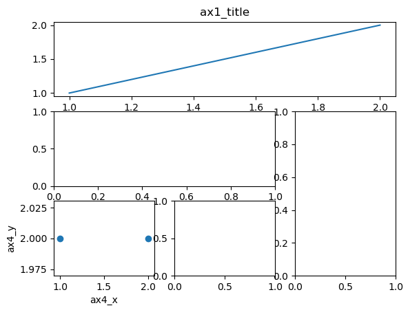
(1)subplot2grid
第一个ax1中(3,3)表示将整个图像窗口分成3行3列,(0,0)表示从第0行0列开始作图。colspan表示列的跨度为3,rowspan表示行的跨度为1
import matplotlib.pyplot as plt

plt.figure()
ax1 = plt.subplot2grid((3,3),(0,0),colspan = 3)
ax1.plot([1,2],[1,2])
ax1.set_title('ax1_title')

ax2 = plt.subplot2grid((3,3),(1,0),colspan = 2)
ax3 = plt.subplot2grid((3,3),(1,2),rowspan = 2)
ax4 = plt.subplot2grid((3,3),(2,0))
ax5 = plt.subplot2grid((3,3),(2,1))

ax4.scatter([1, 2], [2, 2])
ax4.set_xlabel('ax4_x')
ax4.set_ylabel('ax4_y')

plt.show()
(2)gridspec
导入matplotlib.gridspec,使用gridspec.Gridspec将图像窗口分成3行3列
gs[0,:]表示第0行的所有列
import matplotlib.pyplot as plt
import matplotlib.gridspec as gridspec

plt.figure()
gs = gridspec.GridSpec(3, 3)
ax1 = plt.subplot(gs[0,:])
ax2 = plt.subplot(gs[1,:2])
ax3 = plt.subplot(gs[1:,2])
ax4 = plt.subplot(gs[-1,0])
ax5 = plt.subplot(gs[-1,1])

plt.show()
(3)subplots
使用plt.subplots建立一个2行2列的图像窗口,sharex=True表示共享x轴坐标, sharey=True表示共享y轴坐标. ((ax11, ax12), (ax21, ax22))表示第1行从左至右依次放ax11和ax12, 第2行从左至右依次放ax13和ax14
import matplotlib.pyplot as plt

f,((ax11,ax12),(ax21,ax22))=plt.subplots(2,2,sharex=True,sharey=True)

plt.tight_layout() #紧凑显示图像
plt.show()

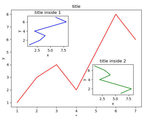
4.3 图中图
left, bottom, width, height = 0.1, 0.1, 0.8, 0.8
4个值都是占整个figure坐标系的百分比。在这里,假设figure的大小是10x10,那么大图就被包含在由(1, 1)开始,宽8,高8的坐标系内。
当直接使用plt时设置属性时不用加上set_
import matplotlib.pyplot as plt

fig = plt.figure()
x = [1, 2, 3, 4, 5, 6, 7]
y = [1, 3, 4, 2, 5, 8, 6]

# below are all percentage
left, bottom, width, height = 0.1, 0.1, 0.8, 0.8
ax1 = fig.add_axes([left, bottom, width, height])  # main axes
ax1.plot(x, y, 'r')
ax1.set_xlabel('x')
ax1.set_ylabel('y')
ax1.set_title('title')

ax2 = fig.add_axes([0.2, 0.6, 0.25, 0.25])  # inside axes
ax2.plot(y, x, 'b')
ax2.set_xlabel('x')
ax2.set_ylabel('y')
ax2.set_title('title inside 1')


# different method to add axes
####################################
plt.axes([0.6, 0.2, 0.25, 0.25])
plt.plot(y[::-1], x, 'g')
plt.xlabel('x')
plt.ylabel('y')
plt.title('title inside 2')

plt.show()
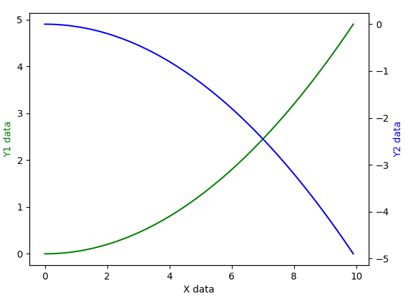
4.4 次坐标轴
import matplotlib.pyplot as plt
import numpy as np

x = np.arange(0, 10, 0.1)
y1 = 0.05 * x**2
y2 = -1 * y1

fig, ax1 = plt.subplots()#获取figure默认的坐标系 ax1

ax2 = ax1.twinx() #对ax1调用twinx()方法,生成如同镜面效果后的ax2
ax1.plot(x, y1, 'g-')
ax1.set_xlabel('X data')
ax1.set_ylabel('Y1 data', color='g')
ax2.plot(x, y2, 'b-')
ax2.set_ylabel('Y2 data', color='b')

plt.show()