mobile adaptor & css media query
移动端适配 & 媒体查询
device-aspect-ratio & 设备纵横比
https://developer.mozilla.org/en-US/docs/Web/CSS/Media_Queries/Using_media_queries
https://www.w3schools.com/css/css_rwd_mediaqueries.asp
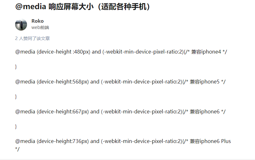
demos
https://css-tricks.com/snippets/css/media-queries-for-standard-devices/
Phones and Handhelds
/* ----------- iPhone 4 and 4S ----------- */

/* Portrait and Landscape */
@media only screen
  and (min-device- 320px)
  and (max-device- 480px)
  and (-webkit-min-device-pixel-ratio: 2) {

}

/* Portrait */
@media only screen
  and (min-device- 320px)
  and (max-device- 480px)
  and (-webkit-min-device-pixel-ratio: 2)
  and (orientation: portrait) {
}

/* Landscape */
@media only screen
  and (min-device- 320px)
  and (max-device- 480px)
  and (-webkit-min-device-pixel-ratio: 2)
  and (orientation: landscape) {

}

/* ----------- iPhone 5, 5S, 5C and 5SE ----------- */

/* Portrait and Landscape */
@media only screen
  and (min-device- 320px)
  and (max-device- 568px)
  and (-webkit-min-device-pixel-ratio: 2) {

}

/* Portrait */
@media only screen
  and (min-device- 320px)
  and (max-device- 568px)
  and (-webkit-min-device-pixel-ratio: 2)
  and (orientation: portrait) {
}

/* Landscape */
@media only screen
  and (min-device- 320px)
  and (max-device- 568px)
  and (-webkit-min-device-pixel-ratio: 2)
  and (orientation: landscape) {

}

/* ----------- iPhone 6, 6S, 7 and 8 ----------- */

/* Portrait and Landscape */
@media only screen
  and (min-device- 375px)
  and (max-device- 667px)
  and (-webkit-min-device-pixel-ratio: 2) {

}

/* Portrait */
@media only screen
  and (min-device- 375px)
  and (max-device- 667px)
  and (-webkit-min-device-pixel-ratio: 2)
  and (orientation: portrait) {

}

/* Landscape */
@media only screen
  and (min-device- 375px)
  and (max-device- 667px)
  and (-webkit-min-device-pixel-ratio: 2)
  and (orientation: landscape) {

}

/* ----------- iPhone 6+, 7+ and 8+ ----------- */

/* Portrait and Landscape */
@media only screen
  and (min-device- 414px)
  and (max-device- 736px)
  and (-webkit-min-device-pixel-ratio: 3) {

}

/* Portrait */
@media only screen
  and (min-device- 414px)
  and (max-device- 736px)
  and (-webkit-min-device-pixel-ratio: 3)
  and (orientation: portrait) {

}

/* Landscape */
@media only screen
  and (min-device- 414px)
  and (max-device- 736px)
  and (-webkit-min-device-pixel-ratio: 3)
  and (orientation: landscape) {

}

/* ----------- iPhone X ----------- */

/* Portrait and Landscape */
@media only screen
  and (min-device- 375px)
  and (max-device- 812px)
  and (-webkit-min-device-pixel-ratio: 3) {

}

/* Portrait */
@media only screen
  and (min-device- 375px)
  and (max-device- 812px)
  and (-webkit-min-device-pixel-ratio: 3)
  and (orientation: portrait) {

}

/* Landscape */
@media only screen
  and (min-device- 375px)
  and (max-device- 812px)
  and (-webkit-min-device-pixel-ratio: 3)
  and (orientation: landscape) {

}
/* ----------- Galaxy S3 ----------- */

/* Portrait and Landscape */
@media screen
  and (device- 360px)
  and (device-height: 640px)
  and (-webkit-device-pixel-ratio: 2) {

}

/* Portrait */
@media screen
  and (device- 320px)
  and (device-height: 640px)
  and (-webkit-device-pixel-ratio: 2)
  and (orientation: portrait) {

}

/* Landscape */
@media screen
  and (device- 320px)
  and (device-height: 640px)
  and (-webkit-device-pixel-ratio: 2)
  and (orientation: landscape) {

}

/* ----------- Galaxy S4, S5 and Note 3 ----------- */

/* Portrait and Landscape */
@media screen
  and (device- 320px)
  and (device-height: 640px)
  and (-webkit-device-pixel-ratio: 3) {

}

/* Portrait */
@media screen
  and (device- 320px)
  and (device-height: 640px)
  and (-webkit-device-pixel-ratio: 3)
  and (orientation: portrait) {

}

/* Landscape */
@media screen
  and (device- 320px)
  and (device-height: 640px)
  and (-webkit-device-pixel-ratio: 3)
  and (orientation: landscape) {

}

/* ----------- Galaxy S6 ----------- */

/* Portrait and Landscape */
@media screen
  and (device- 360px)
  and (device-height: 640px)
  and (-webkit-device-pixel-ratio: 4) {

}

/* Portrait */
@media screen
  and (device- 360px)
  and (device-height: 640px)
  and (-webkit-device-pixel-ratio: 4)
  and (orientation: portrait) {

}

/* Landscape */
@media screen
  and (device- 360px)
  and (device-height: 640px)
  and (-webkit-device-pixel-ratio: 4)
  and (orientation: landscape) {

}
* ----------- Google Pixel ----------- */

/* Portrait and Landscape */
@media screen
  and (device- 360px)
  and (device-height: 640px)
  and (-webkit-device-pixel-ratio: 3) {

}

/* Portrait */
@media screen
  and (device- 360px)
  and (device-height: 640px)
  and (-webkit-device-pixel-ratio: 3)
  and (orientation: portrait) {

}

/* Landscape */
@media screen
  and (device- 360px)
  and (device-height: 640px)
  and (-webkit-device-pixel-ratio: 3)
  and (orientation: landscape) {

}

/* ----------- Google Pixel XL ----------- */

/* Portrait and Landscape */
@media screen
  and (device- 360px)
  and (device-height: 640px)
  and (-webkit-device-pixel-ratio: 4) {

}

/* Portrait */
@media screen
  and (device- 360px)
  and (device-height: 640px)
  and (-webkit-device-pixel-ratio: 4)
  and (orientation: portrait) {

}

/* Landscape */
@media screen
  and (device- 360px)
  and (device-height: 640px)
  and (-webkit-device-pixel-ratio: 4)
  and (orientation: landscape) {

}
/* ----------- HTC One ----------- */

/* Portrait and Landscape */
@media screen
  and (device- 360px)
  and (device-height: 640px)
  and (-webkit-device-pixel-ratio: 3) {

}

/* Portrait */
@media screen
  and (device- 360px)
  and (device-height: 640px)
  and (-webkit-device-pixel-ratio: 3)
  and (orientation: portrait) {

}

/* Landscape */
@media screen
  and (device- 360px)
  and (device-height: 640px)
  and (-webkit-device-pixel-ratio: 3)
  and (orientation: landscape) {

}
/* ----------- Windows Phone ----------- */

/* Portrait and Landscape */
@media screen
  and (device- 480px)
  and (device-height: 800px) {

}

/* Portrait */
@media screen
  and (device- 480px)
  and (device-height: 800px)
  and (orientation: portrait) {

}

/* Landscape */
@media screen
  and (device- 480px)
  and (device-height: 800px)
  and (orientation: landscape) {

}
Tablets
/* ----------- iPad 1, 2, Mini and Air ----------- */

/* Portrait and Landscape */
@media only screen
  and (min-device- 768px)
  and (max-device- 1024px)
  and (-webkit-min-device-pixel-ratio: 1) {

}

/* Portrait */
@media only screen
  and (min-device- 768px)
  and (max-device- 1024px)
  and (orientation: portrait)
  and (-webkit-min-device-pixel-ratio: 1) {

}

/* Landscape */
@media only screen
  and (min-device- 768px)
  and (max-device- 1024px)
  and (orientation: landscape)
  and (-webkit-min-device-pixel-ratio: 1) {

}

/* ----------- iPad 3, 4 and Pro 9.7" ----------- */

/* Portrait and Landscape */
@media only screen
  and (min-device- 768px)
  and (max-device- 1024px)
  and (-webkit-min-device-pixel-ratio: 2) {

}

/* Portrait */
@media only screen
  and (min-device- 768px)
  and (max-device- 1024px)
  and (orientation: portrait)
  and (-webkit-min-device-pixel-ratio: 2) {

}

/* Landscape */
@media only screen
  and (min-device- 768px)
  and (max-device- 1024px)
  and (orientation: landscape)
  and (-webkit-min-device-pixel-ratio: 2) {

}

/* ----------- iPad Pro 10.5" ----------- */

/* Portrait and Landscape */
@media only screen
  and (min-device- 834px)
  and (max-device- 1112px)
  and (-webkit-min-device-pixel-ratio: 2) {

}

/* Portrait */
/* Declare the same value for min- and max-width to avoid colliding with desktops */
/* Source: https://medium.com/connect-the-dots/css-media-queries-for-ipad-pro-8cad10e17106*/
@media only screen
  and (min-device- 834px)
  and (max-device- 834px)
  and (orientation: portrait)
  and (-webkit-min-device-pixel-ratio: 2) {

}

/* Landscape */
/* Declare the same value for min- and max-width to avoid colliding with desktops */
/* Source: https://medium.com/connect-the-dots/css-media-queries-for-ipad-pro-8cad10e17106*/
@media only screen
  and (min-device- 1112px)
  and (max-device- 1112px)
  and (orientation: landscape)
  and (-webkit-min-device-pixel-ratio: 2) {

}

/* ----------- iPad Pro 12.9" ----------- */

/* Portrait and Landscape */
@media only screen
  and (min-device- 1024px)
  and (max-device- 1366px)
  and (-webkit-min-device-pixel-ratio: 2) {

}

/* Portrait */
/* Declare the same value for min- and max-width to avoid colliding with desktops */
/* Source: https://medium.com/connect-the-dots/css-media-queries-for-ipad-pro-8cad10e17106*/
@media only screen
  and (min-device- 1024px)
  and (max-device- 1024px)
  and (orientation: portrait)
  and (-webkit-min-device-pixel-ratio: 2) {

}

/* Landscape */
/* Declare the same value for min- and max-width to avoid colliding with desktops */
/* Source: https://medium.com/connect-the-dots/css-media-queries-for-ipad-pro-8cad10e17106*/
@media only screen
  and (min-device- 1366px)
  and (max-device- 1366px)
  and (orientation: landscape)
  and (-webkit-min-device-pixel-ratio: 2) {

}
/* ----------- Galaxy Tab 2 ----------- */

/* Portrait and Landscape */
@media
  (min-device- 800px)
  and (max-device- 1280px) {

}

/* Portrait */
@media
  (max-device- 800px)
  and (orientation: portrait) {

}

/* Landscape */
@media
  (max-device- 1280px)
  and (orientation: landscape) {

}

/* ----------- Galaxy Tab S ----------- */

/* Portrait and Landscape */
@media
  (min-device- 800px)
  and (max-device- 1280px)
  and (-webkit-min-device-pixel-ratio: 2) {

}

/* Portrait */
@media
  (max-device- 800px)
  and (orientation: portrait)
  and (-webkit-min-device-pixel-ratio: 2) {

}

/* Landscape */
@media
  (max-device- 1280px)
  and (orientation: landscape)
  and (-webkit-min-device-pixel-ratio: 2) {

}
/* ----------- Nexus 7 ----------- */

/* Portrait and Landscape */
@media screen
  and (device- 601px)
  and (device-height: 906px)
  and (-webkit-min-device-pixel-ratio: 1.331)
  and (-webkit-max-device-pixel-ratio: 1.332) {

}

/* Portrait */
@media screen
  and (device- 601px)
  and (device-height: 906px)
  and (-webkit-min-device-pixel-ratio: 1.331)
  and (-webkit-max-device-pixel-ratio: 1.332)
  and (orientation: portrait) {

}

/* Landscape */
@media screen
  and (device- 601px)
  and (device-height: 906px)
  and (-webkit-min-device-pixel-ratio: 1.331)
  and (-webkit-max-device-pixel-ratio: 1.332)
  and (orientation: landscape) {

}

/* ----------- Nexus 9 ----------- */

/* Portrait and Landscape */
@media screen
  and (device- 1536px)
  and (device-height: 2048px)
  and (-webkit-min-device-pixel-ratio: 1.331)
  and (-webkit-max-device-pixel-ratio: 1.332) {

}

/* Portrait */
@media screen
  and (device- 1536px)
  and (device-height: 2048px)
  and (-webkit-min-device-pixel-ratio: 1.331)
  and (-webkit-max-device-pixel-ratio: 1.332)
  and (orientation: portrait) {

}

/* Landscape */
@media screen
  and (device- 1536px)
  and (device-height: 2048px)
  and (-webkit-min-device-pixel-ratio: 1.331)
  and (-webkit-max-device-pixel-ratio: 1.332)
  and (orientation: landscape) {

}
/* ----------- Kindle Fire HD 7" ----------- */

/* Portrait and Landscape */
@media only screen
  and (min-device- 800px)
  and (max-device- 1280px)
  and (-webkit-min-device-pixel-ratio: 1.5) {

}

/* Portrait */
@media only screen
  and (min-device- 800px)
  and (max-device- 1280px)
  and (-webkit-min-device-pixel-ratio: 1.5)
  and (orientation: portrait) {
}

/* Landscape */
@media only screen
  and (min-device- 800px)
  and (max-device- 1280px)
  and (-webkit-min-device-pixel-ratio: 1.5)
  and (orientation: landscape) {

}

/* ----------- Kindle Fire HD 8.9" ----------- */

/* Portrait and Landscape */
@media only screen
  and (min-device- 1200px)
  and (max-device- 1600px)
  and (-webkit-min-device-pixel-ratio: 1.5) {

}

/* Portrait */
@media only screen
  and (min-device- 1200px)
  and (max-device- 1600px)
  and (-webkit-min-device-pixel-ratio: 1.5)
  and (orientation: portrait) {
}

/* Landscape */
@media only screen
  and (min-device- 1200px)
  and (max-device- 1600px)
  and (-webkit-min-device-pixel-ratio: 1.5)
  and (orientation: landscape) {

}
Laptops
/* ----------- Non-Retina Screens ----------- */
@media screen
  and (min-device- 1200px)
  and (max-device- 1600px)
  and (-webkit-min-device-pixel-ratio: 1) {
}

/* ----------- Retina Screens ----------- */
@media screen
  and (min-device- 1200px)
  and (max-device- 1600px)
  and (-webkit-min-device-pixel-ratio: 2)
  and (min-resolution: 192dpi) {
}
Wearables
/* ----------- Apple Watch ----------- */
@media
  (max-device- 42mm)
  and (min-device- 38mm) {

}
/* ----------- Moto 360 Watch ----------- */
@media
  (max-device- 218px)
  and (max-device-height: 281px) {

}